18 Colours Mixed

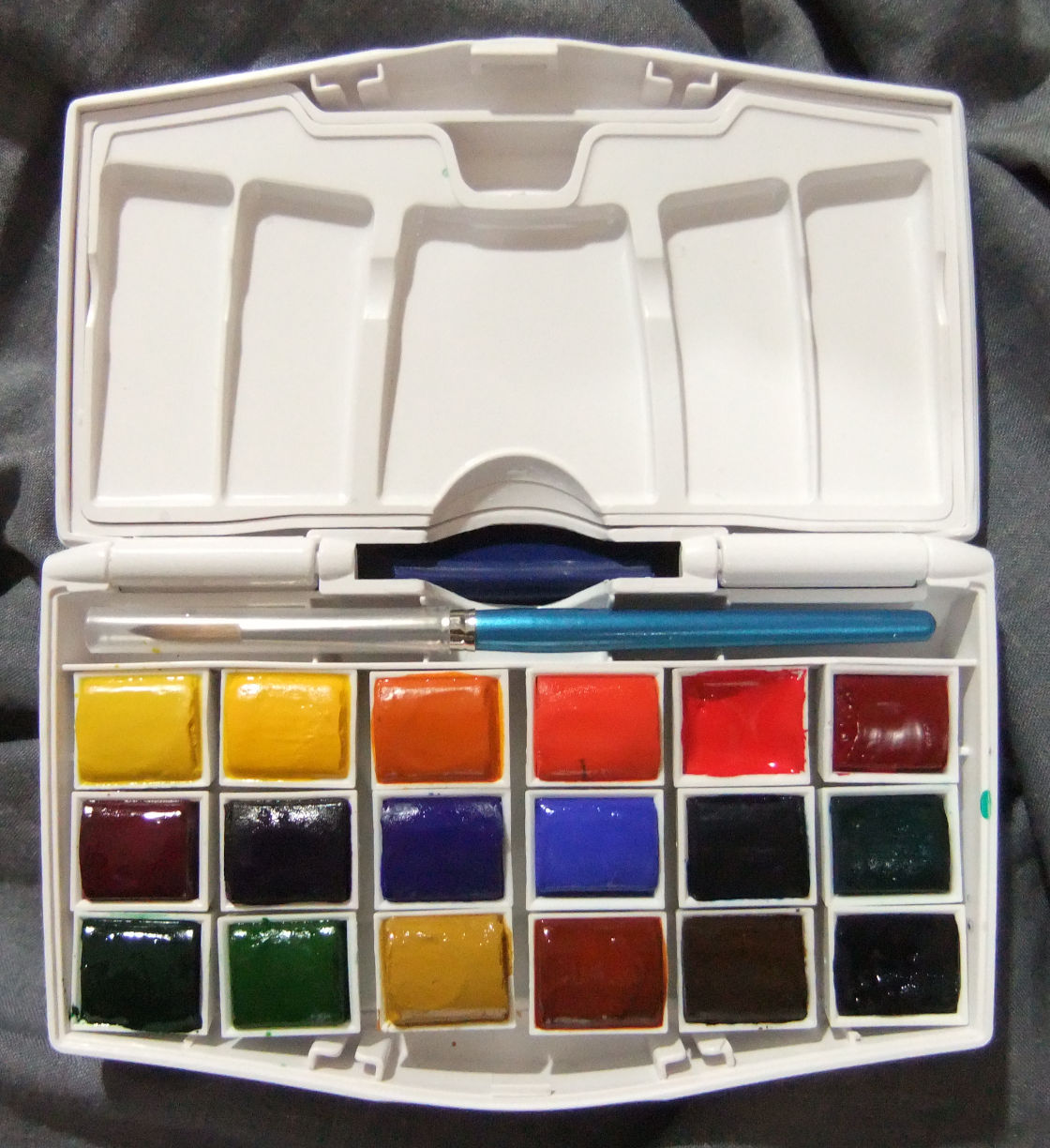
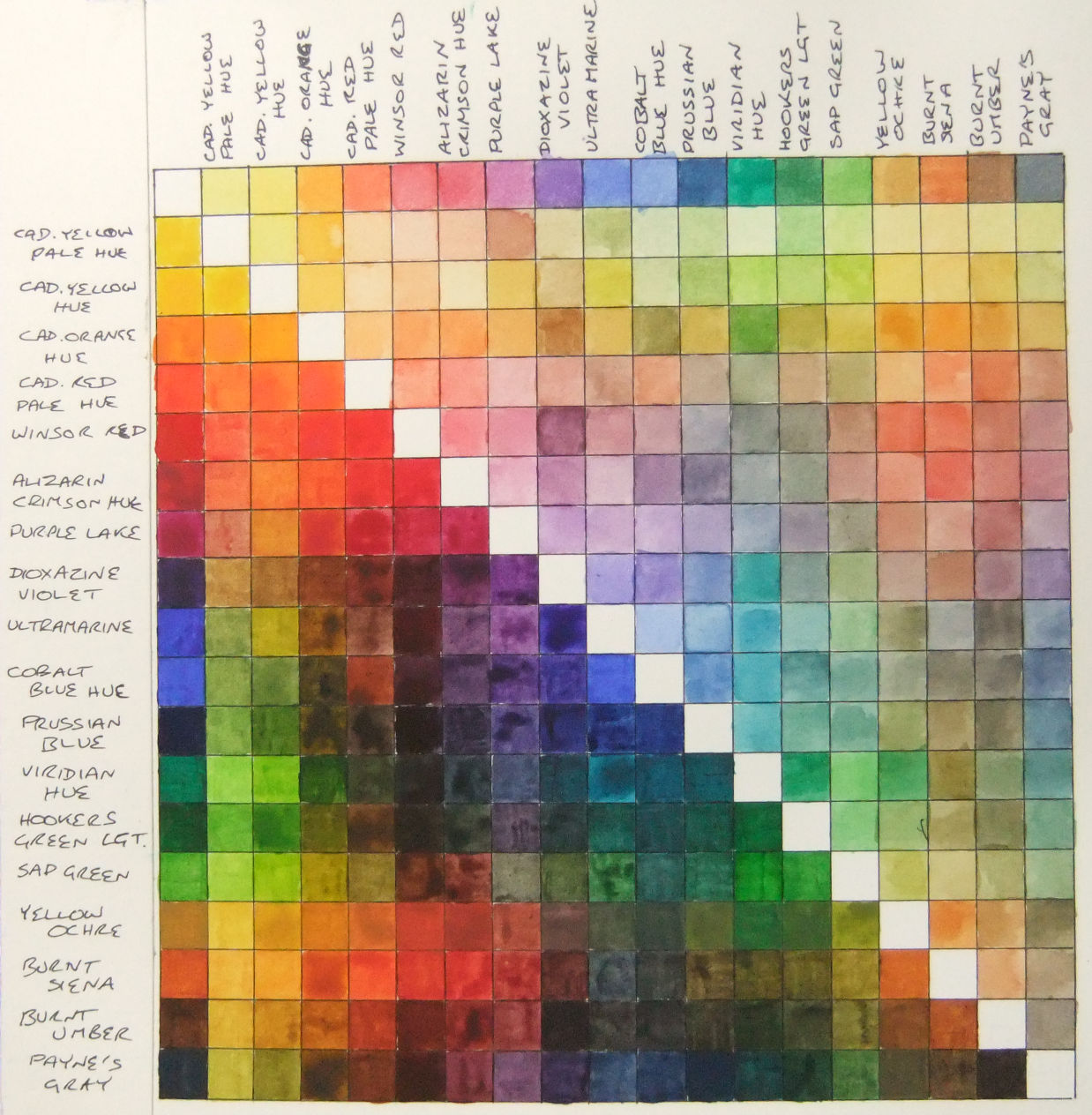
As i use the University of Youtube to teach me all about watercolours, it appears that artists eagerly produce mix charts for every palette they use. So, not to be outdone, i proceeded to do just this with my one single palette.

By doing this one can learn many things: it’s not just about the colours, but also the relative strengths of the pigments within each colour.   And i do admit that it was also a rather enjoyable pleasure watching the colours change as i mixed them.

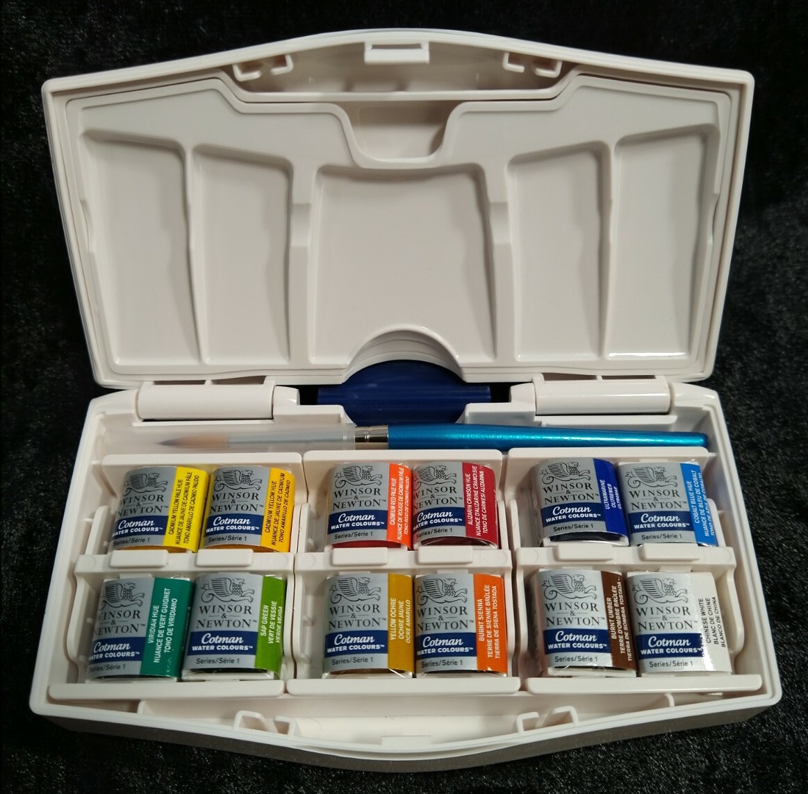
My palette consists of 17 Winsor & Newton Cotman colours, and one Winsor & Newton Professional colour — that being the Winsor Red.

It struck me as i was mixing them the difference in quality between the Winsor Red and the Cotman colours.   When mixing with the Winsor Red i only had to apply a tiny amount compared to the Cotman colour i was mixing it with, else the Winsor Red would simply over power the other colour.   So a good lesson learned there as to the difference between student grade and artist grade watercolours.   I look forward to slowly swapping out the Cotmans for artist grade ones as time goes by.

Certainly the first colour i want rid of is the Sap Green.   This colour, i felt, just totally lacked any mojo and was easily drowned out by other colours.   It doesn’t look too bad on the mix chart, but to get those colours with it i had to use over twice as much paint as the other colours.   So whether i want rid of it or not, it isn’t going to last very long anyway.   Therefore, i shall return to the University of Youtube and find me a suitable replacement to try.

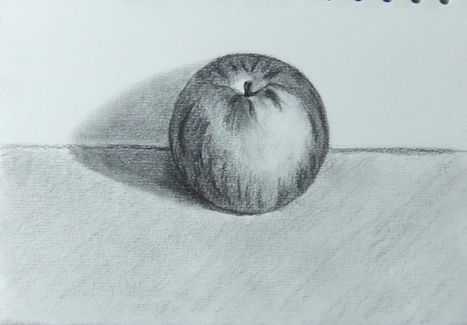
For anyone interested, i used a sheet of Fabriano Artistico trad white for this.

So my next step in my watercolour journey is to simply play around to find the colours i need and learn to apply them nicely in order to paint my recent picture of De Waag.

Ta ta for now.   x

Posted in art

Cotman Water Colours Pocket Plus

One has to begin somewhere and this little palette seemed to have everything to suit a beginner.  

Not only does it come as a great little beginner’s palette, it actually is easily expandable to accomodate some future purchases . . .

An hour or so of tinkering, sanding, cutting and grinding with a Dremel and you soon have space for an extra 6 half pans.

You could also take any two out and replace them with a full pan to suit your needs.   Or give all the Cotman colours to a child to enjoy and replace them with whatever professional pans you want to use instead.

Posted in art

St John’s Church — Exmouth

Materials:   Pentel Colour Brush Pen in grey, and a rather crappy bit of paper.

Plan:   I bought this pen in grey as i was hoping to use it to do shading on my ink drawings.   The plan here was to have a quick, first go with this brush pen on a bit of crappy paper that was laying on my coffee table, but i got a bit carried away.

Learned:   That the brush pen is a very interesting way of drawing and much more expressive than a pen or pencil.   It goes from really fat lines to incredibly fine ones, if you’re gentle enough — which i do need more practice at.   This pen is the grey version, which it gave a fairly reasonable interpretation of at first, but that was because the ink wasn’t really flowing and once the ink did start flowing properly it turns out to be almost black.   I think most manufacturers need to reset their ideas of what grey means — like half way between white and black would be what normal people would call grey, not 90% toward black like this ink is.

Soooo:   I’m rather pleased with my first play with a brush pen and will definitely be back with it in the future.

Next:   I’m just gonna keep doodling with it until all this nearly black ink is used up and then i shall refill it with a much milder shade of grey and start using it for what i bought it for.

Posted in art

Arghhhh!!!

I found some lessons on Conté à Paris’ website and decided to have a play.

Materials:   Conté àParis Black B crayon, Pierre Noire H and Blanc 630 on Pink Pig Sketch Book 150gsm white mixed media cartridge.

Thoughts:   This was a “Subtractive Drawing” lesson that used to be on Conté àParis’ website: sadly no longer there for some reason.   It said to use a black pastel pencil to make the paper grey, i didn’t have one so i used the Black B crayon instead.   Need to try this same technique with a black or grey pastel instead and see what the difference is like.

Learned:   That i can do a reasonable copy of something.   How to use different erasers for drawing light in.

And:   I definitely plan no coming back to this technique in the future and have some more playtime with it.   It’s a fun way to draw.

In the meanwhile i have another picture on the go which i need to get finished.

Posted in art

Apple

Materials:   Koh i Noor Giaconda Silky Black 2 on Pink Pig Sketch Book 150gsm white mixed media cartridge.

Thoughts:   first drawing using my Cretacolor Ecologic — and also this lead.   Reminds me of being a child again with a big chunky crayon, especially as the Silky Black 2 has a nice waxy feel — and smell — to it.   Fun!

I bought this sketch book years ago with all the good intentions of the world to get back into drawing back then, but alas, life went extremely off the rails for a while and it’s only now that i sit down with it and finally use it.

Learned:   Chunky lead holders are super fun.   You can get very good points and super black lines from these crayon type leads.   I’ve no idea what exactly they’re made of but they’re definitely fun to play with.

Posted in art

Bottle

Materials:   Started with a Derwent Graphic for initial sketch then played around with Conté; Pierre Noire 2B, blanc 630, sanguine, and pastel blue.   Paper is Strathmore Toned Gray.

Thoughts:   i need to sort my light bulb out as the paper is the Toned Gray and looks like Toned Tan in the photo.   Also not sure how i feel about the rough edges from the paper with the Pierre Noire, but i do love the depth of the black in this pencil — Johnny Nice Painter would love ’em.

Learned:   Pierre Noire didn’t sit on the graphite under-drawing, so in future i’ll try a harder Pierre Noir to do the initial sketch and see how that goes.

Posted in art

Jug

Materials:   Conté black ‘B’ crayon and blanc 630 pencil.   Paper is Strathmore Toned Gray — yes, i know, i’m off to buy a new light bulb when the shop opens today.

Thoughts:   first time playing with Conté crayon, ever, and i really like it.   Going to buy lots of them and see what may happen.

Learned:   Conté crayon is super fun.   I remember as a child really enjoying playing with crayons, so imagine my surprise and joy when i recently discovered that Conté make crayons for grown ups.   Awesome!

Posted in art