


18
17
16
15
14
13
12
11
10
09
08
07
06
05
04
03
02
01
18
17
16
15
14
13
12
11
10
09
08
07
06
05
04
03
02
01


If you left click on the photos you’ll get a much bigger picture open in a new tab: best viewed on a large 4k monitor.
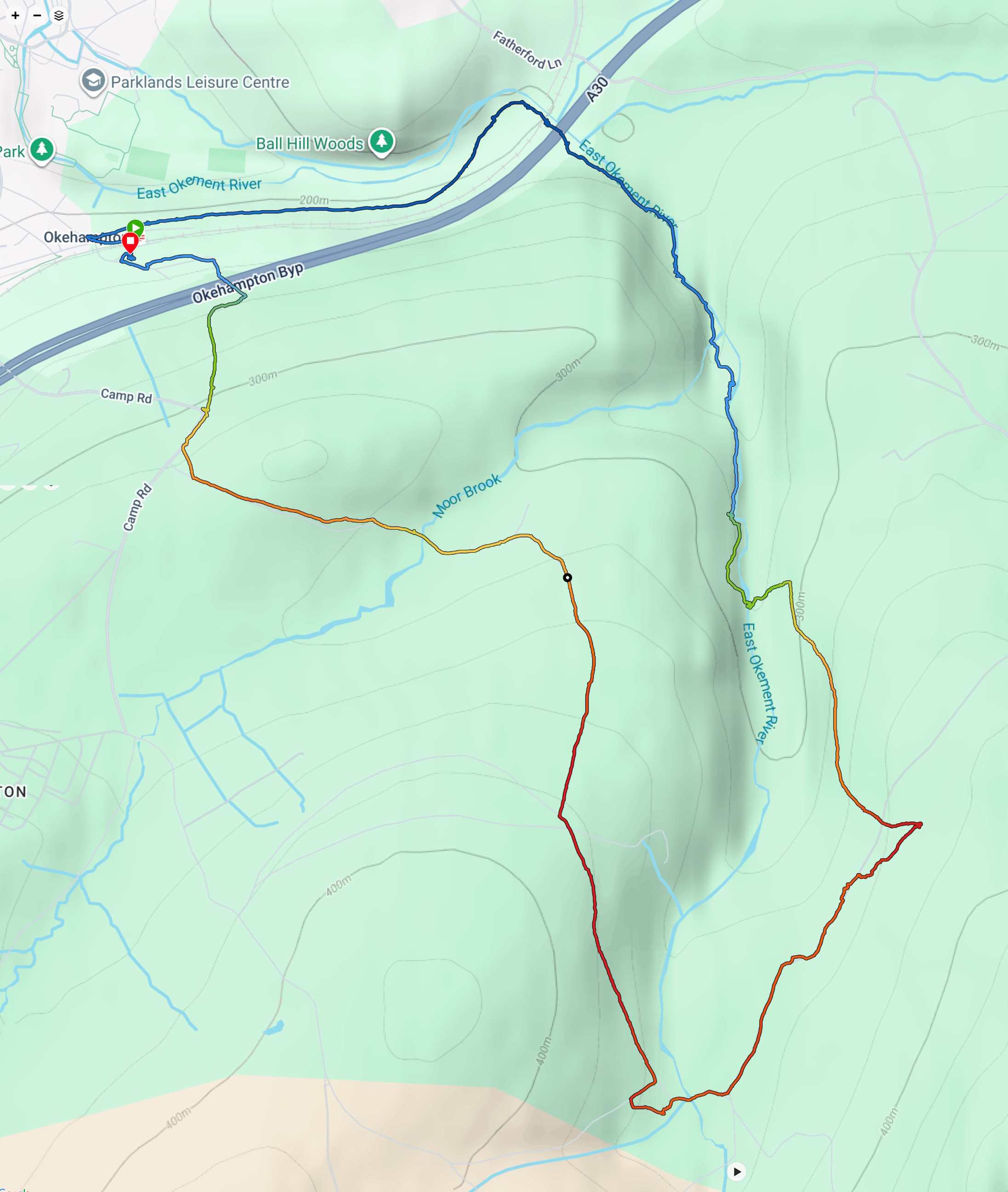
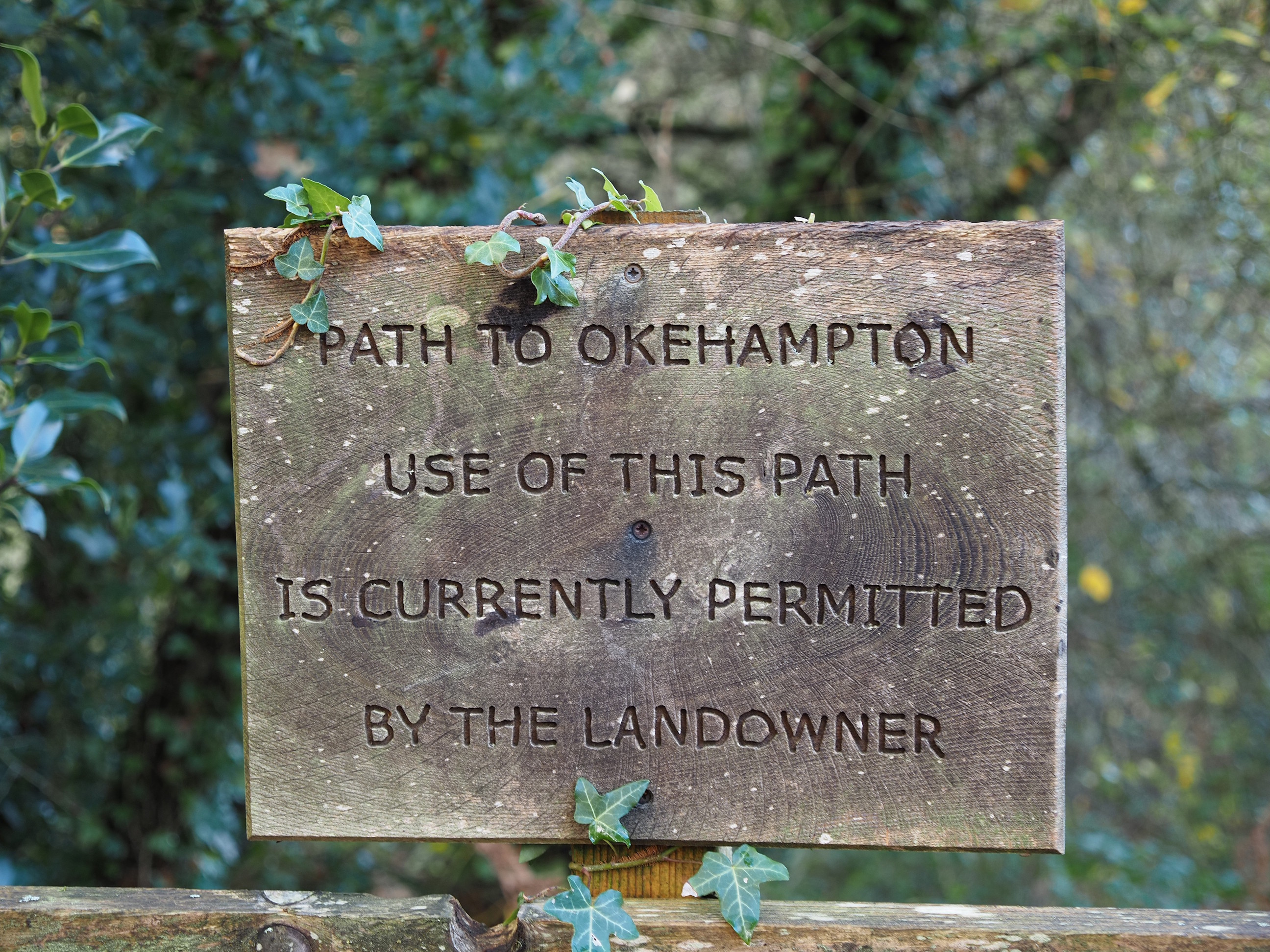
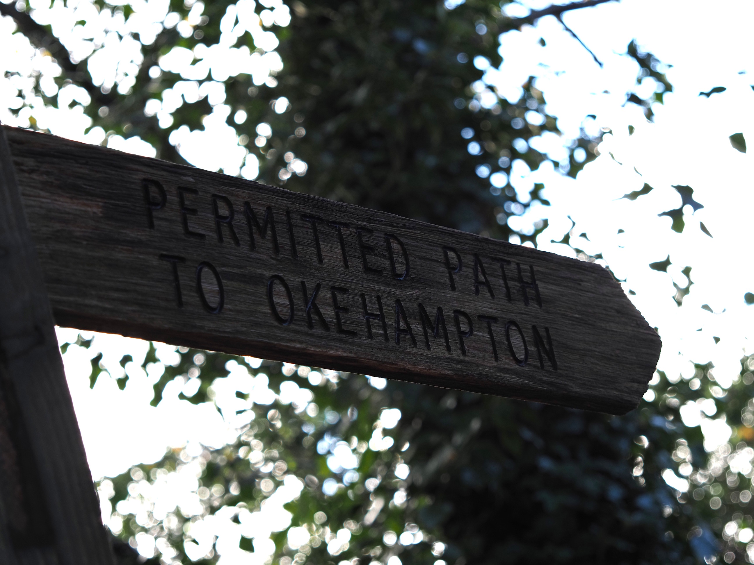
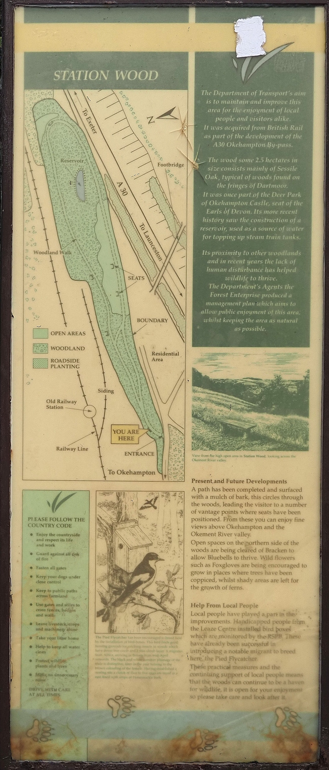
This week we set off from Okehampton Station and walked up the west bank of the East Okement River and then crossed over to the Nine Maidens Stone Circle before taking a big loop back . . .
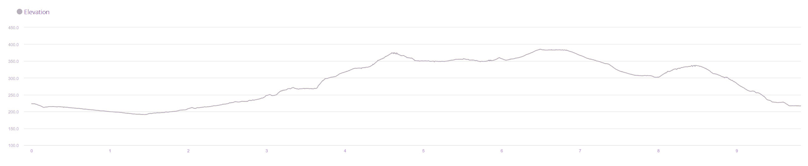
And here’s the elevation plot against distance. It’s got quite a few tough-going little ramps, very yoyo-esque, and can be very wet underfoot. But it’s well worth the effort . . .
Altogether we climbed 283 metres up and 283 metres down over 9.82 km and took us 4 hours almost to the second.
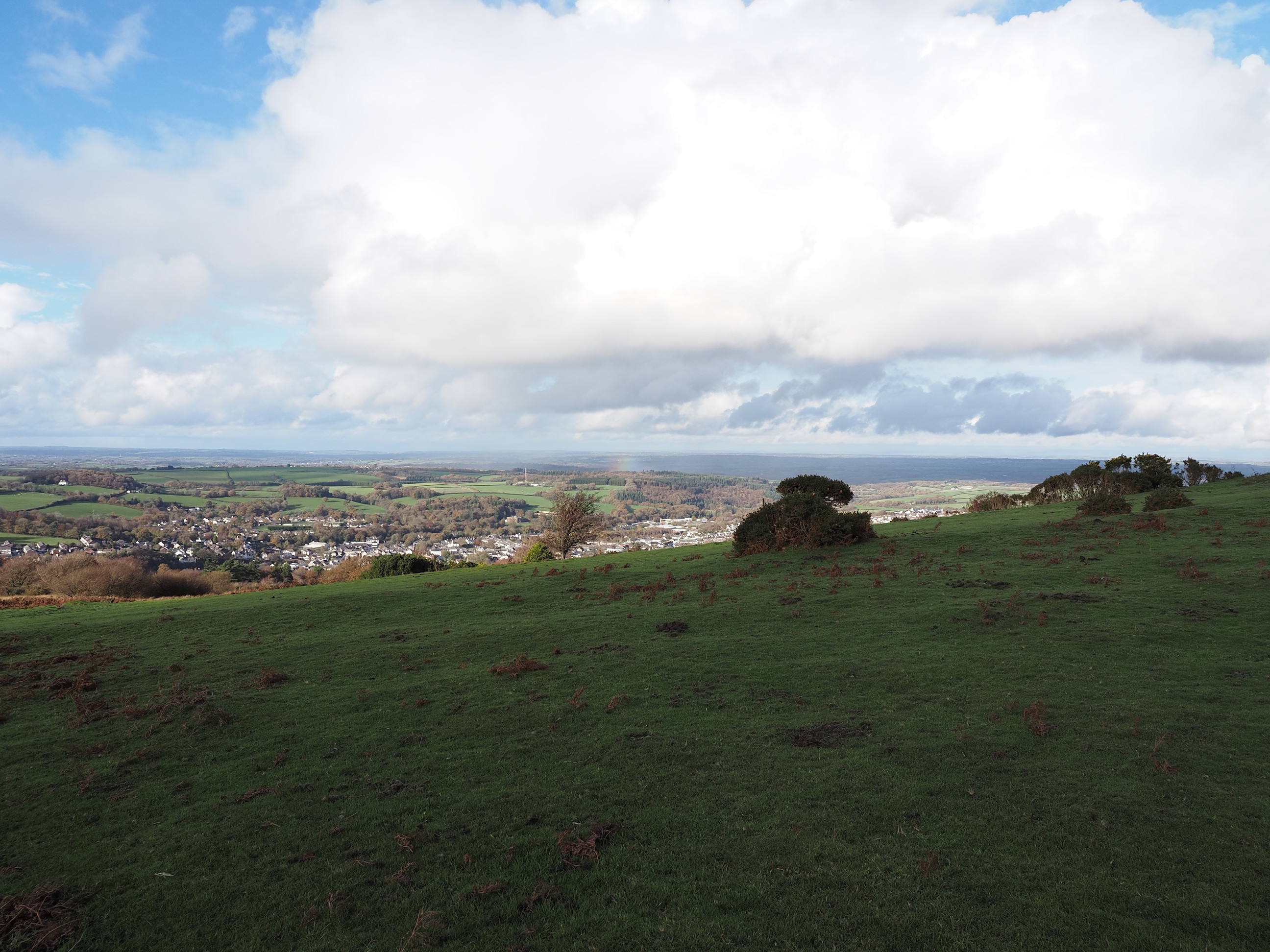
The last view of Okehampton looking back . . .
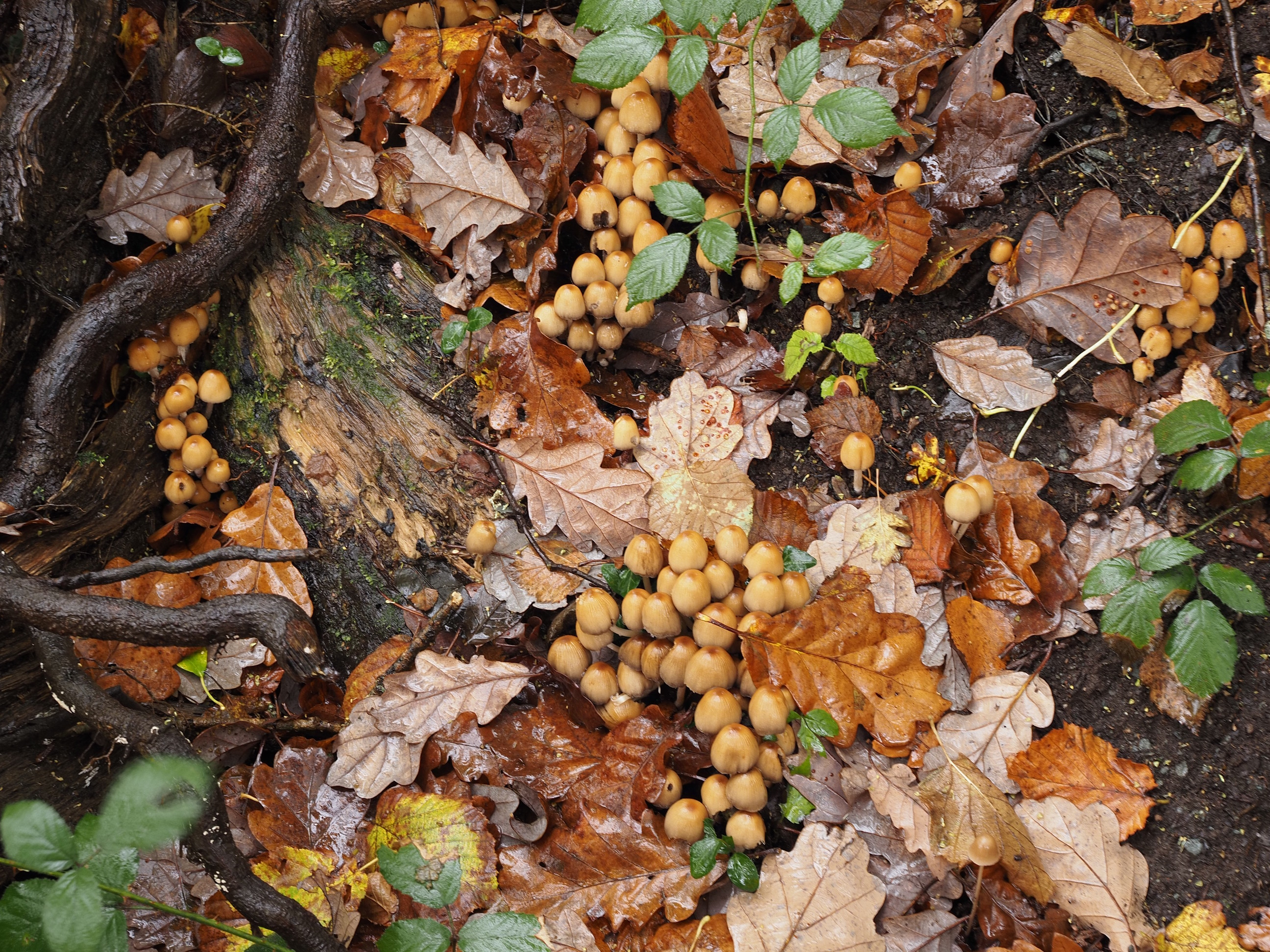
Nothing magic about these mushrooms . . .
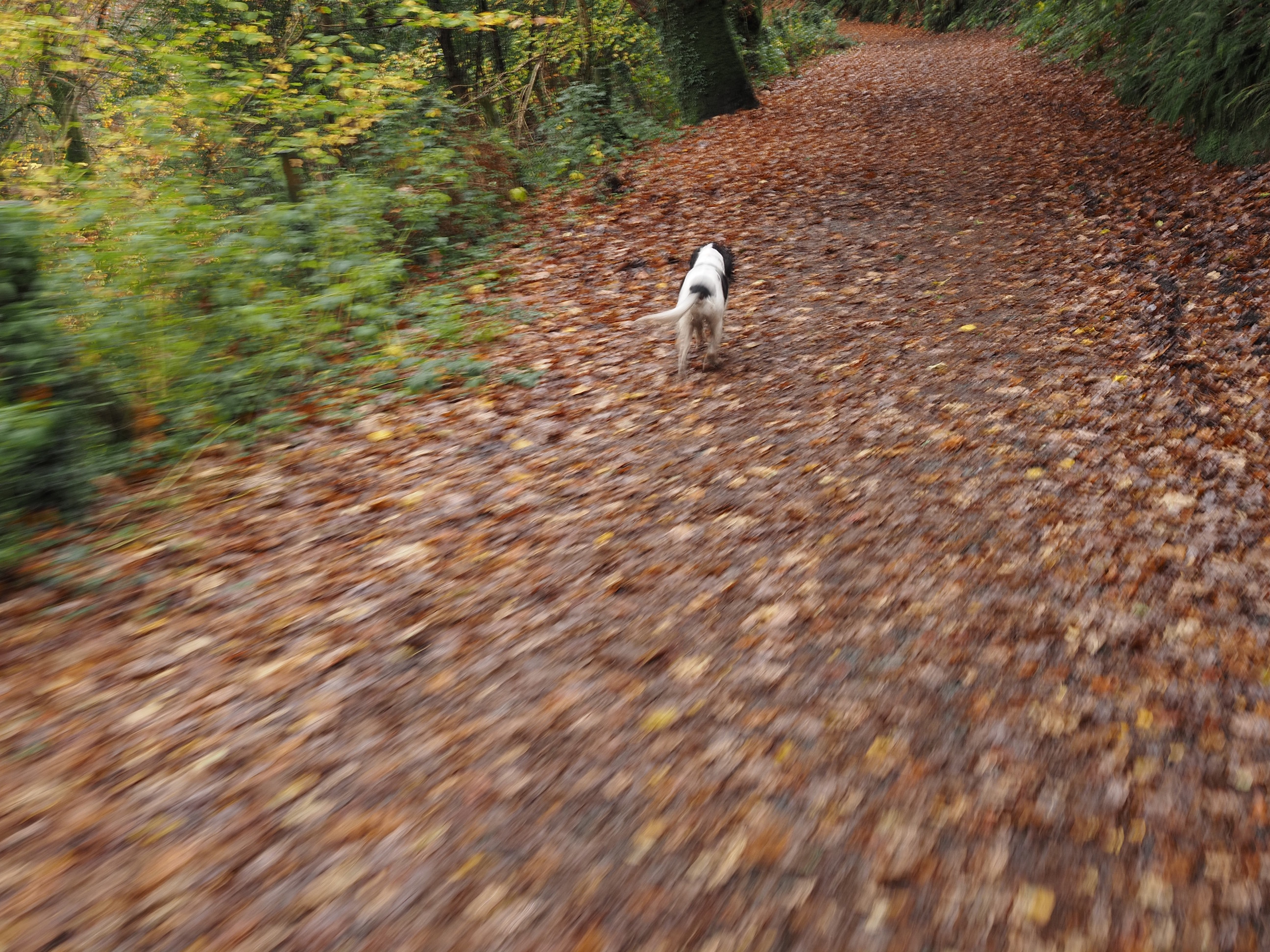
Jasper was having a good run. Definitely not interested in pacing himself: oh, to be young again . . .
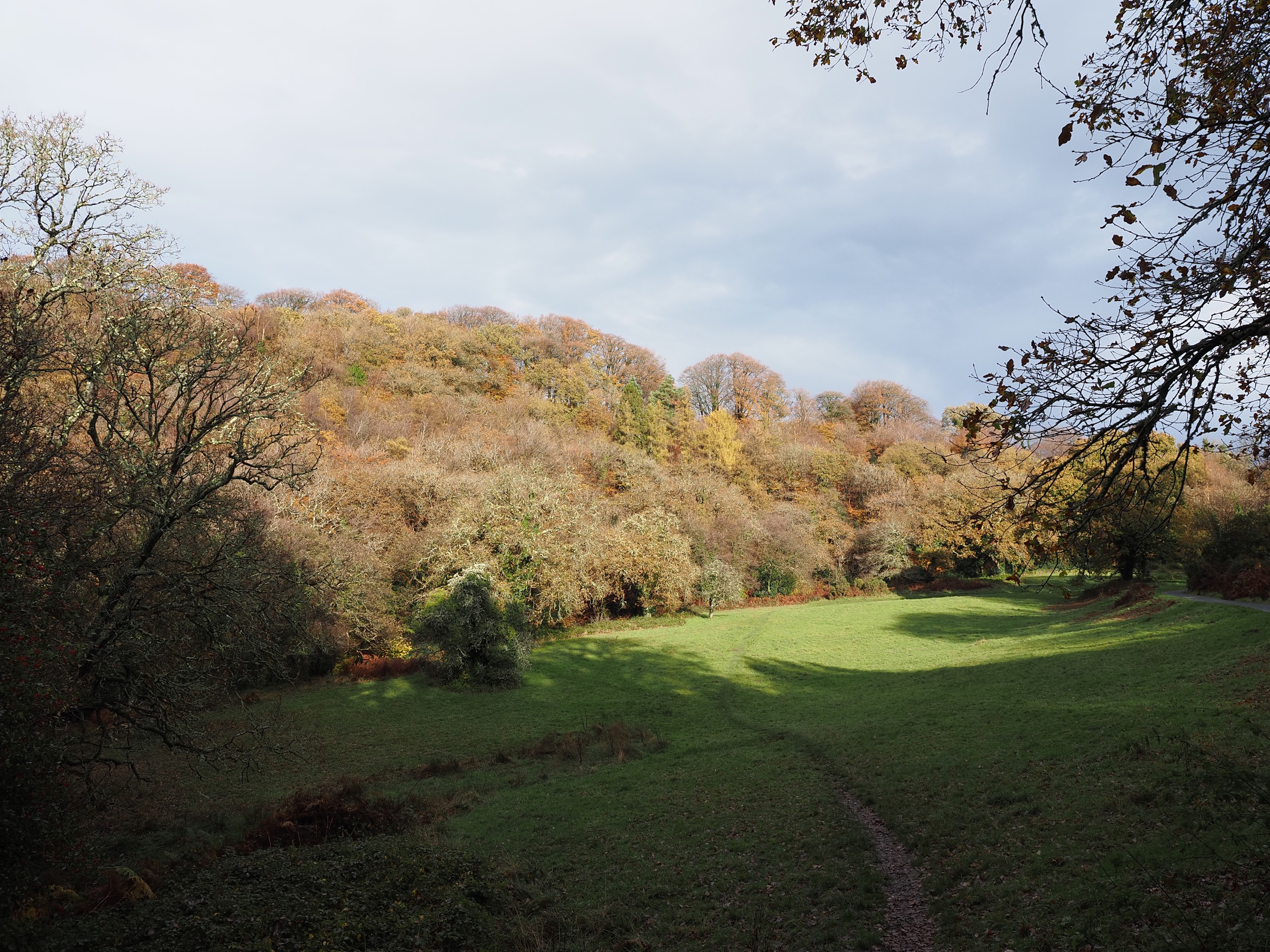
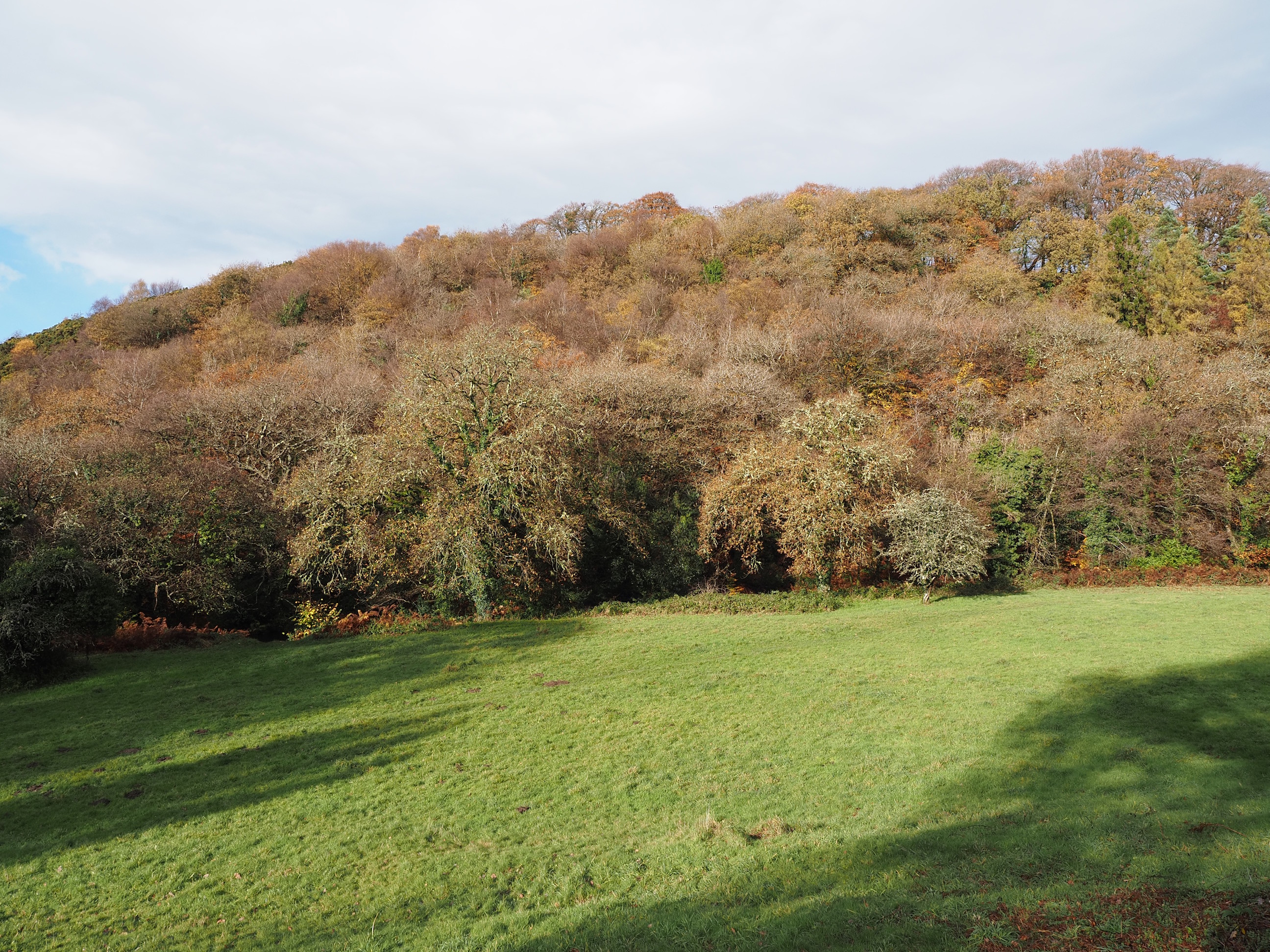
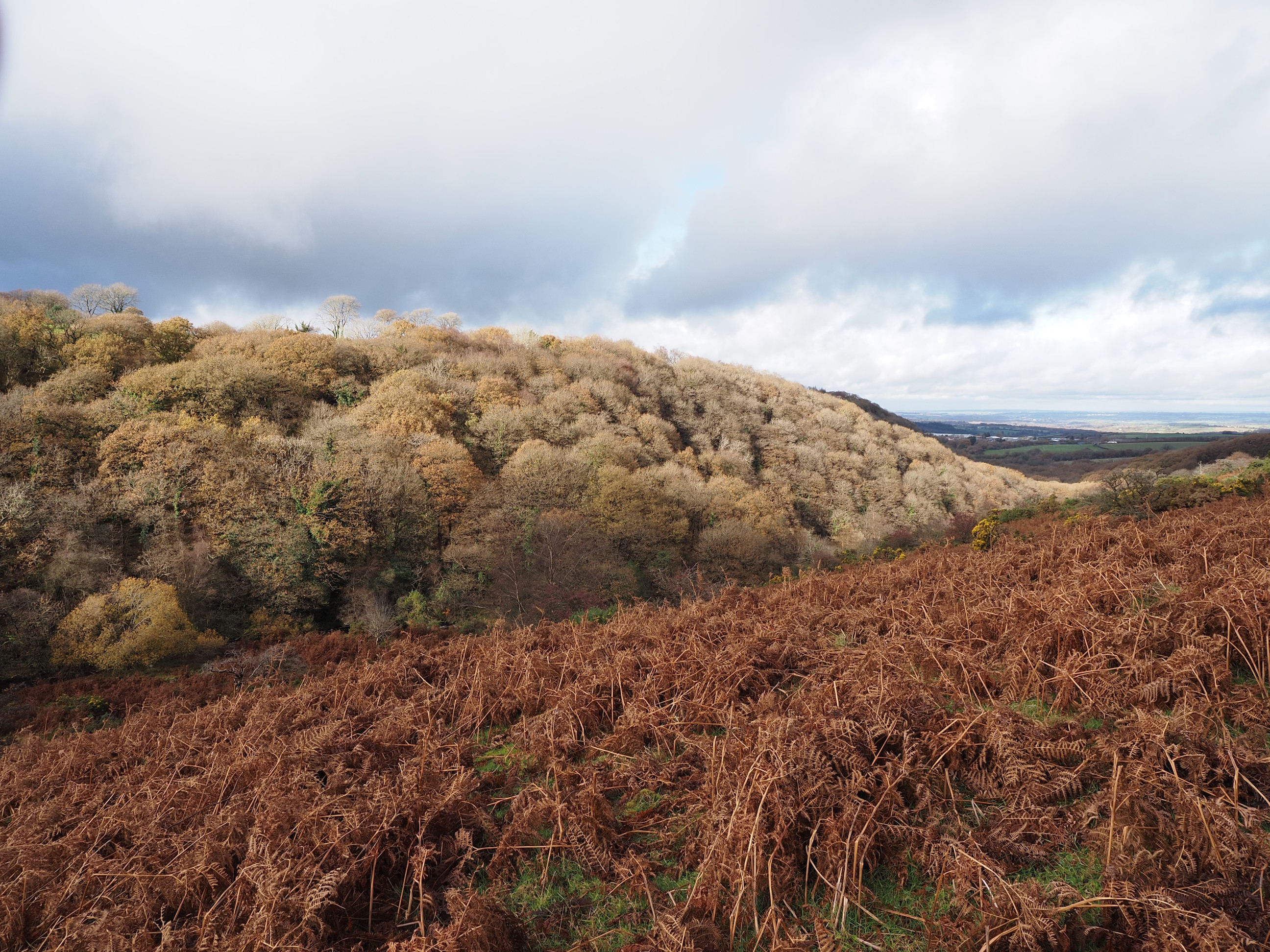
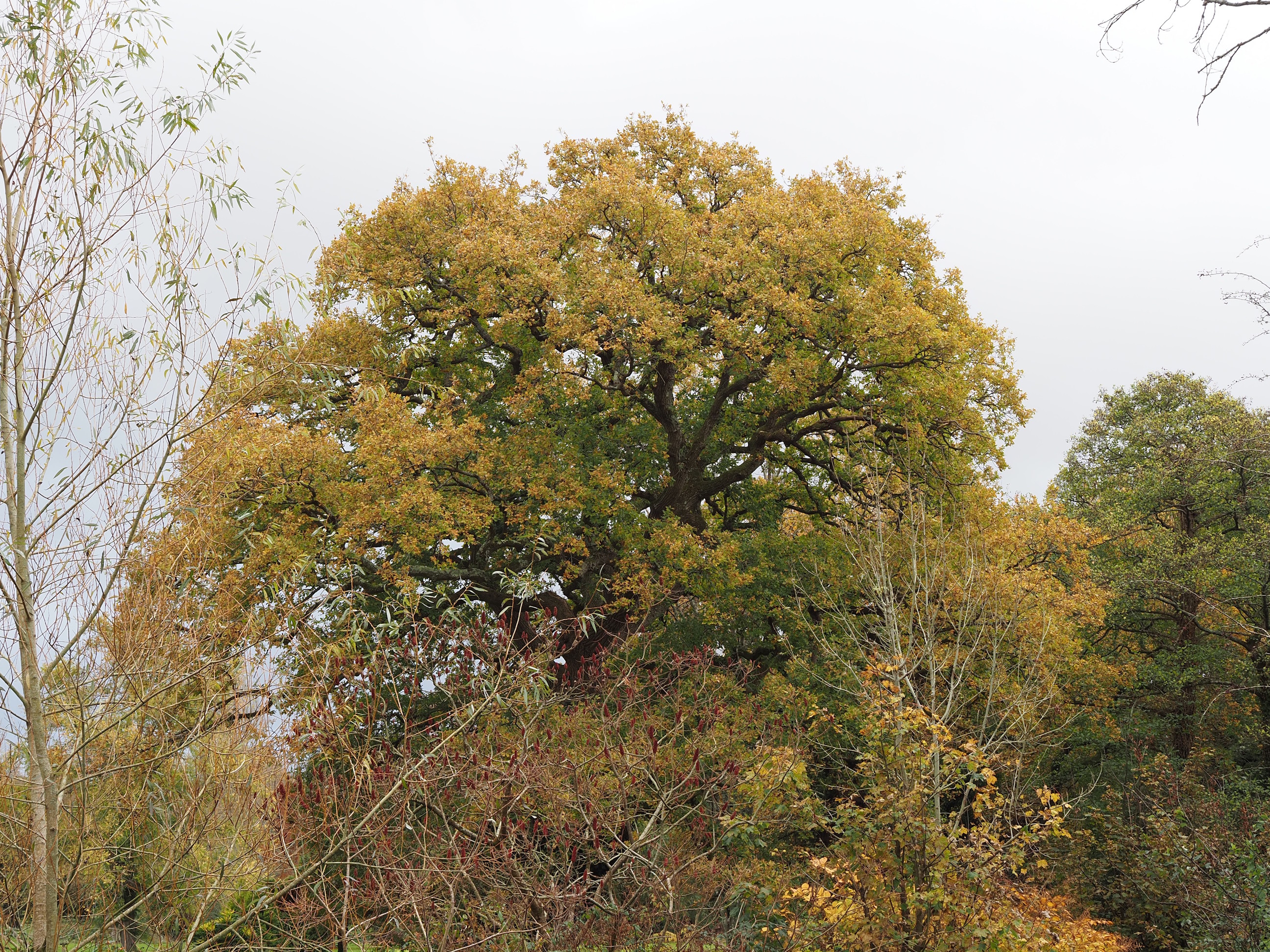
The weather was a bit of a pick-and-mix with the occasional bit of sunshine breaking through the clouds, and it timed it perfectly just as we were passing this beautiful meadow to light up some lovely Autumnal trees . . .
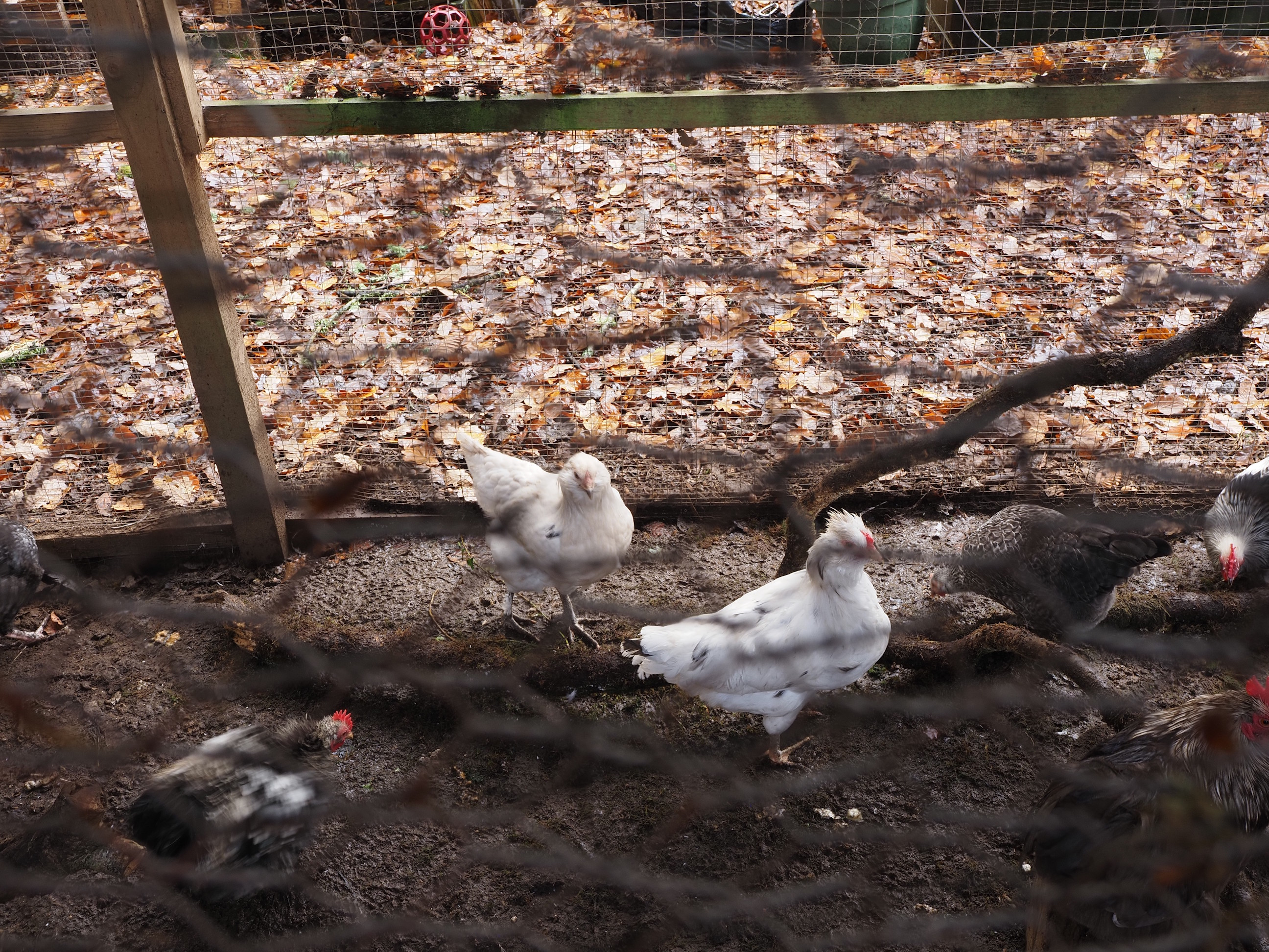
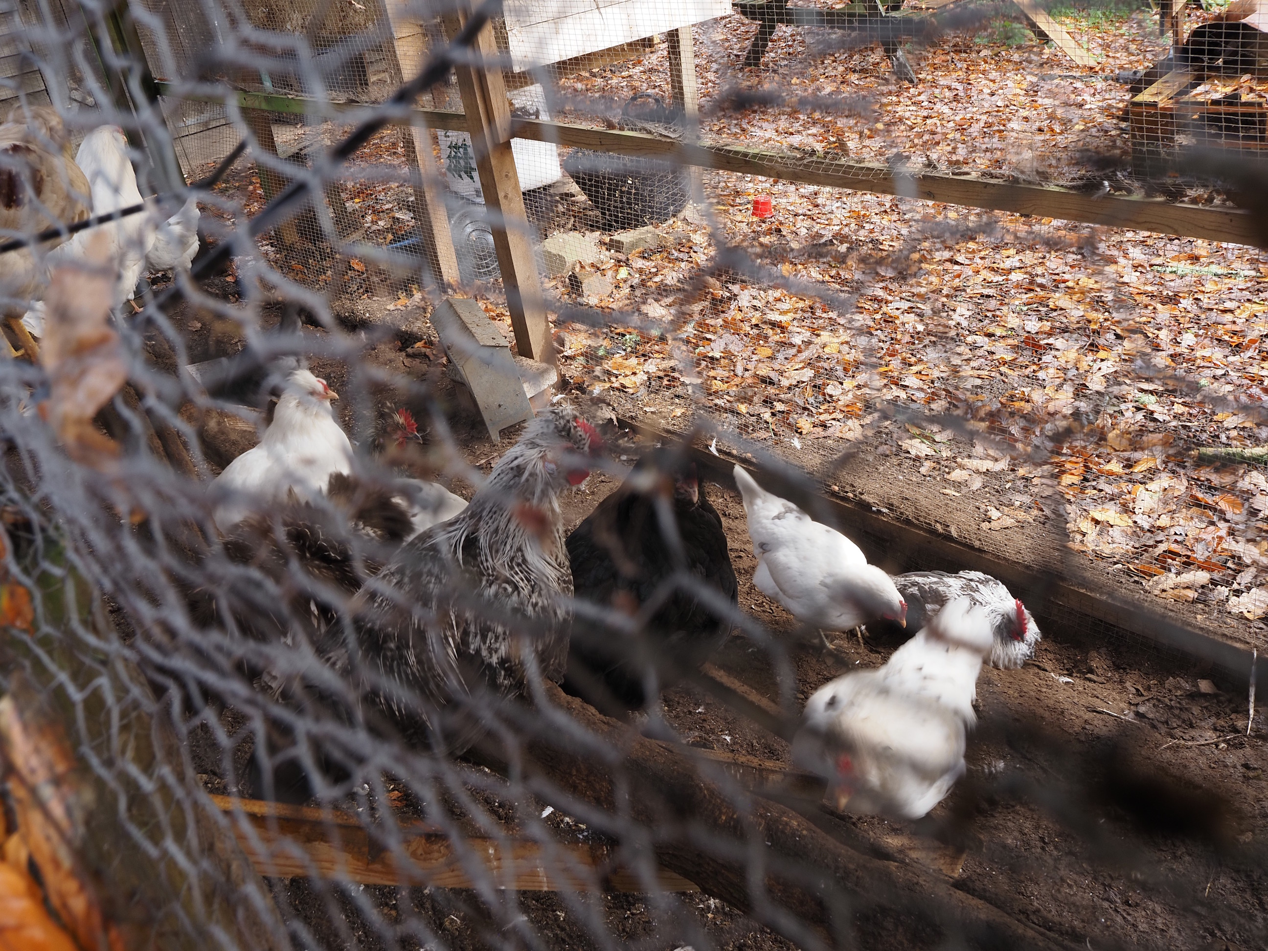
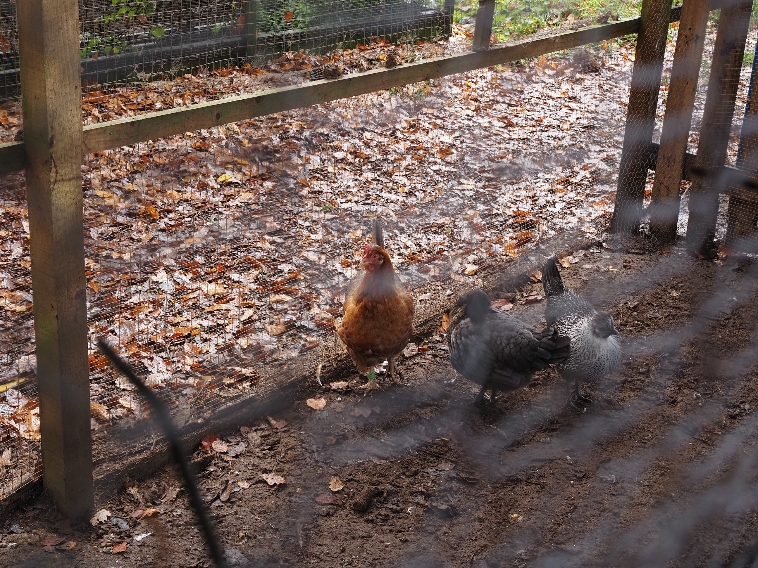
Then we came across a farm that had loads of random breeds of chickens (sorry about the chicken wire playing havoc with the focus). . .
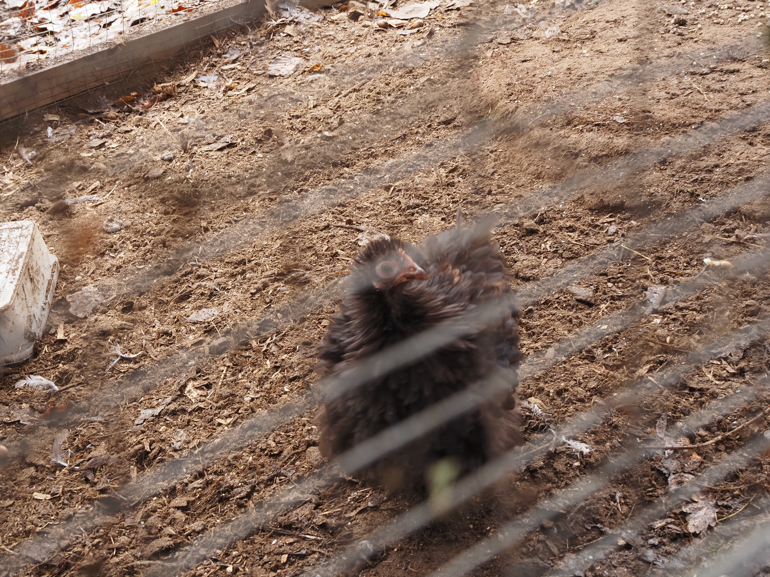
I really liked this little one, it was soooo fluffy and cute . . .
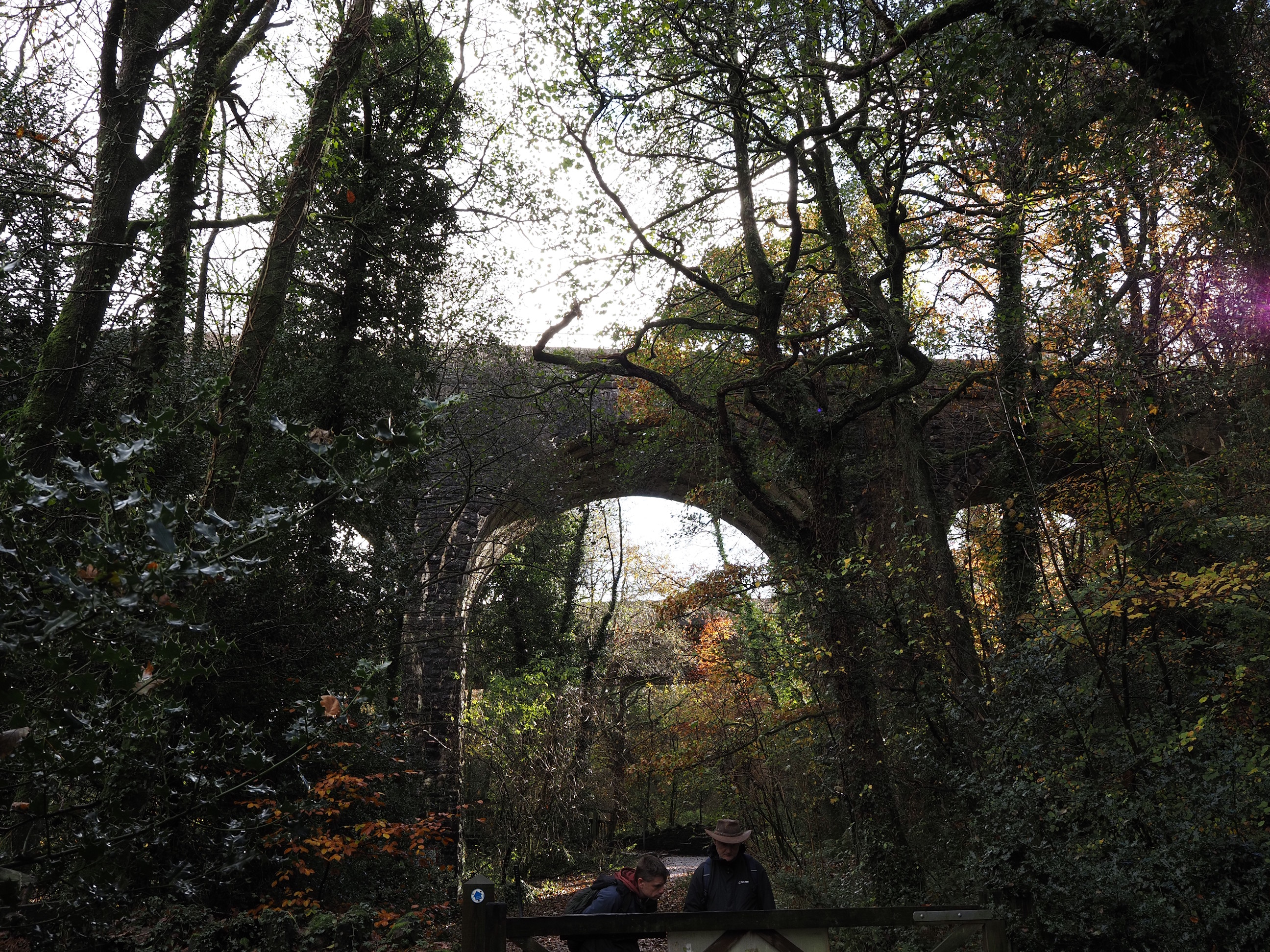
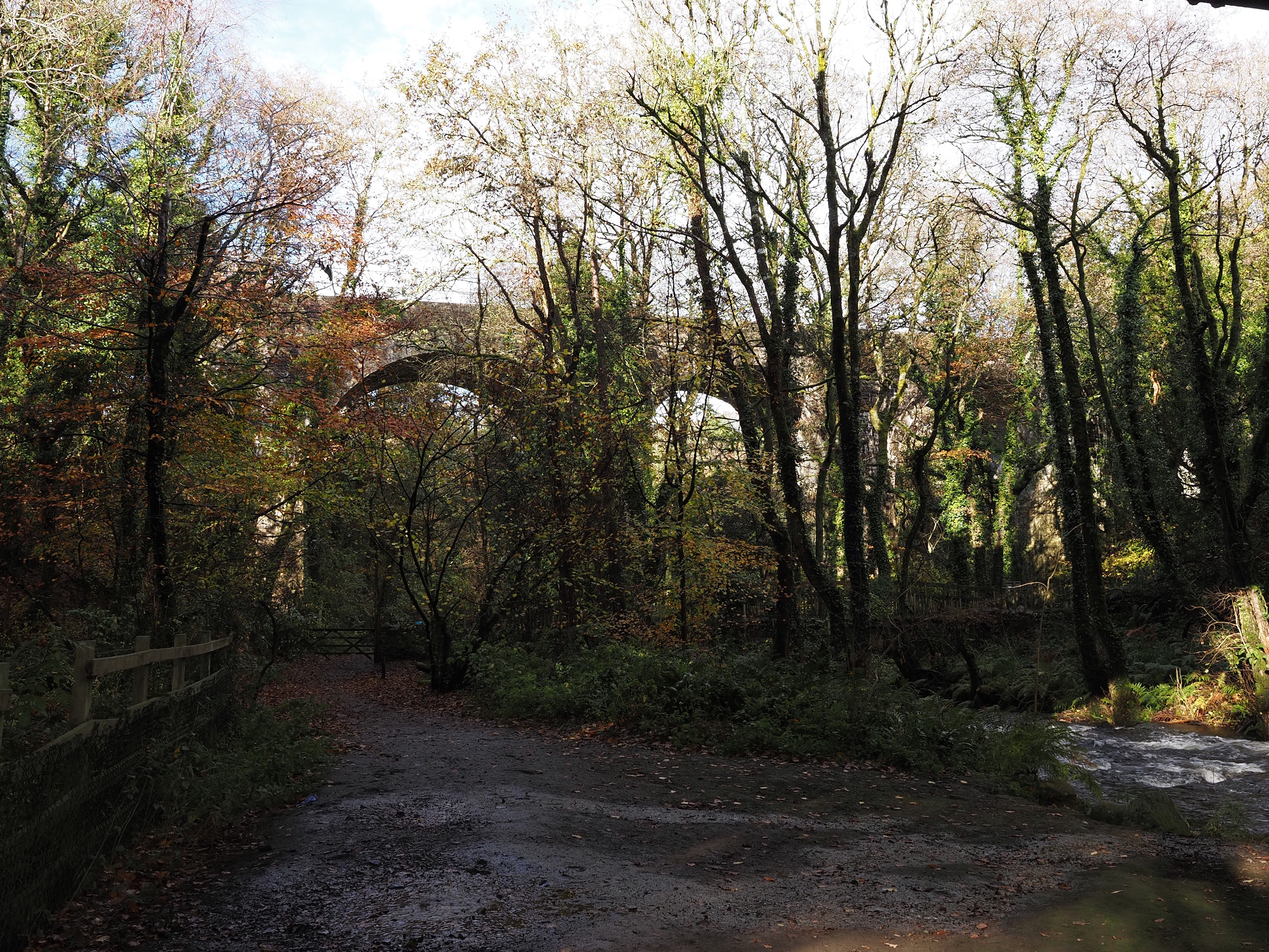
Ball Hill Viaduct over which the train comes into town . . .
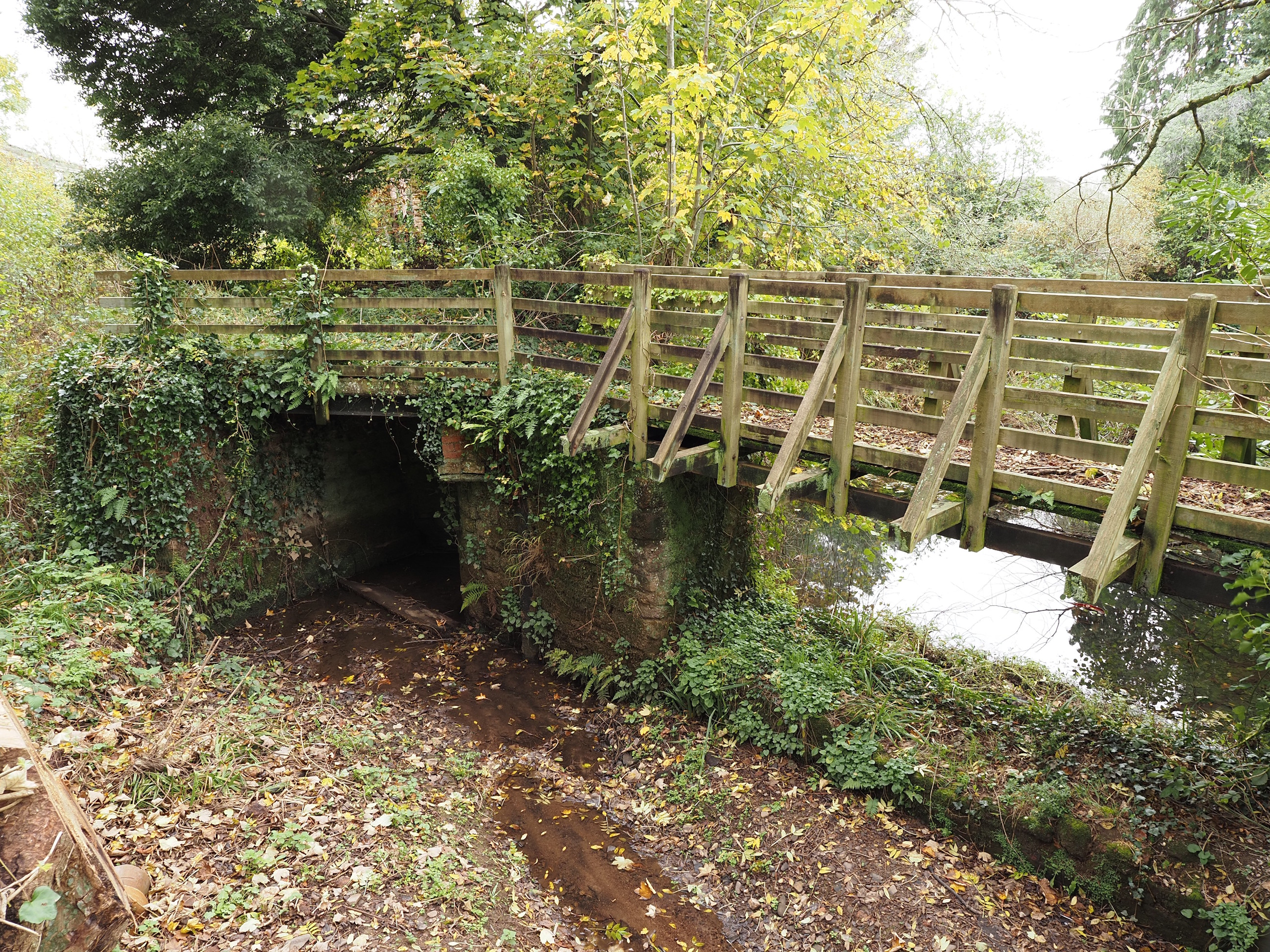
The old ford, which, thankfully, we won’t be wading across today . . .
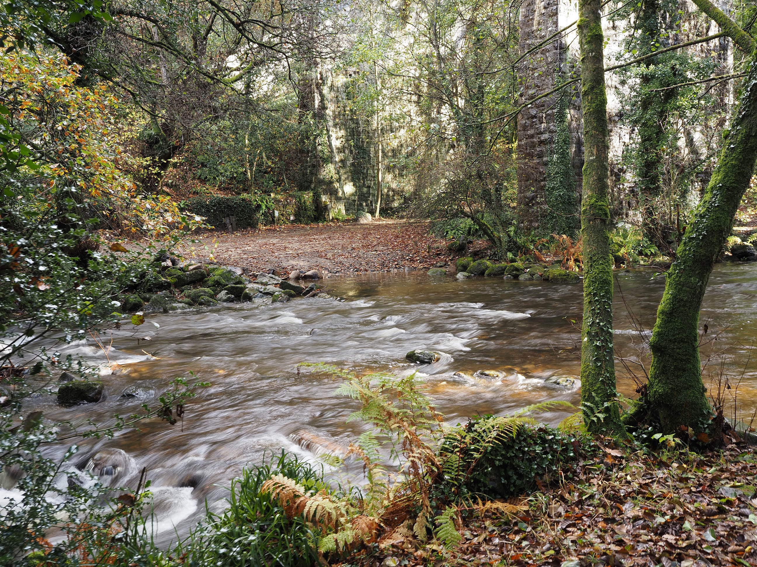
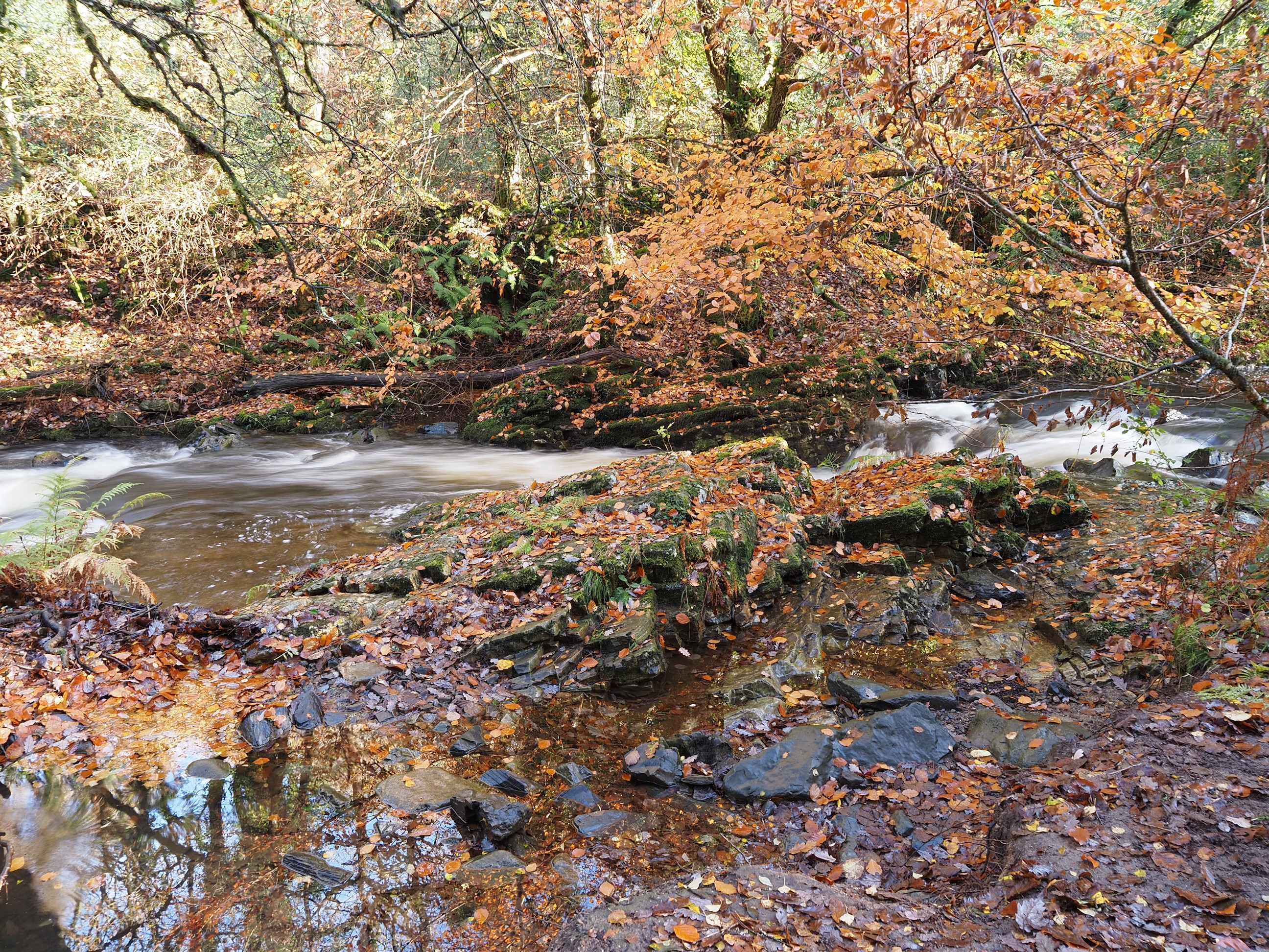
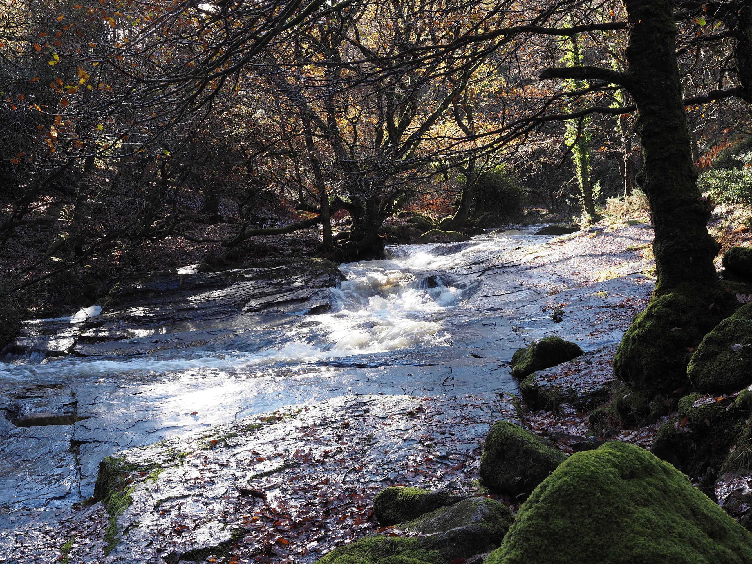
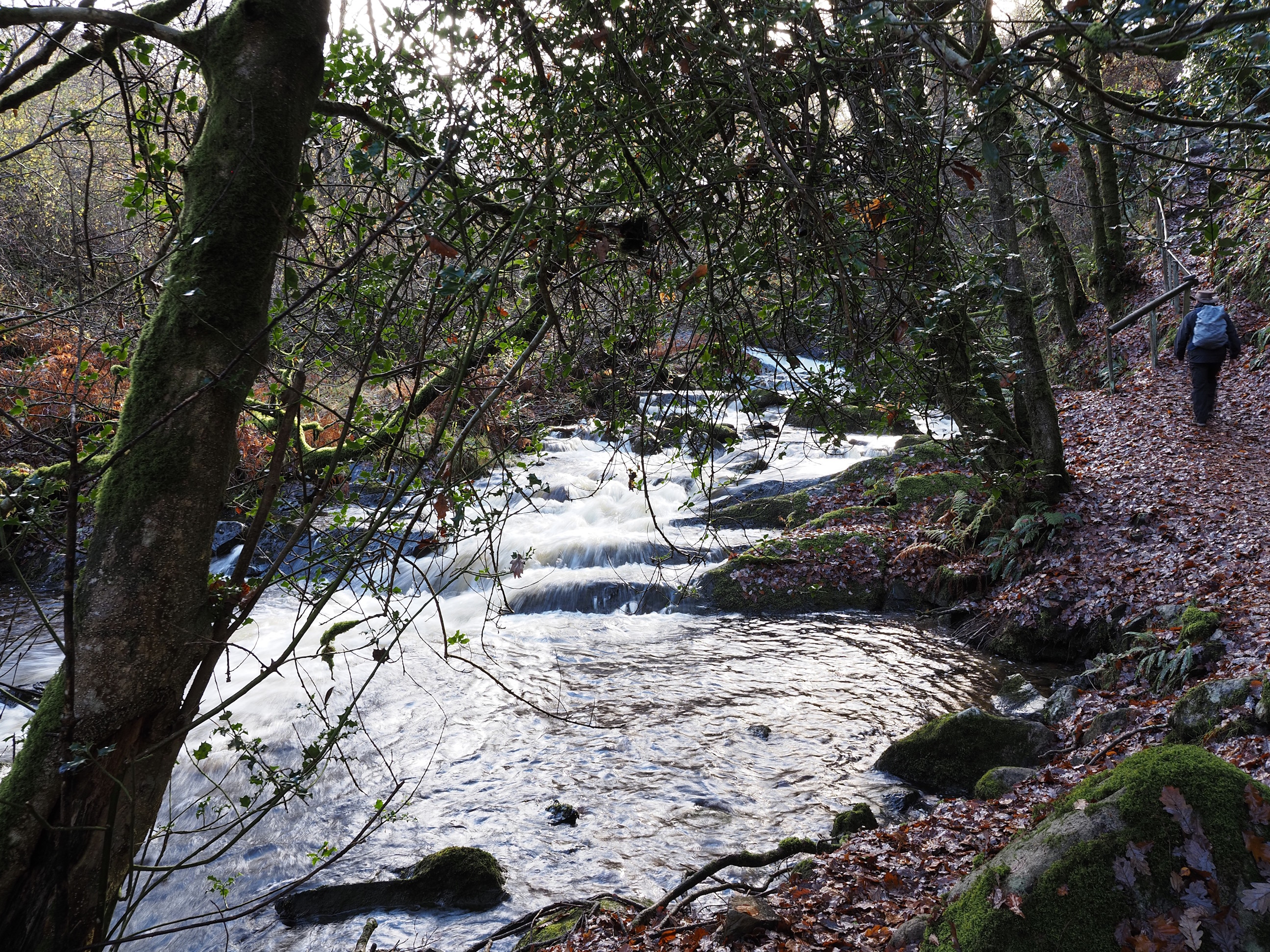
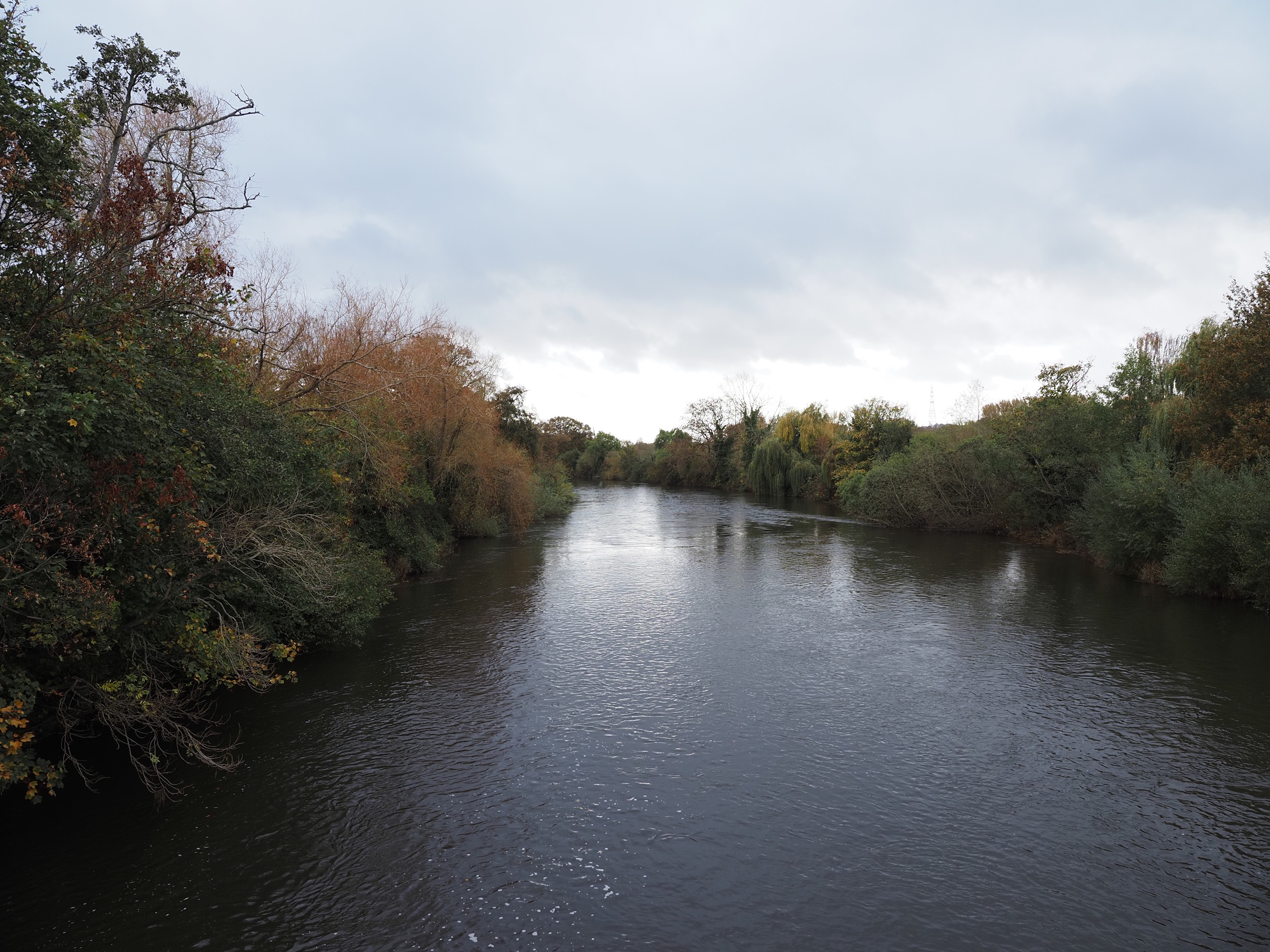
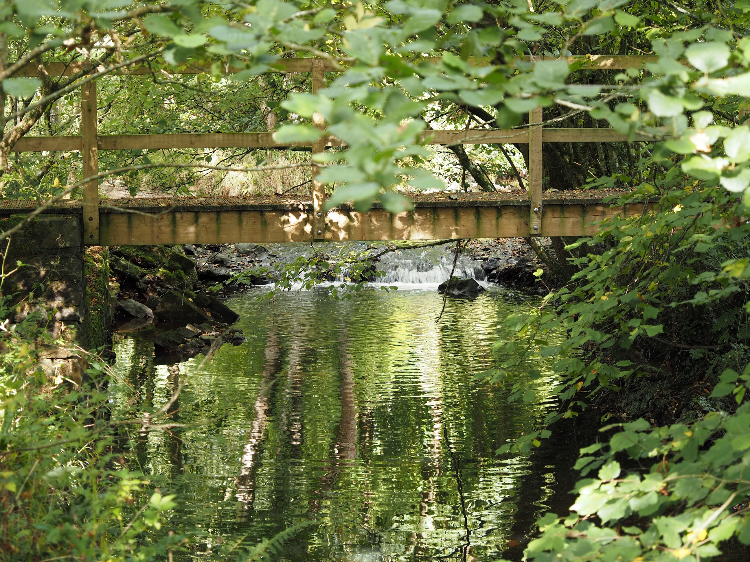
The river begins to get really pretty from here . . .
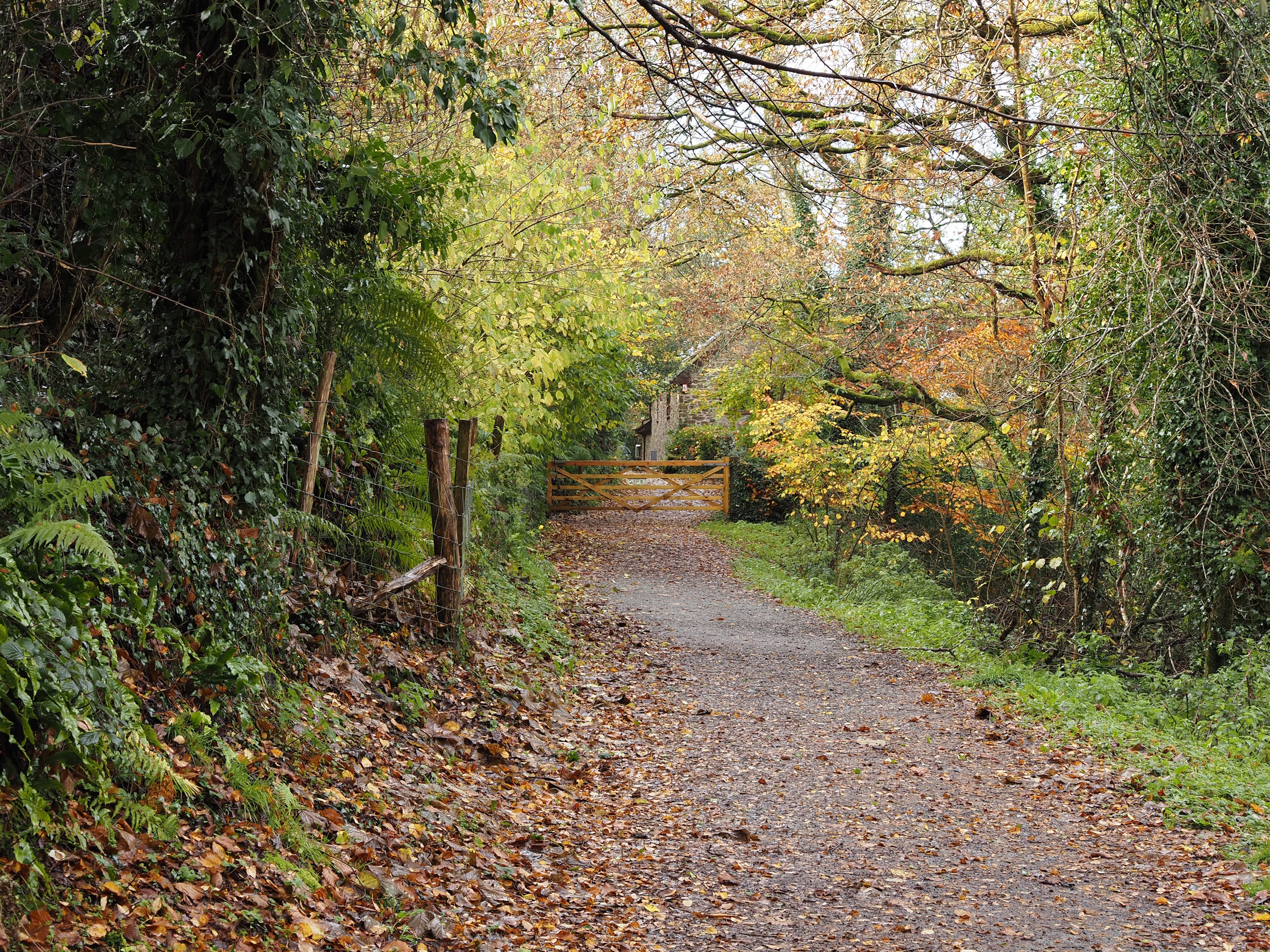
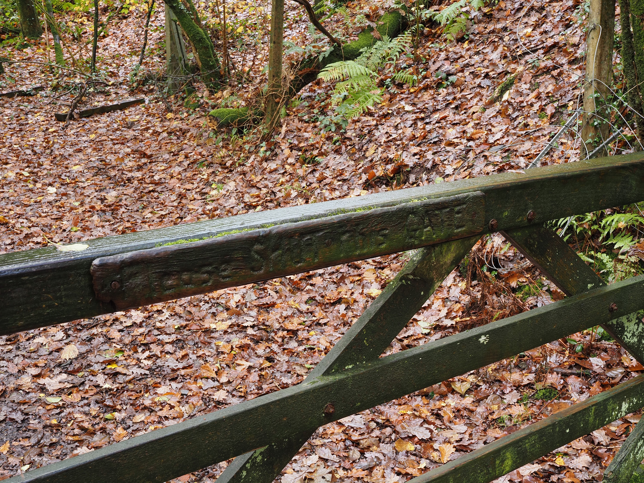
But don’t forget to shut the gates on the way . . .
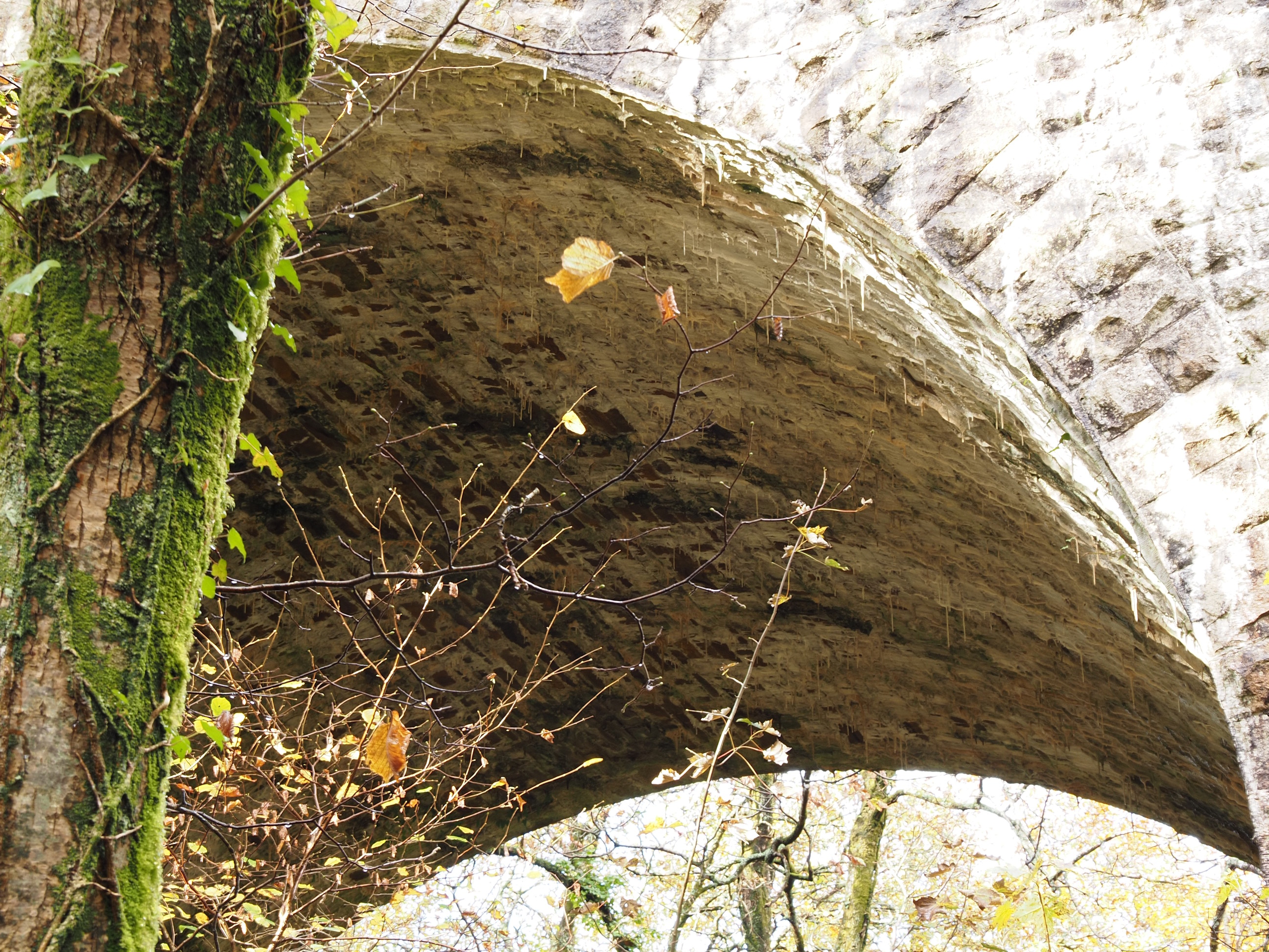
There’s some nice stalactites growing in the arches . . .
And a look back to see the sunny side . . .
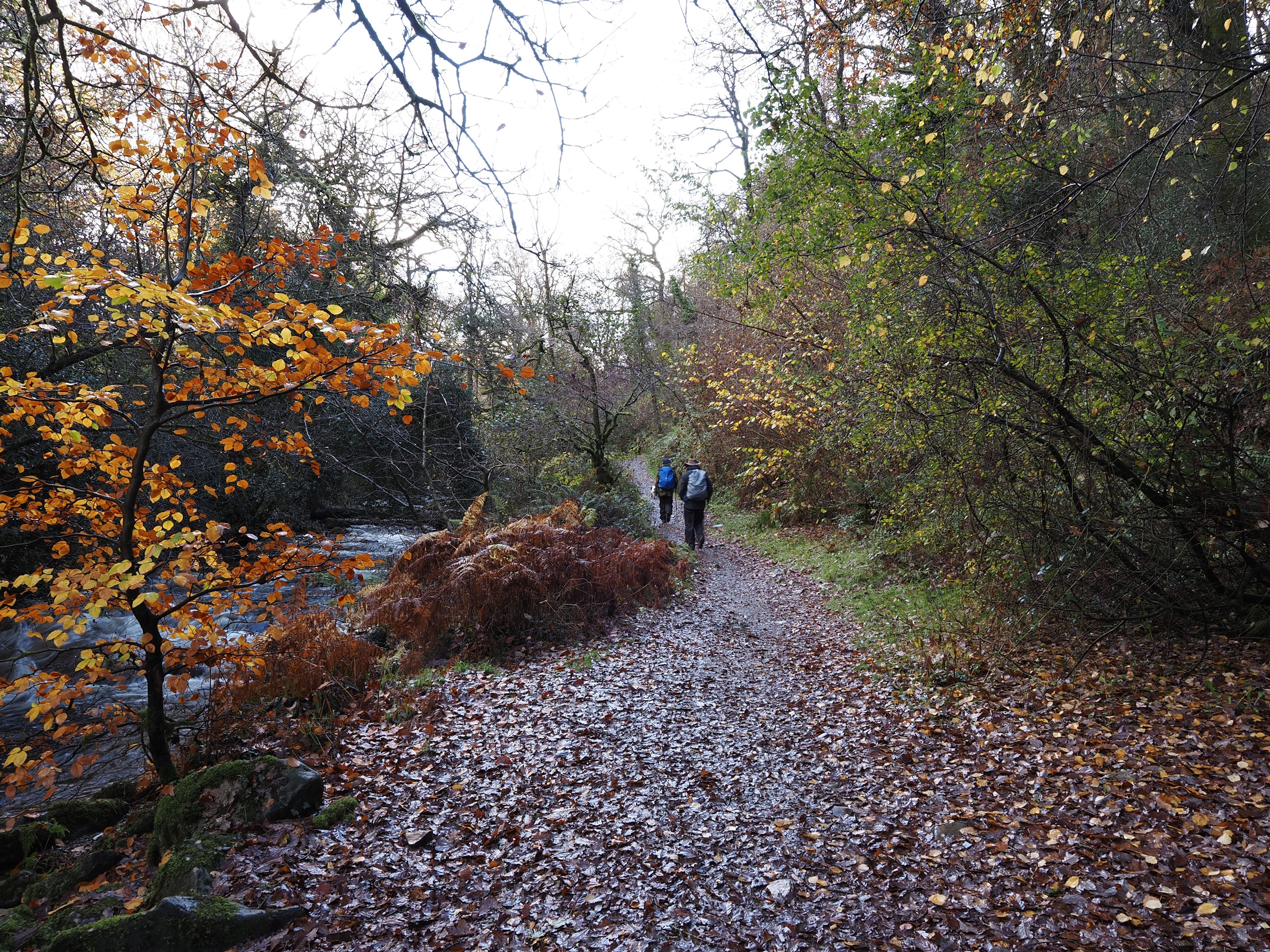
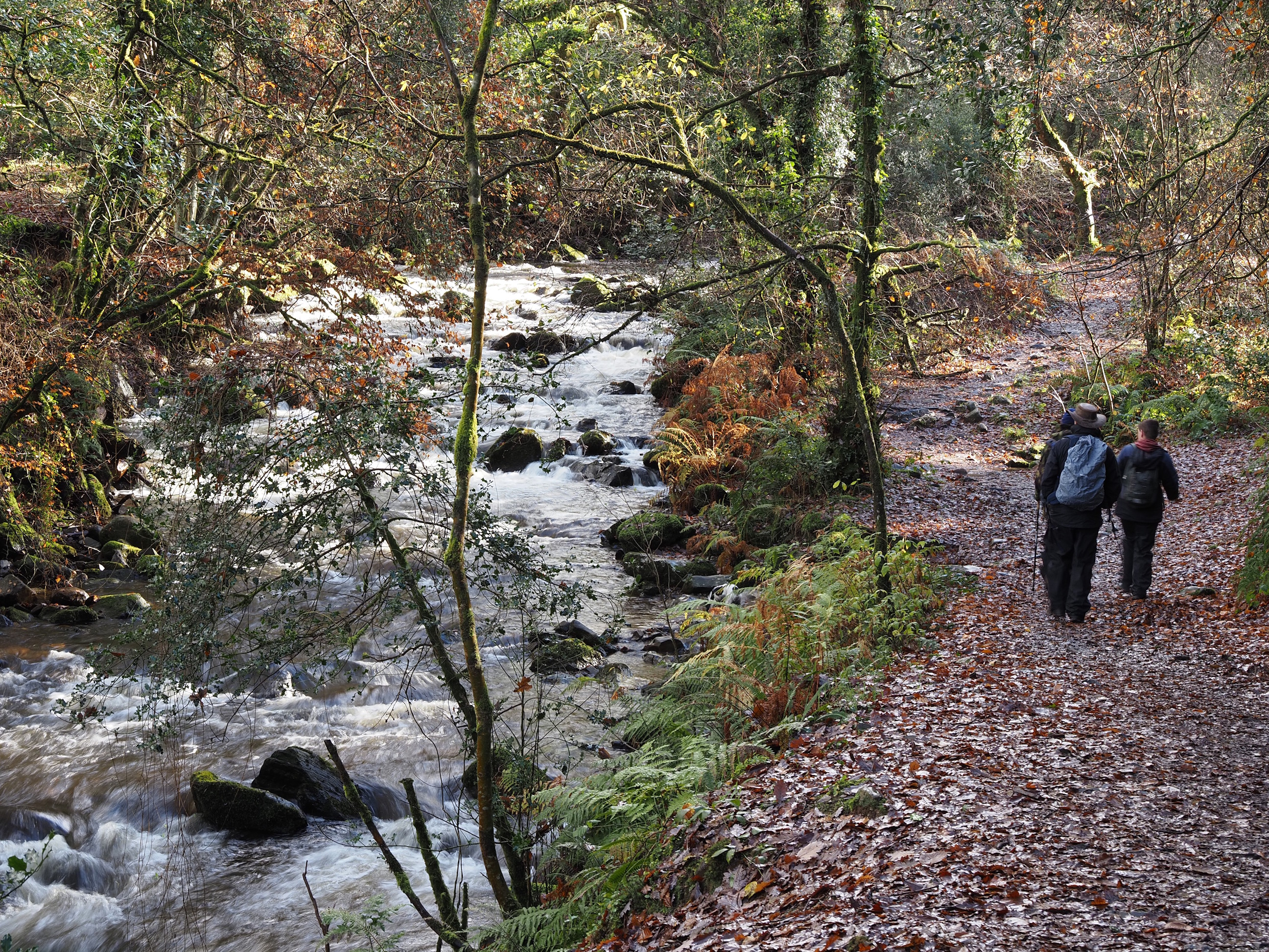
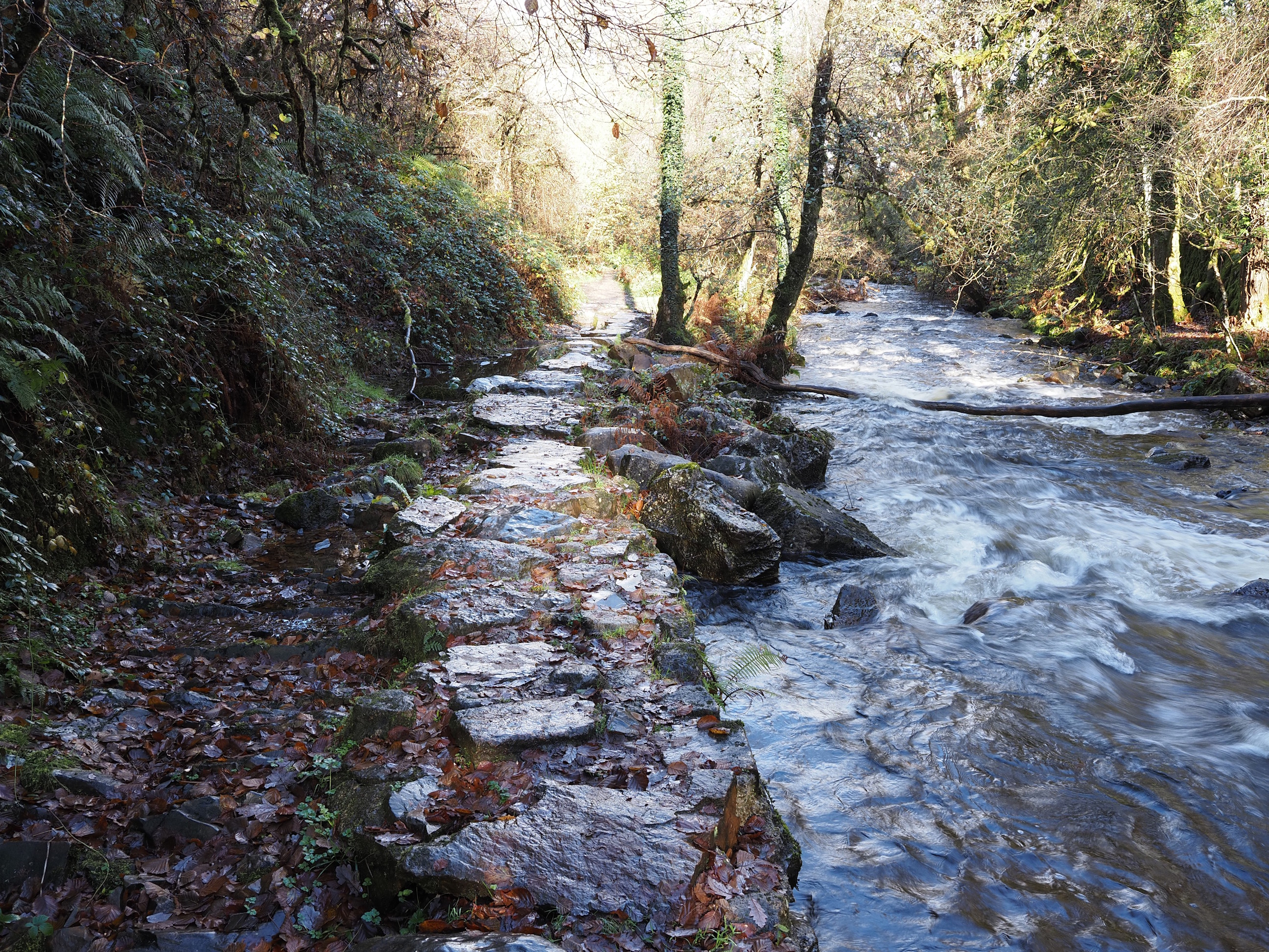
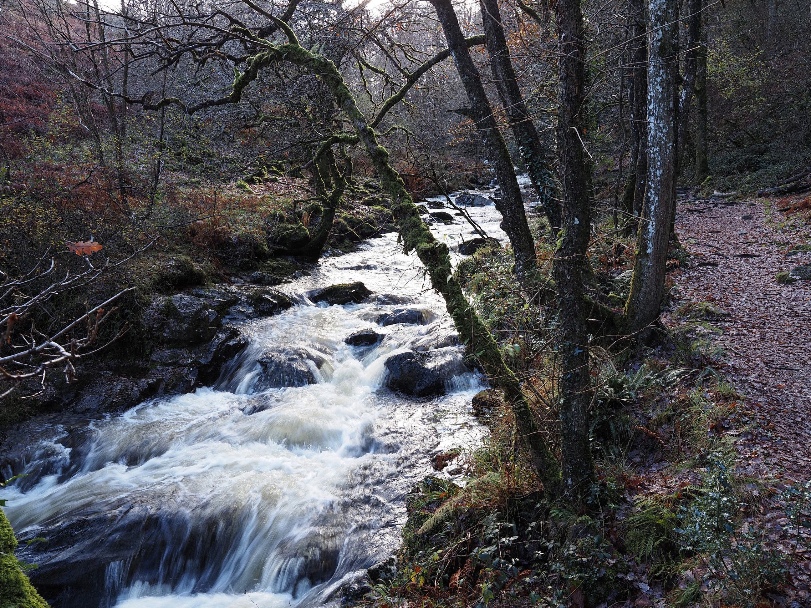
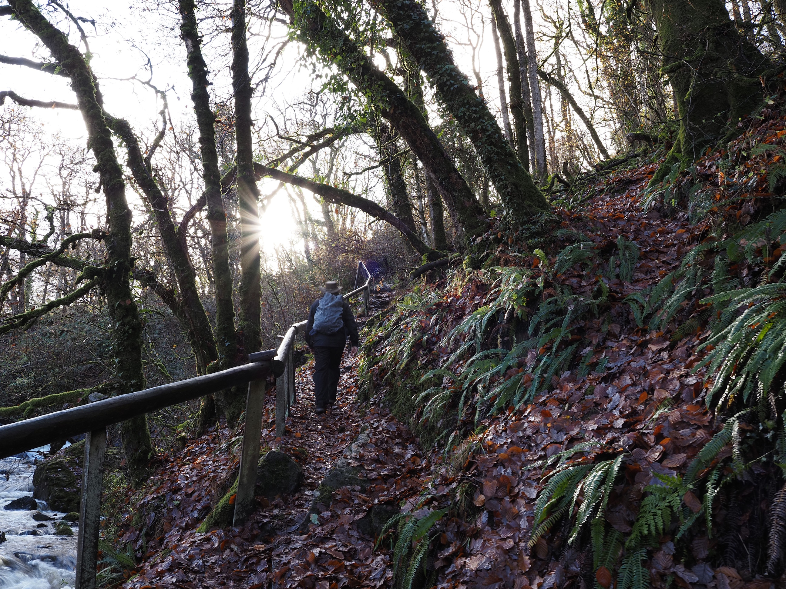
And then we’re off up the river bank path . . .
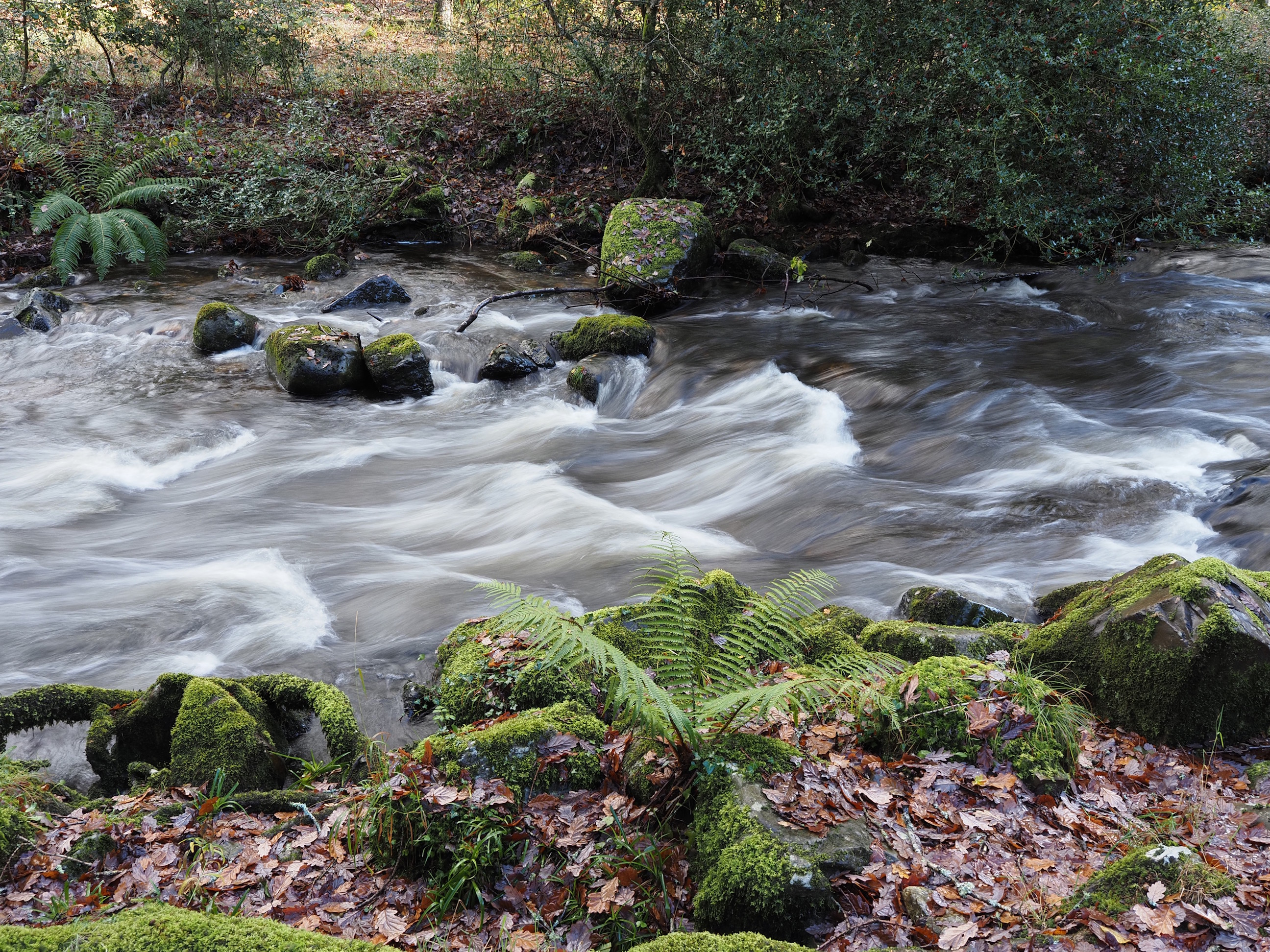
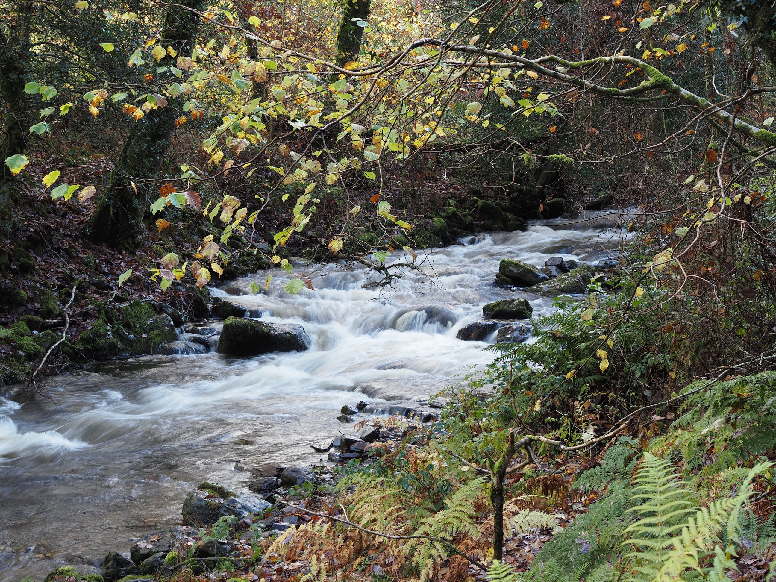
It really is a lovely place to walk . . .
The sun kept on teasing us . . .
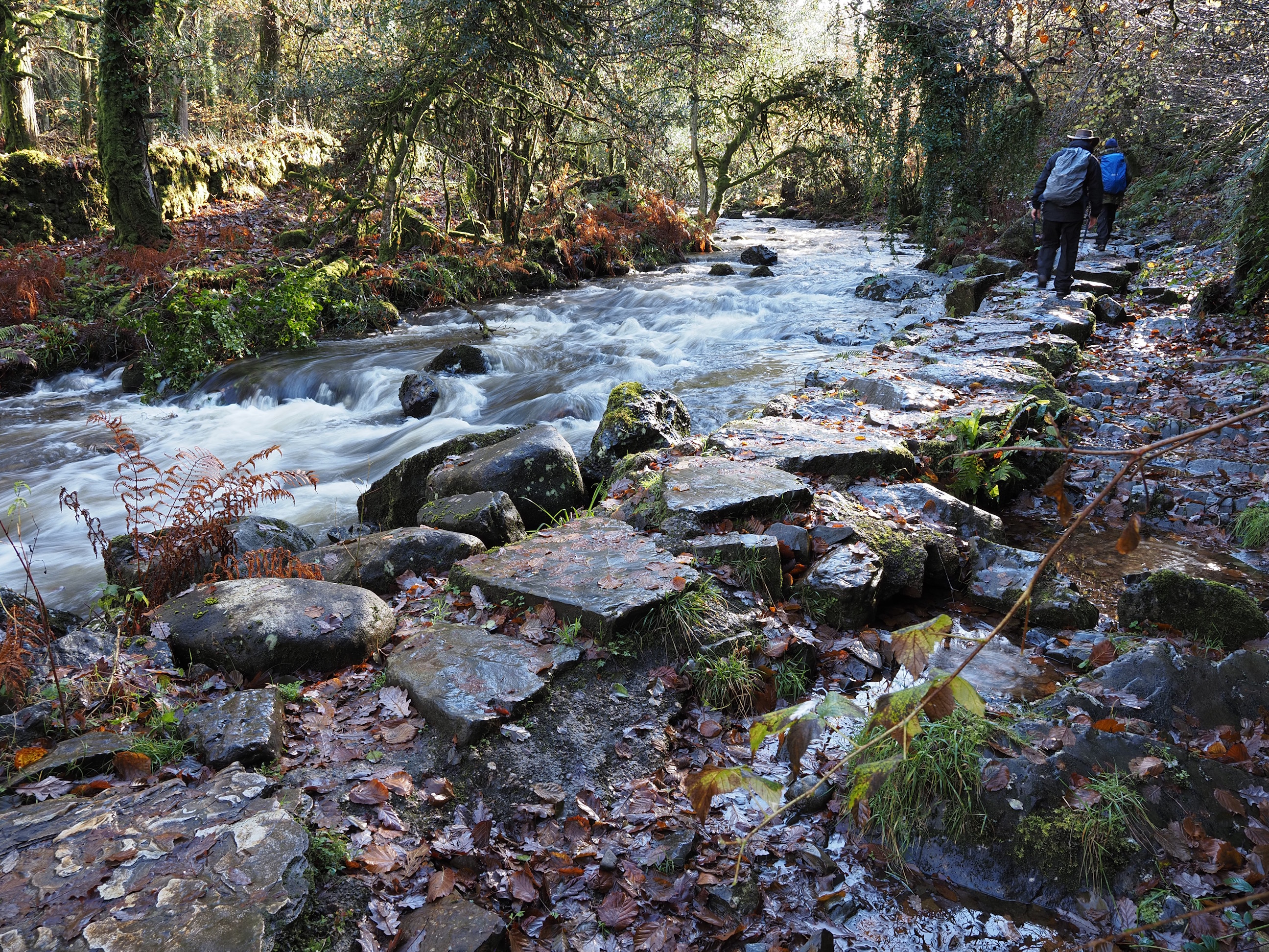
This bit looked quite sketchy to walk on, especially with all the water and leaves on the stones, but there was still plenty of grip . . .
Dazzling . . .
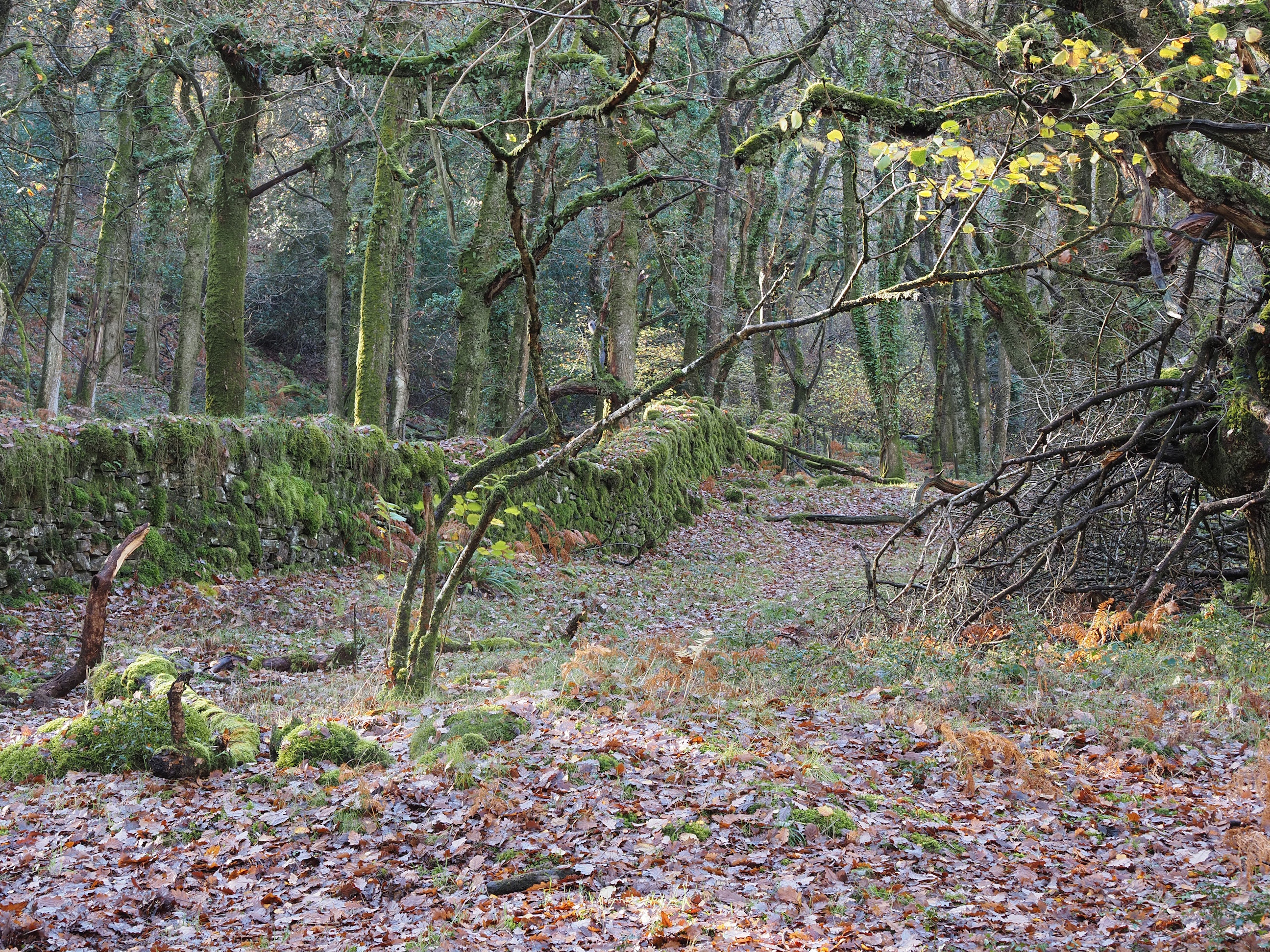
I love these old mossy stone walls . . .
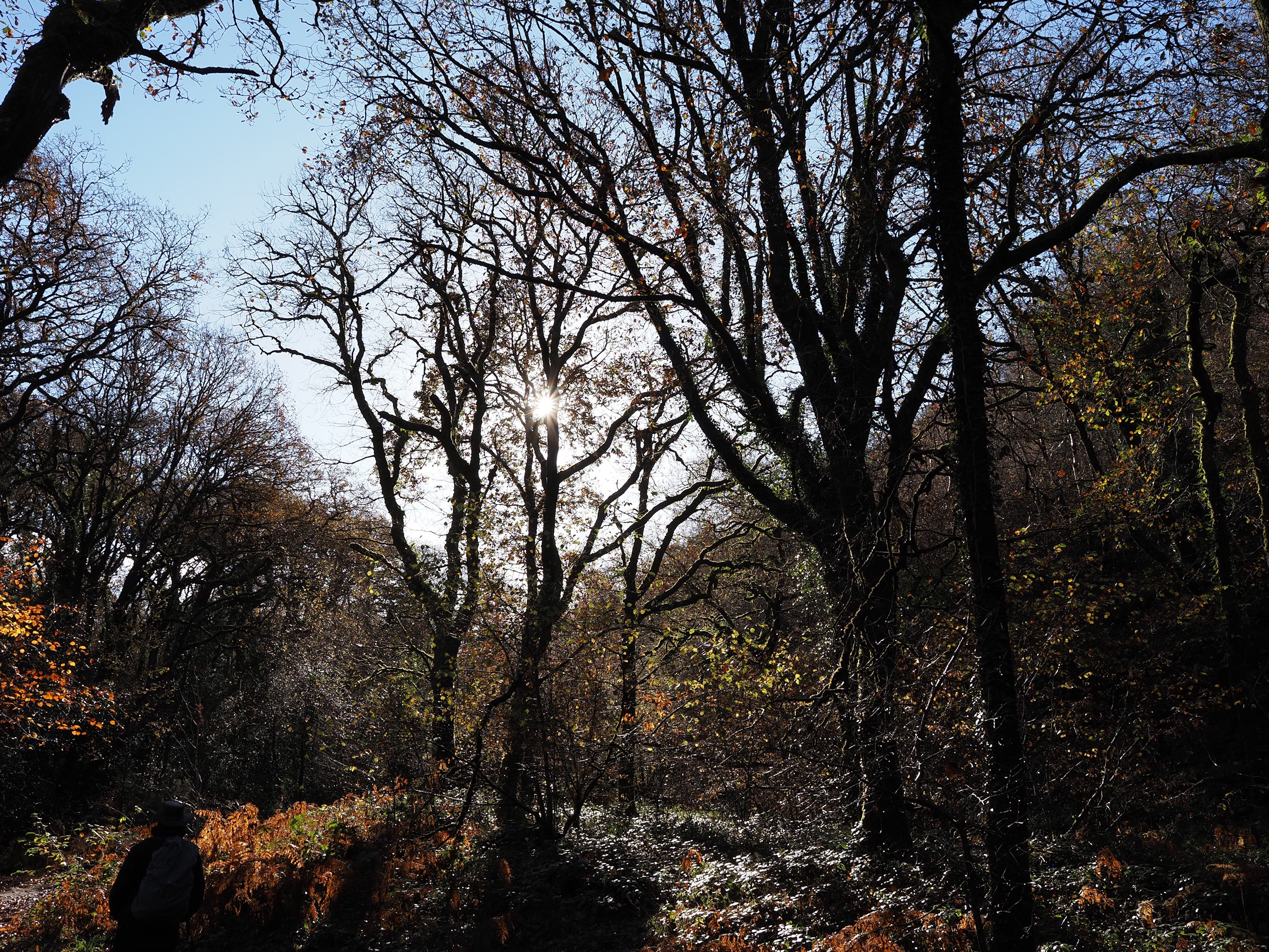
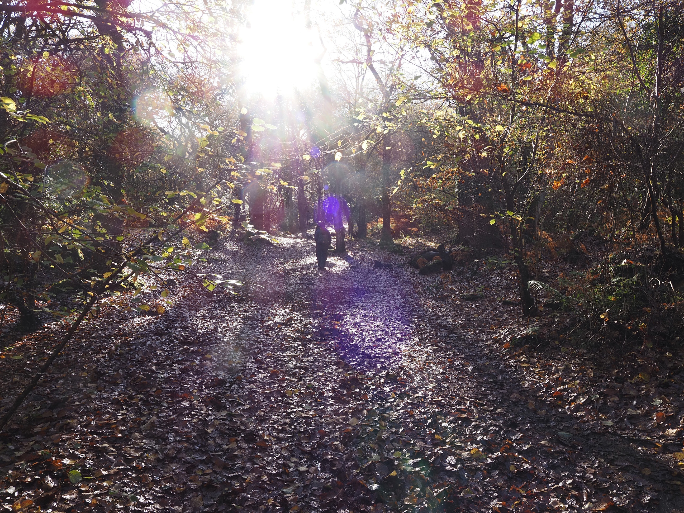
And now we get a really steep bit: up, up and away from the river . . .
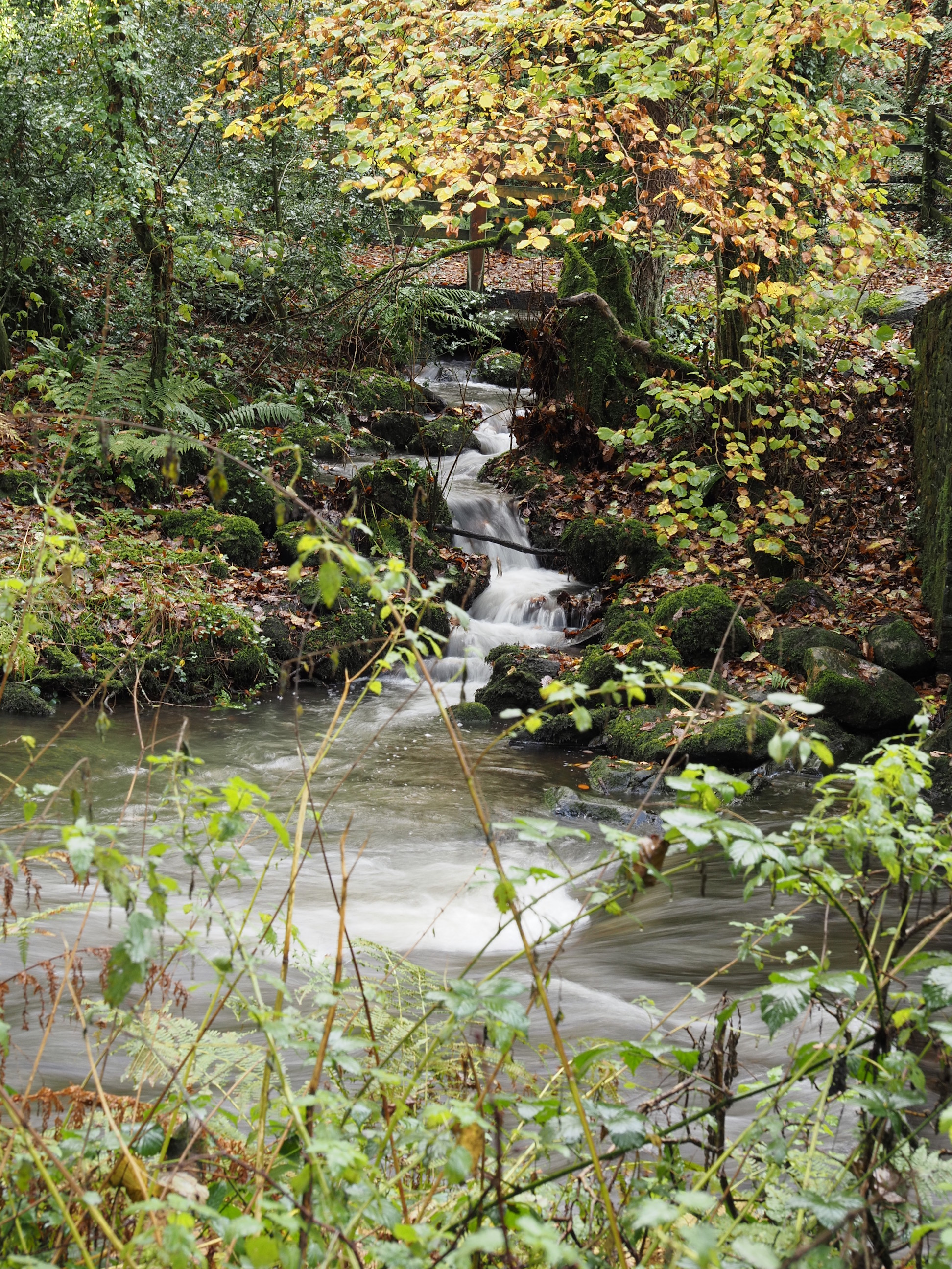
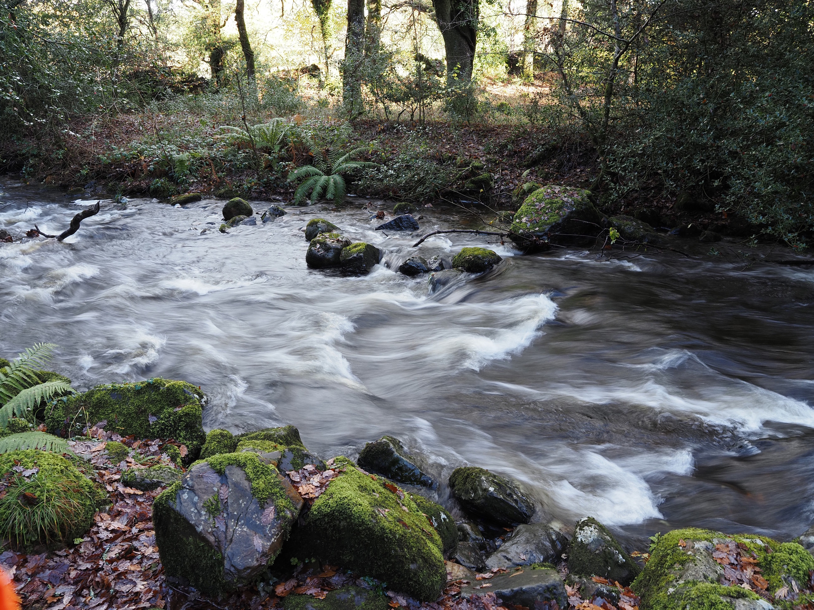
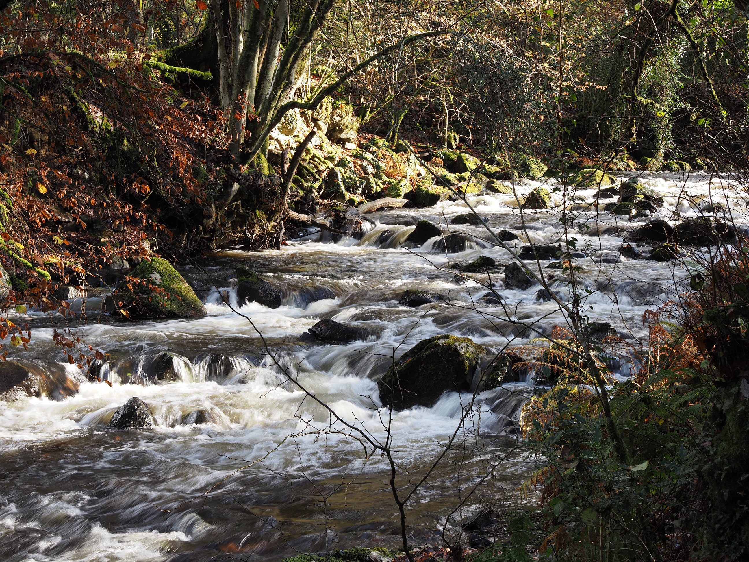
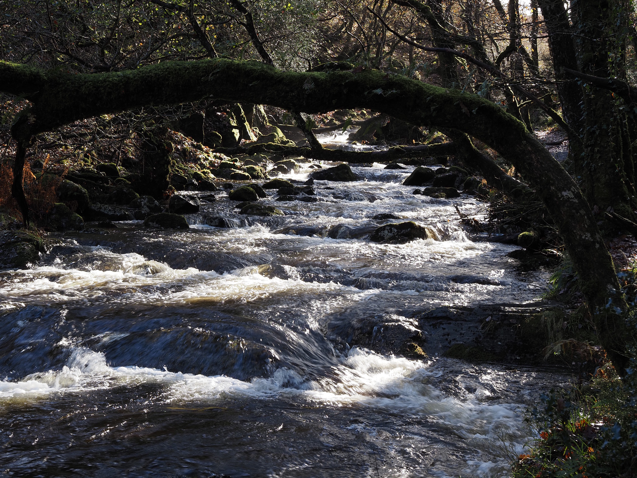
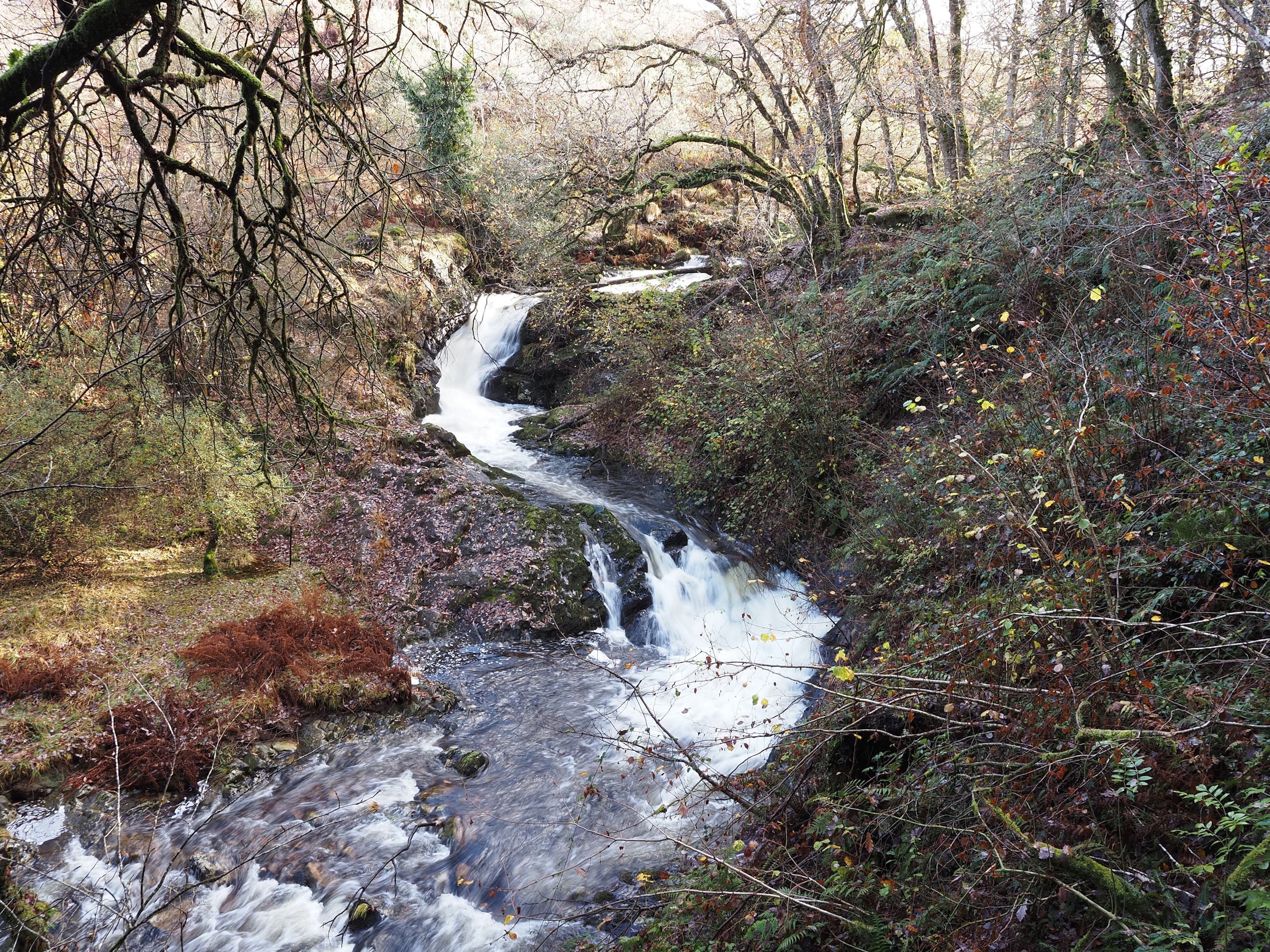
For a great view of the little waterfall . . .
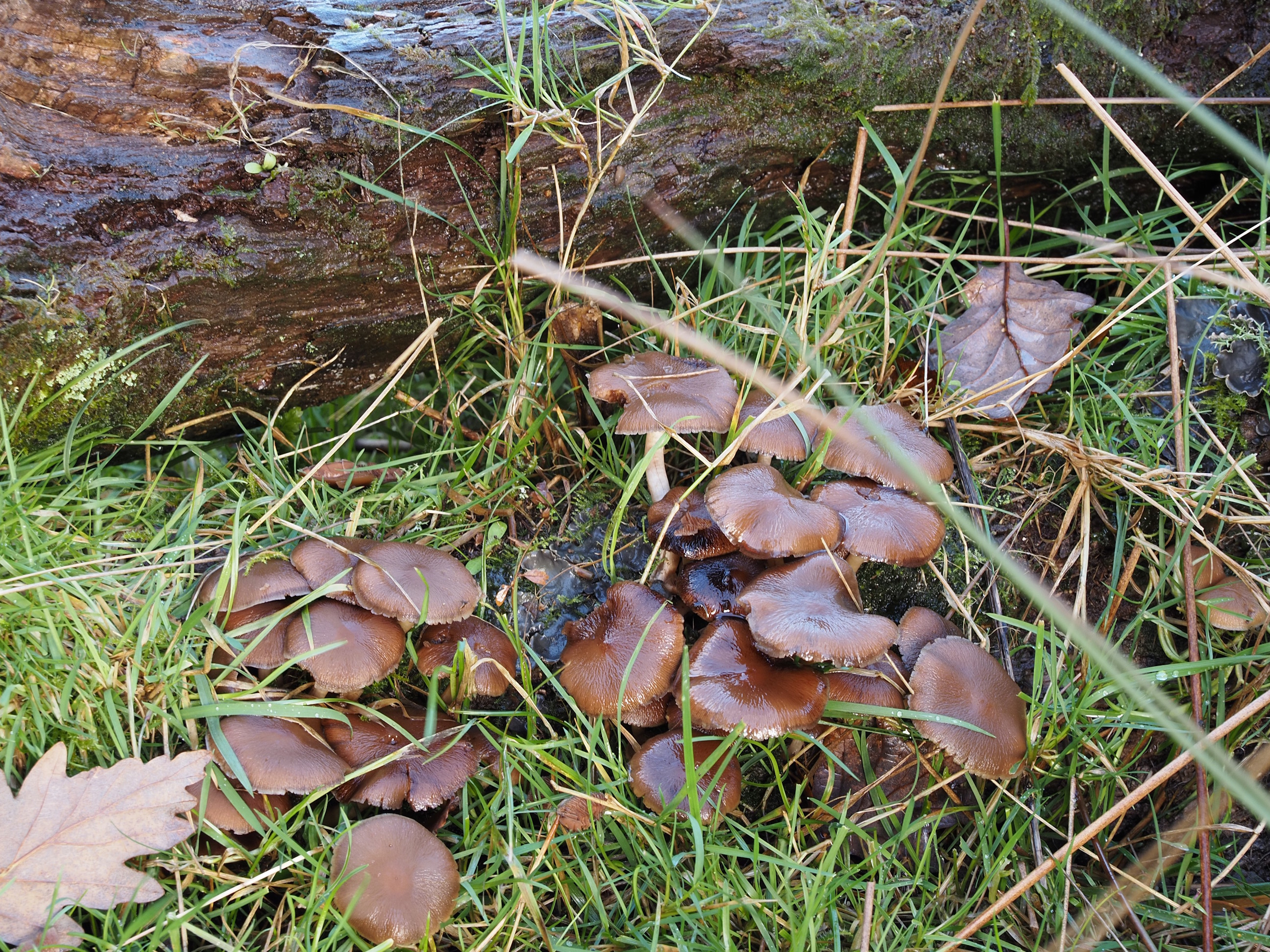
And some more mushrooms . . .
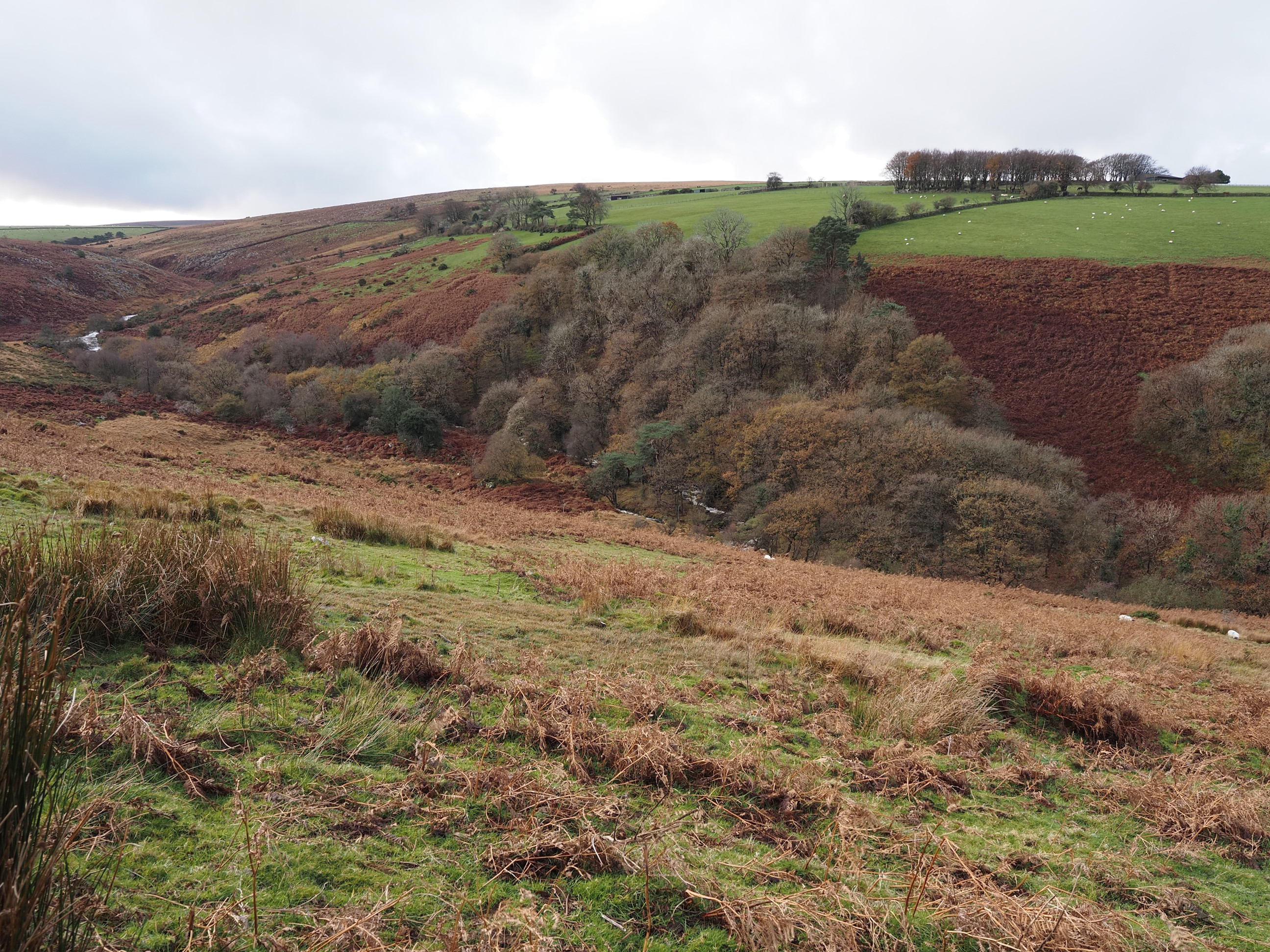
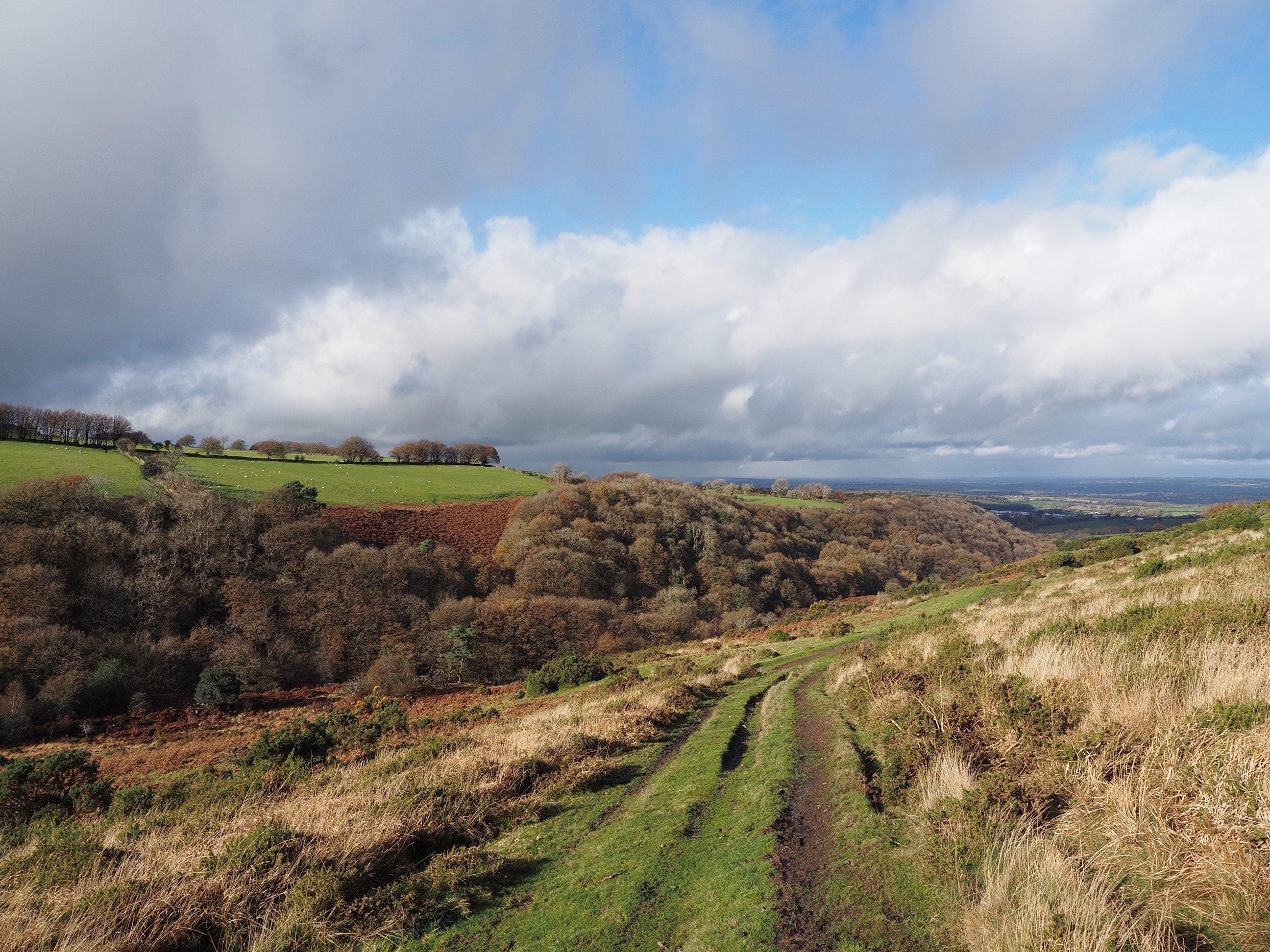
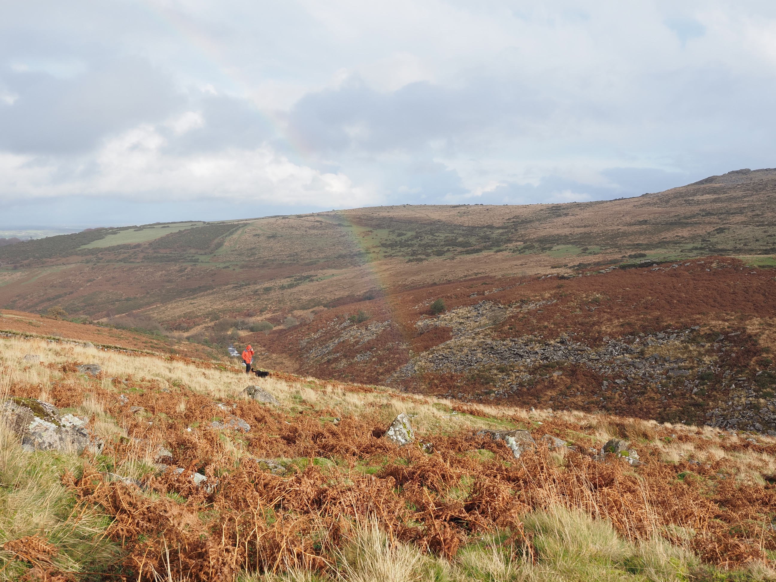
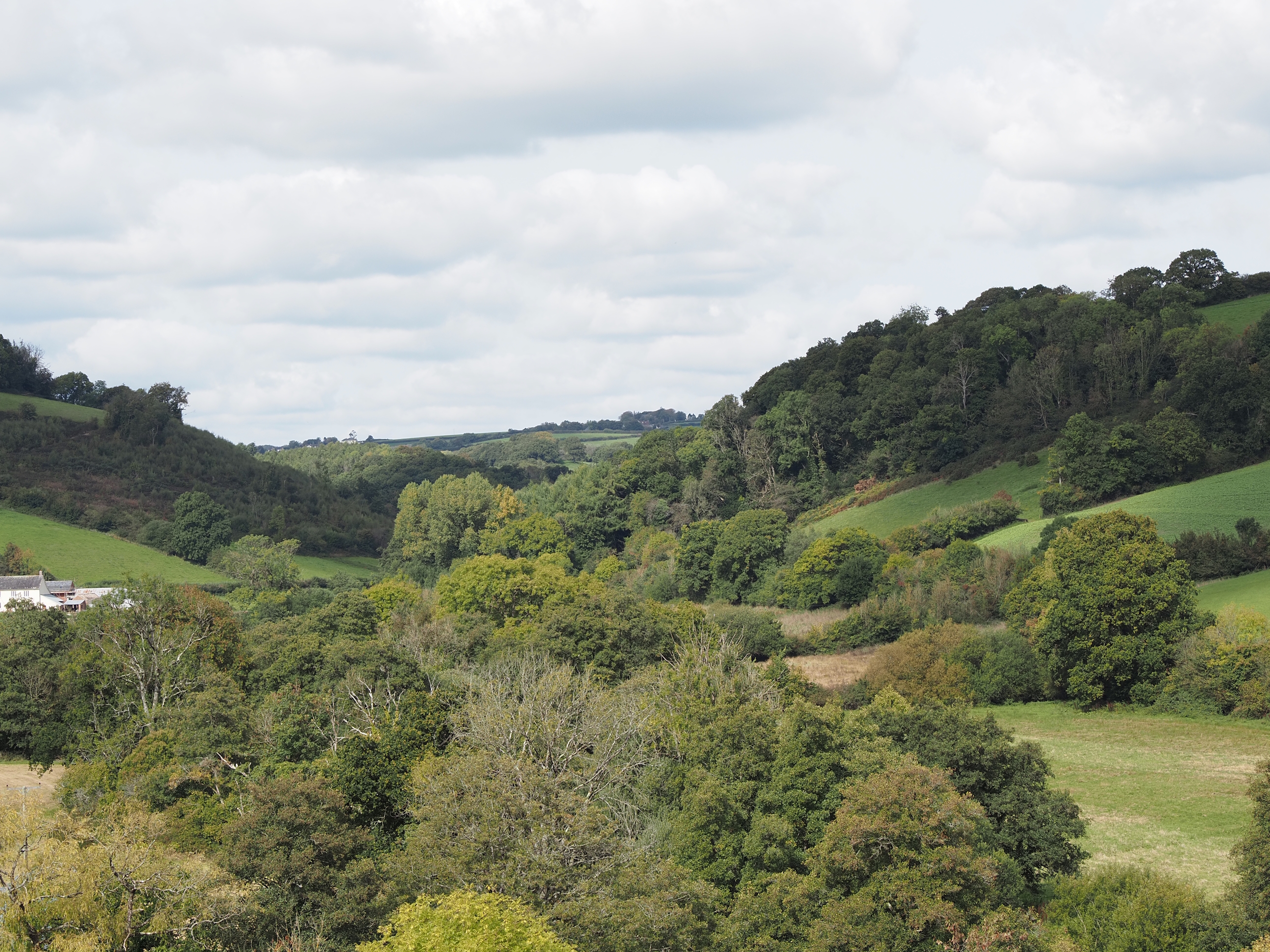
Then we crossed over the river and kept on climbing up. This photo shows the view down into the valley we just walked up . . .
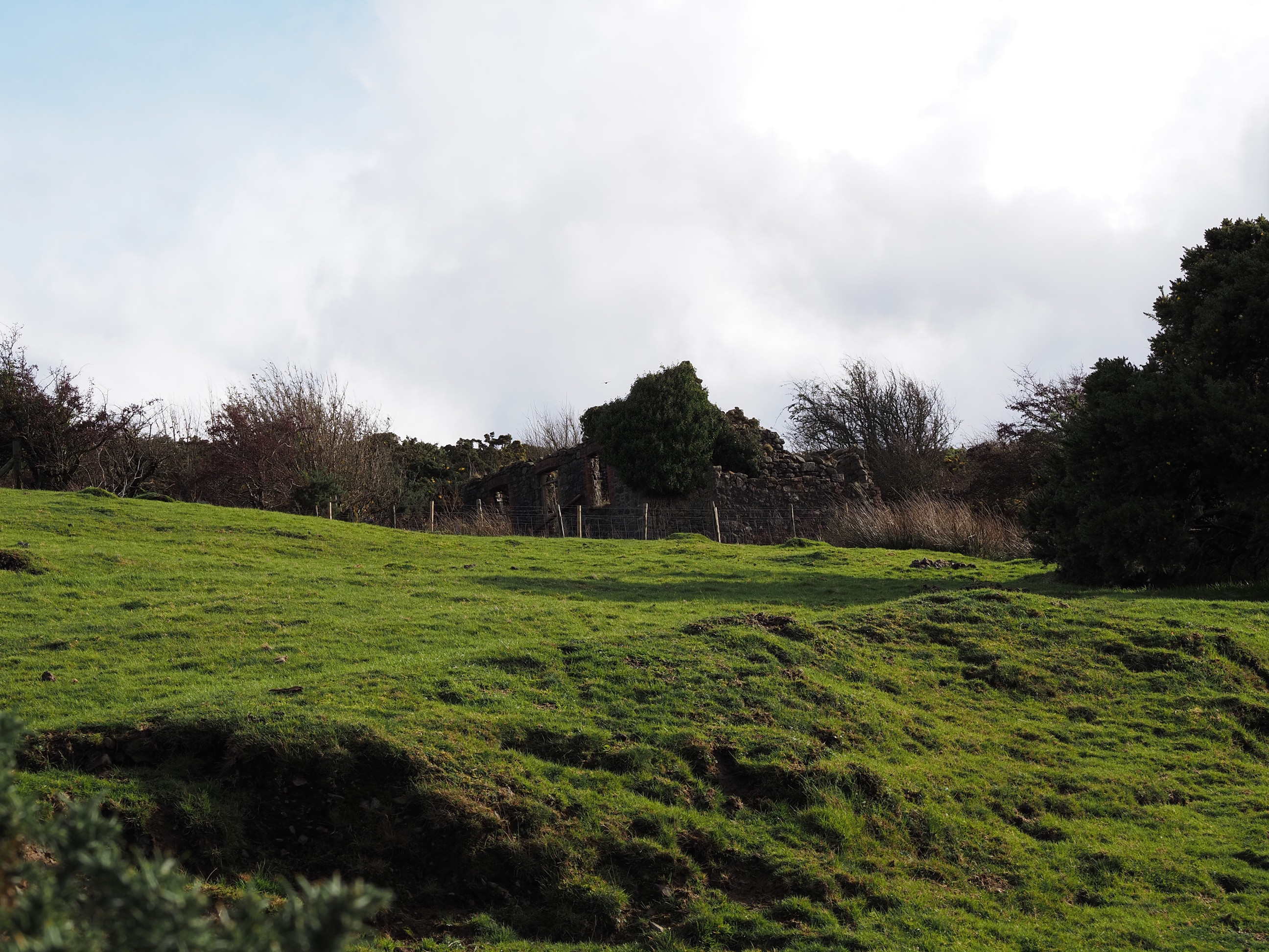
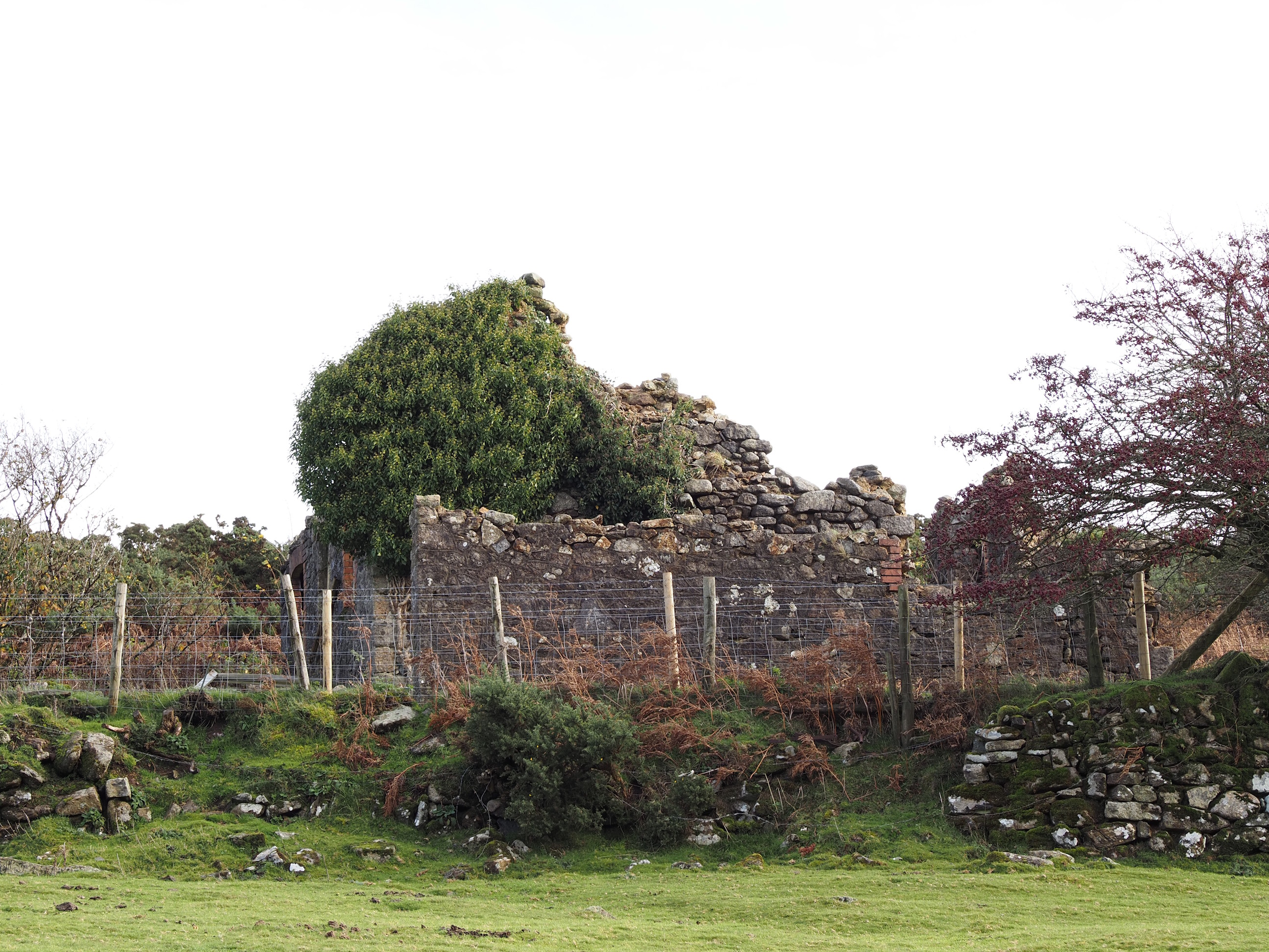
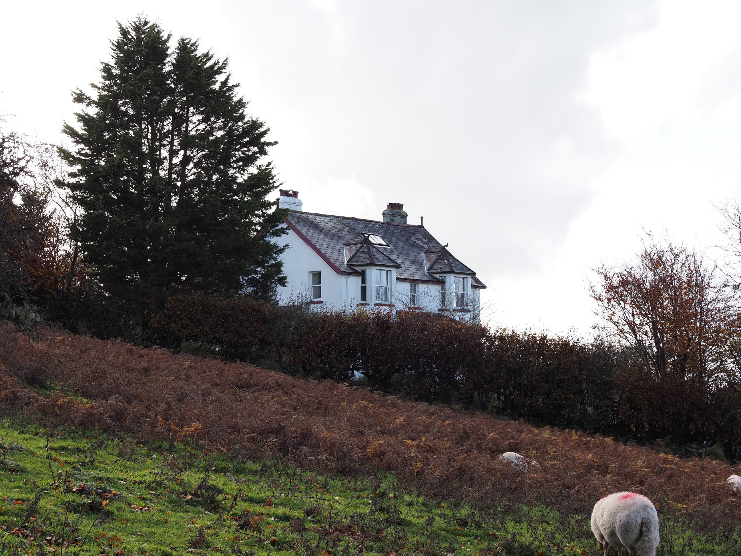
Watchet Hill Cottage . . .
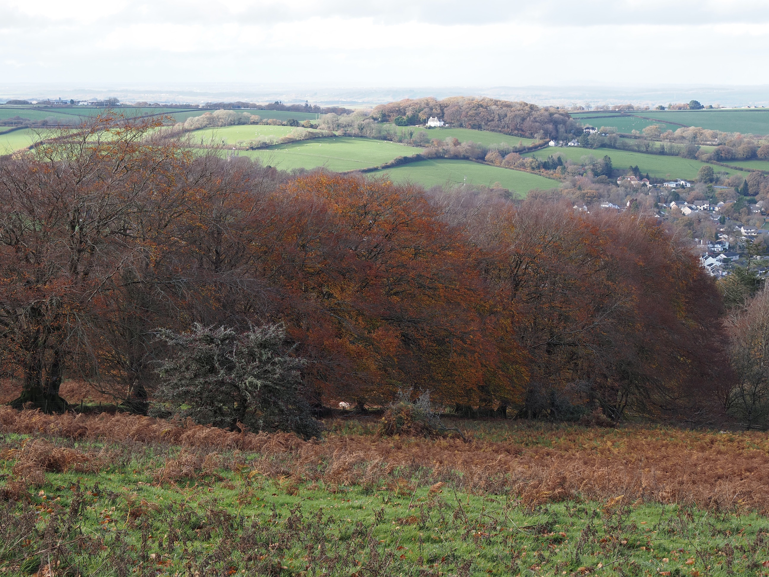
East Bowden Wood and the view up the river . . .
Still climbing up as i look back down . . .
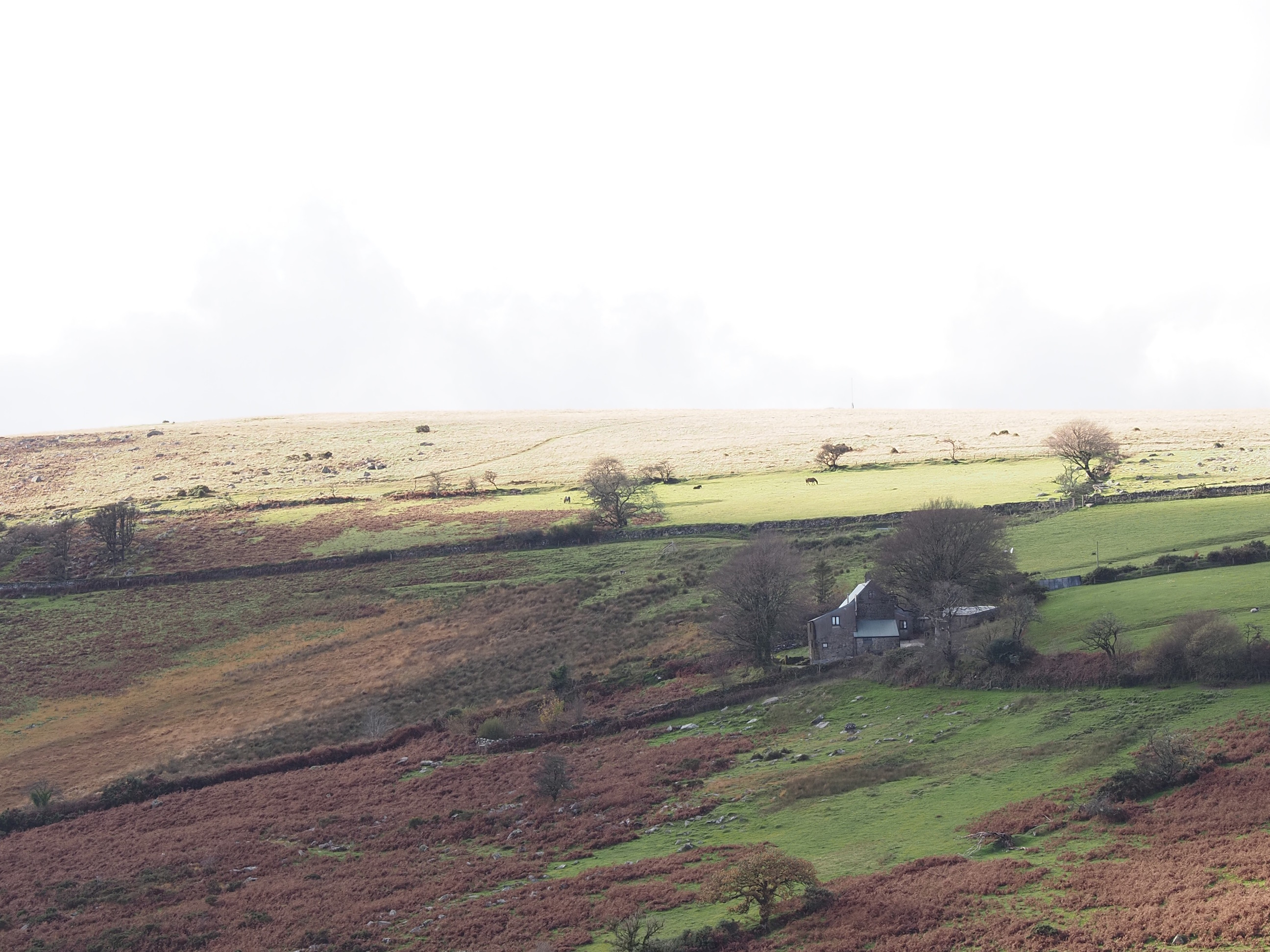
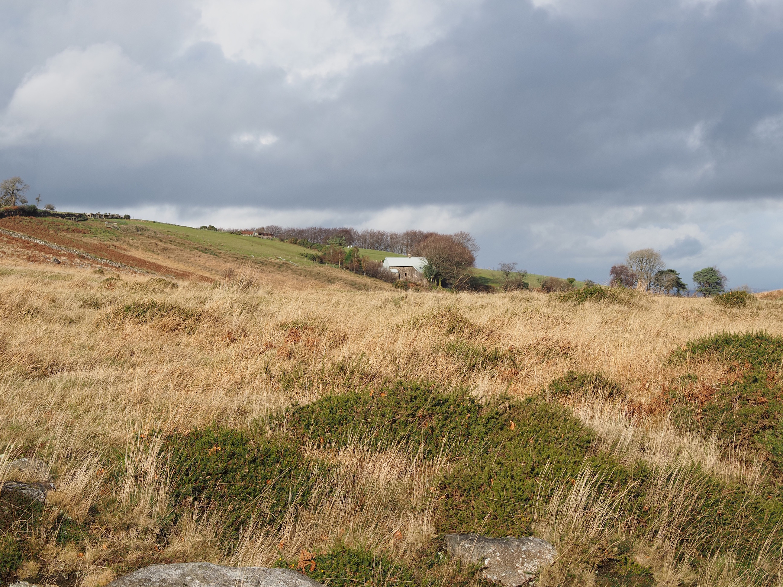
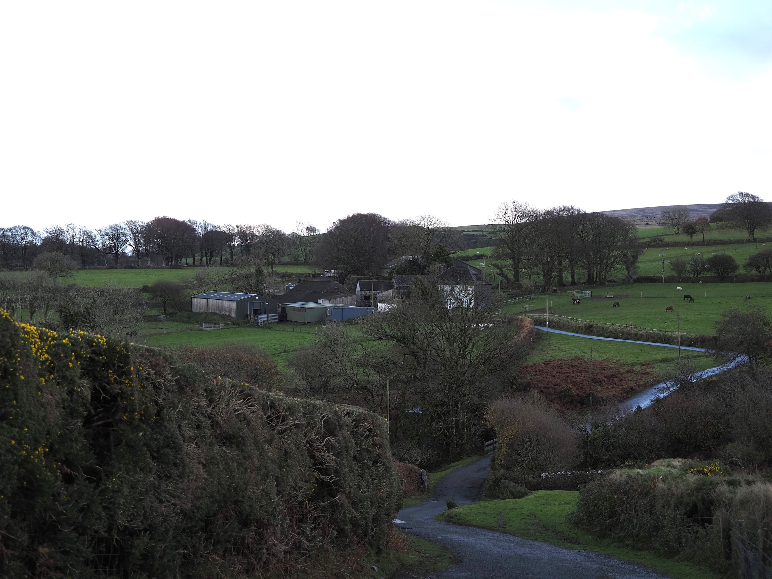
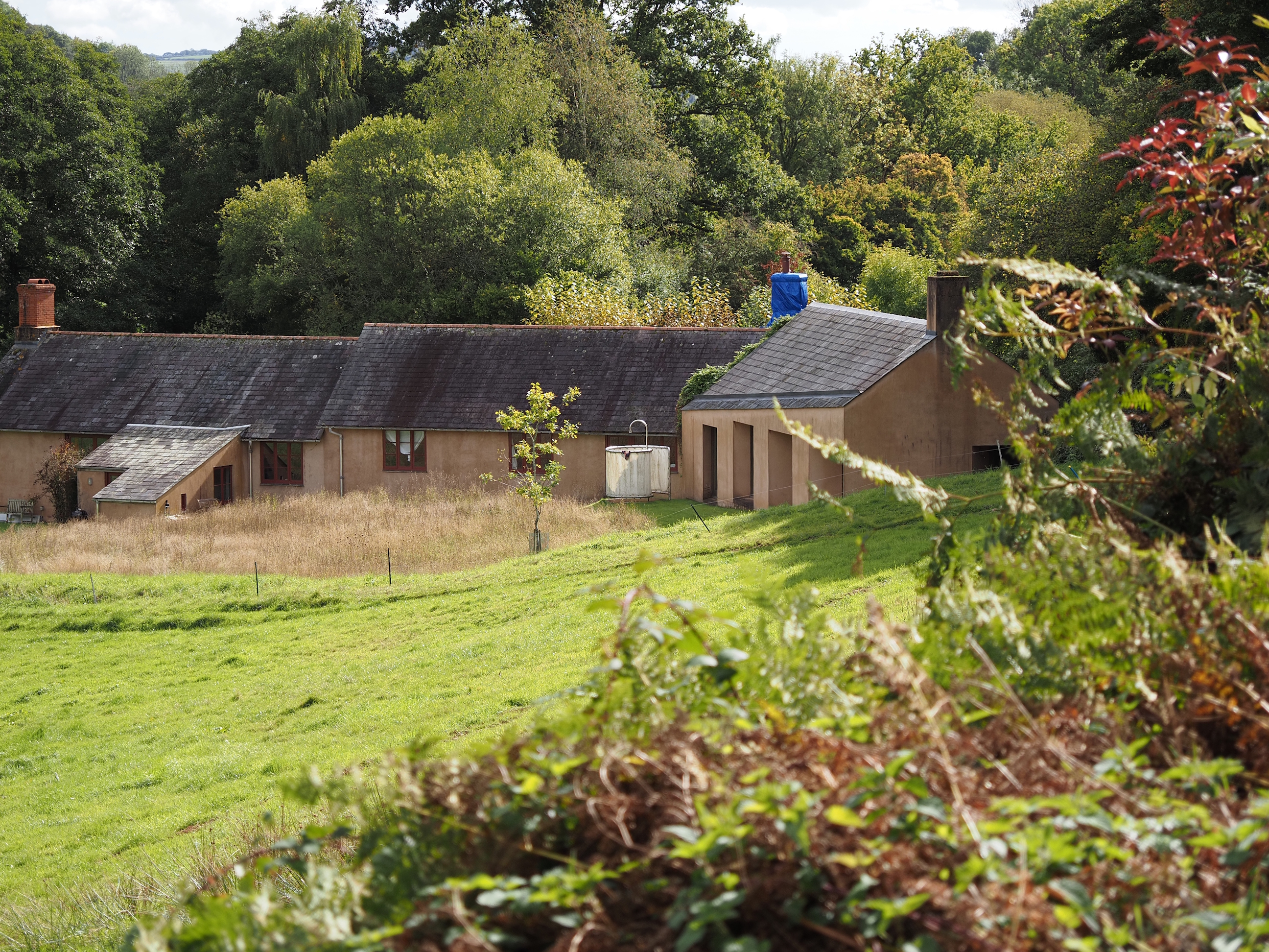
Higher Halstock Farm from the East. . .
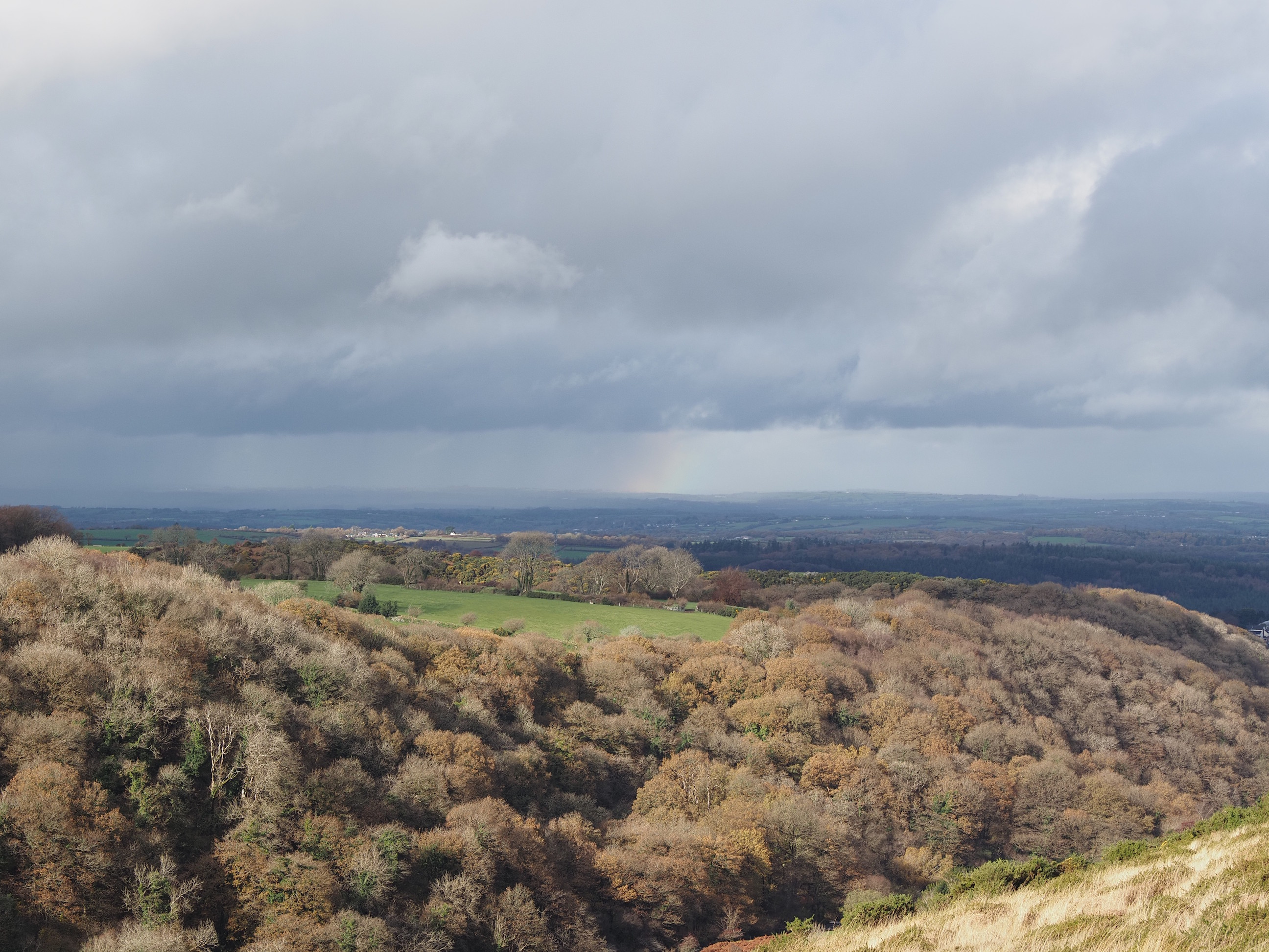
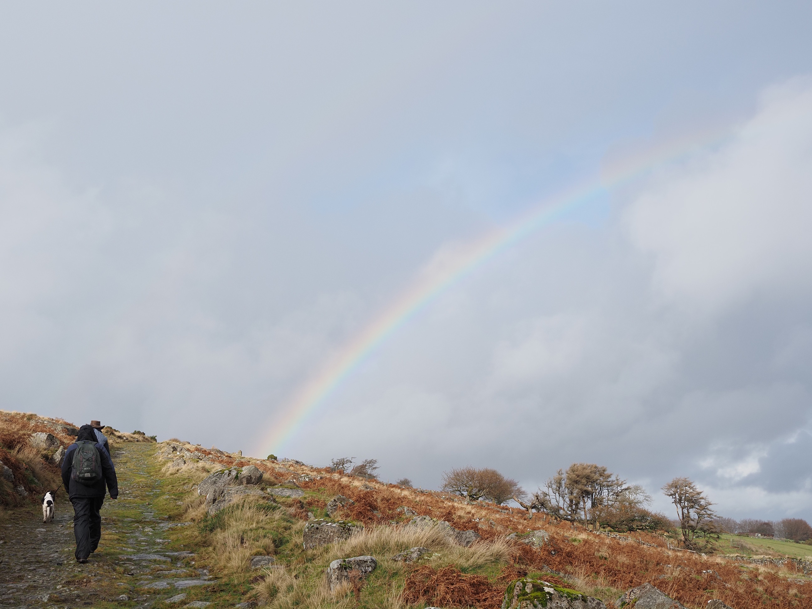
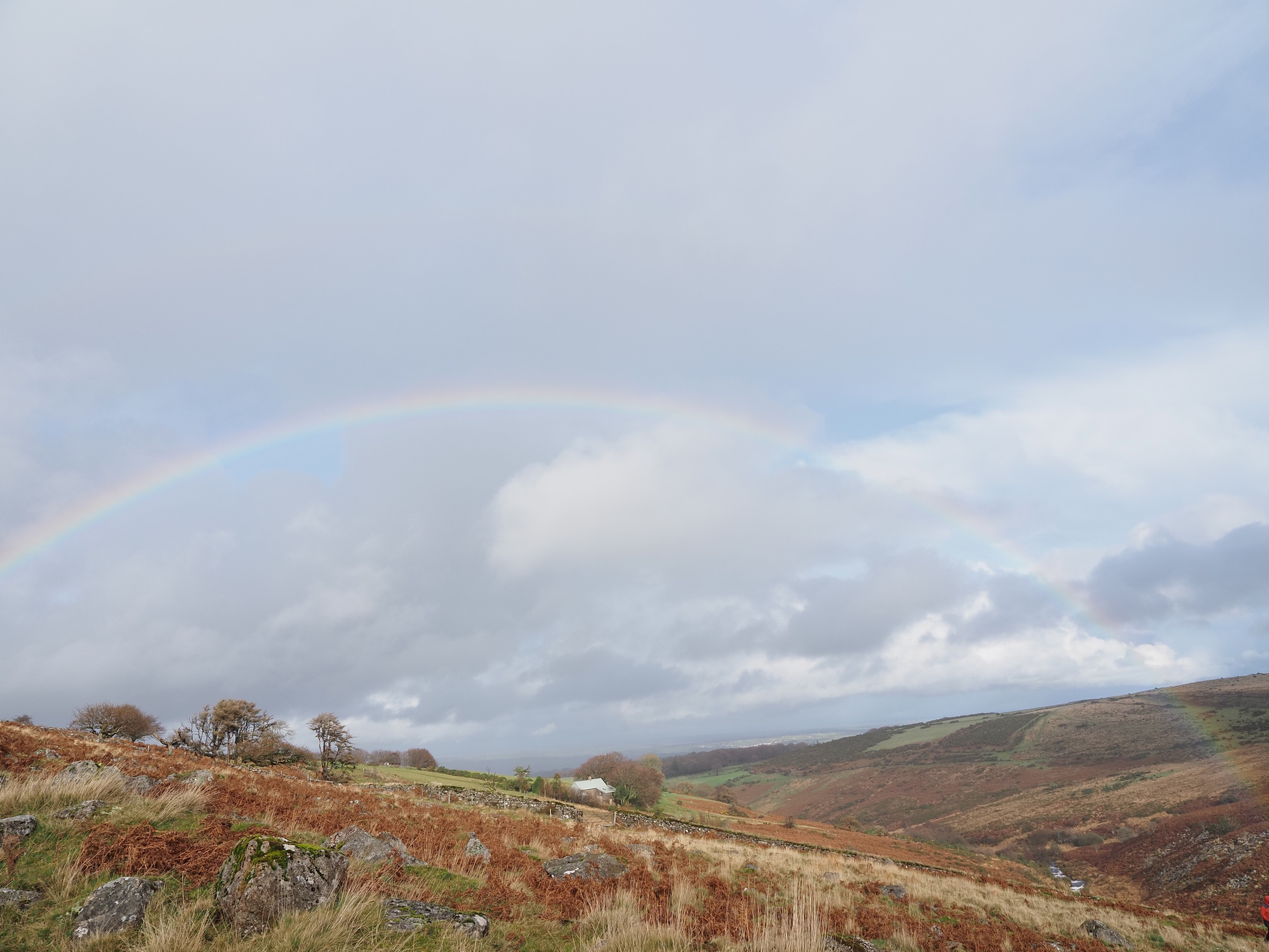
The first rainbow of the day . . .
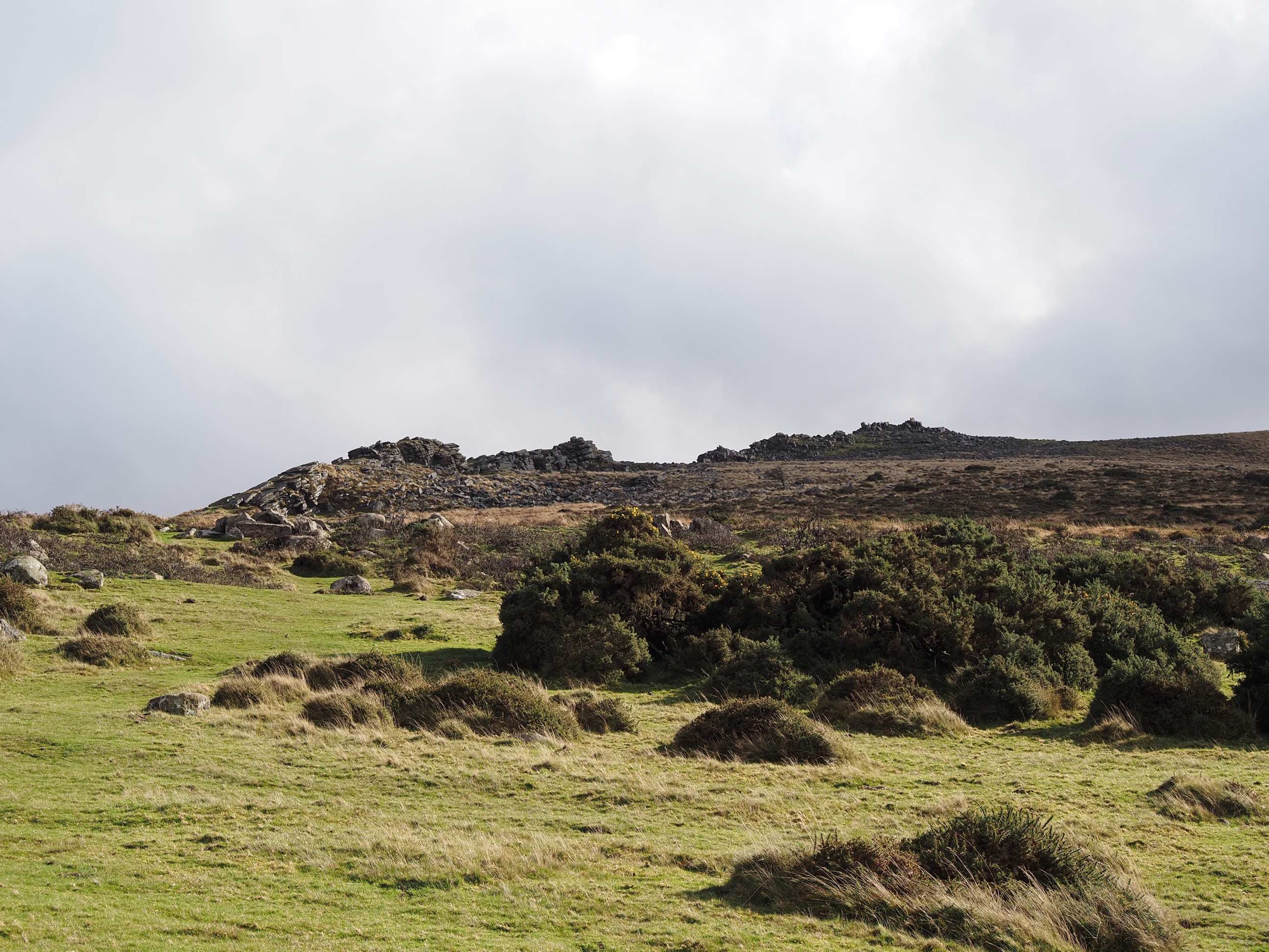
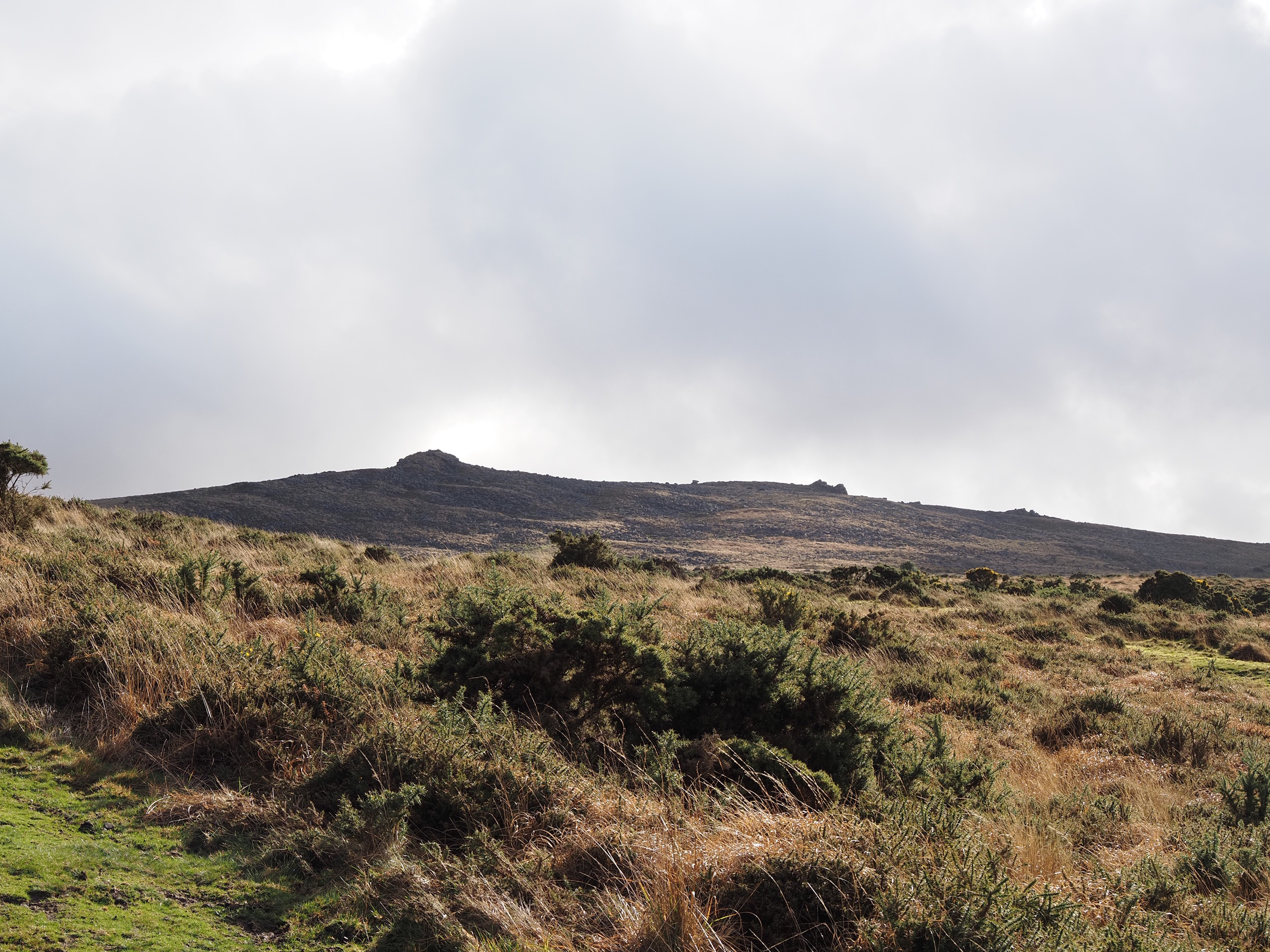
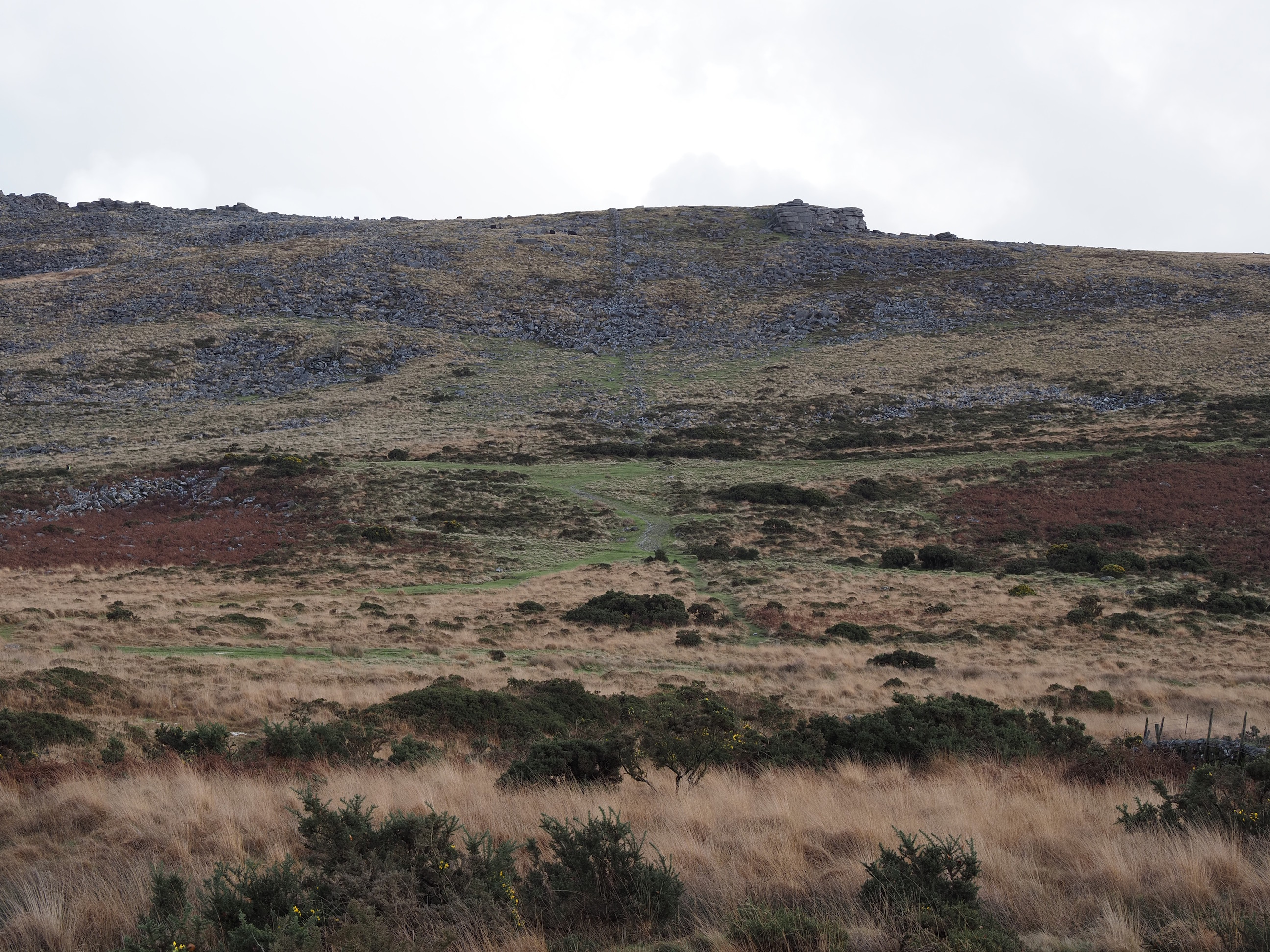
Tor’s End and Belstone Common Tor . . .
Belstone Tor, Higher Tor and i’m guessing the one on the right is Winter Tor . . .
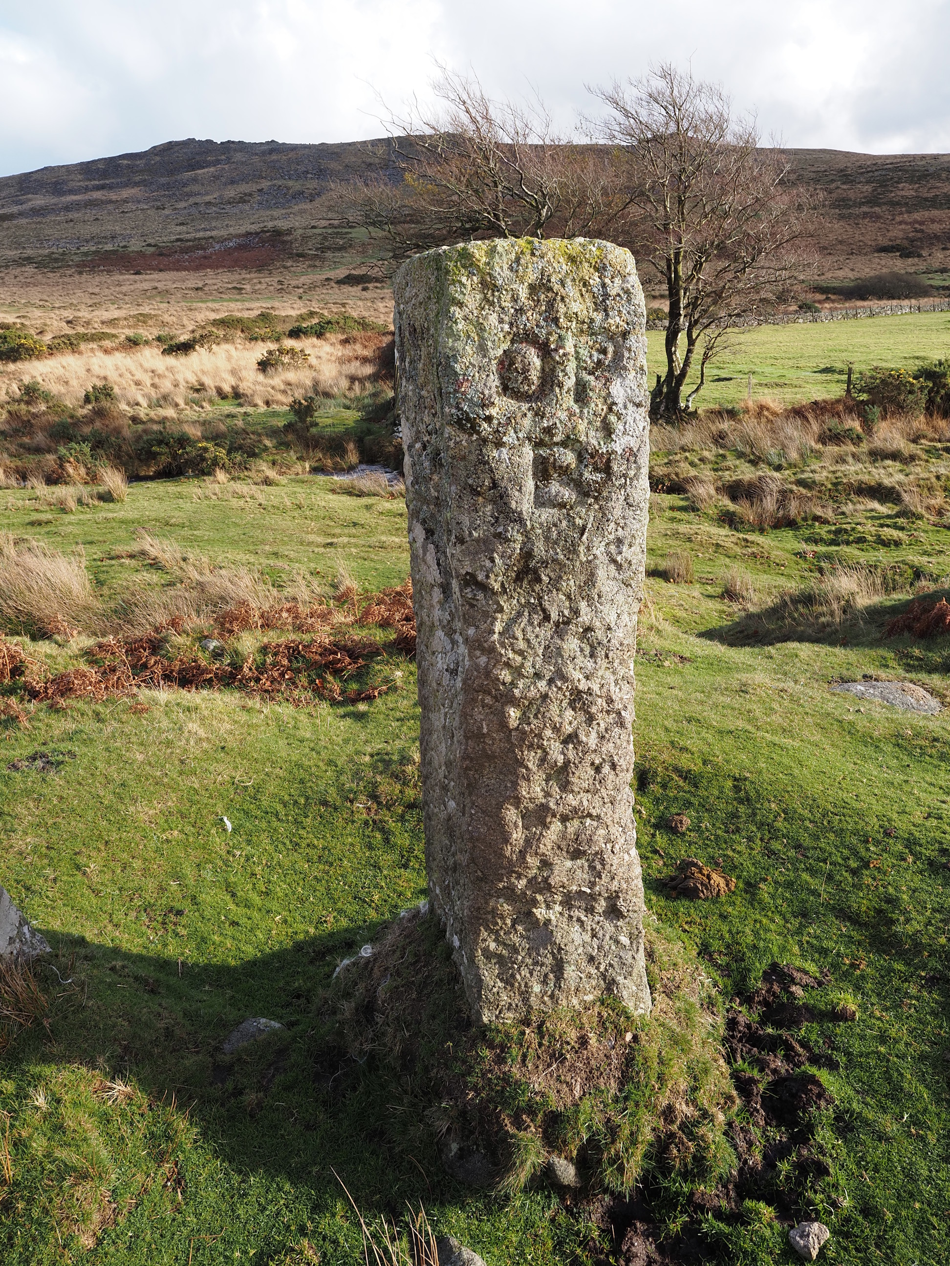
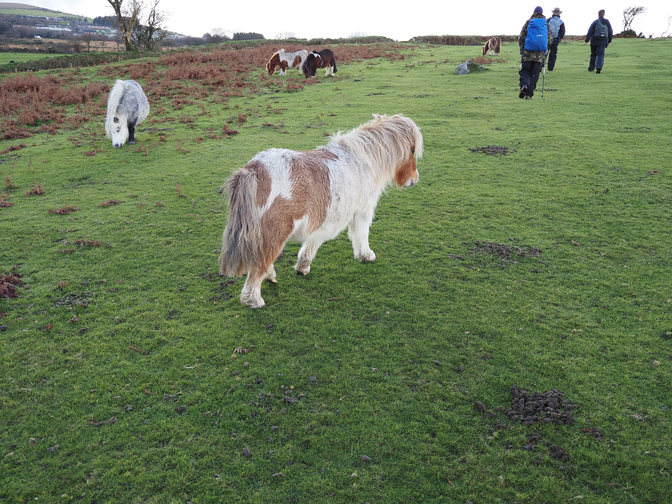
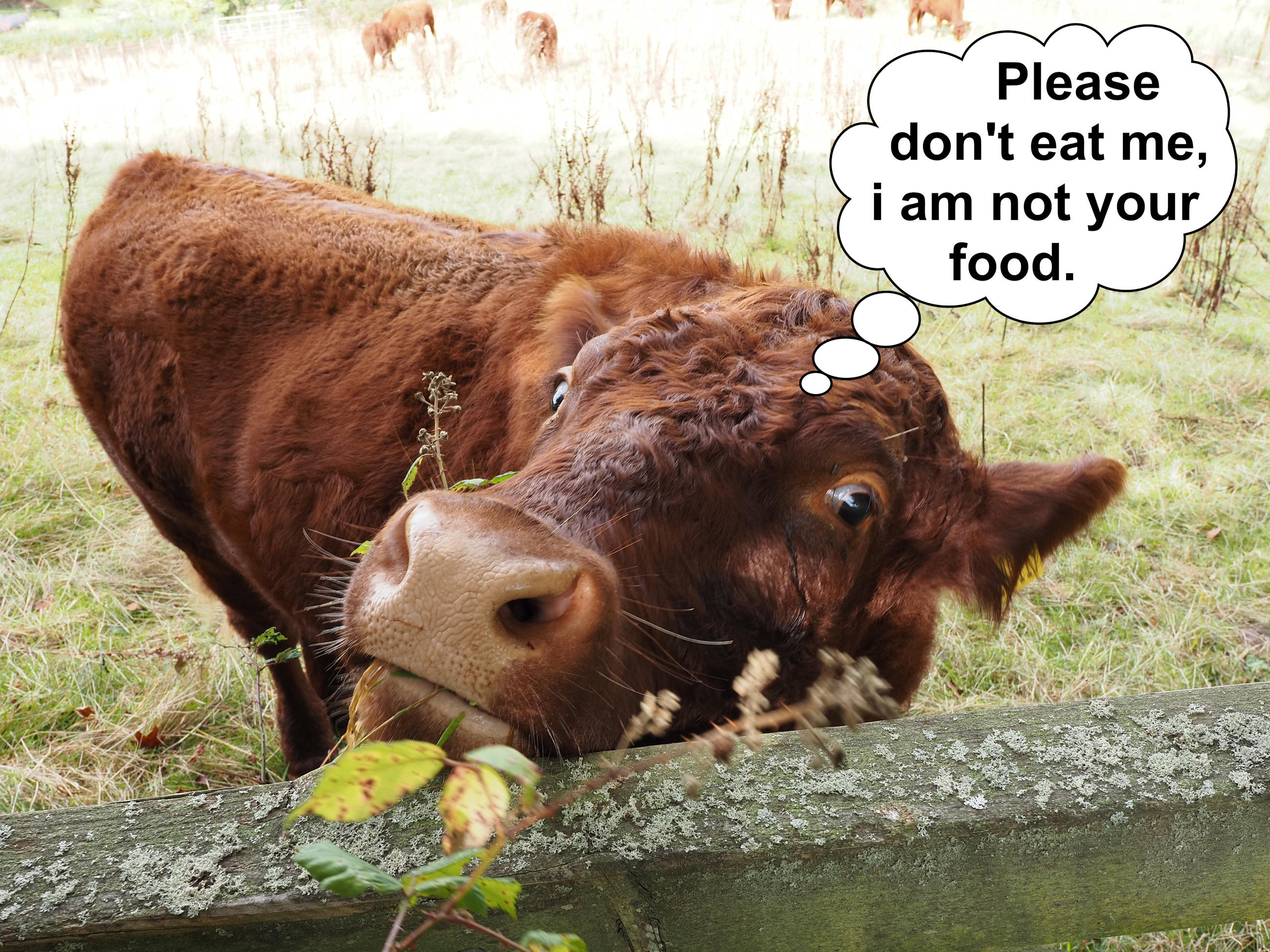
Nine Maidens, three men, one dog, and . . .
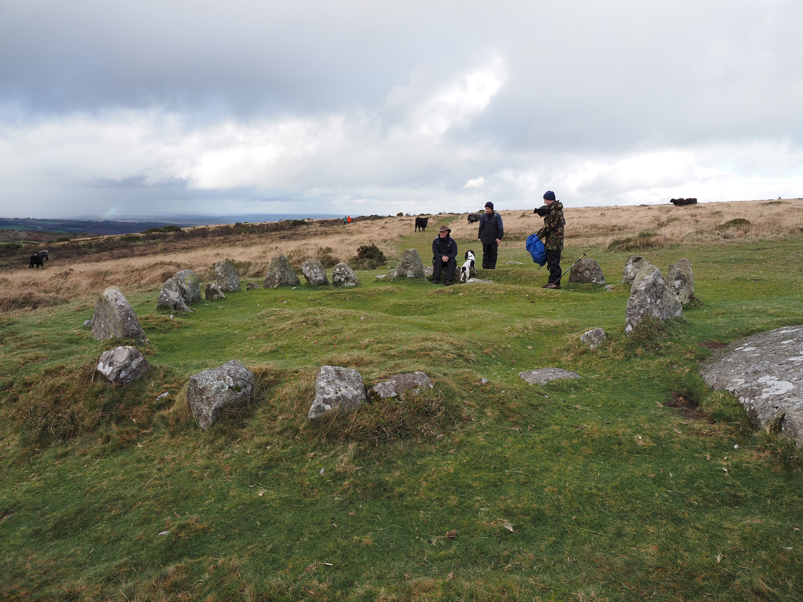
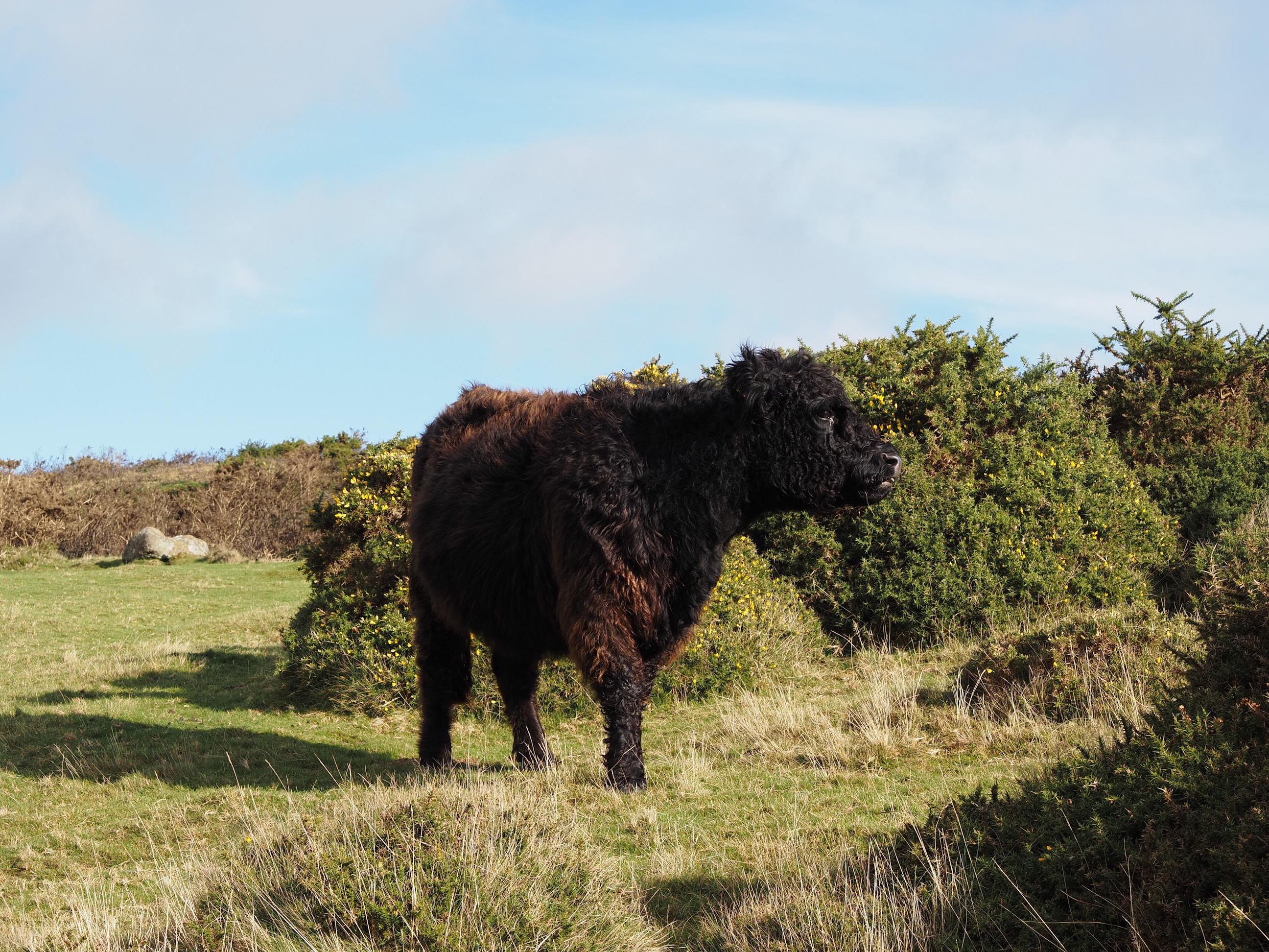
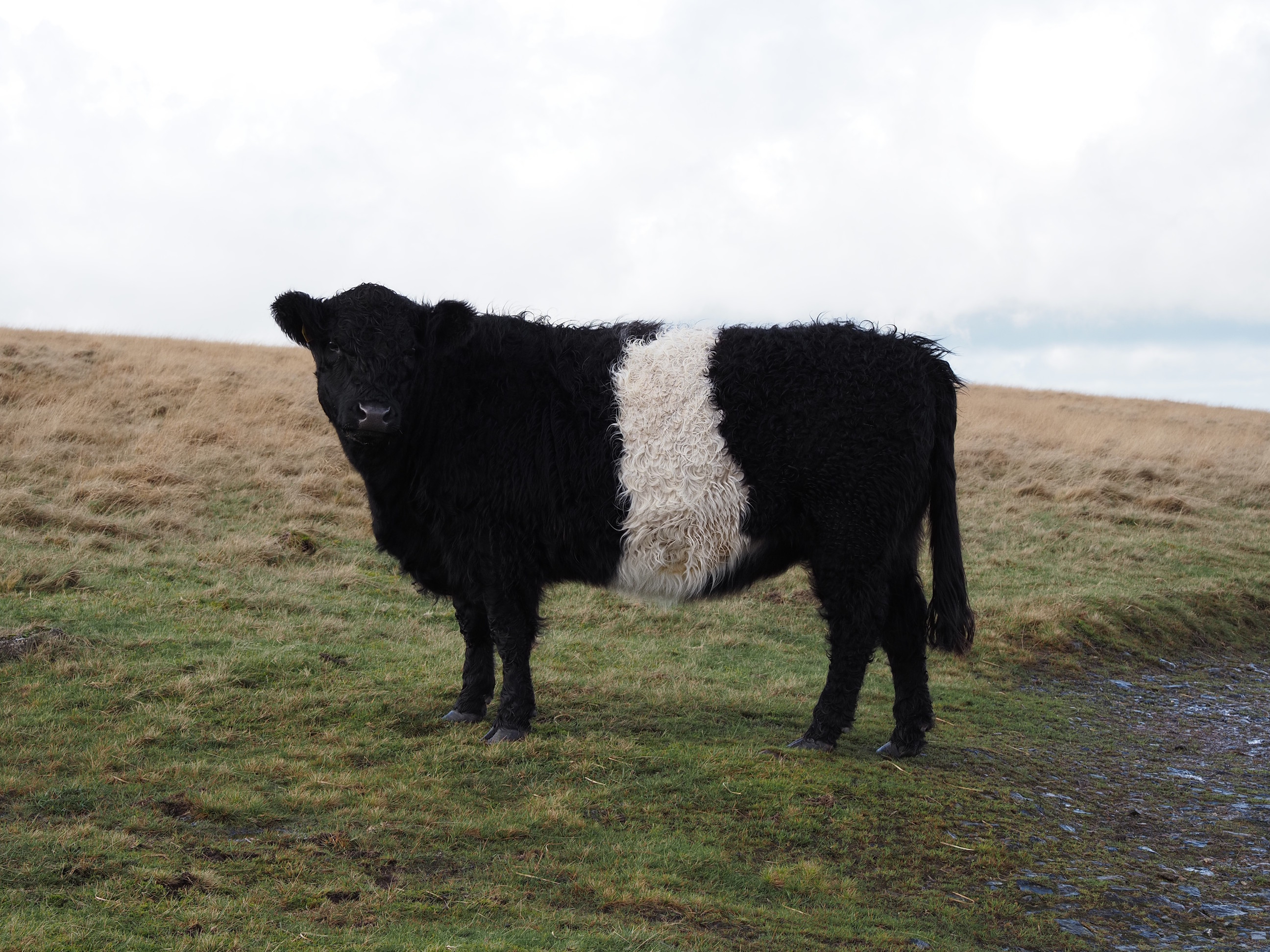
a cow . . .
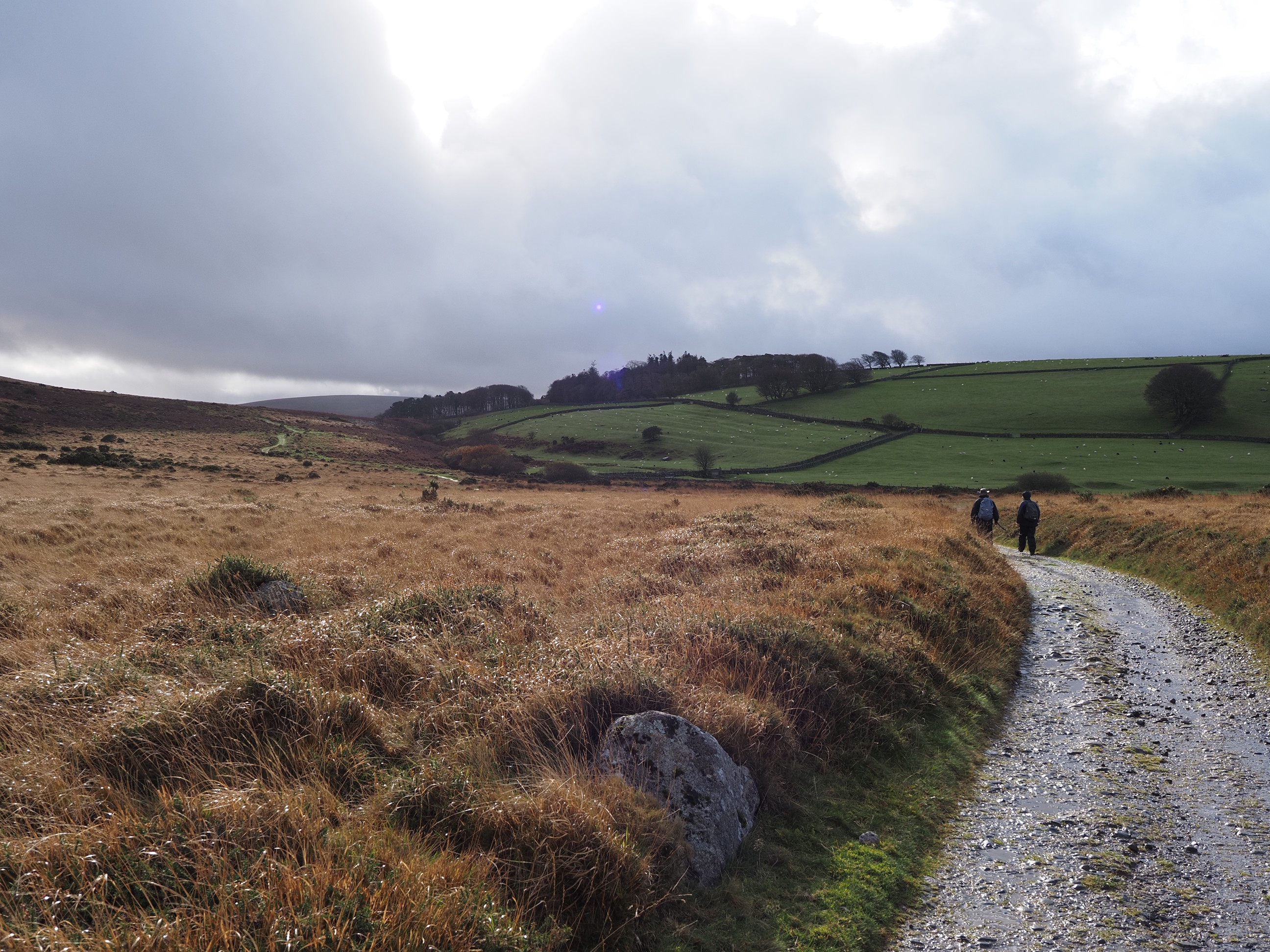
Then we walked down towards Cullever Steps . . .
Irishman’s Wall with Higher Tor on the right and Belstone Tor to the left . . .
Okehampton Parish Boundary . . .
Higher Halstock Farm from the South . . .
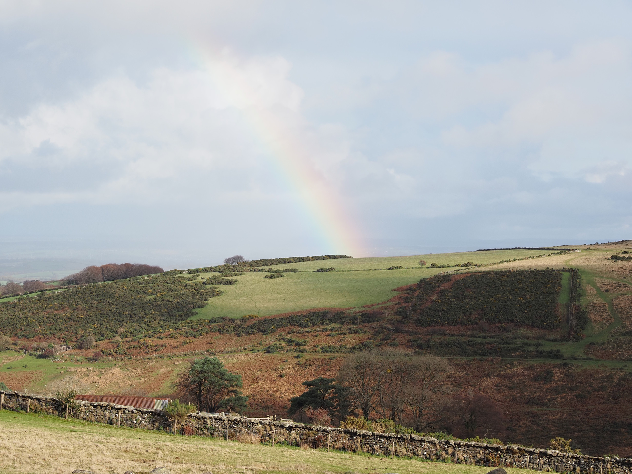
The rainbow came back with a full-on primary bow and a faint secondary bow . . .
There be a pot of gold and a leprechaun around here somewhere . . .
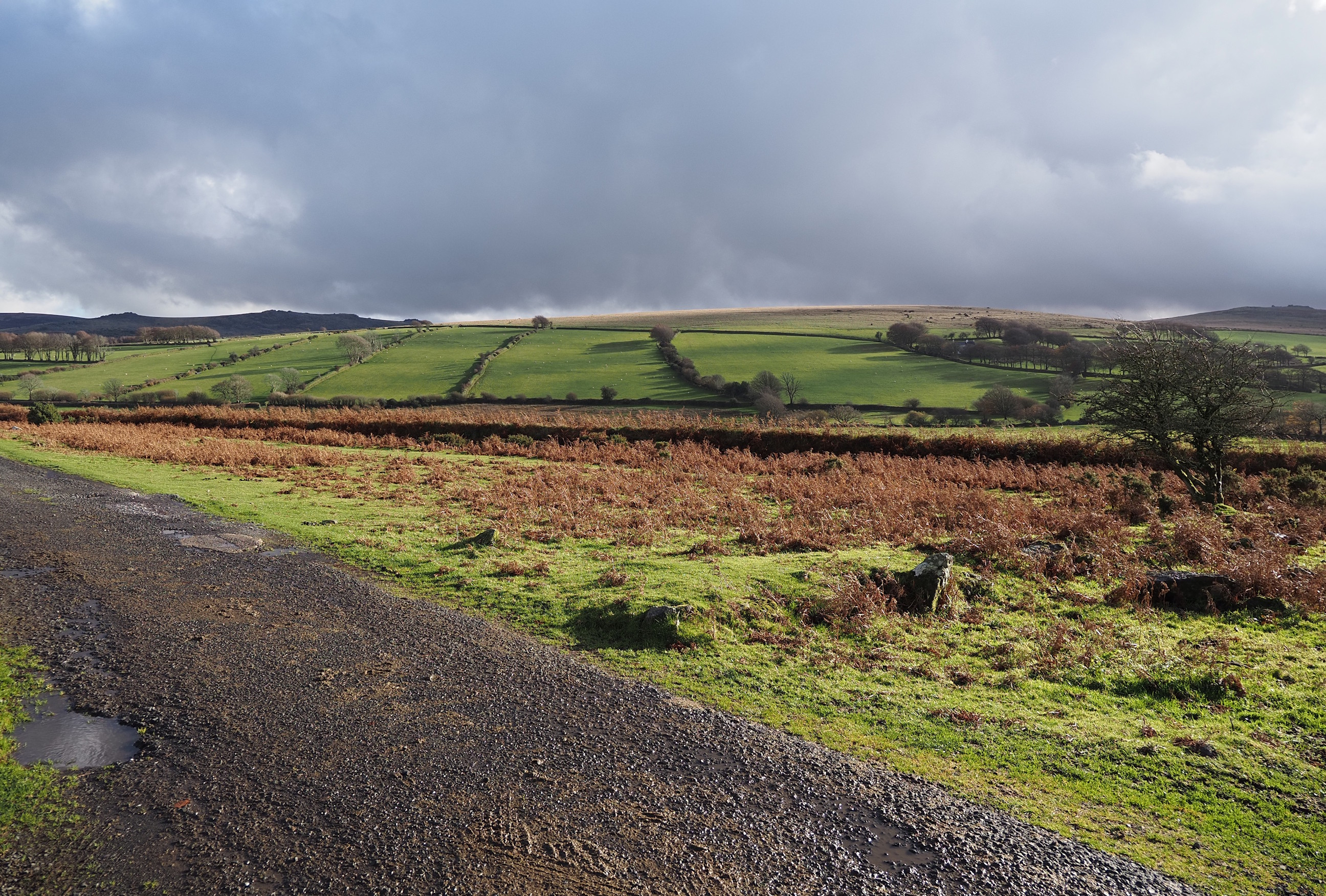
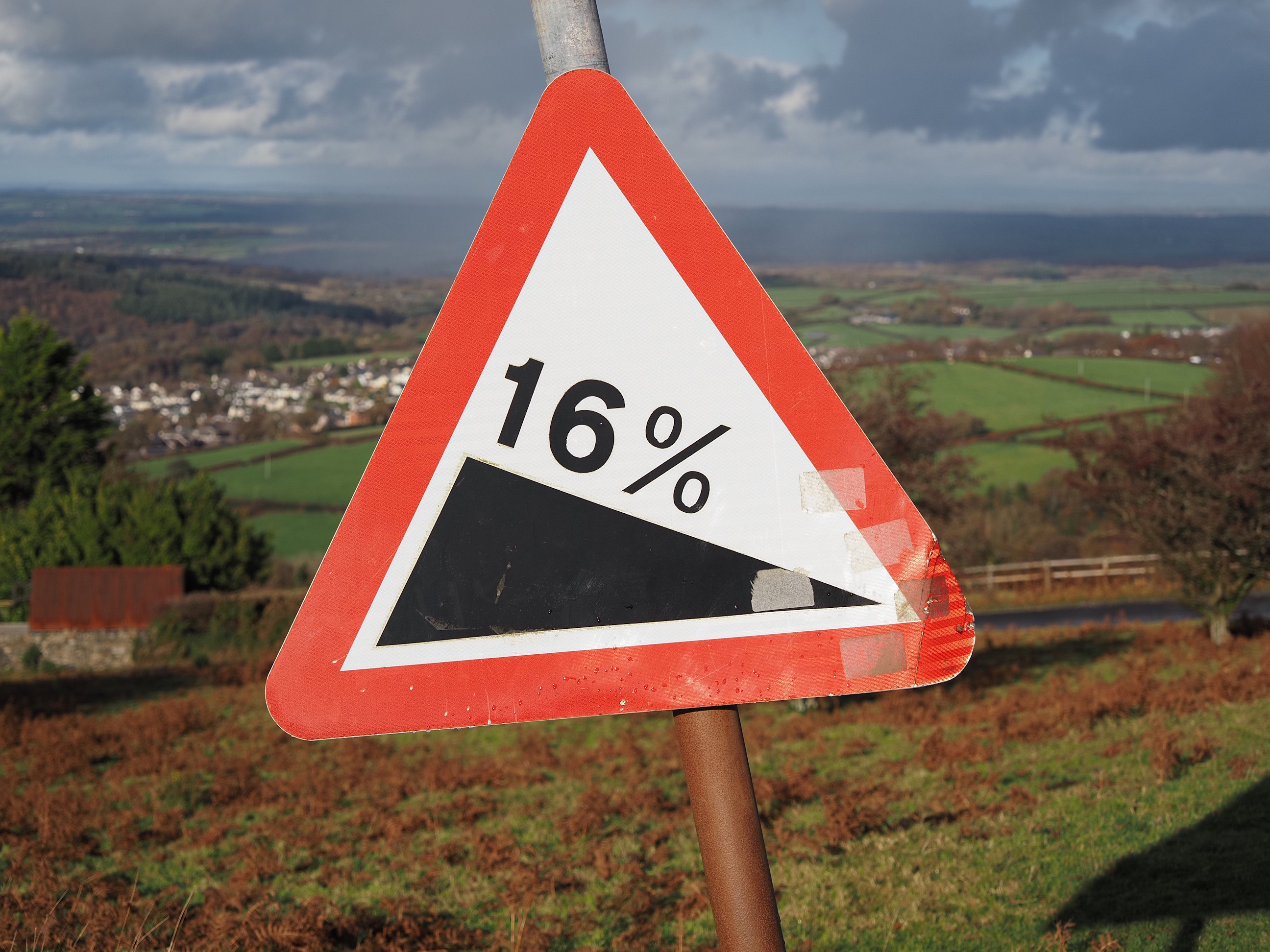
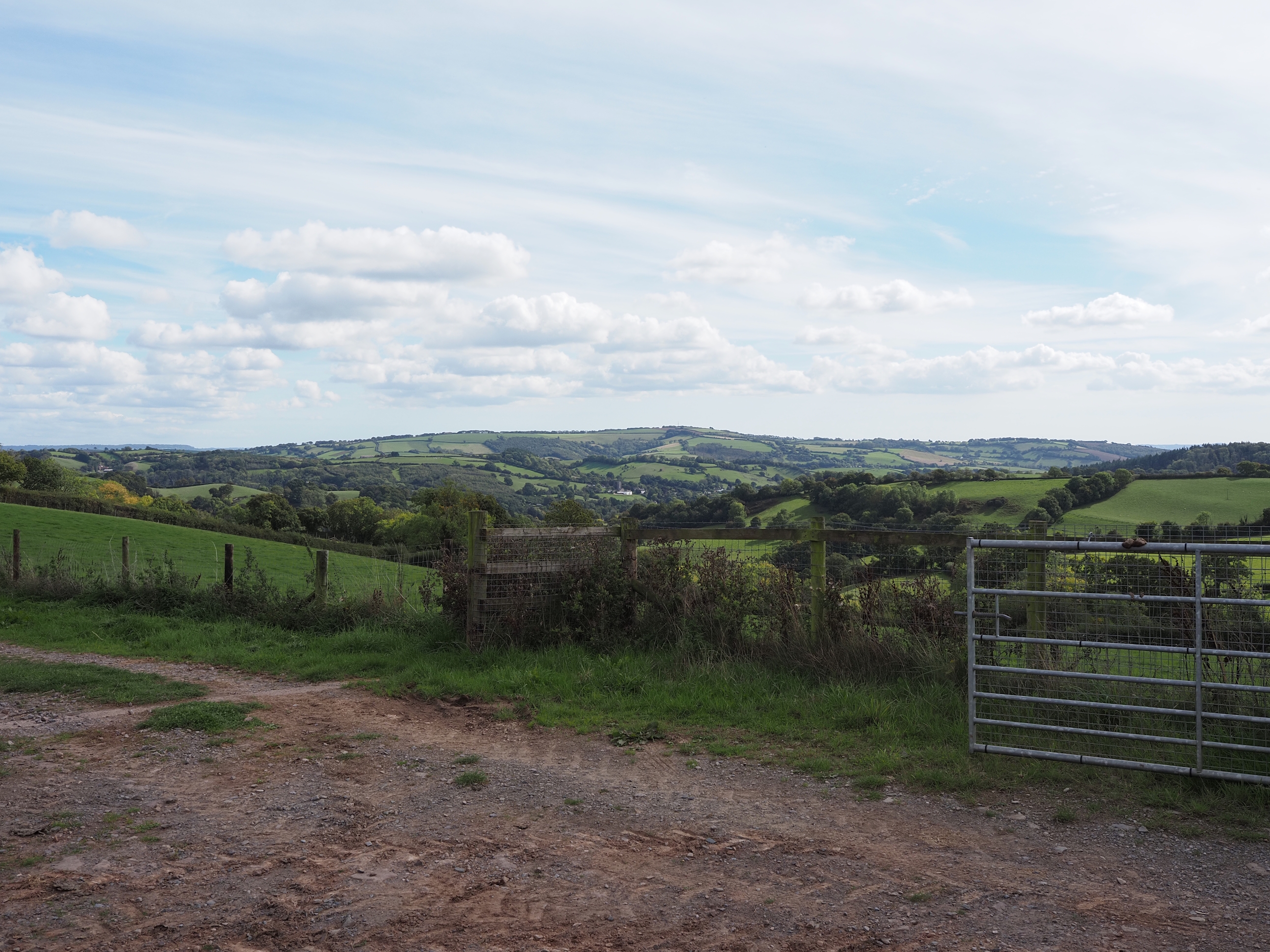
From the top of the hill this would be an amazing view on a clear day . . .
Today we just got the last bit of rainbow . . .
Panda cow . . .
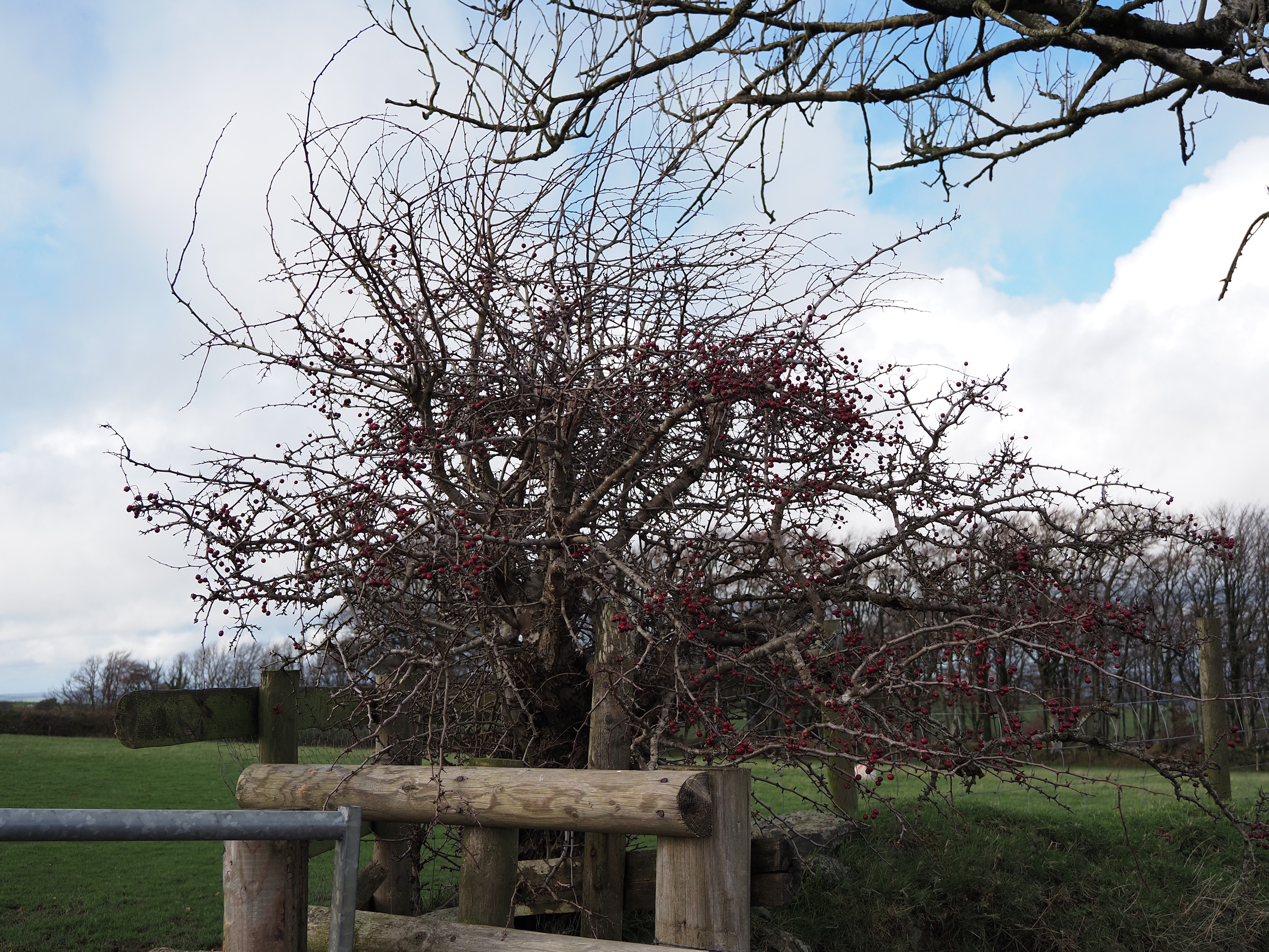
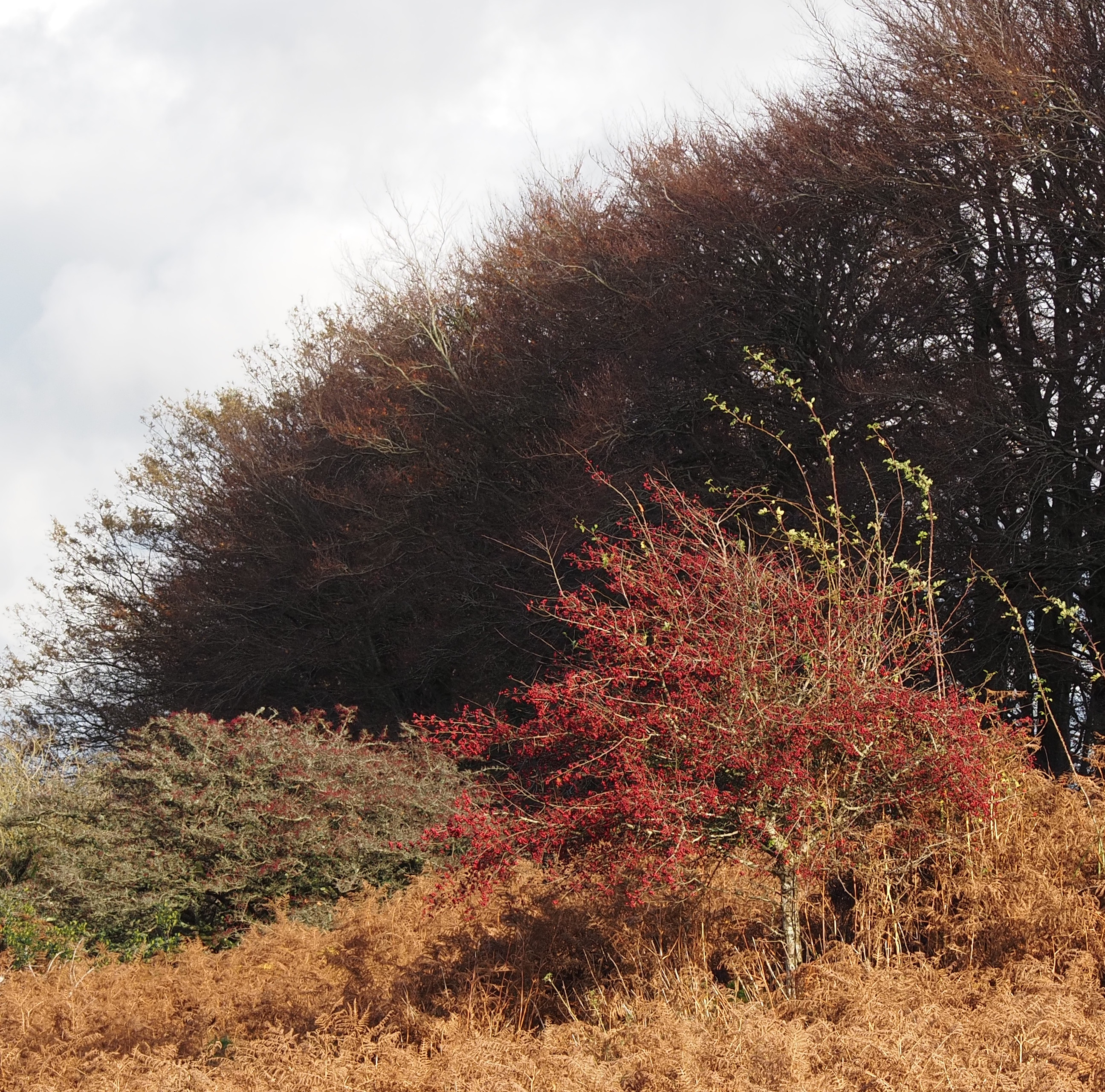
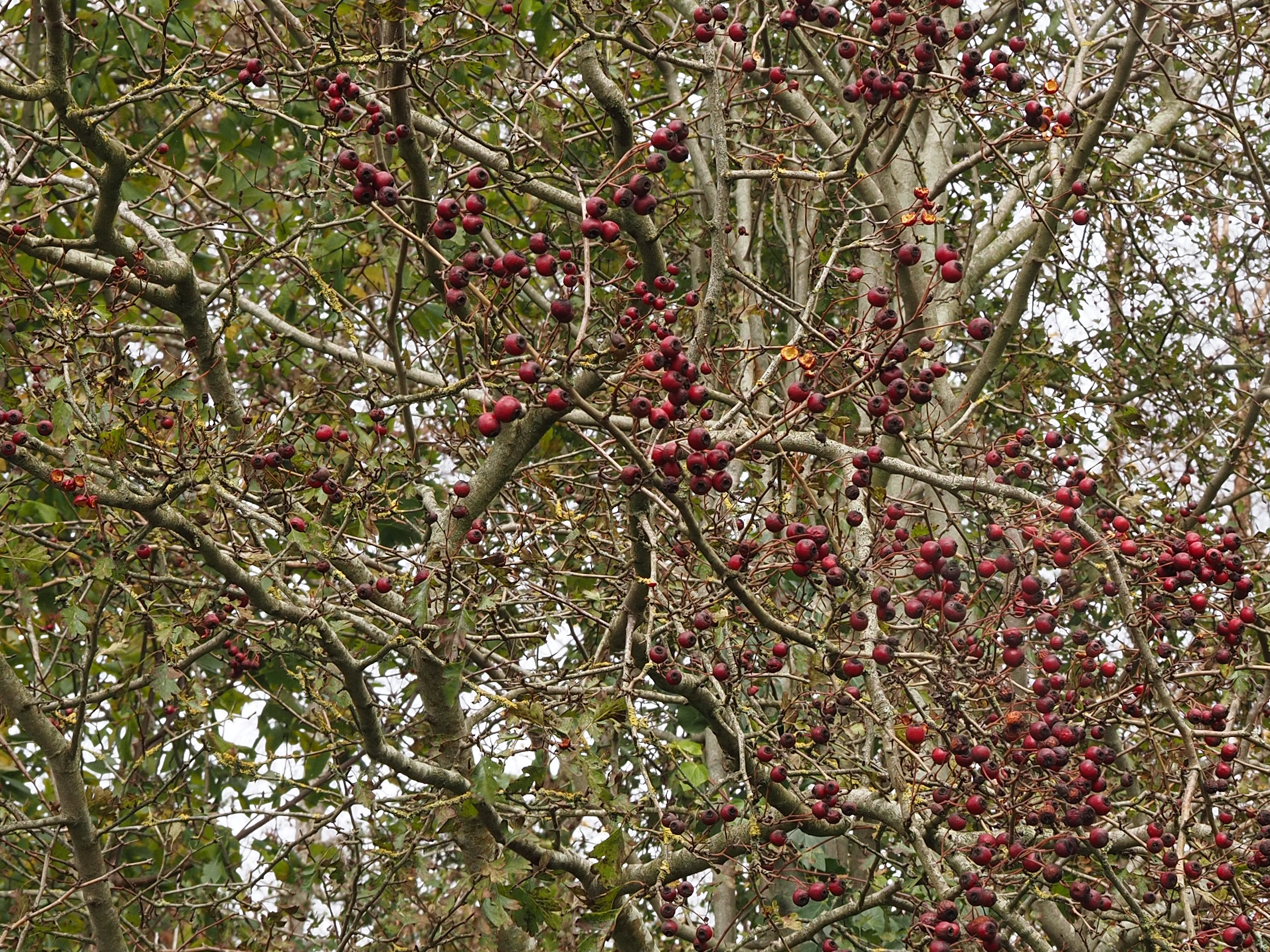
The hawthorns have lost all their leaves already, but there’s plenty of haws left for the birdies . . .
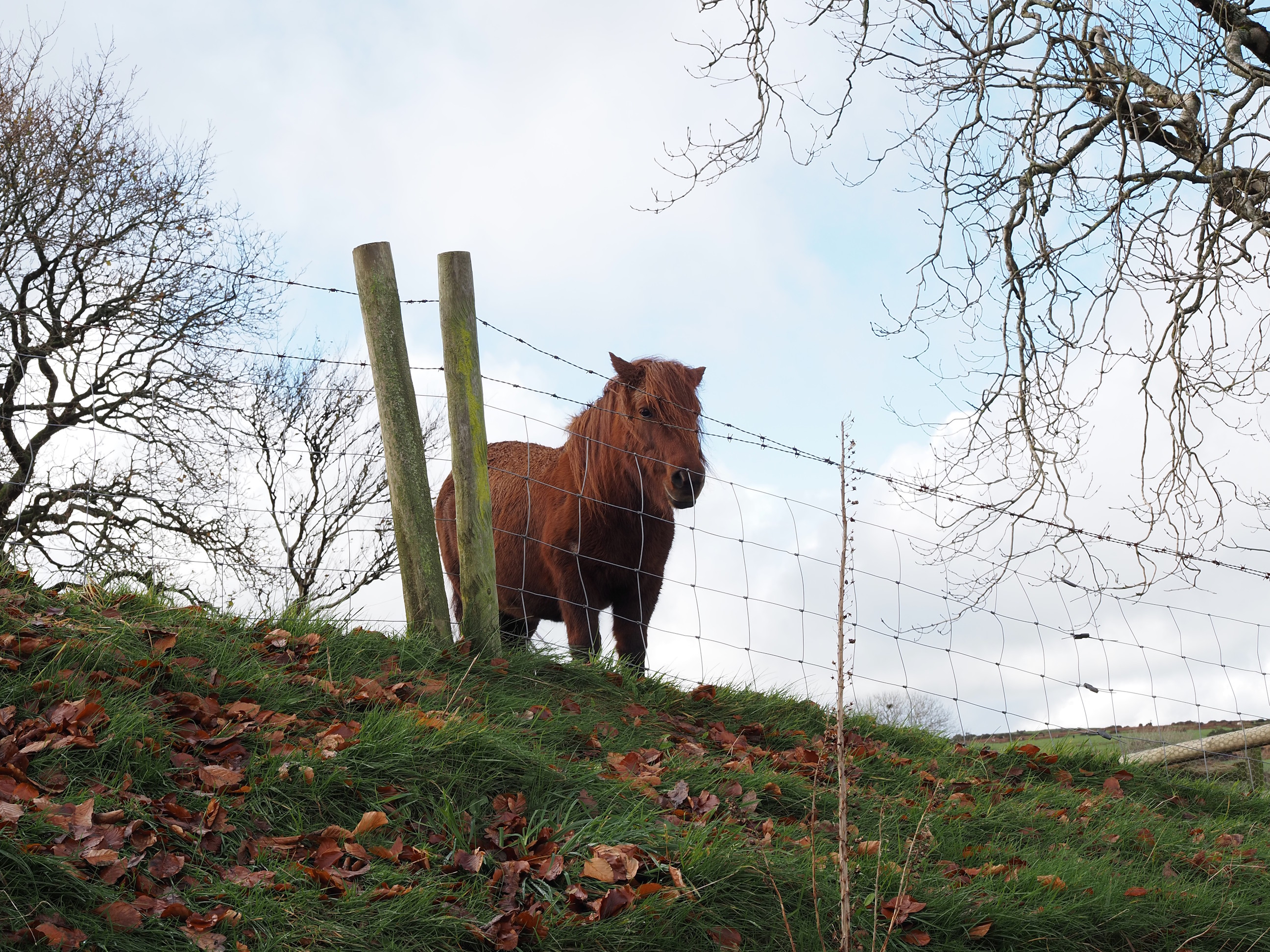
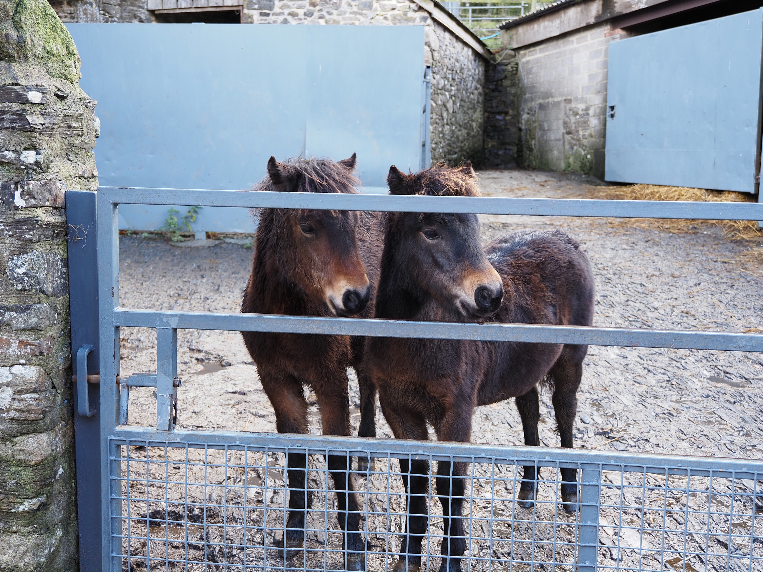
Heading down to The Halstock & Blackertor studs at Lower Halstock Farm . . .
The farm is all about breeding and showing bonsai horses . . .
1, 2, 3, altogether now, awwwwww, so cute . . .
The farm from the North . . .
Wait for me . . .
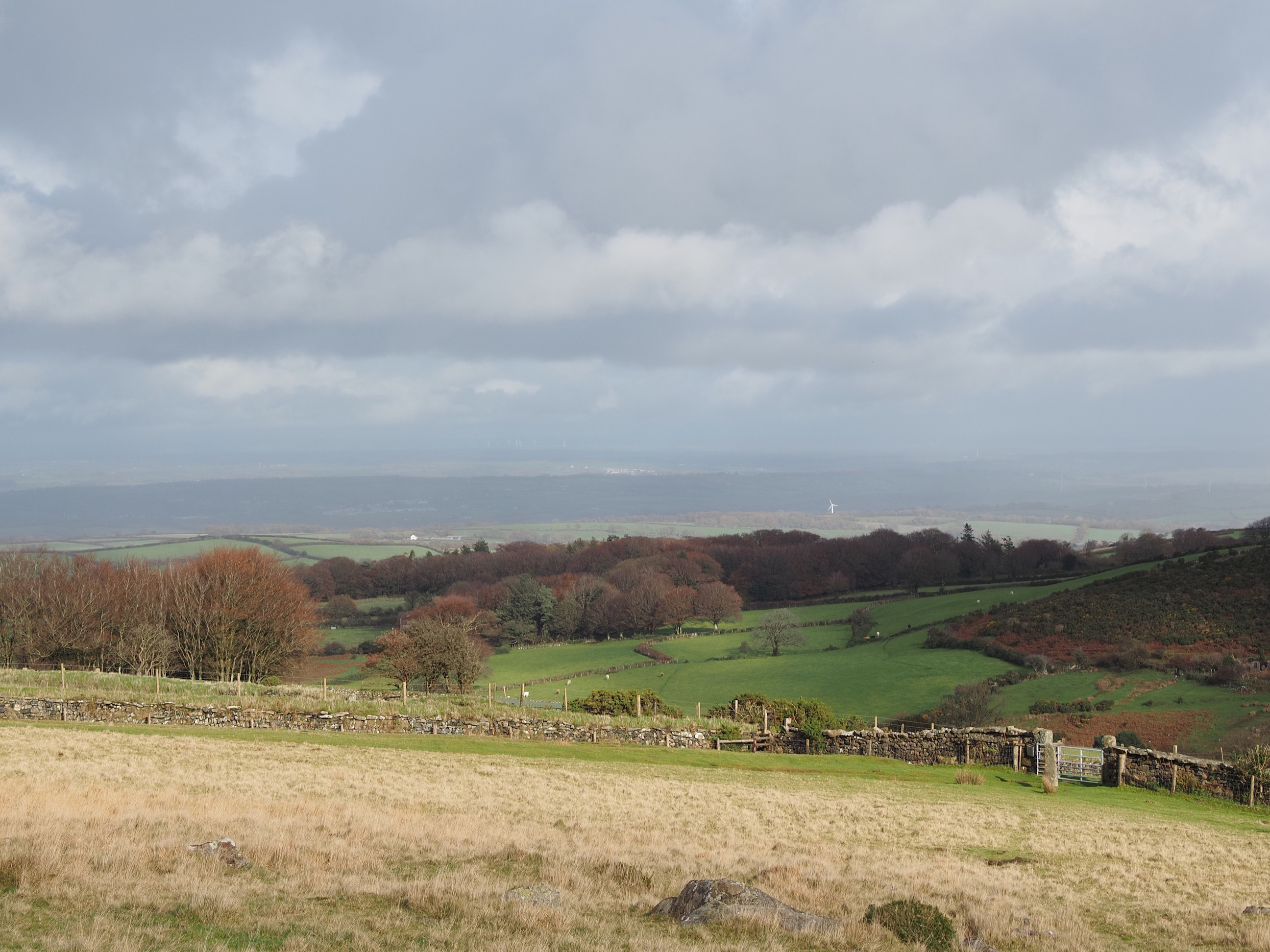
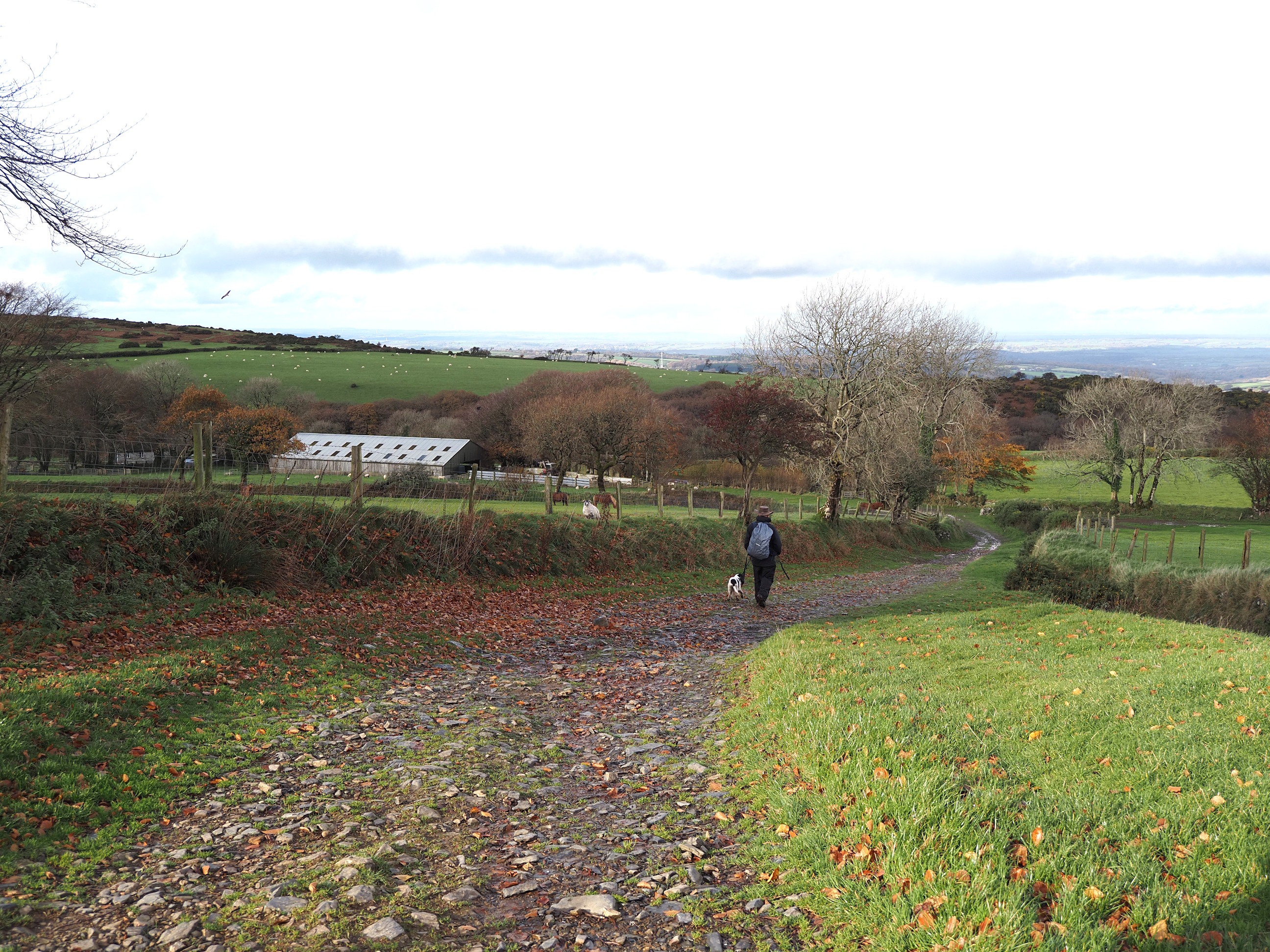
Our last view of the moors today . . .
As Okehampton appears in the distance with another tiny slice of rainbow. . .
I was very happy to be going down the hill . . .
That middle tree was just showing off . . .
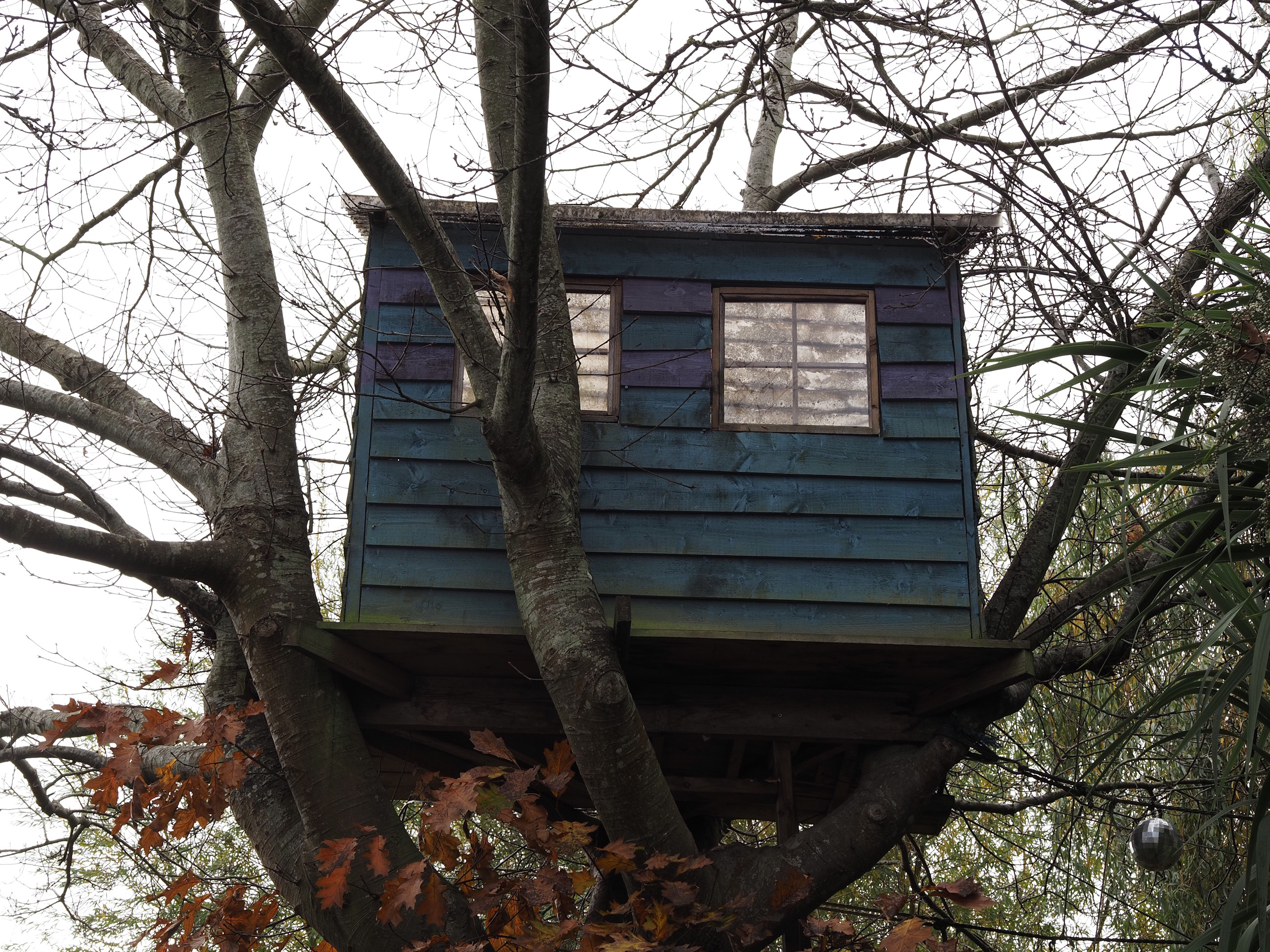
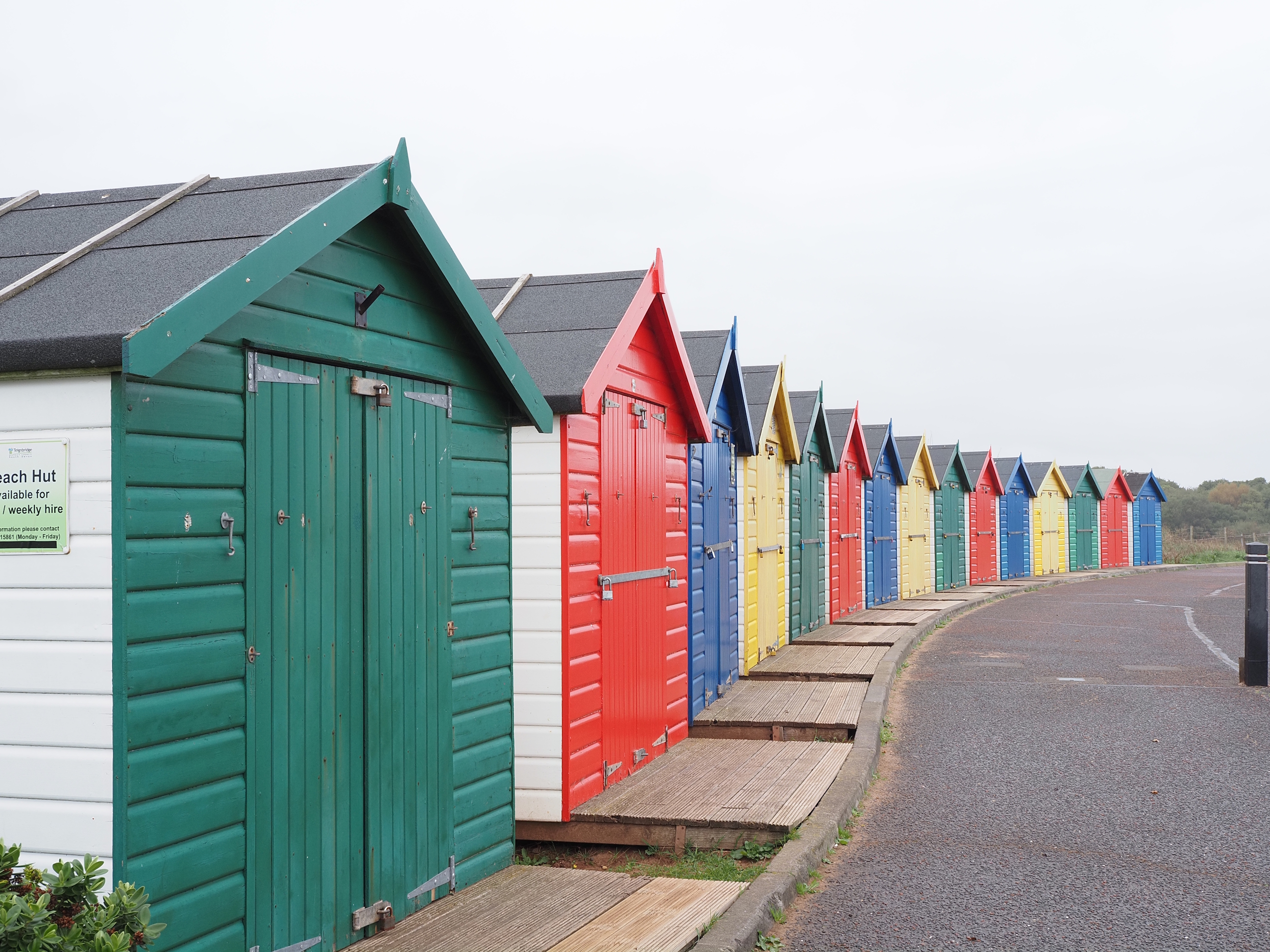
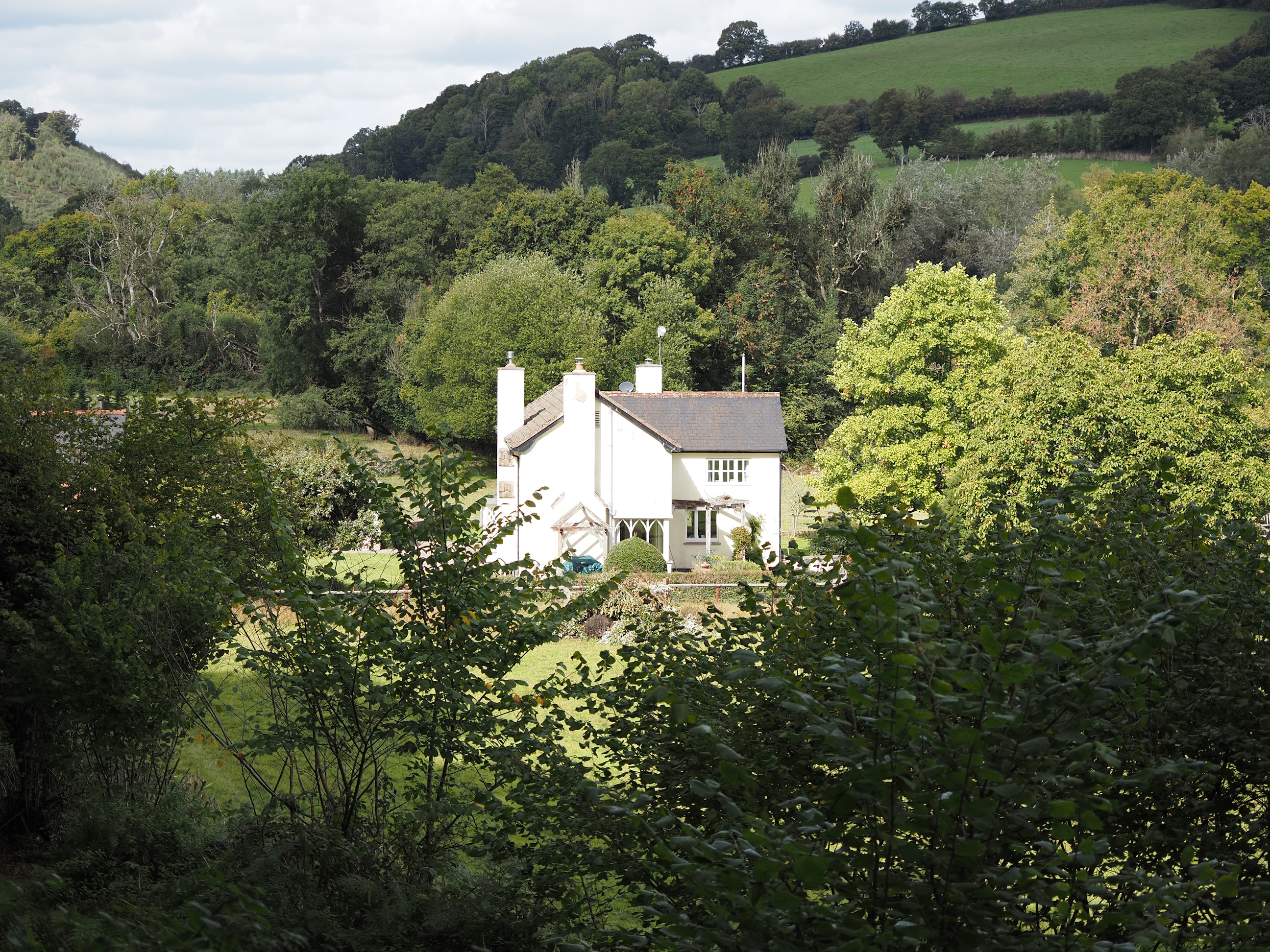
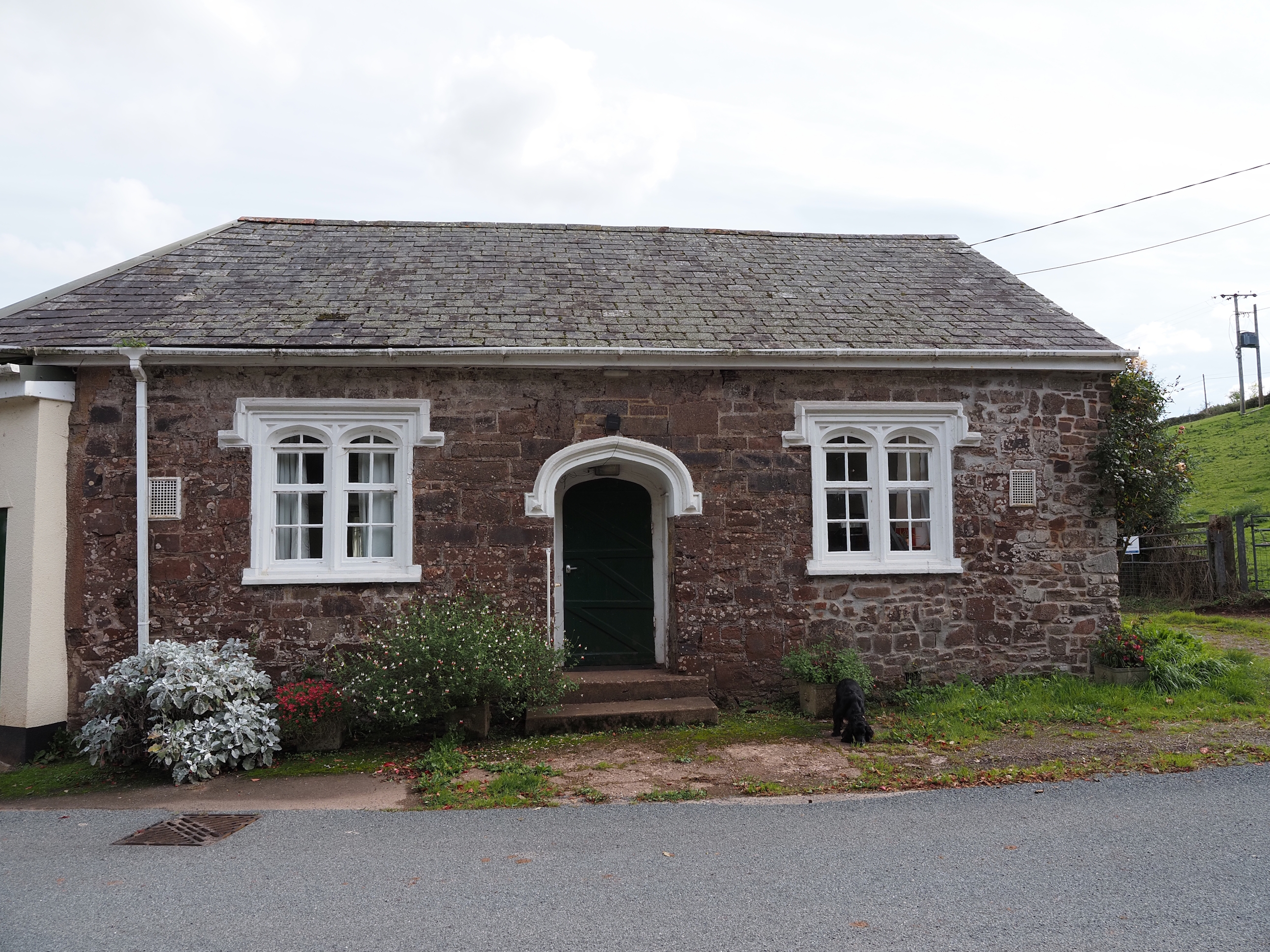
I’m awarding this “Cottage of the Day” . . .
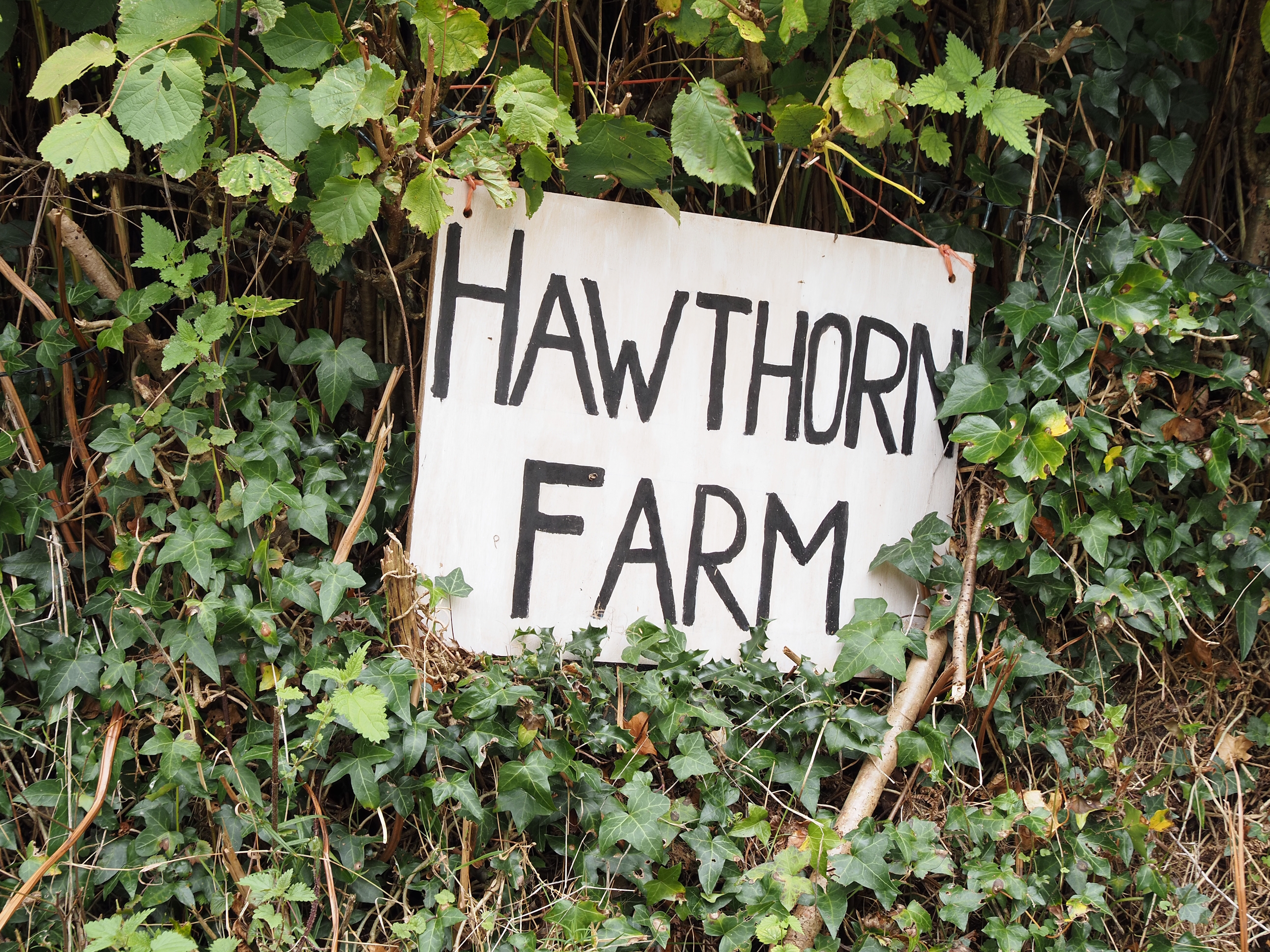
And this be “Hawthorn of the Day” . . .
Nearly back . . .
Just a little further . . .
And thus endeth this walk . . .
A really good and colourful autumn walk. Shout out to Andrew for leading us around and pointing lots of things out along the way, thank you. I’ll definitely be suggesting we go back in Spring to see all the Spring colours, buds and flowers.
See soon.
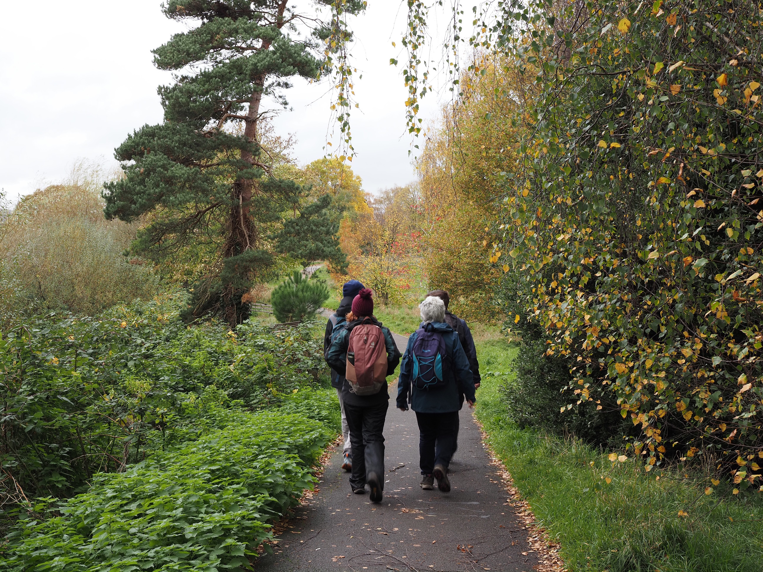
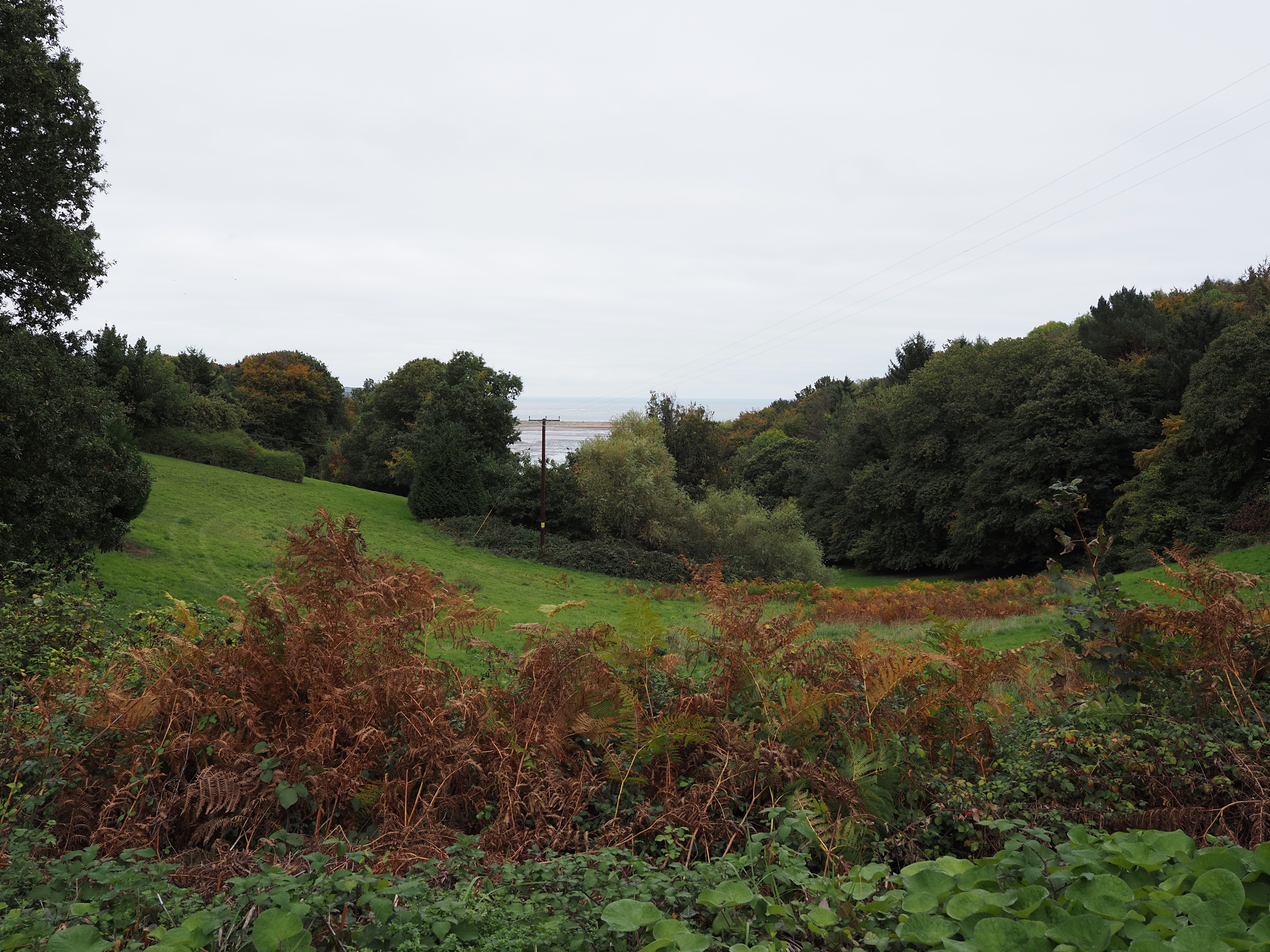
This week we had a walk around the River Exe and Exeter Ship Canal paths.
Left click on the photos and you’ll get a much bigger picture open in a new tab.
Here’s the approximate route we took. I forgot to turn my Garmin on so had to make it up as best i could plotting it out at home . . .
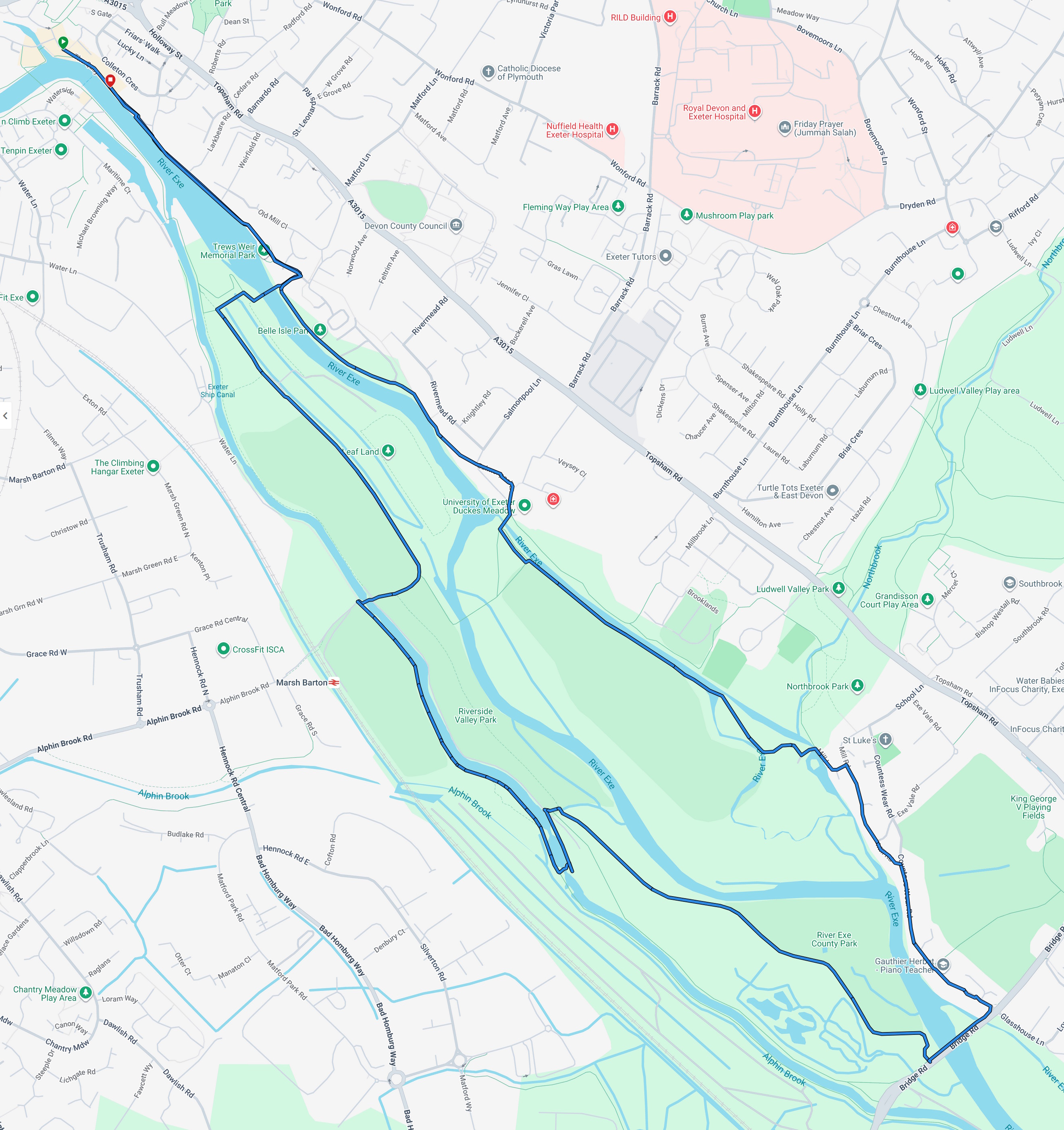
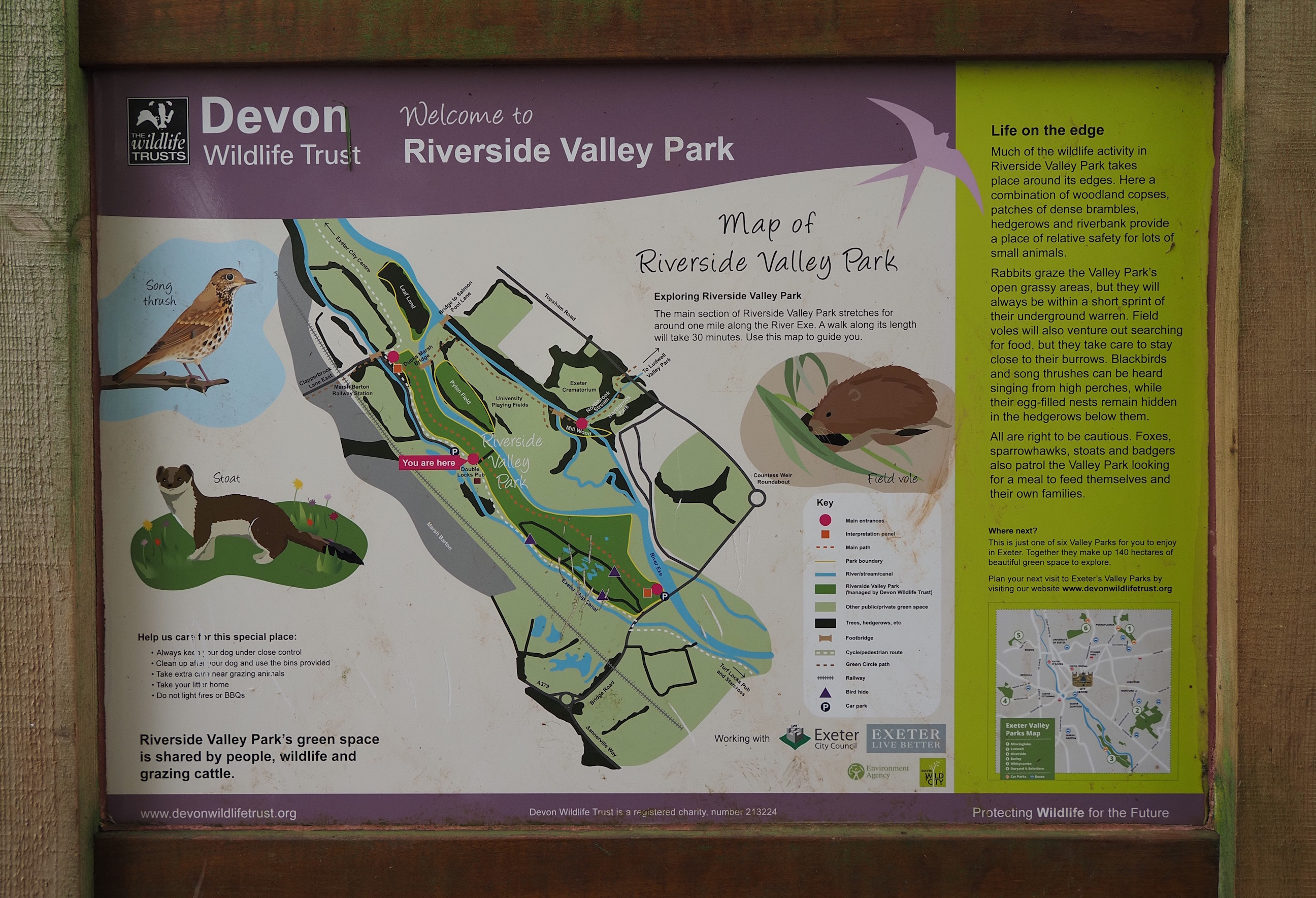
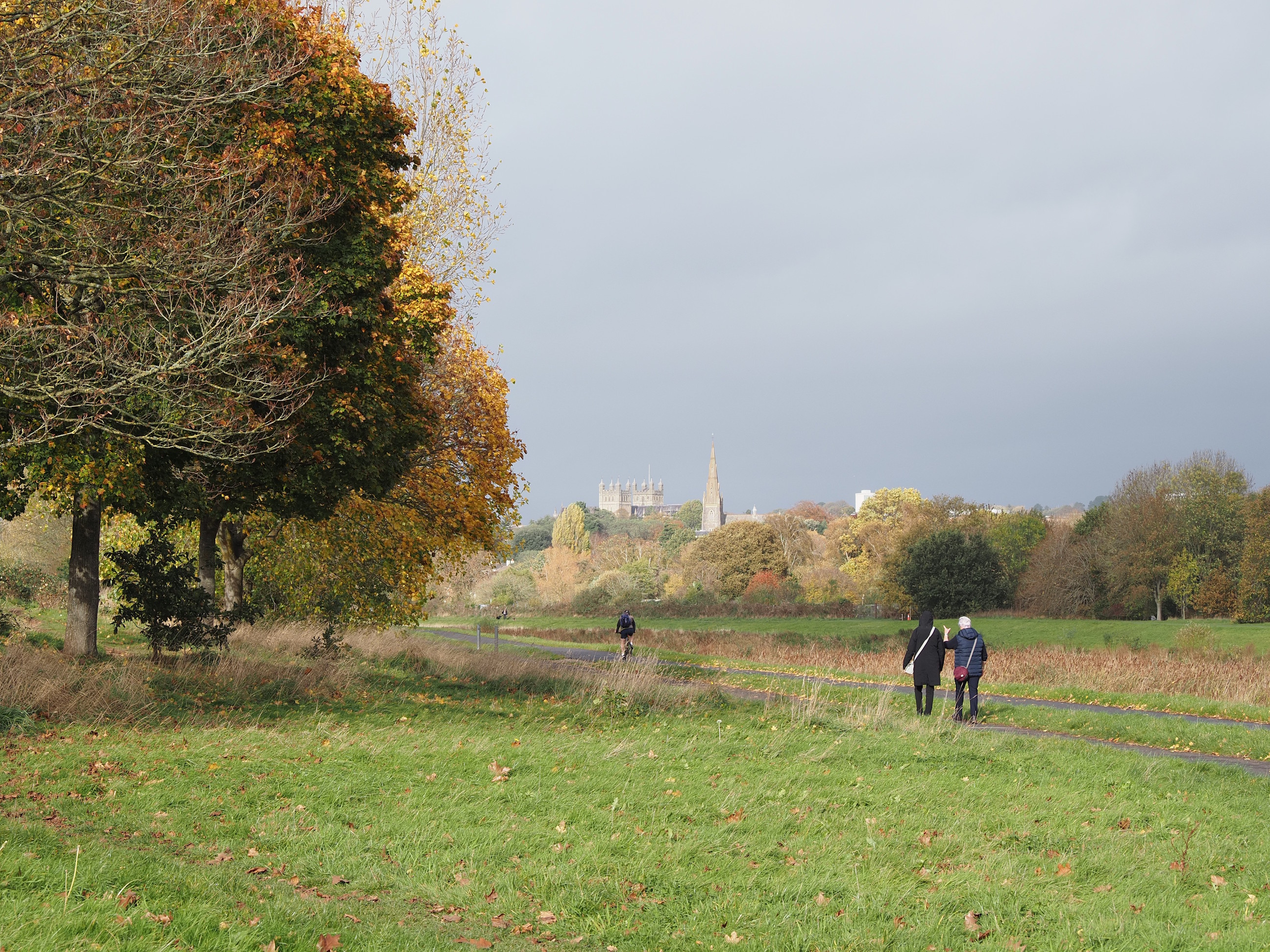
Most of the area we’ll be walking through today is Riverside Valley Park, which is run by Devon Wildlife Trust . . .
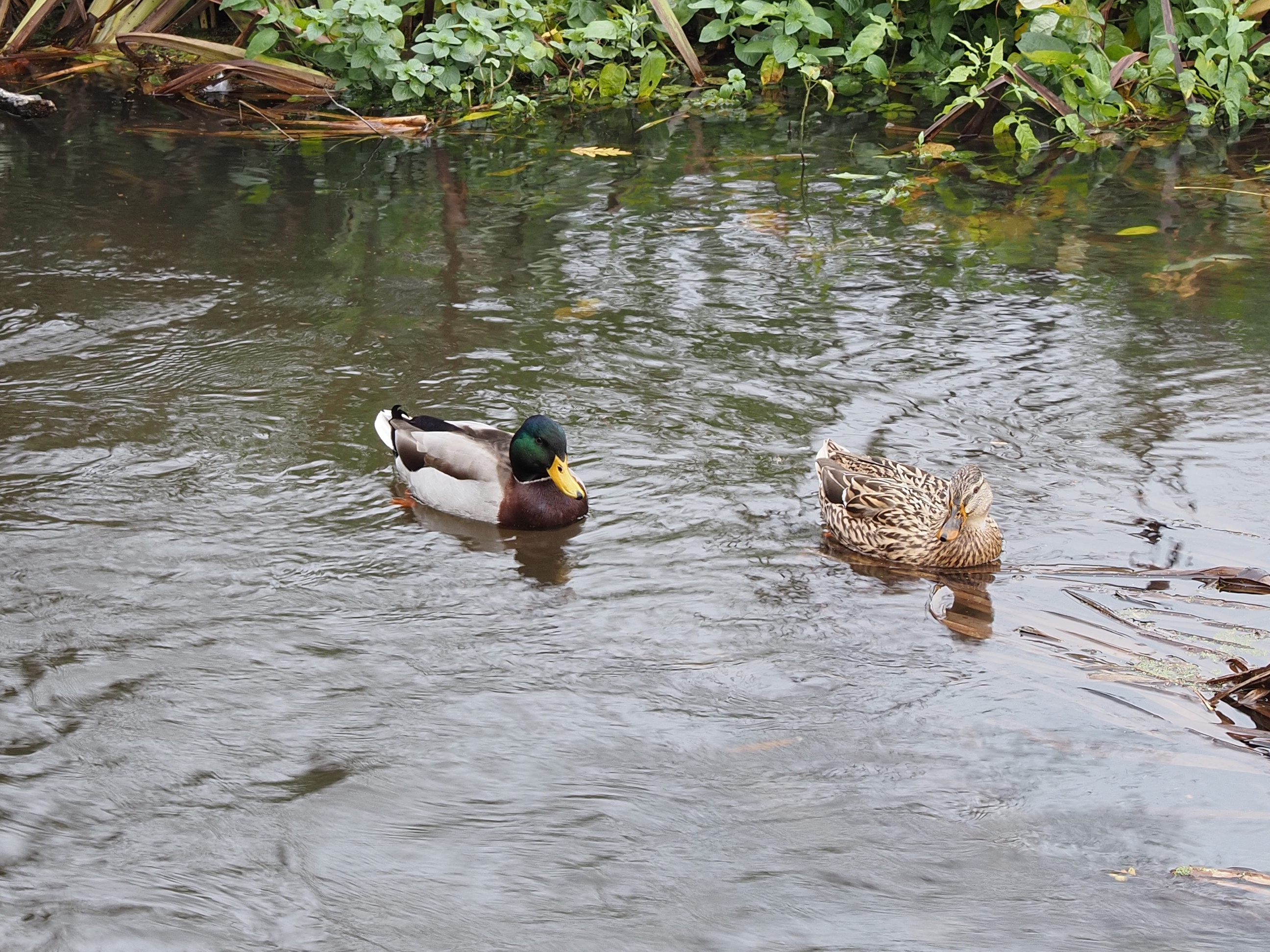
We had a lovely couple of quackers to send us on our way . . .
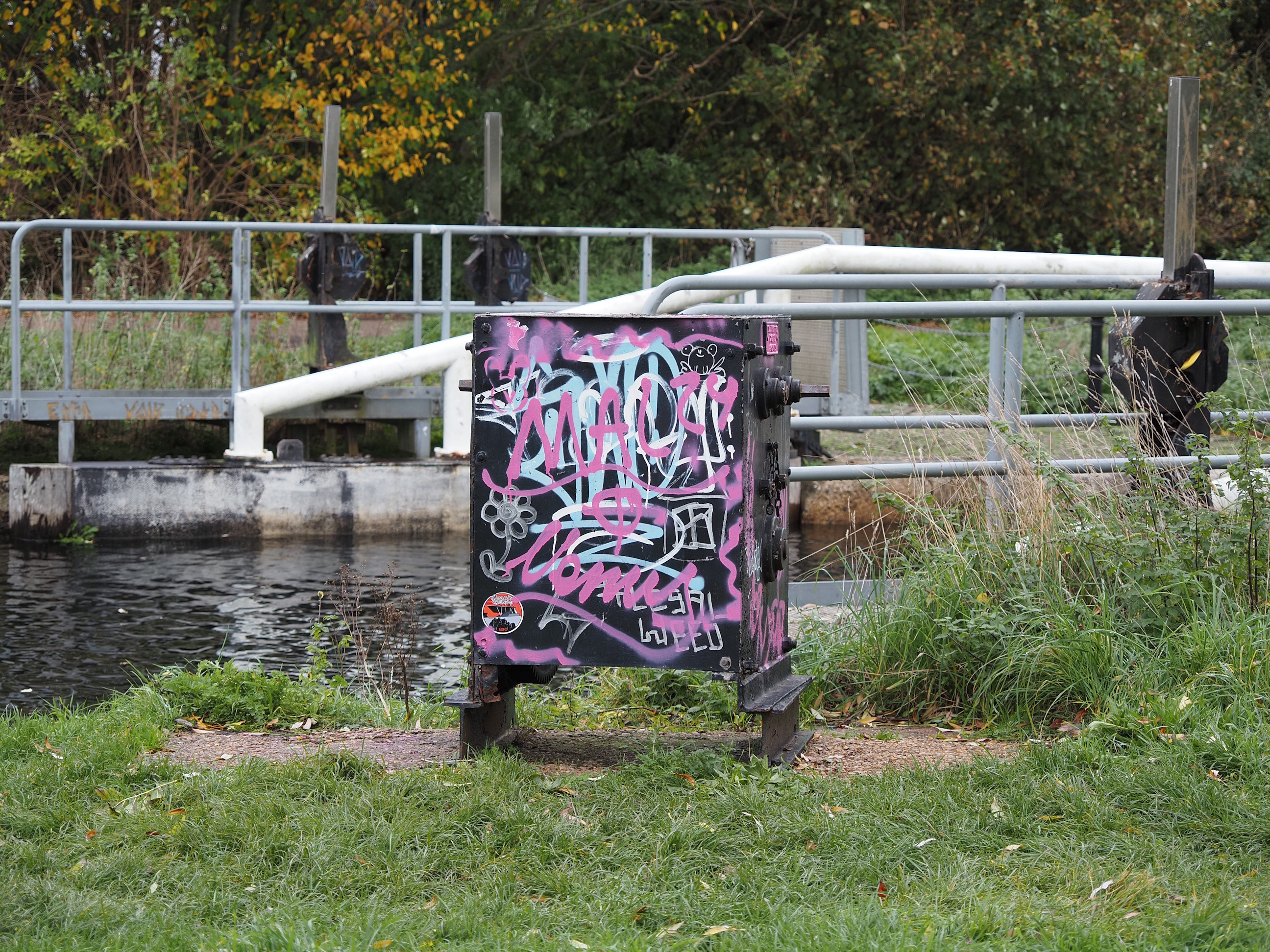
Plenty of water going over the wear with some nice graffiti to cheer the place up . . .
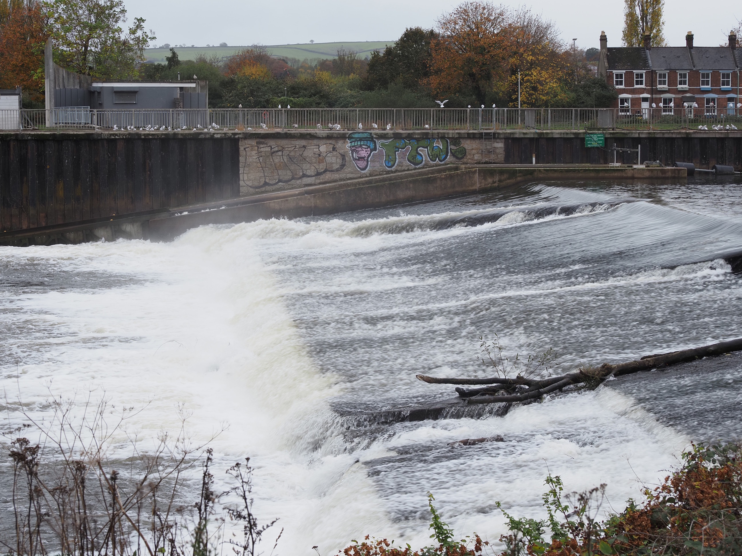
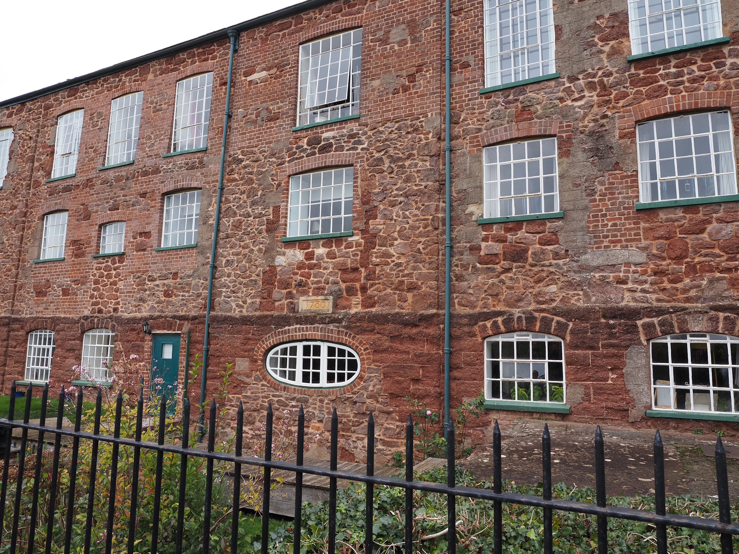
I don’t think new buildings will look this good in 245 years . . .
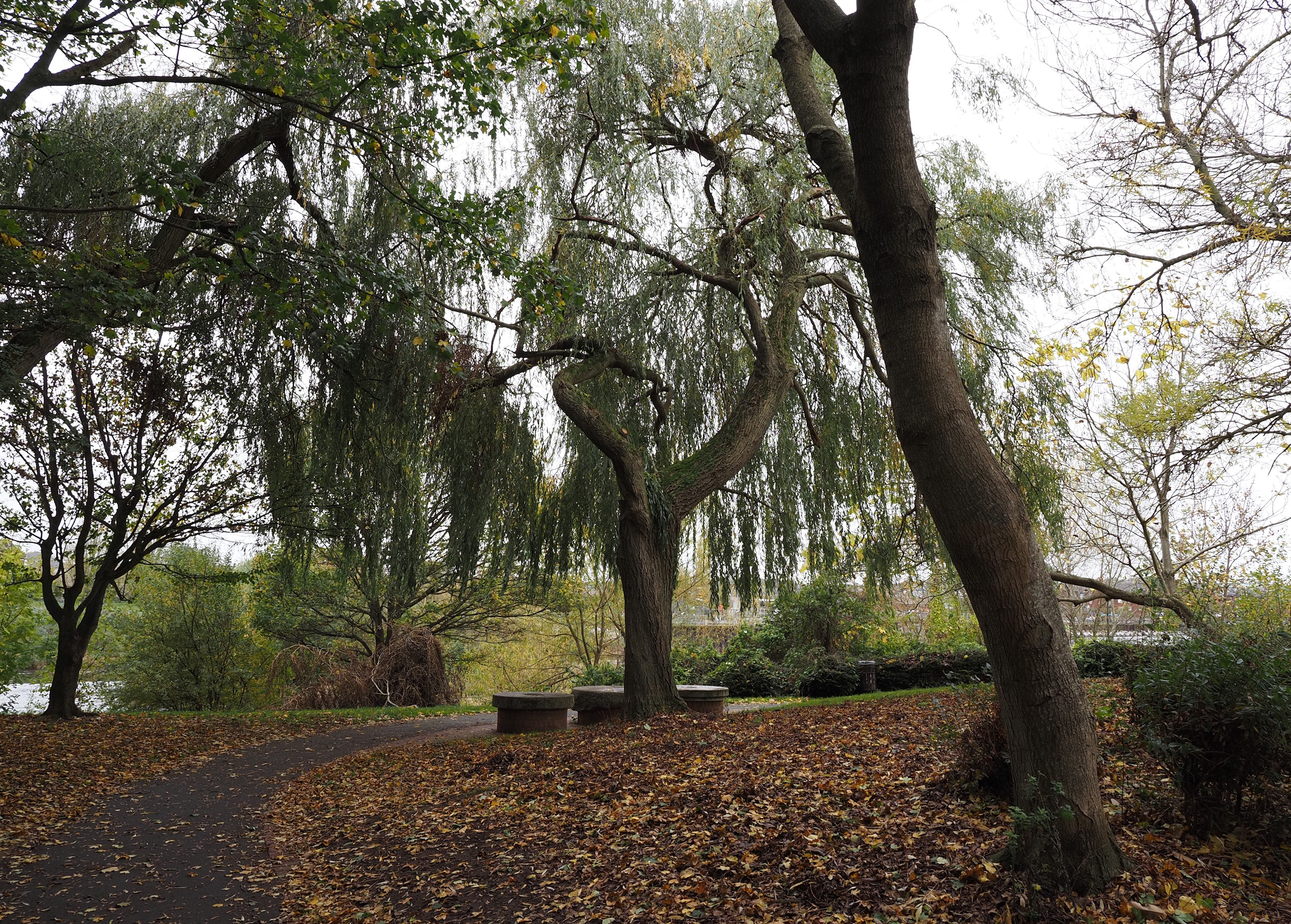
Trews Weir Memorial Park . . .
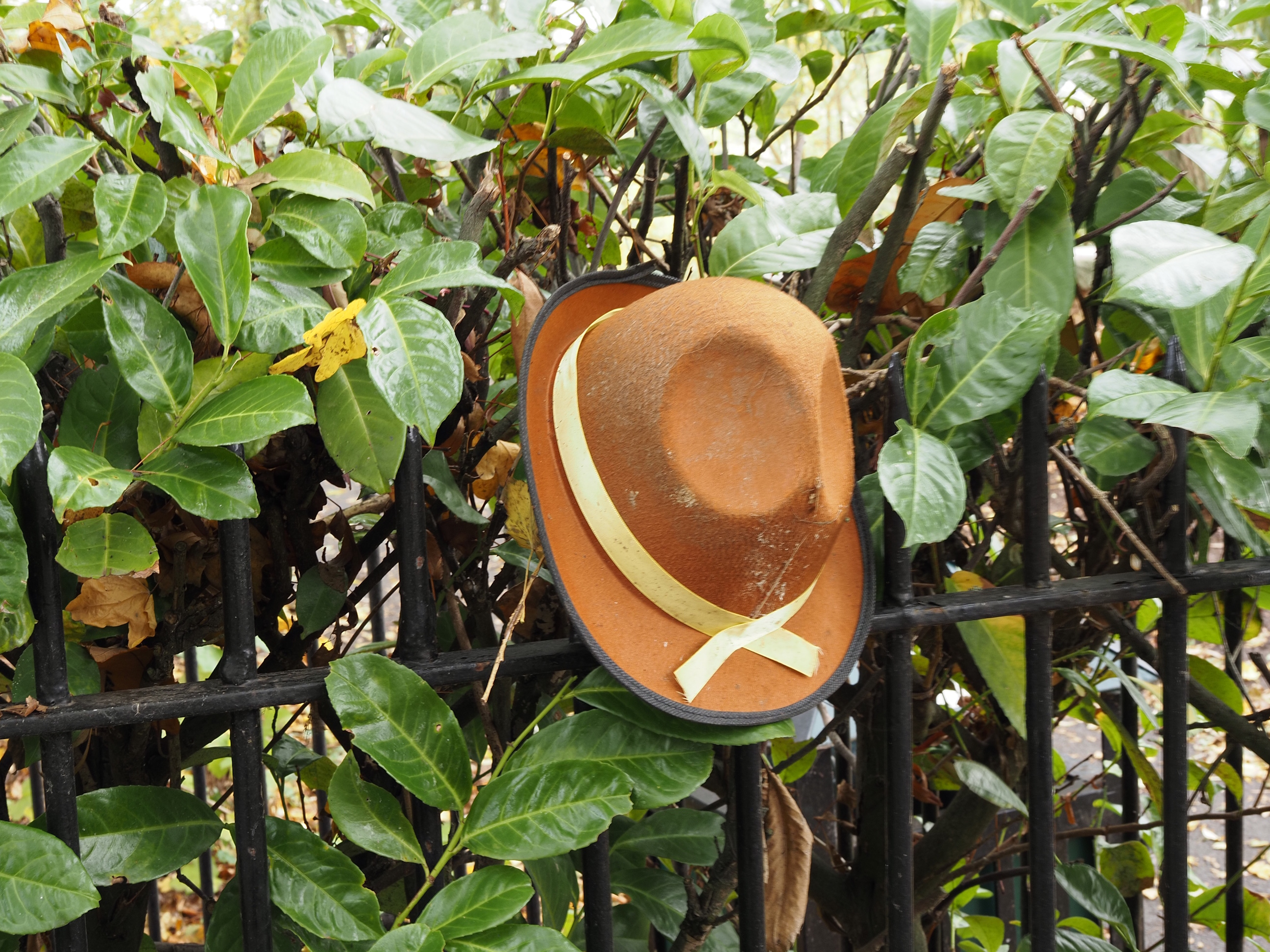
The first random hat of the day . . .
The trees are still mostly hanging onto their green along this bit of the Exe . . .
A lovely view of the cathedral towers with St Leonard’s Church tower in front . . .
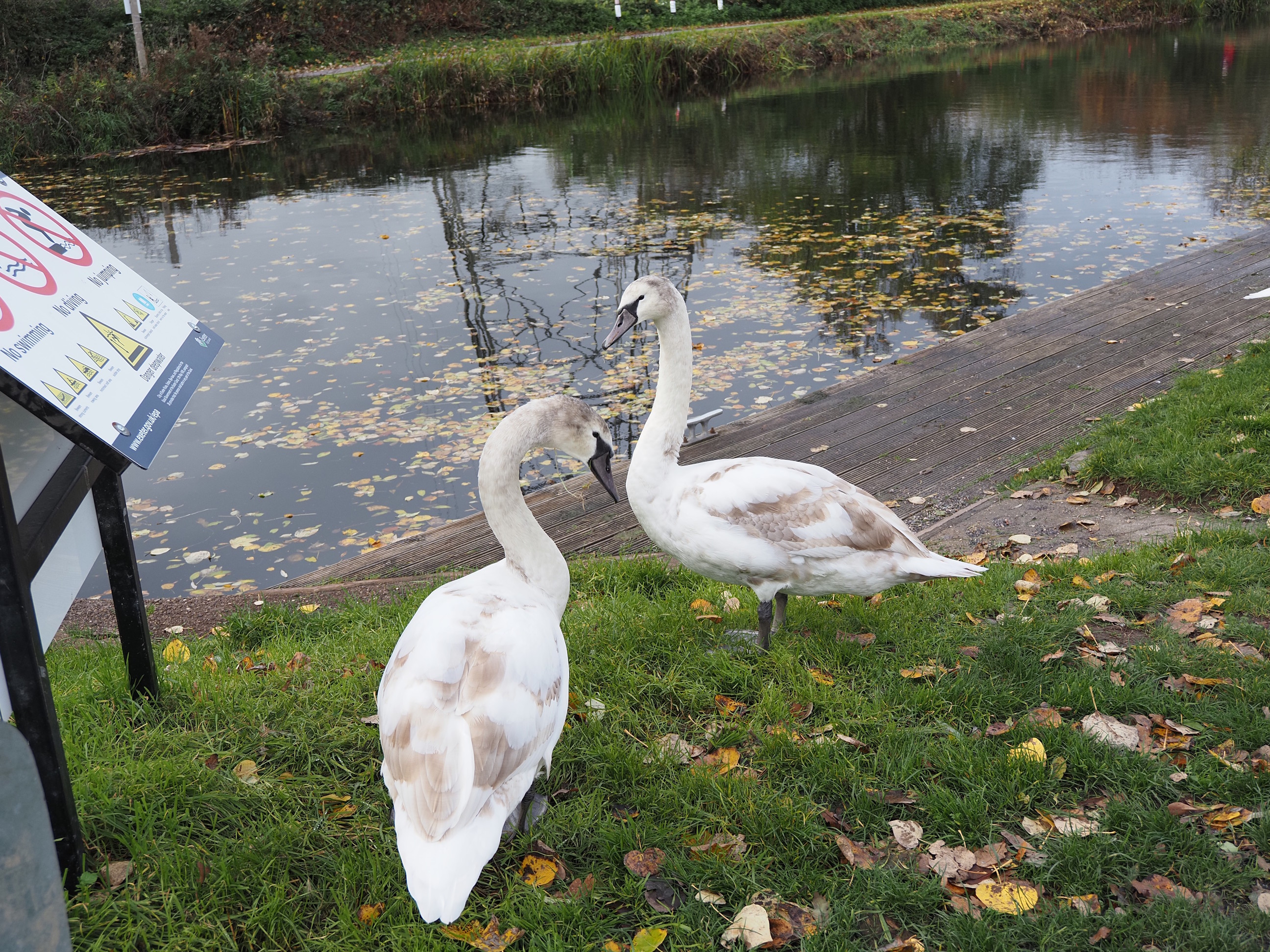
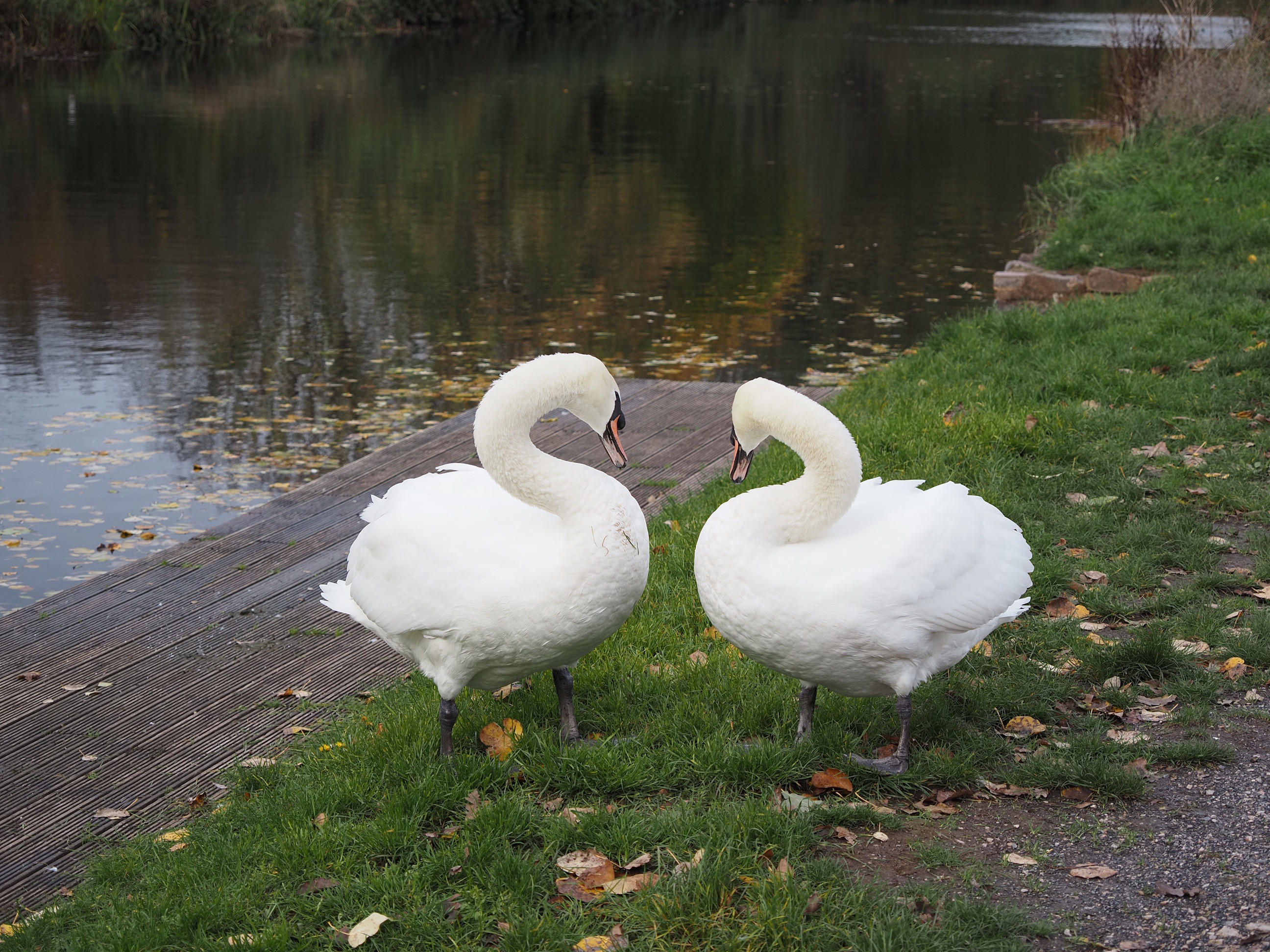
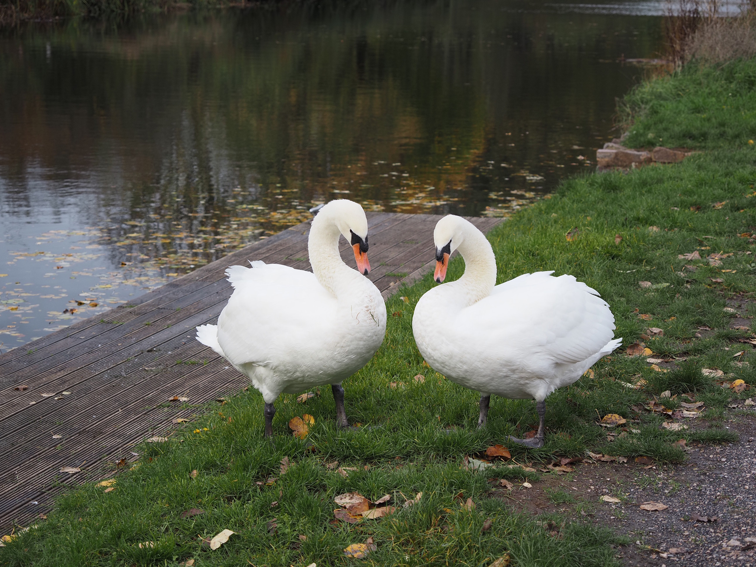
And a couple of cygnets up by the canal, there was a third one but it didn’t want to be in the photo . . .
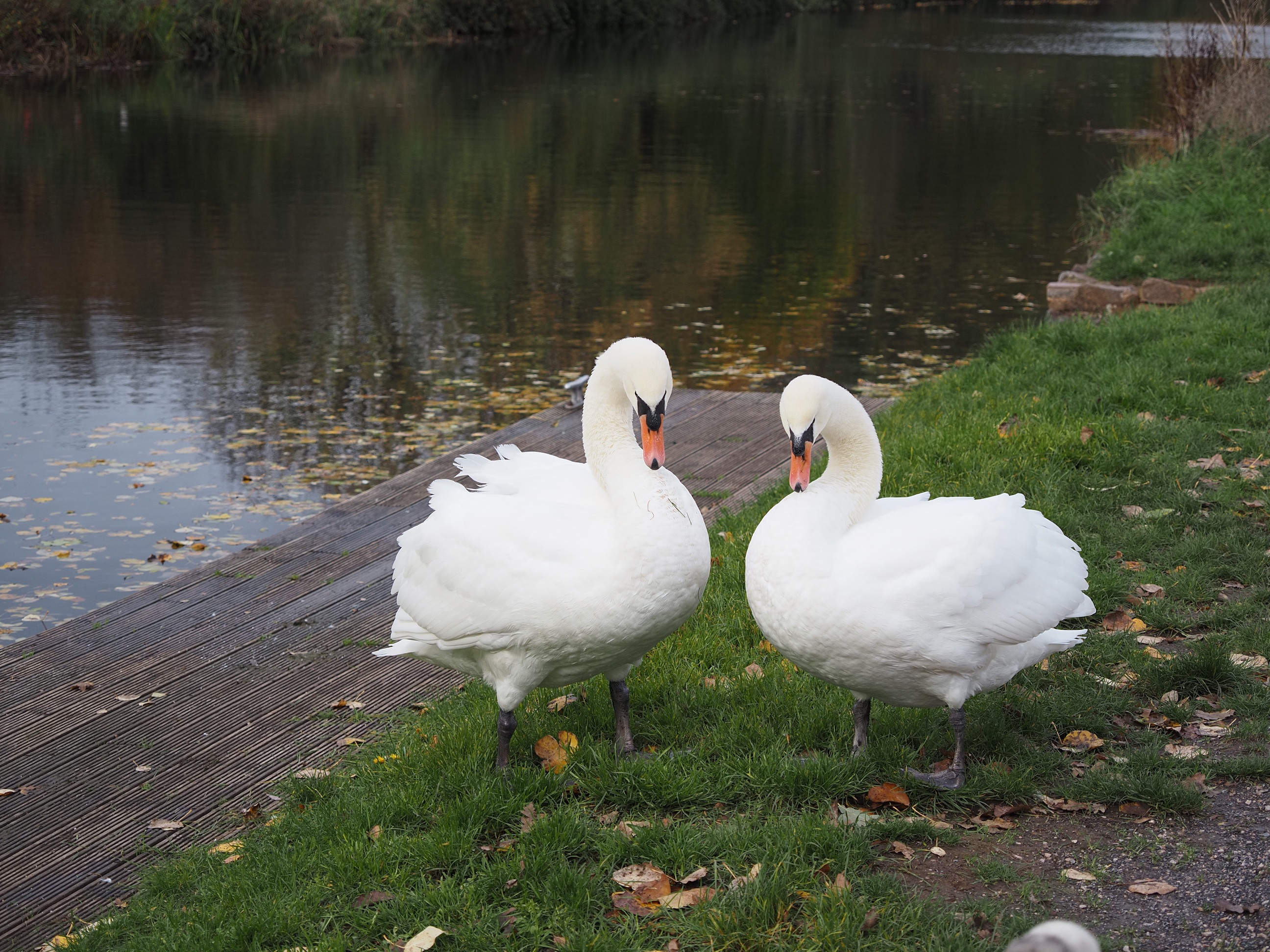
Mummy and Daddy decided to show of and do some synchronised head waving for the camera . . .
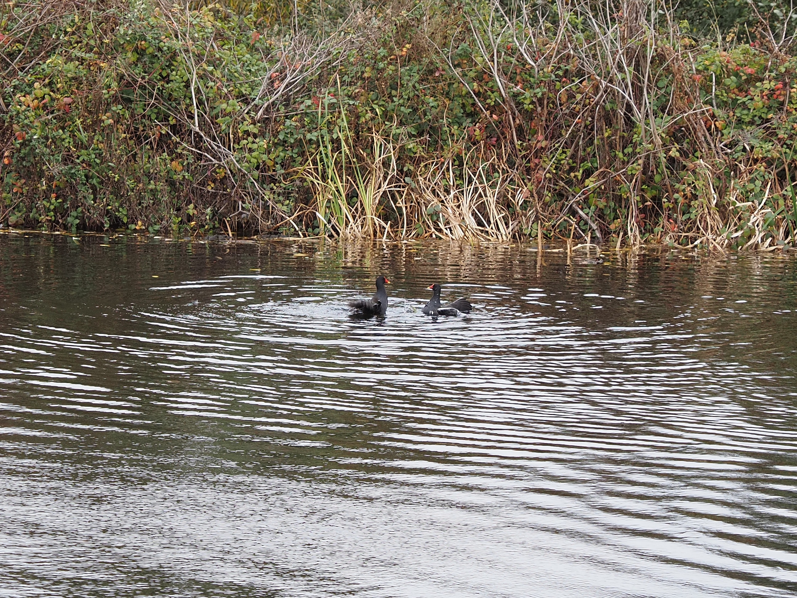
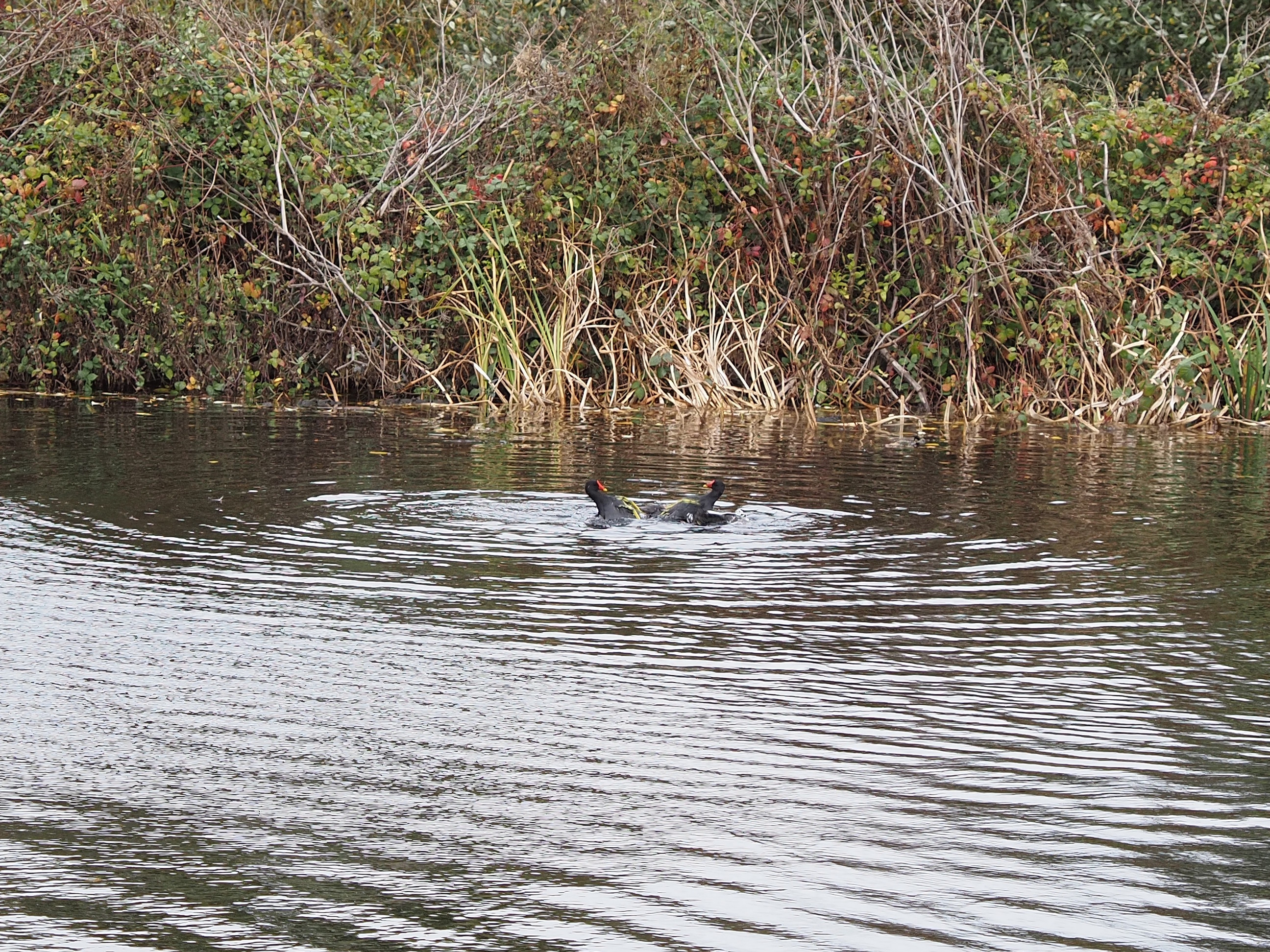
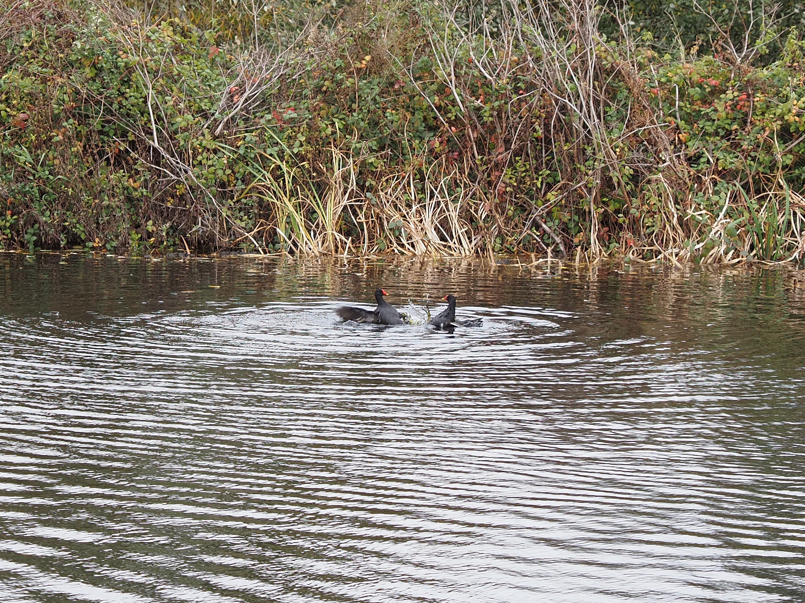
Not to be outdone by a couple of head waving swans, the moorhens chose to really show off with some synchronised swimming . . .
It’s almost as bad as Exmouth graffiti, almost . . .
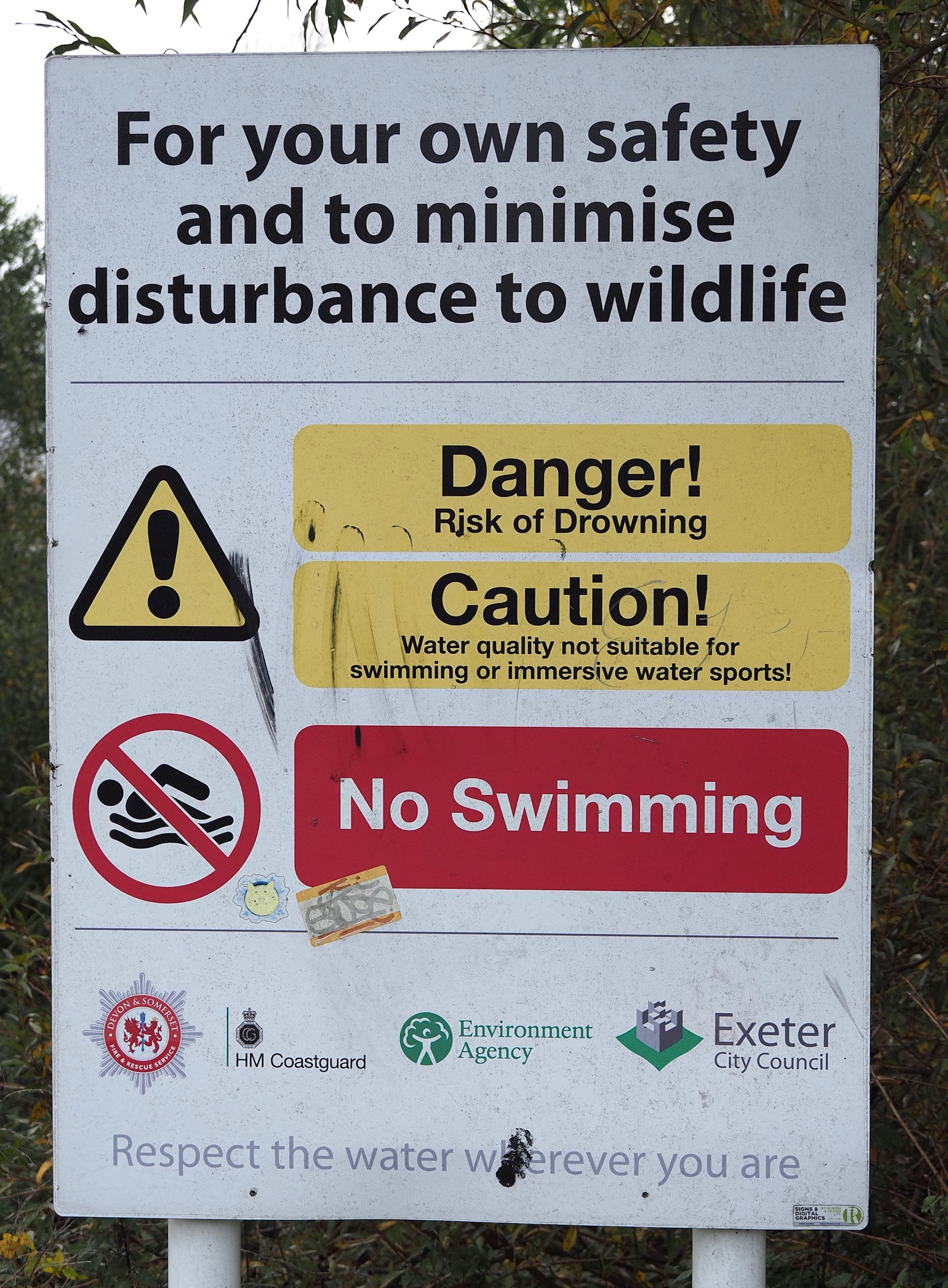
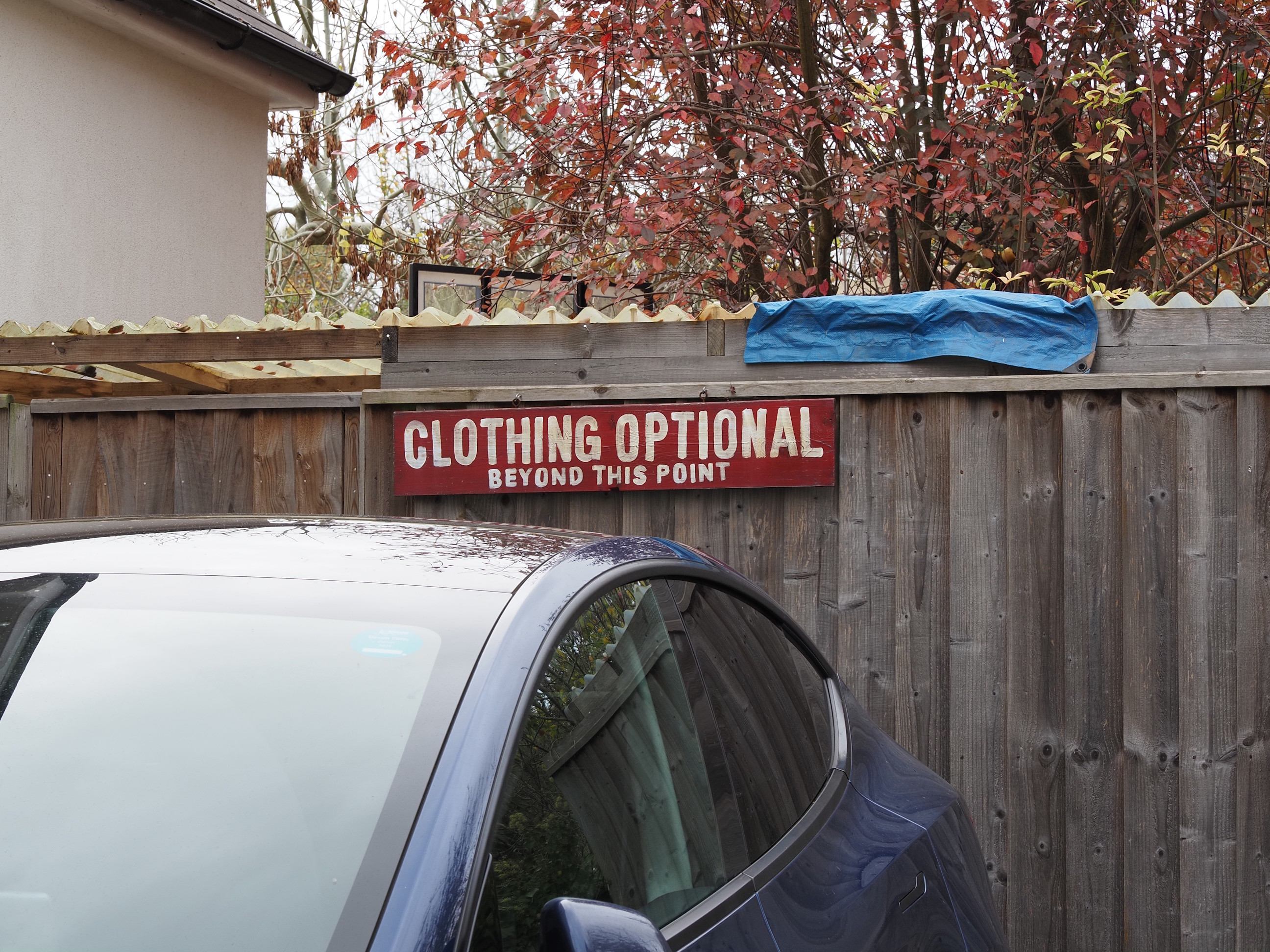
Just in case anyone was tempted . . .
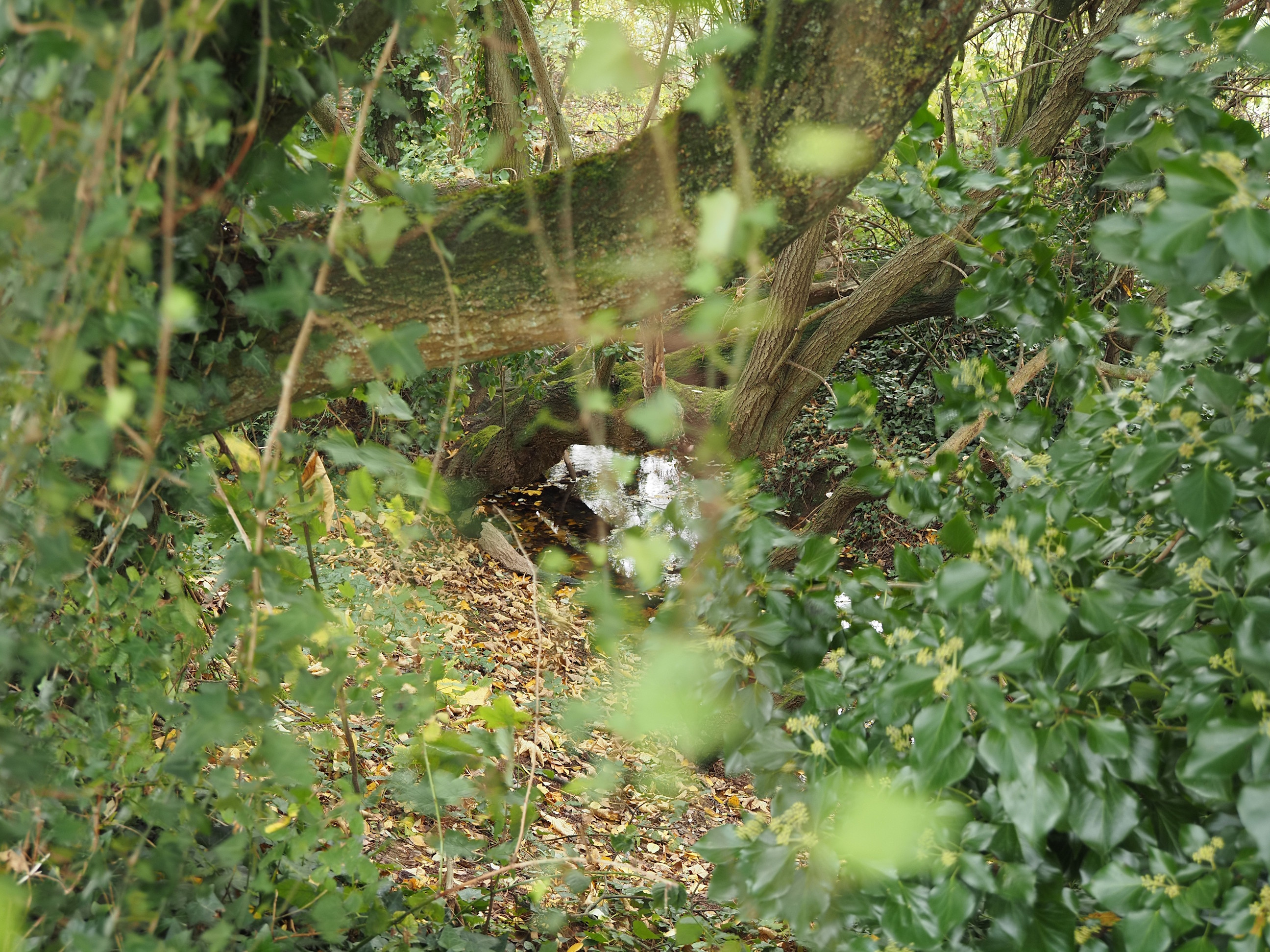
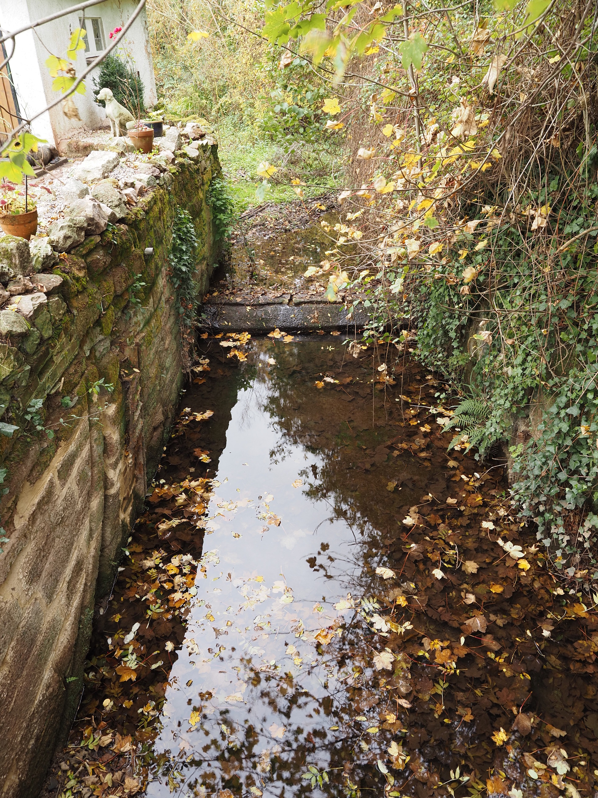
Alphin Brook hiding amongst the trees . . .
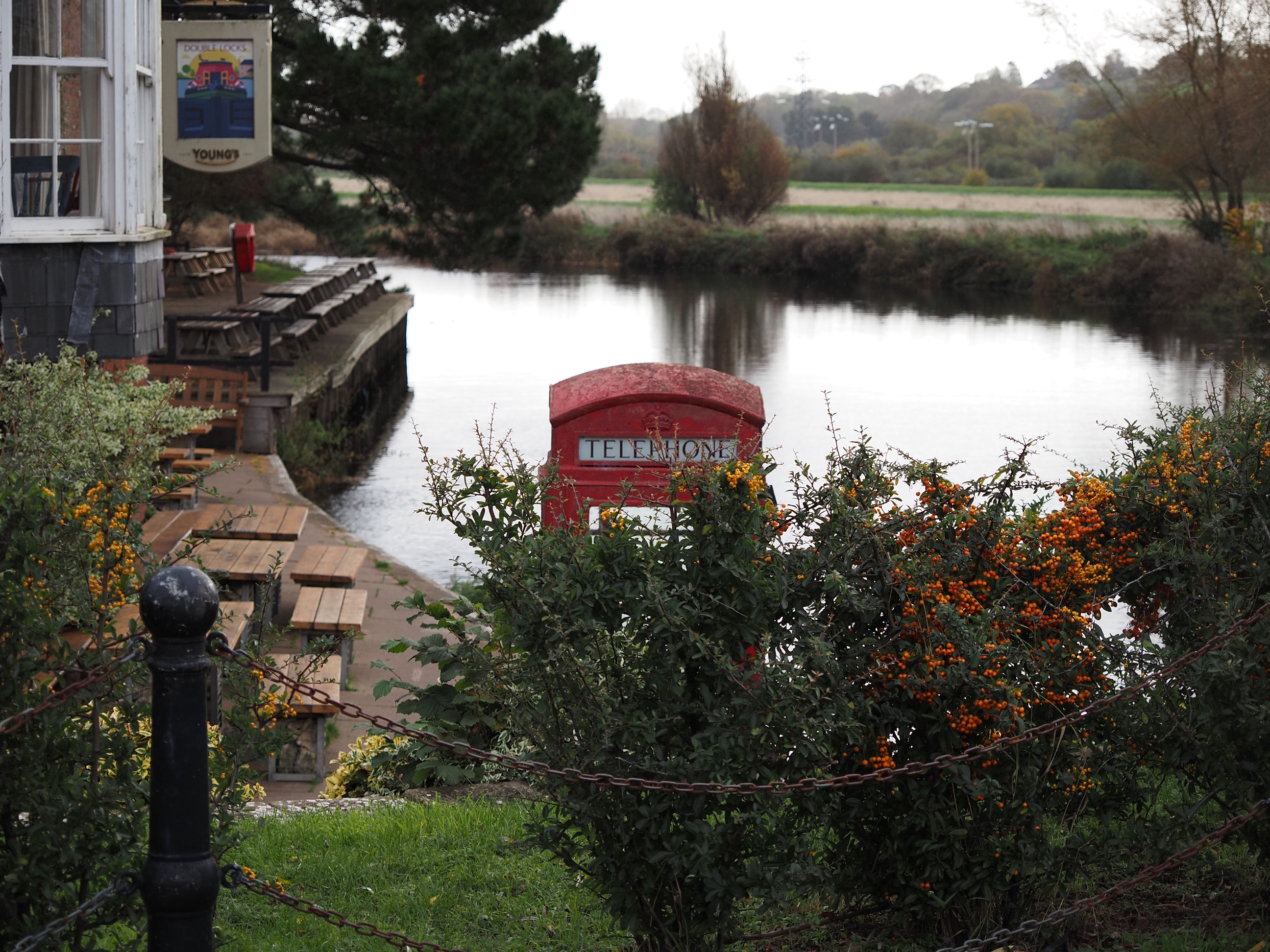
Today’s lunch break was at this house of refreshment . . .
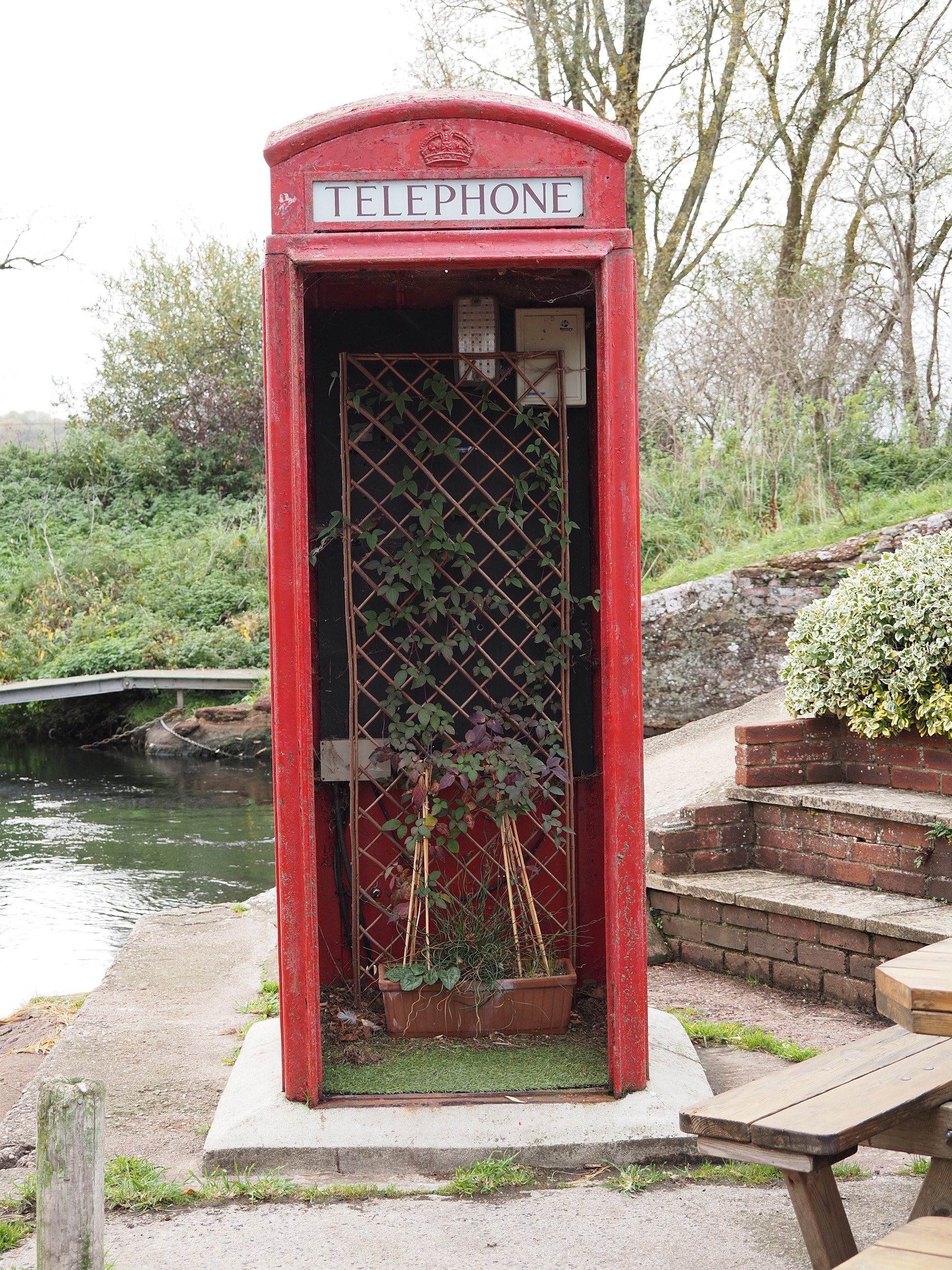
An old phone box poking above the hedge . . .
Turned out to be a flower arrangement. I’ve seen these converted into many things, usually village book banks, and other really useful things, even a tropical fish tank (amazing), this one looks the saddest so far . . .
Nice to see they made a bit more effort on the Autumnal wreath for the door: pretty . . .
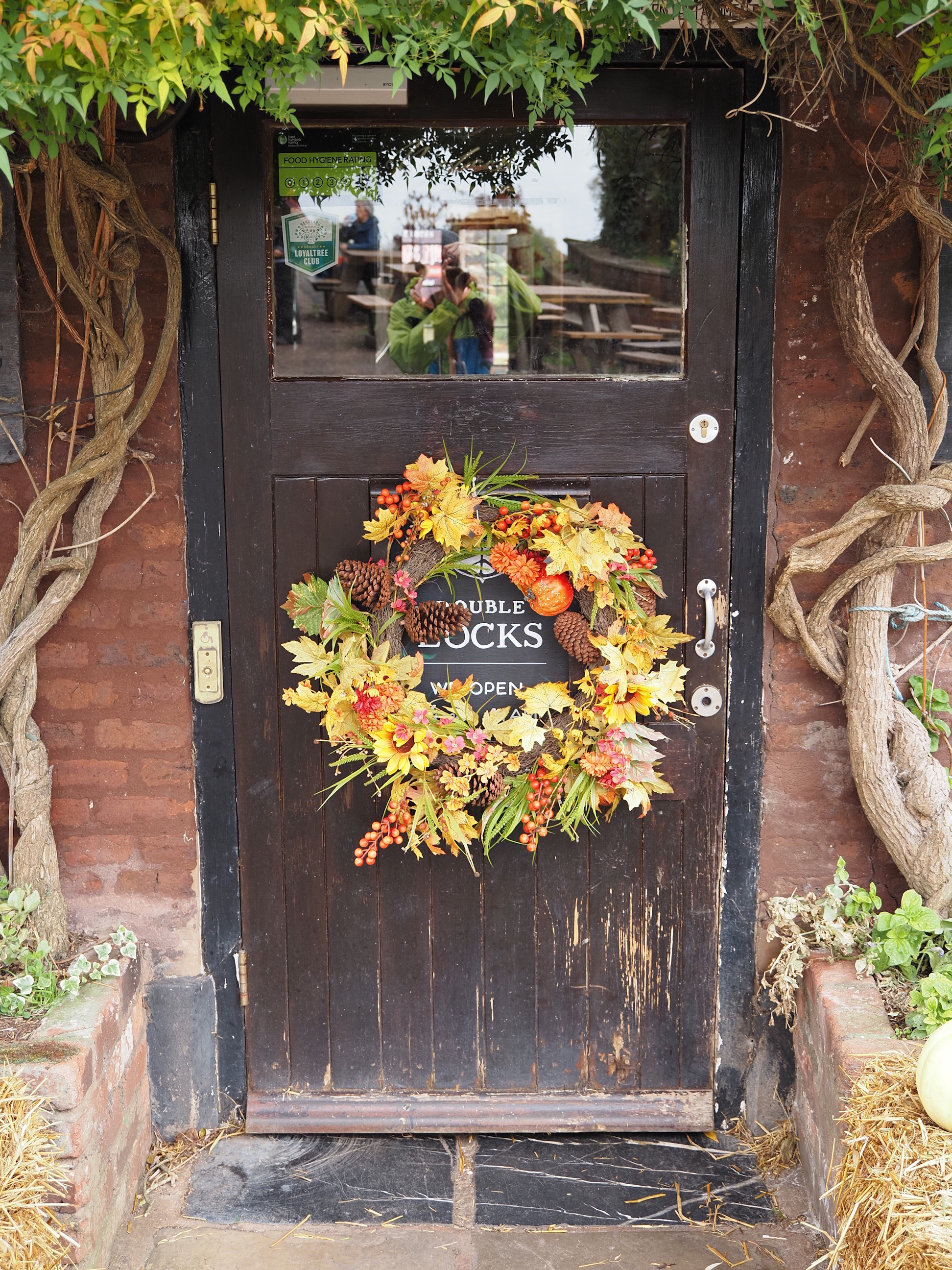
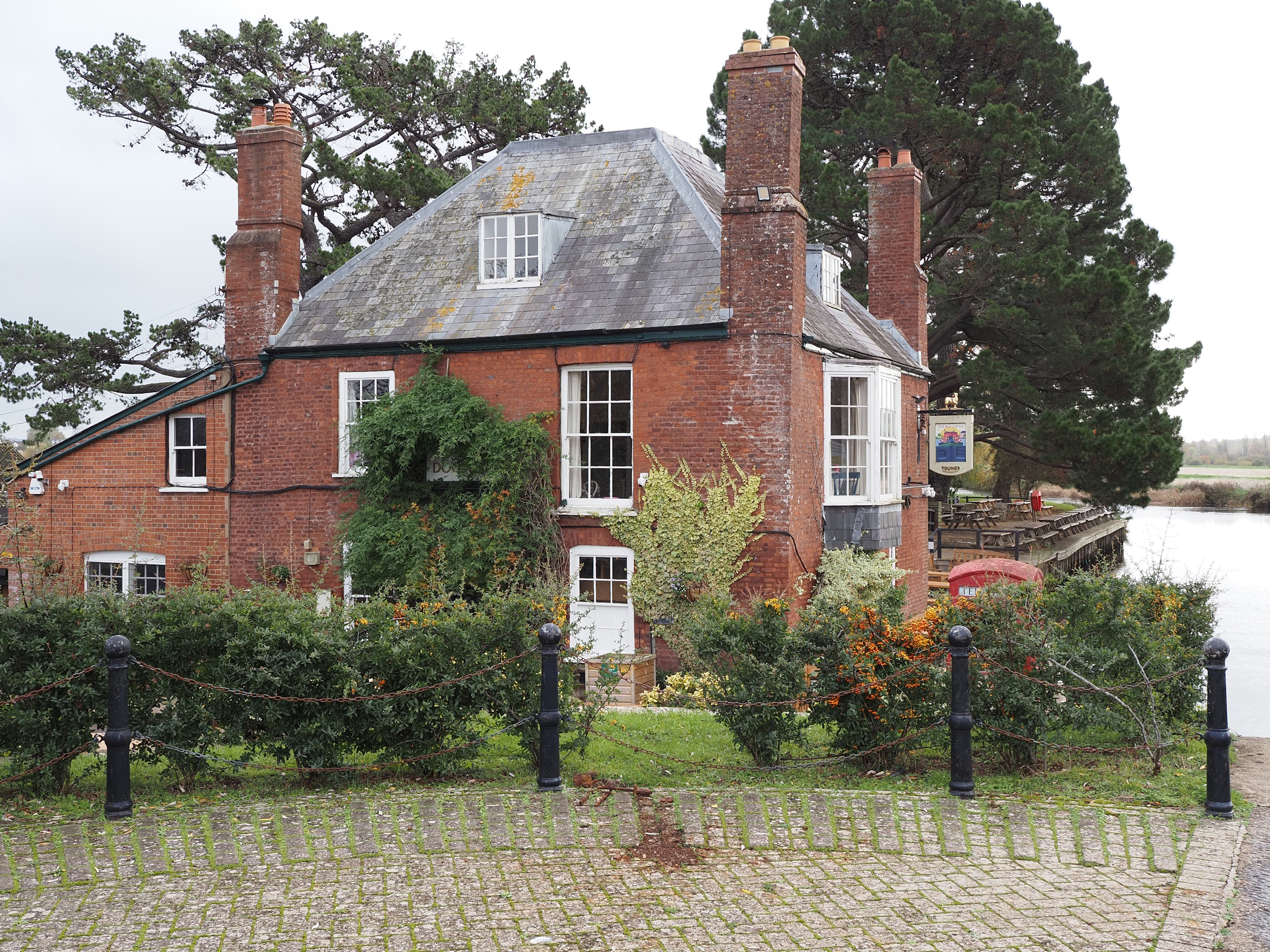
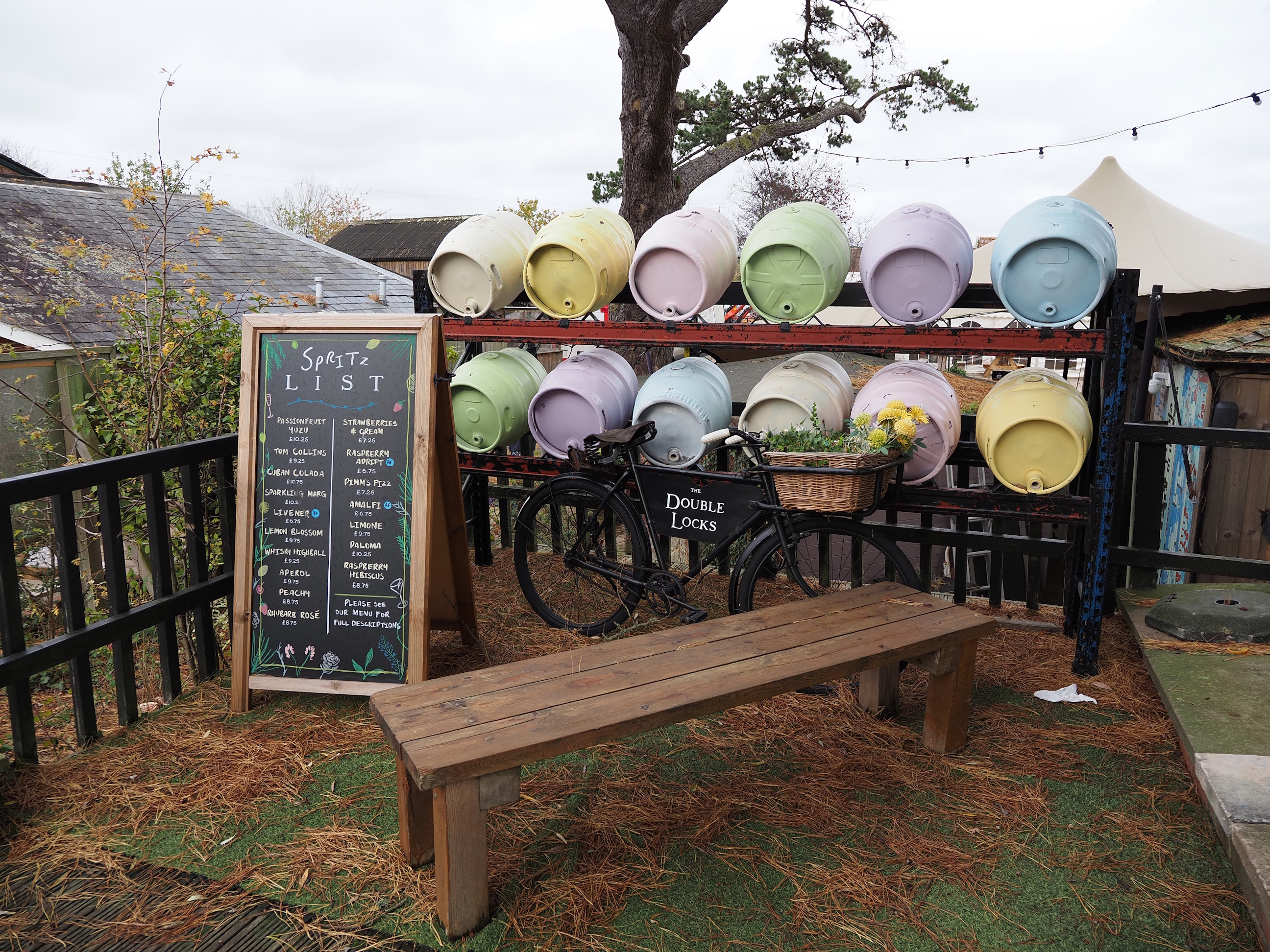
Yes, it’s the Double Locks . . .
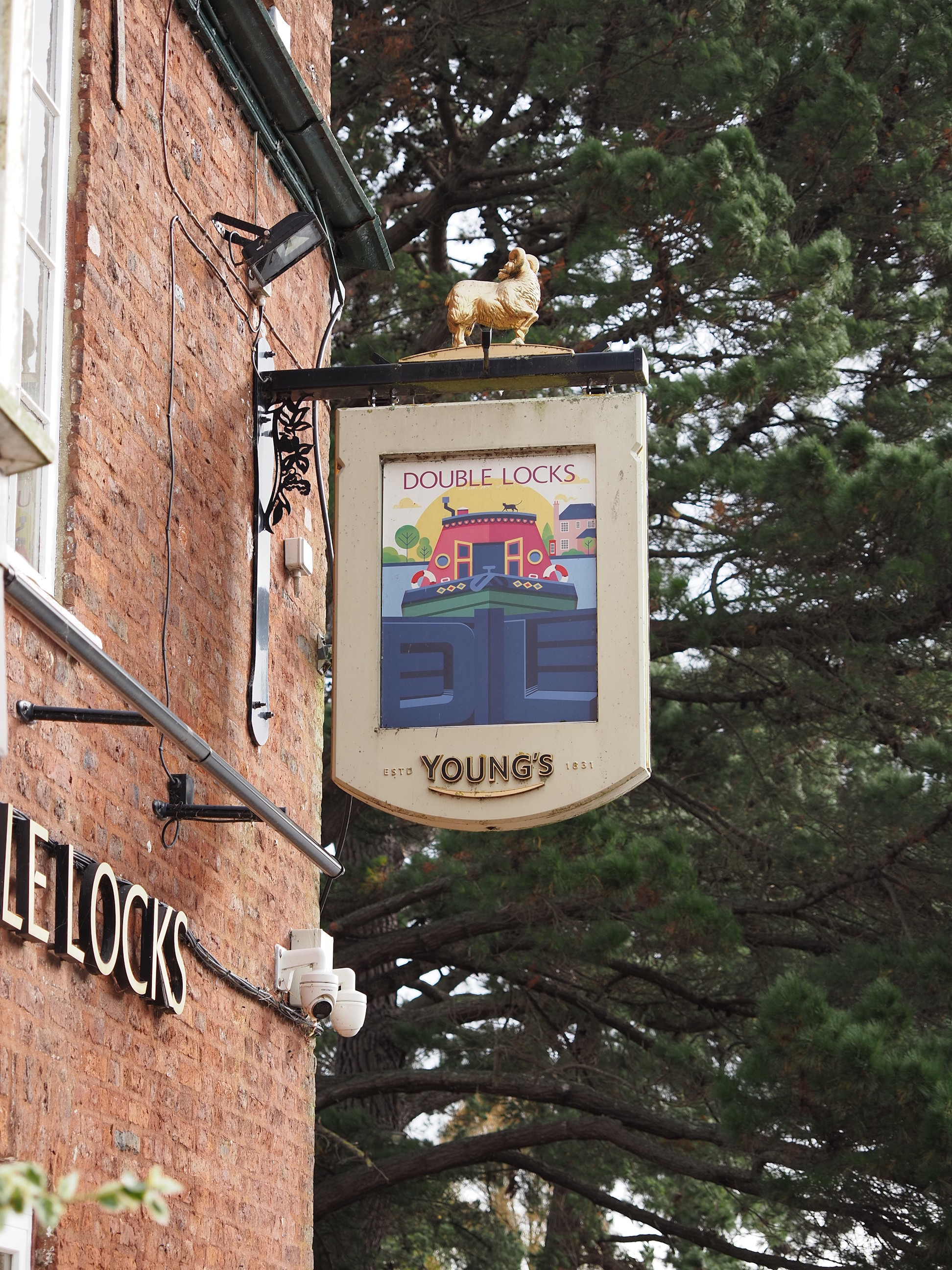
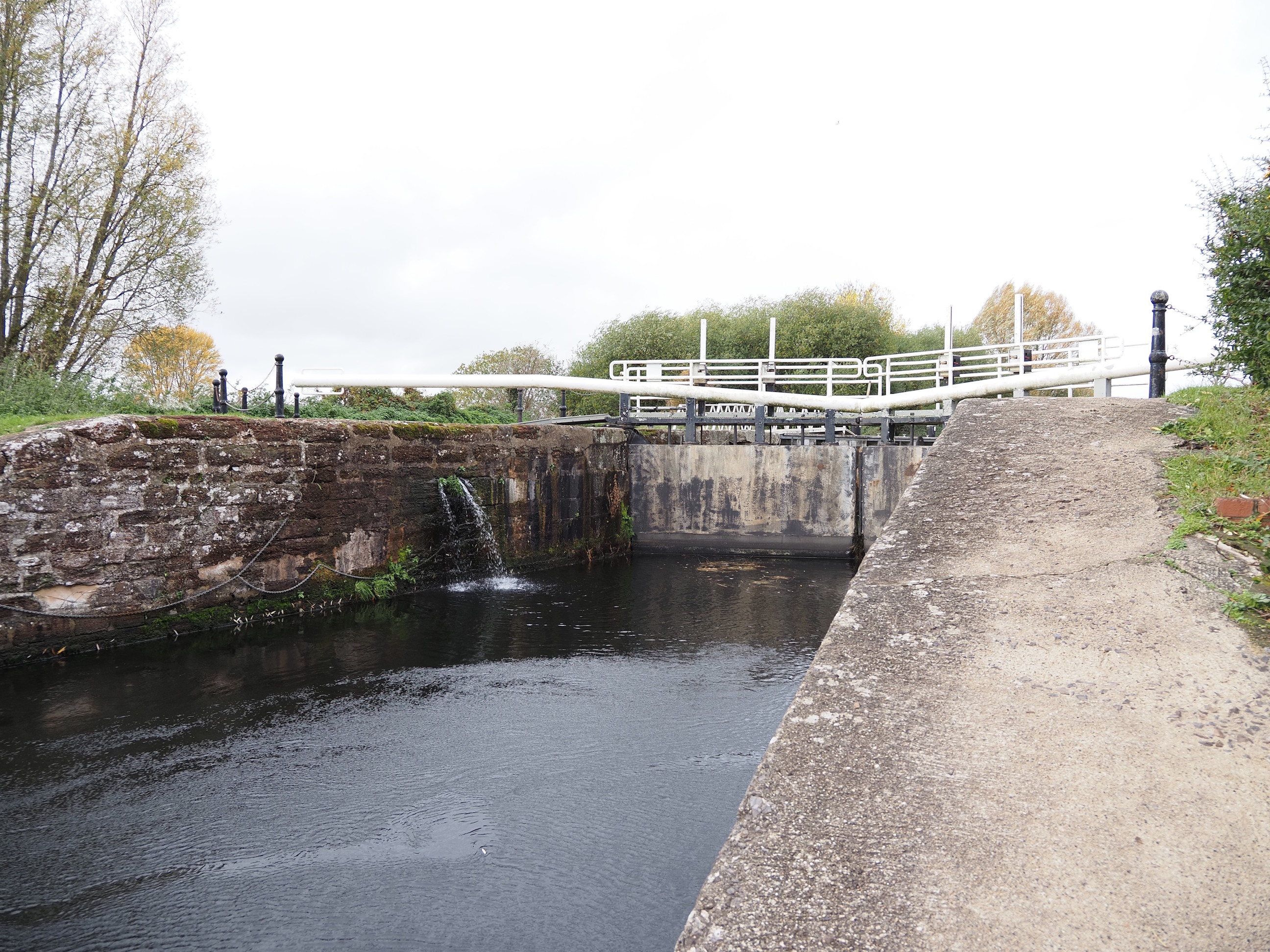
Due to it being next to the double locks on the Exeter Ship Canal . . .
To the picnic area with our own packed lunches: naughty us . . .
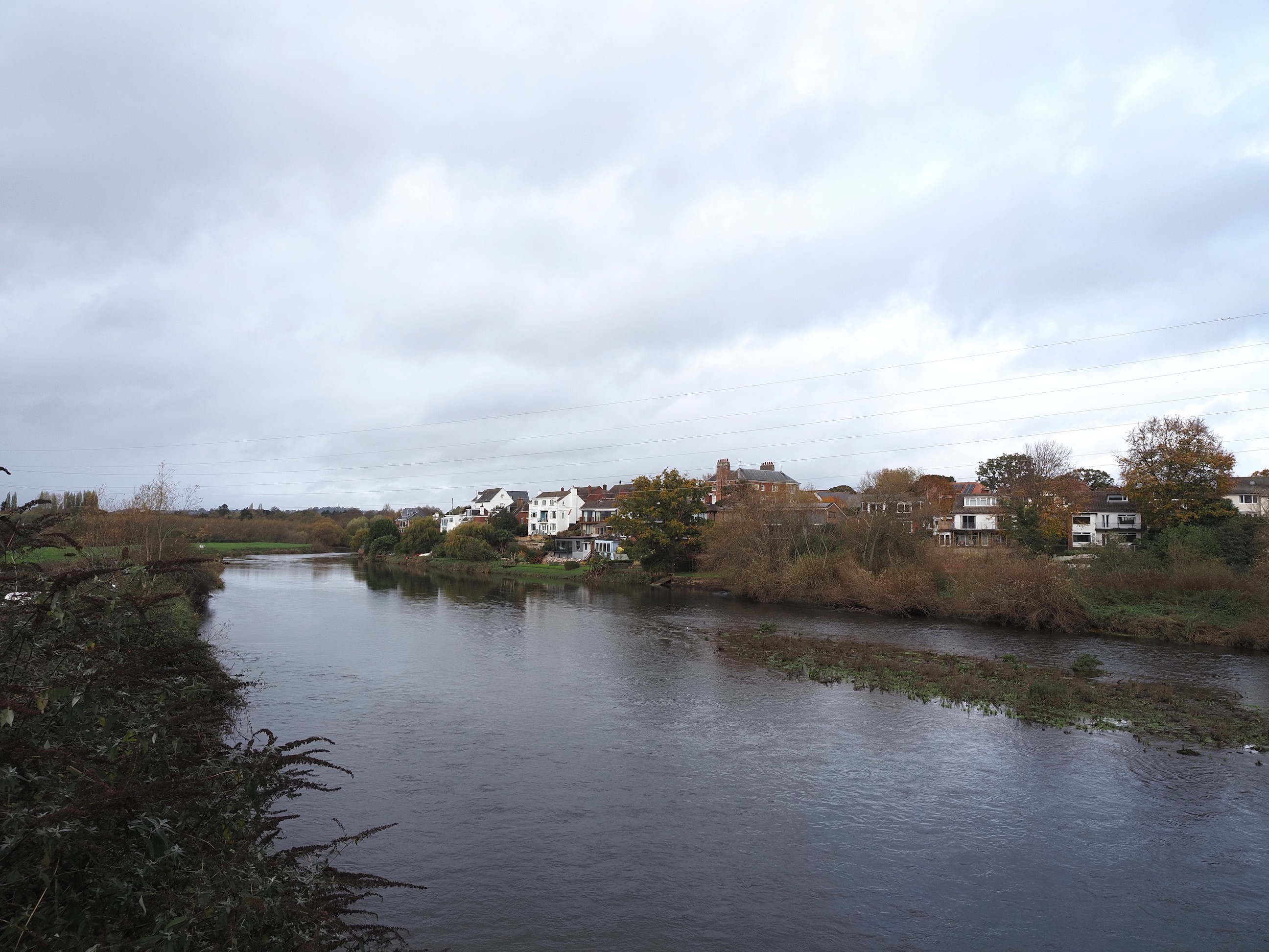
After lunch we kept walking South to Bridge Road to cross over to the other side of the Exe for the walk back . . .
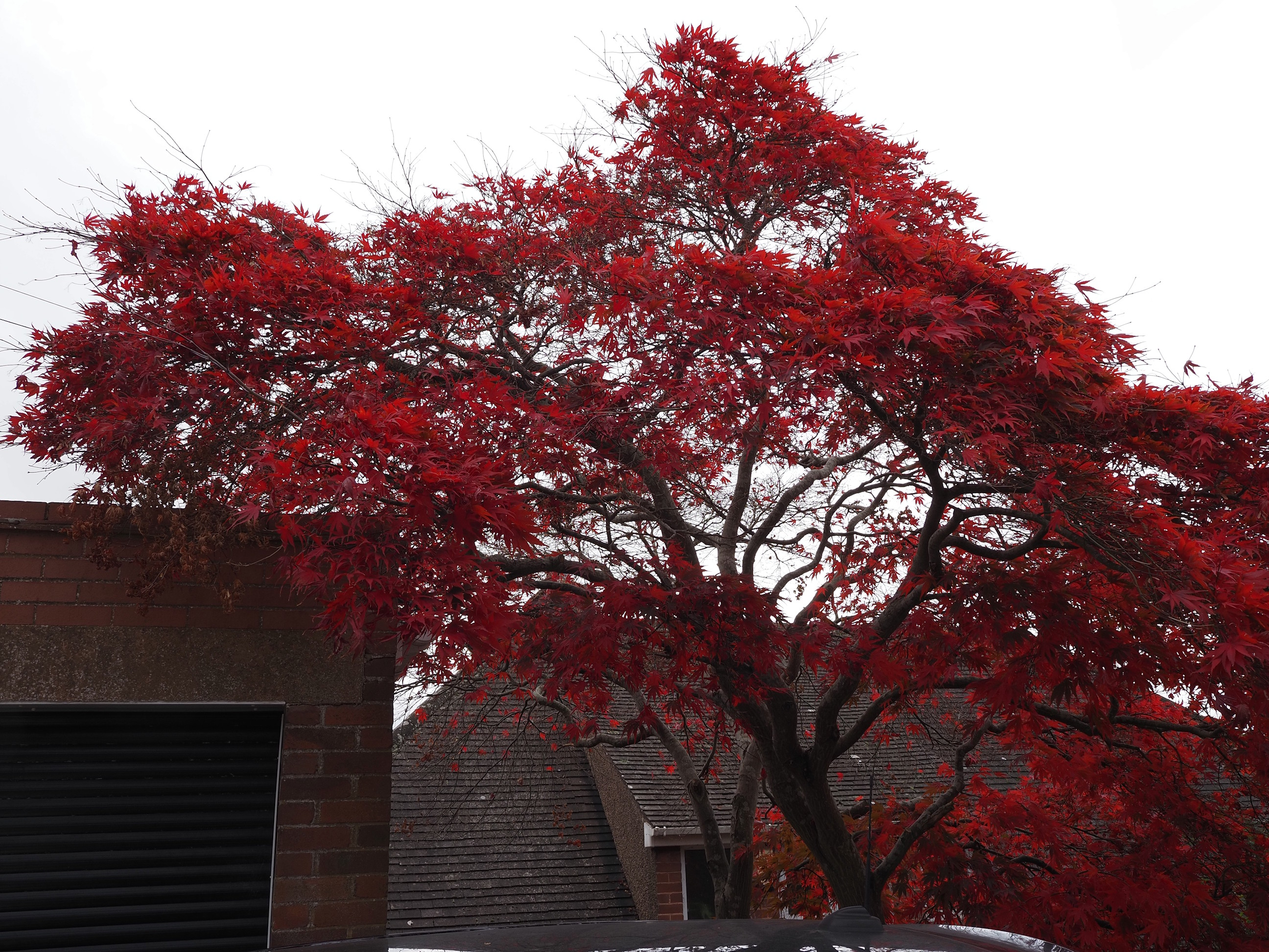
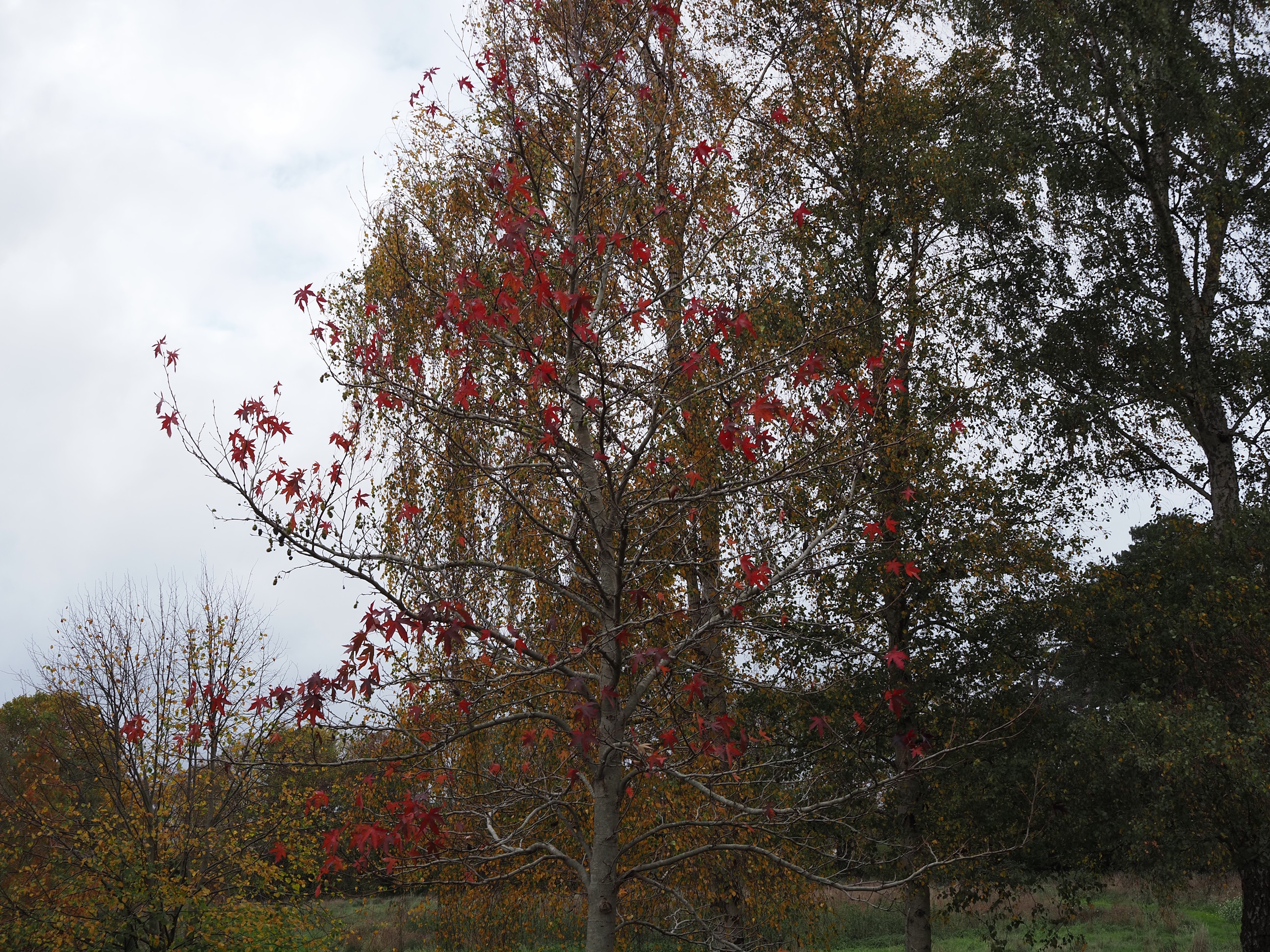
And were immediately treated to this stunning show off of leaves . . .
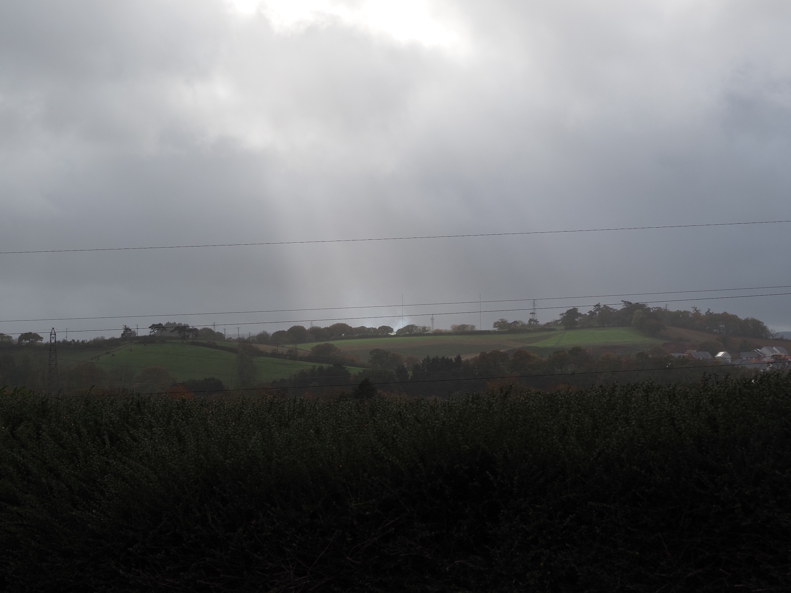
The weather to the West didn’t look too great, but thankfully it never came our way . . .
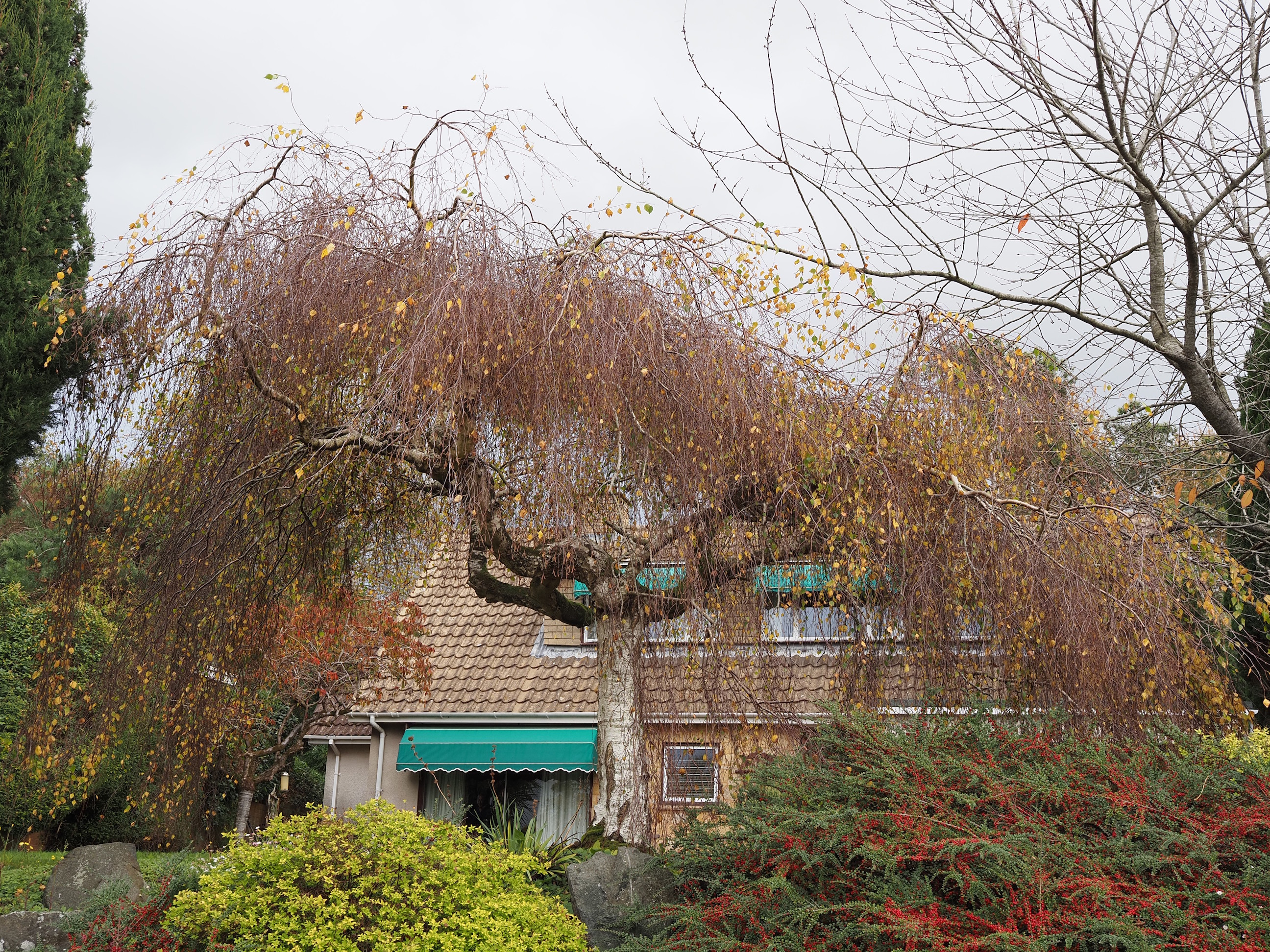
A lovely little birch tree reminding us that Winter is coming . . .
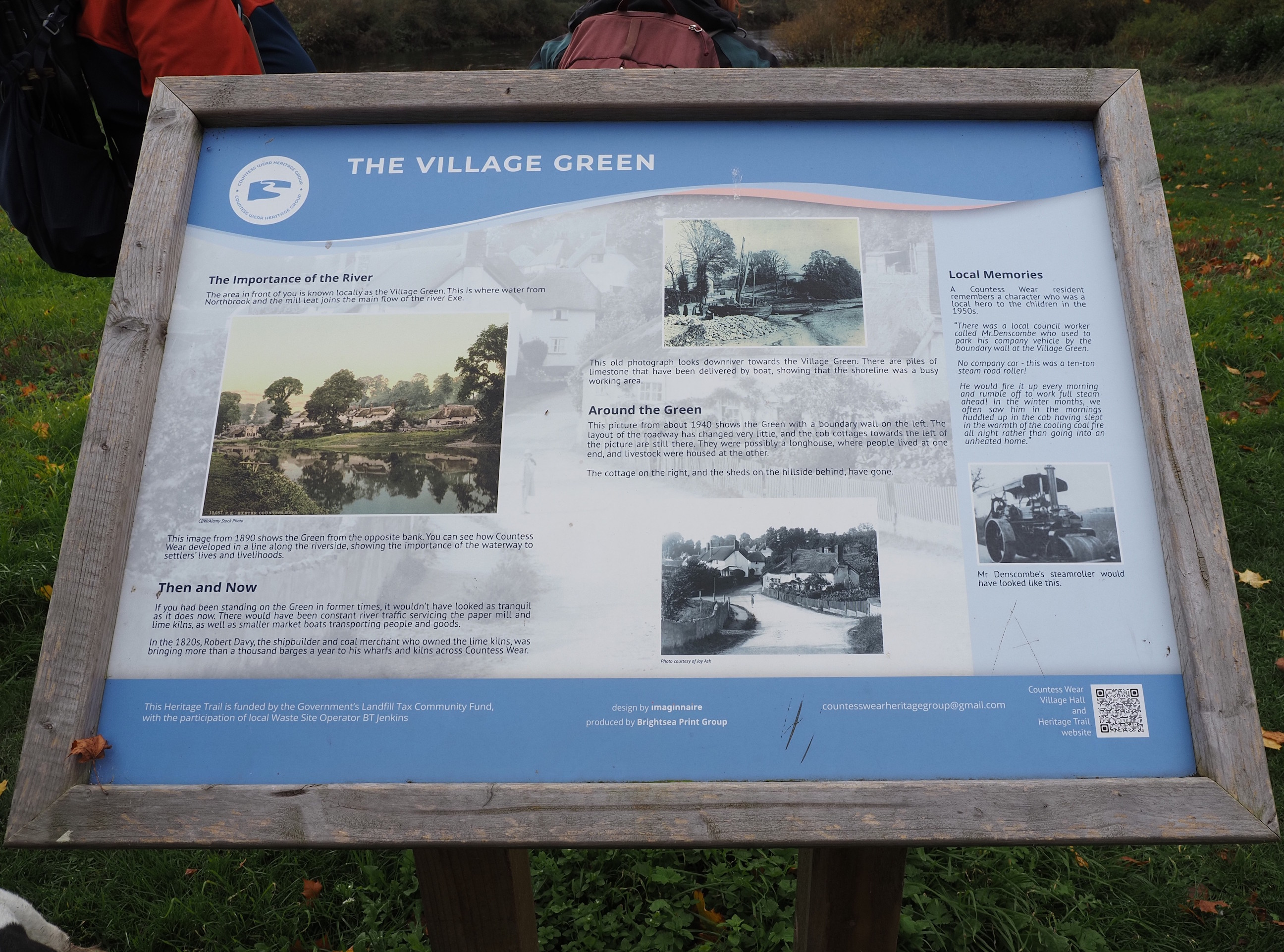
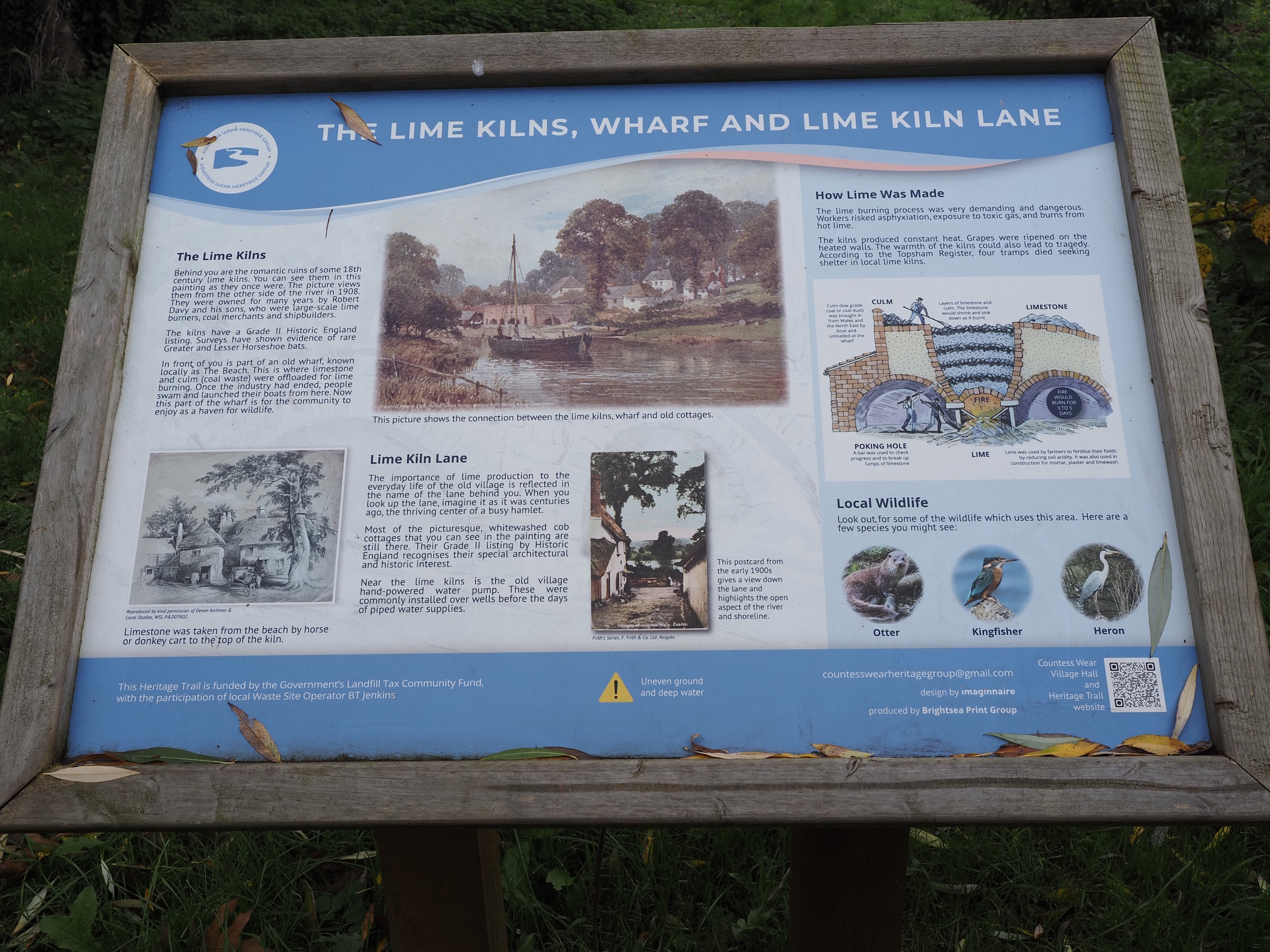
A fair bit of history around Countess Wear . . .
Seeing how the other half live . . .
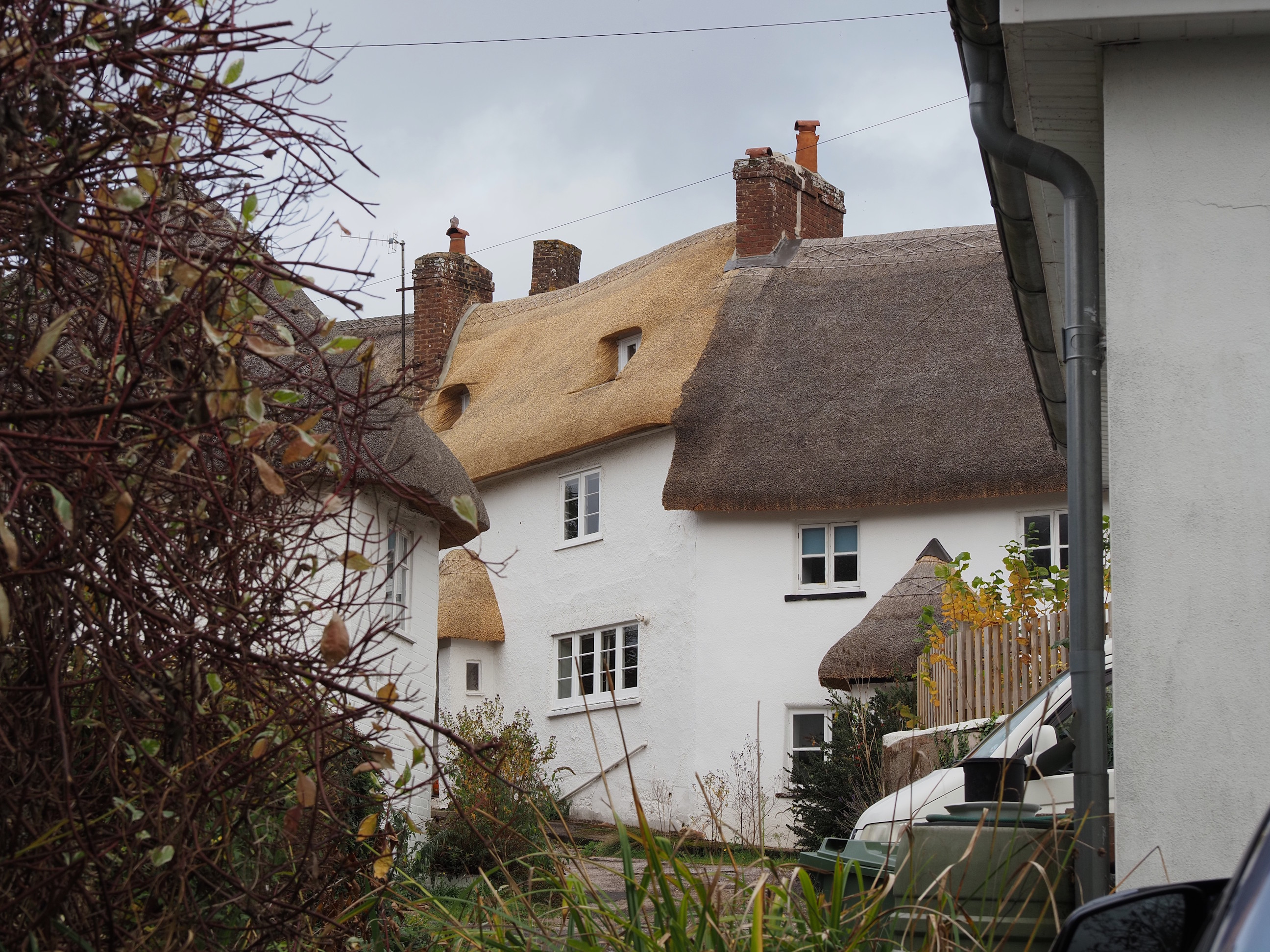
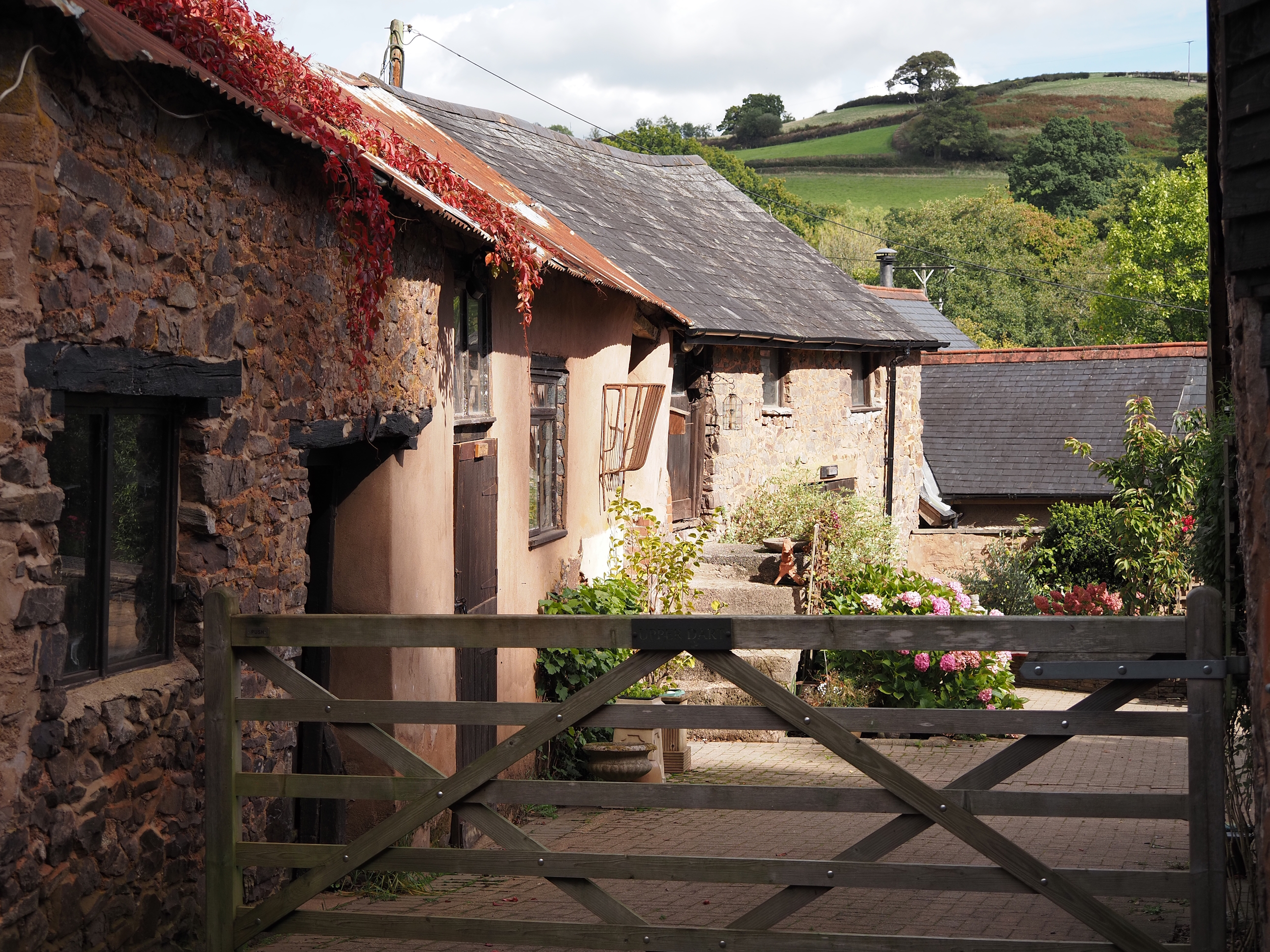
Cottage of the day award goes to the one with the new roof . . .
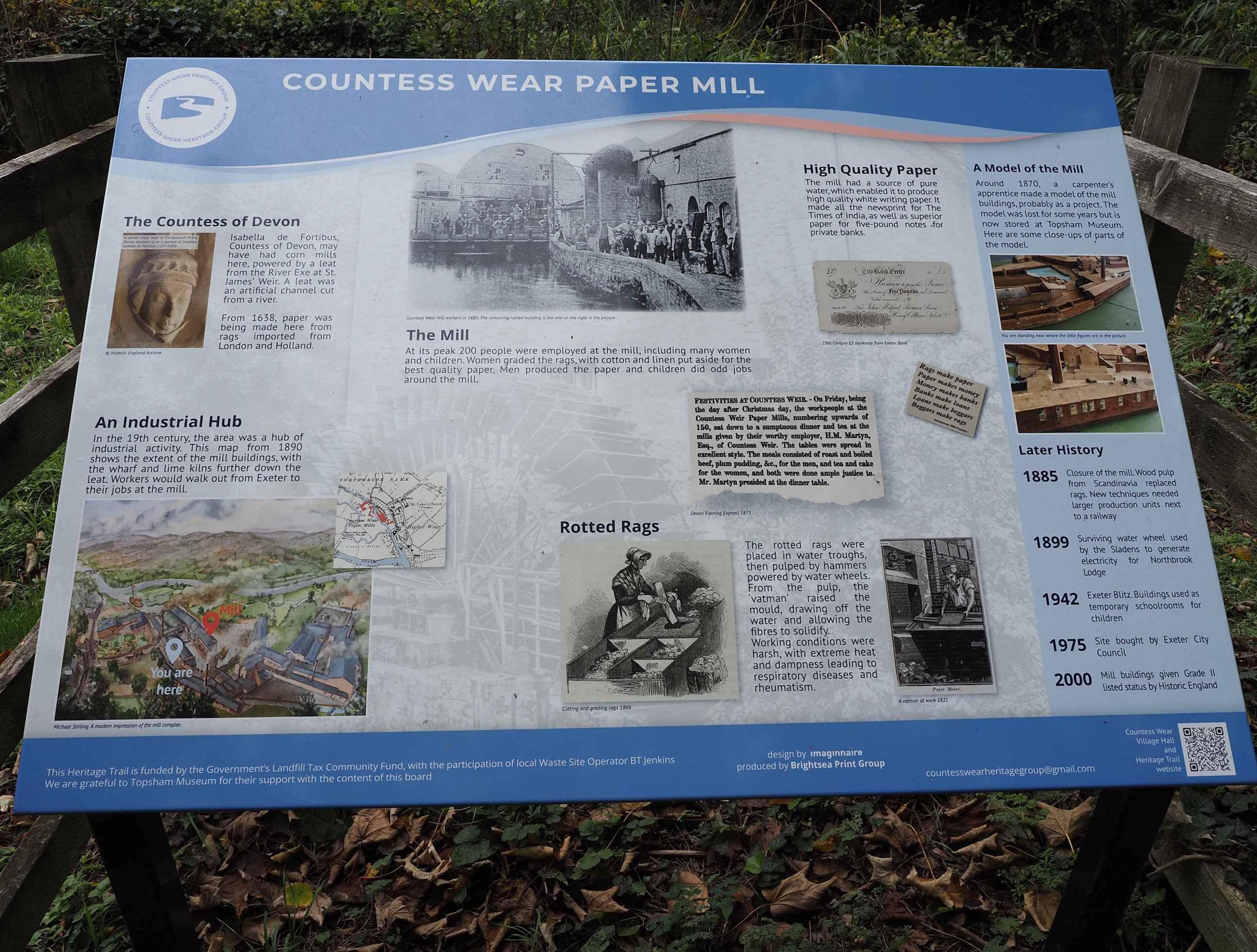
And some more history of this old part of Exeter . . .
There are still places producing paper in this way, Two Rivers Paper Mill in Somerset are still making handmade rag paper at their 400 year old mill. Click on link if you’re interested in learning more, and visit Jackson’s if you’d like to buy some of this high quality paper . . .
The mill pool above the mill . . .
And the leat that flows into it . . .
Temptation . . .
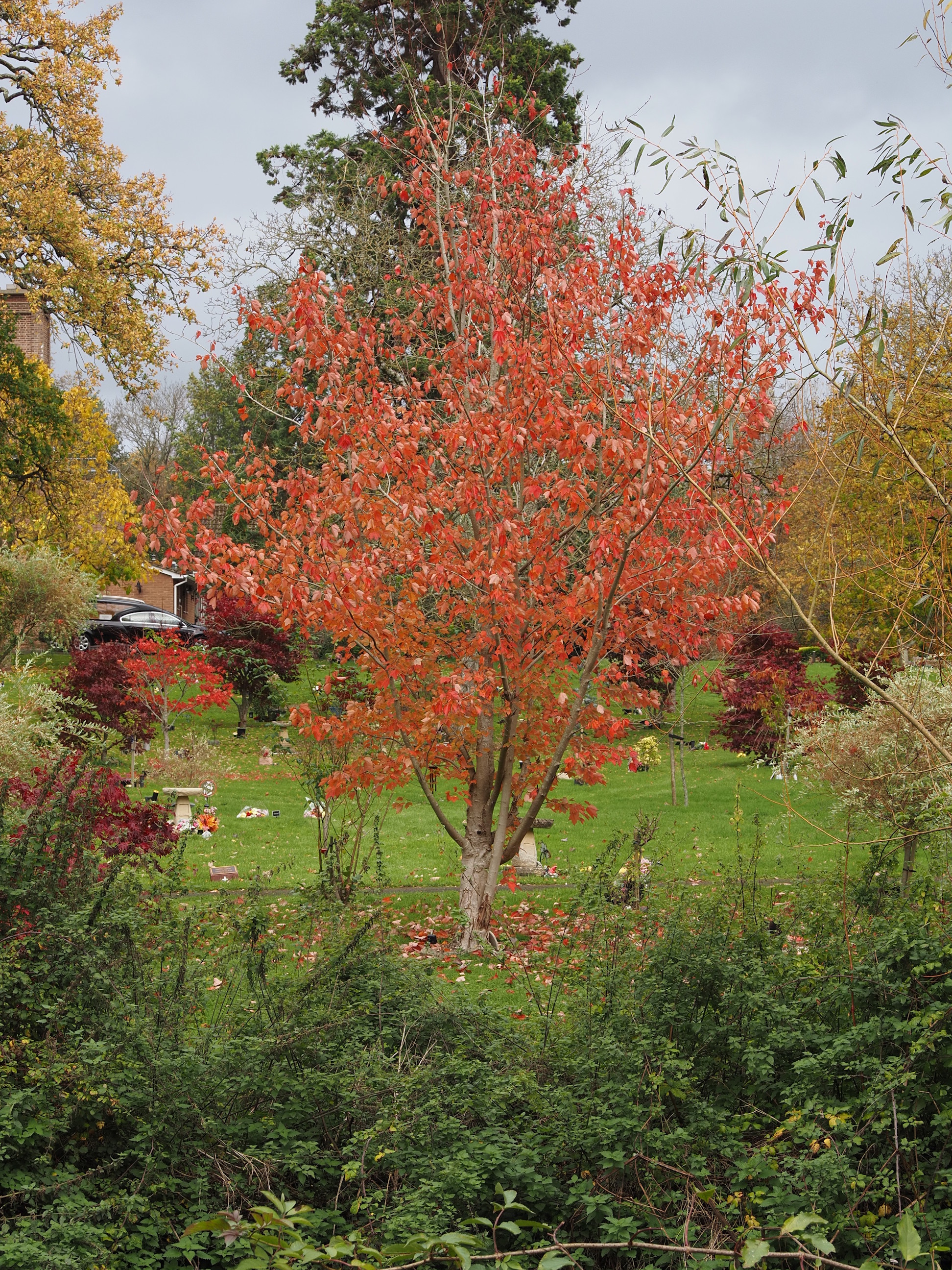
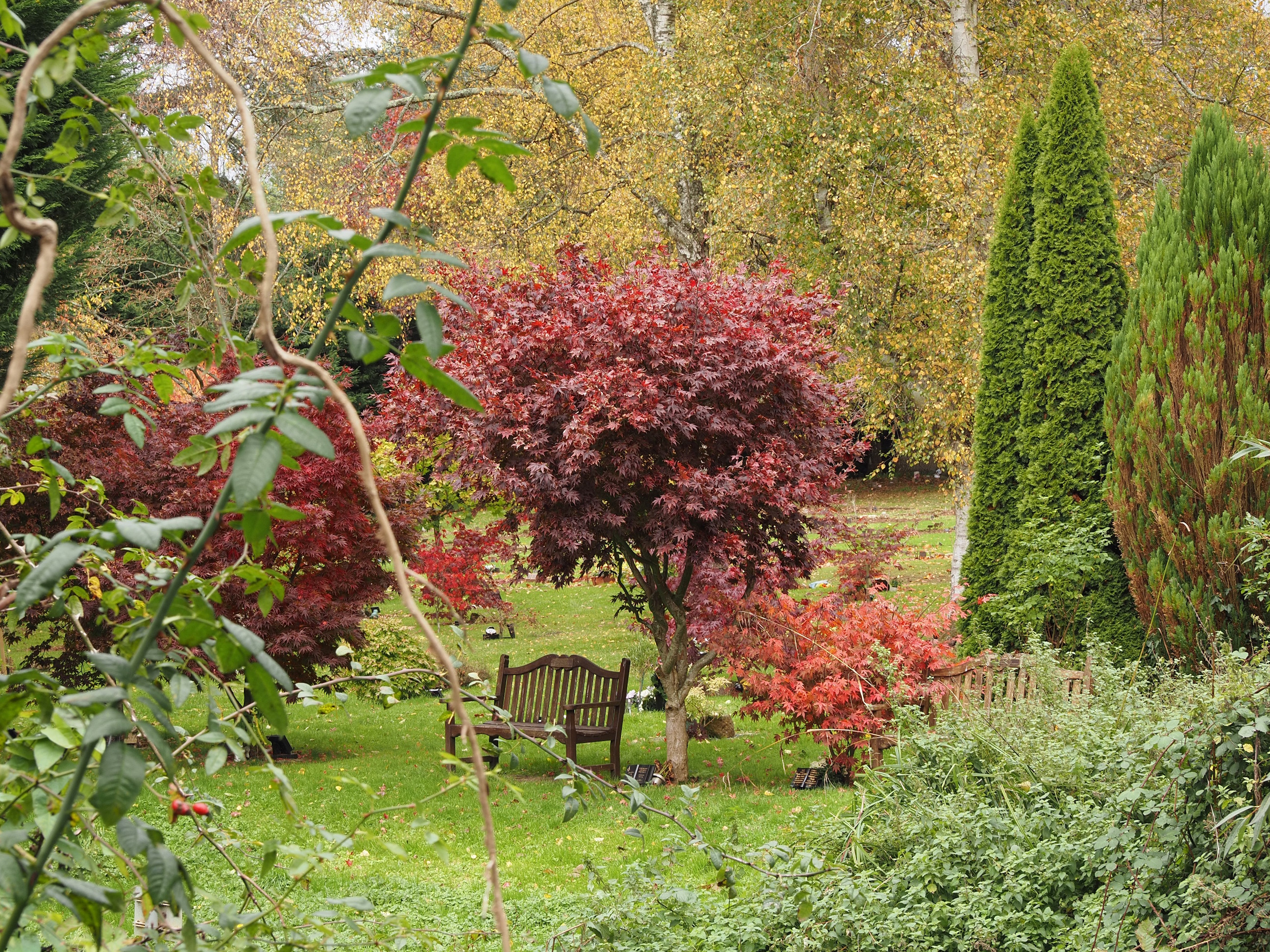
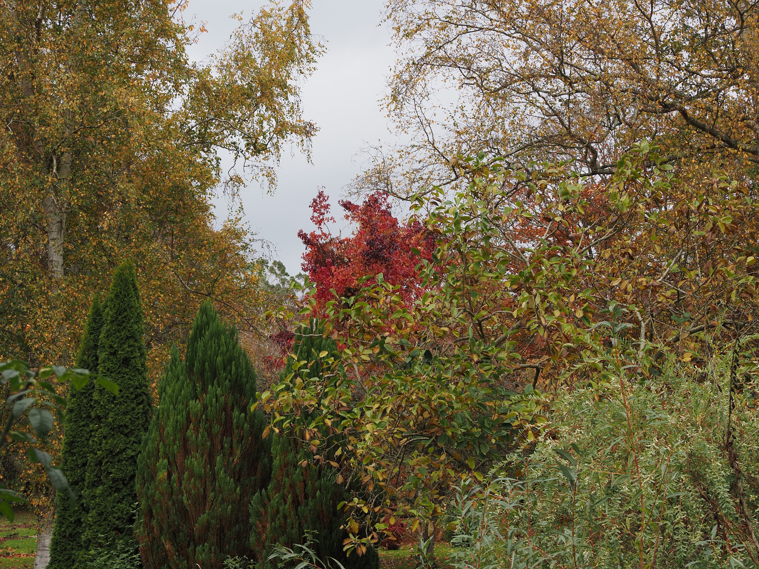
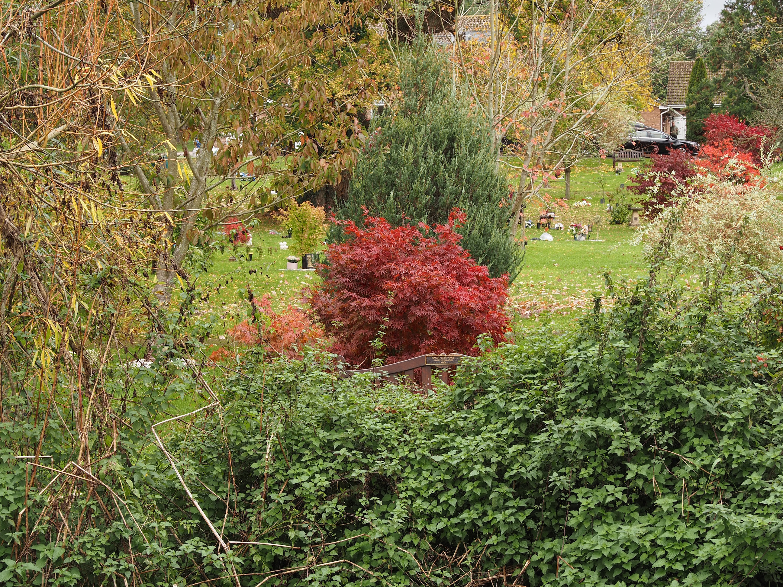
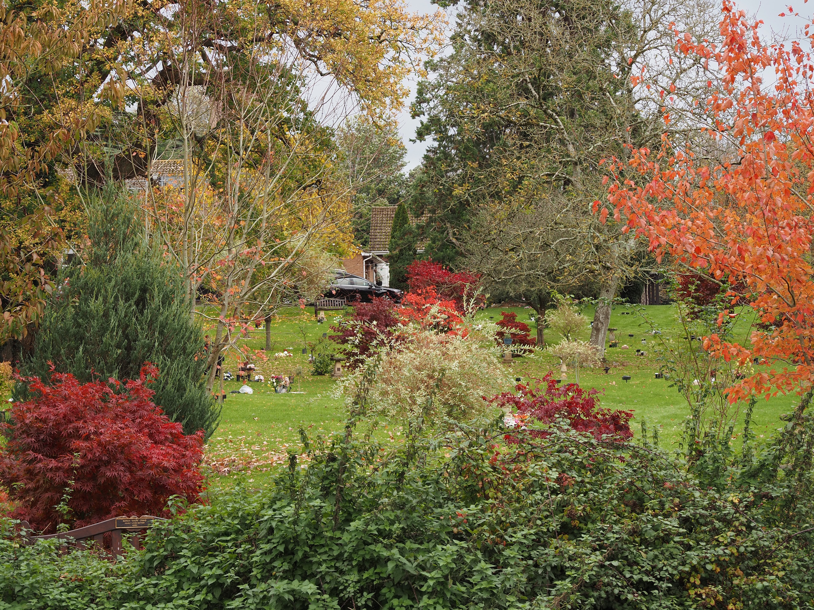
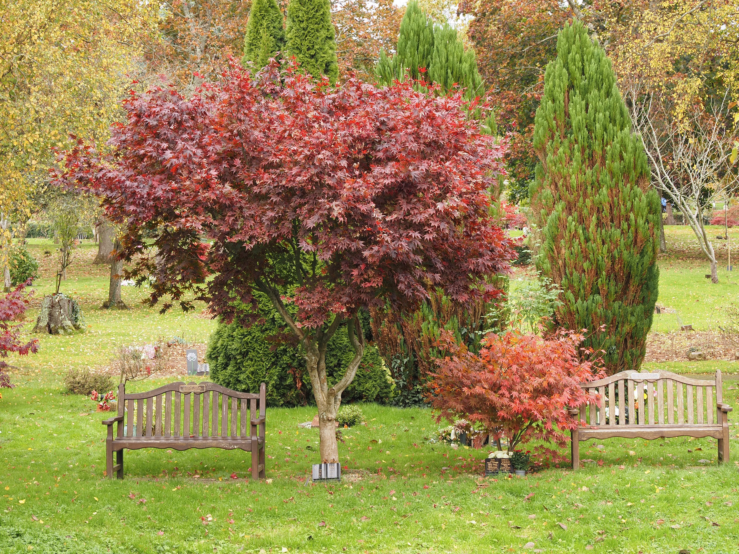
And onto the path that runs alongside the Crematorium. The gardens of remembrance are really nice: a delightful splash of colourful trees . . .
The second random hat of the day. This was outside the gardens, on the path we were walking along. Not sure what it’s about: but two random hats in one walk . . .
Autumn berries . . .
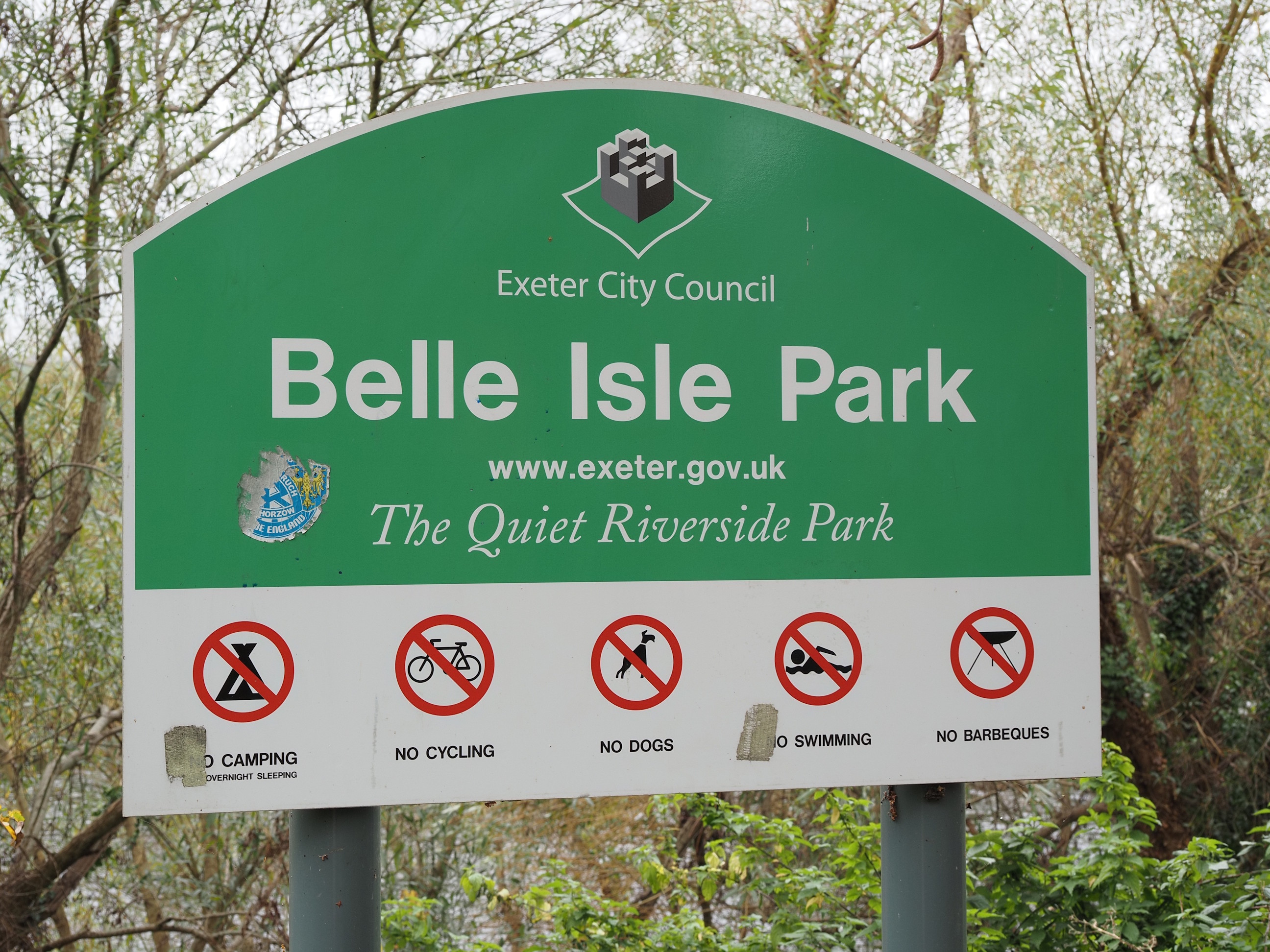
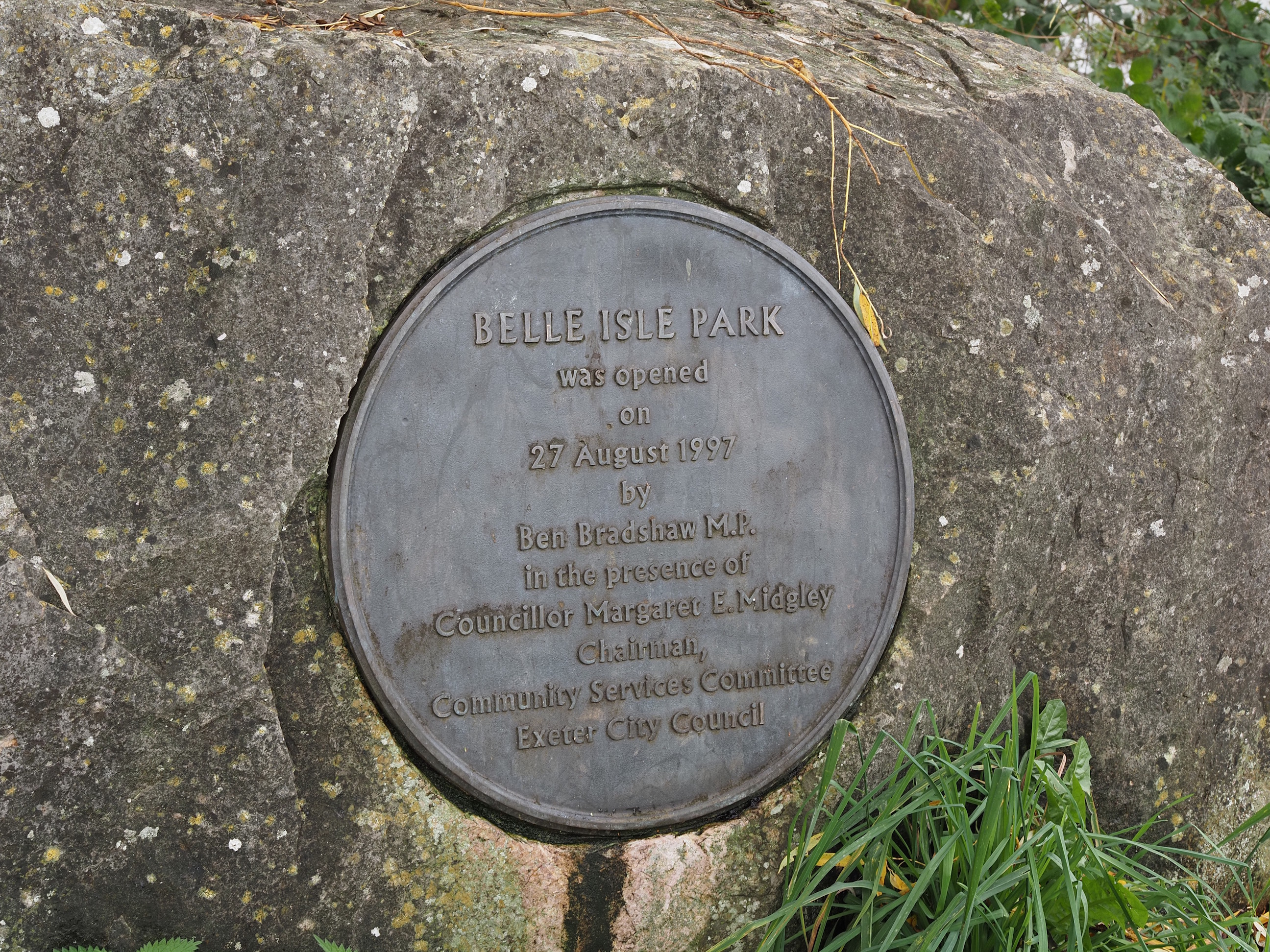
And into Belle Isle Park . . .
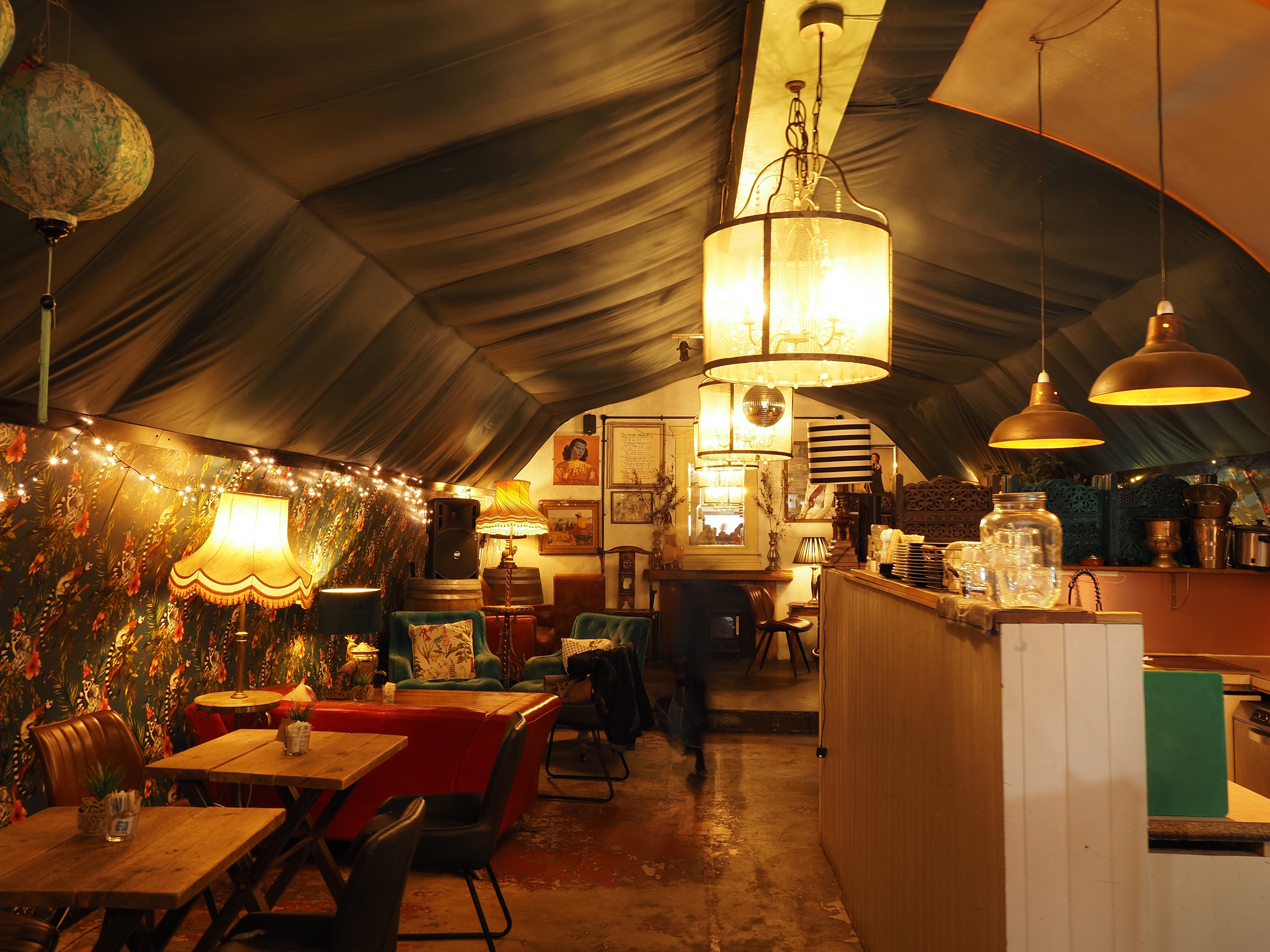
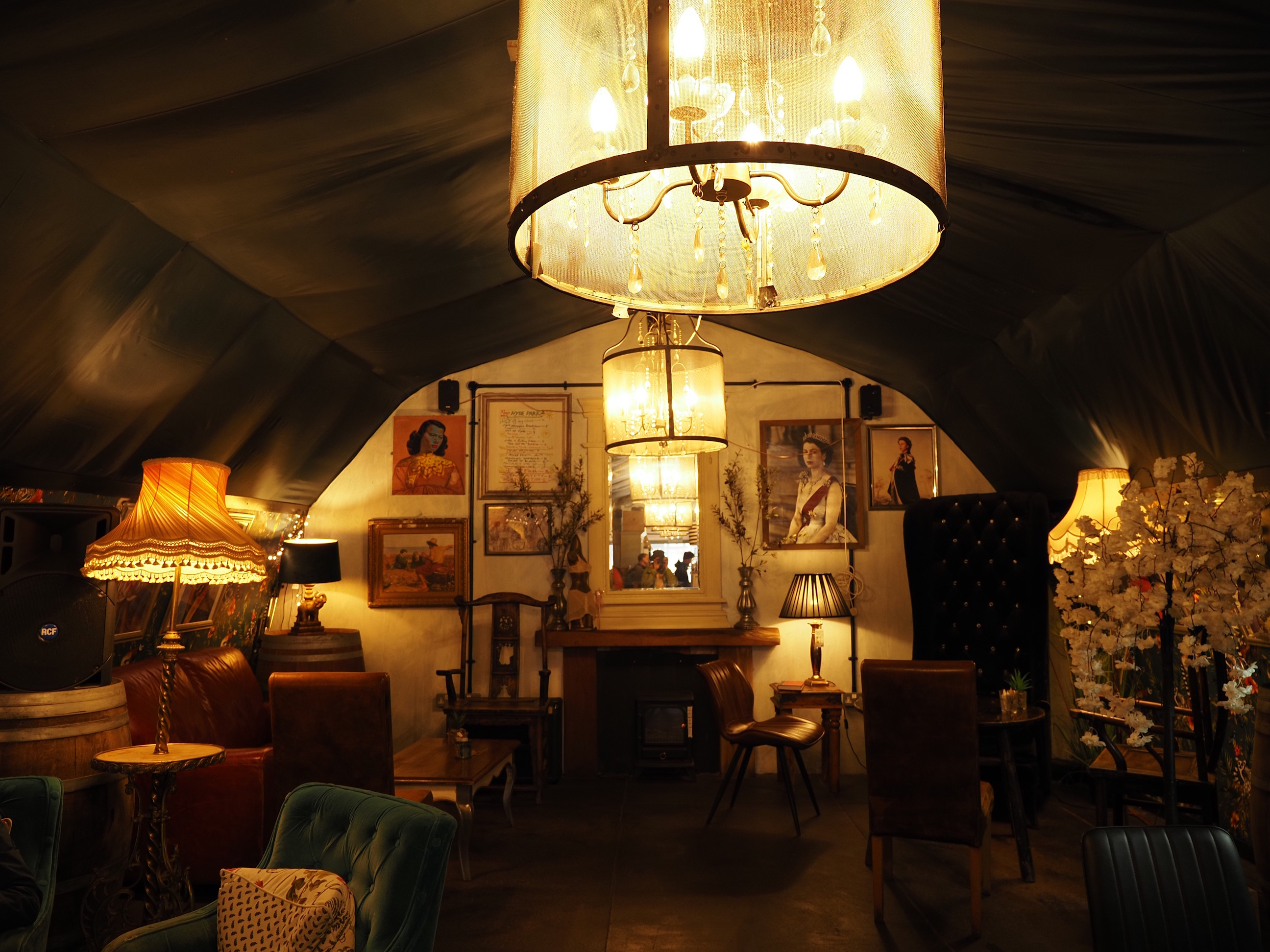
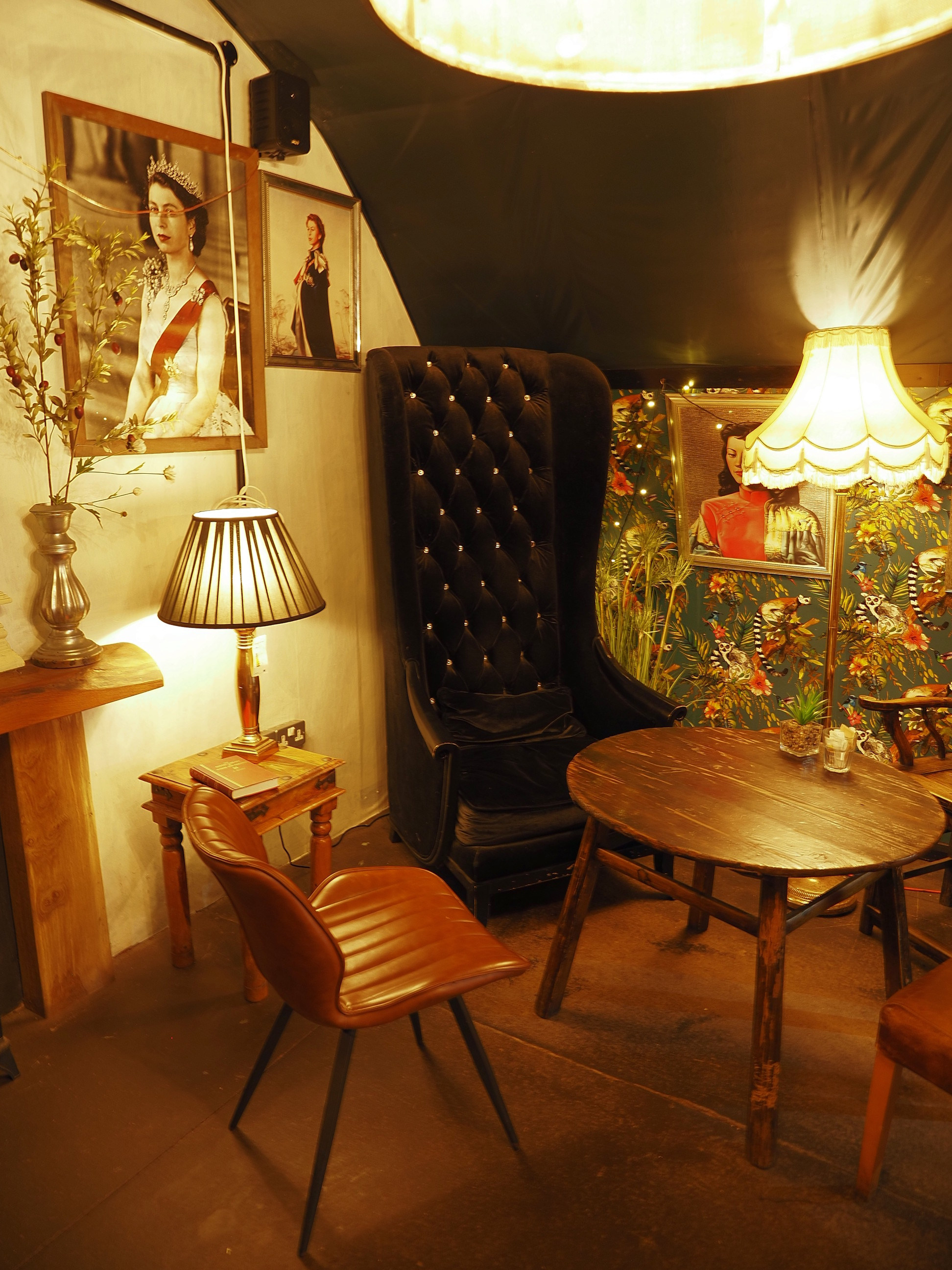
And finally back to the Quay for a nice sit down and cuppa in this lovely arch conversion . . .
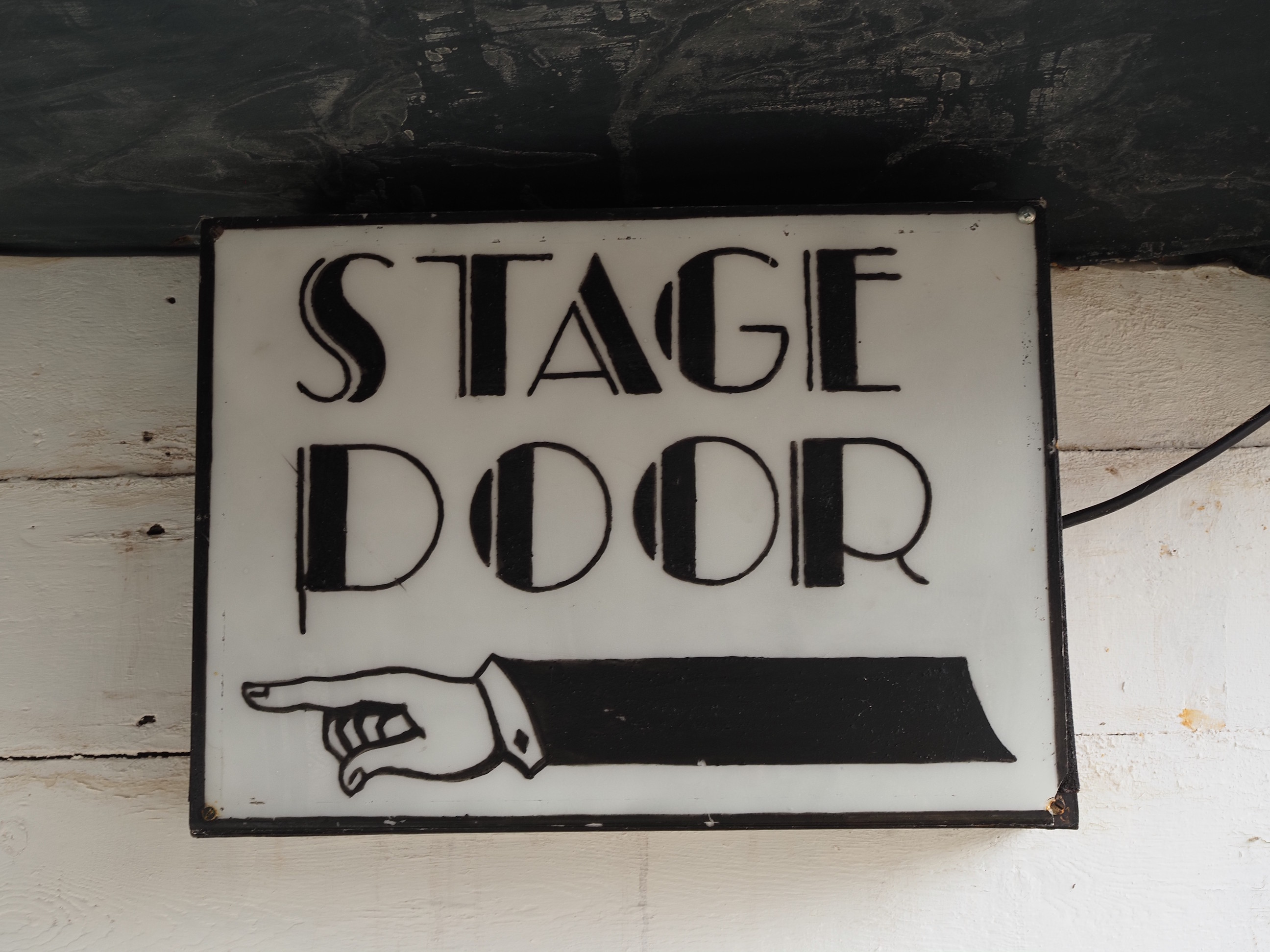
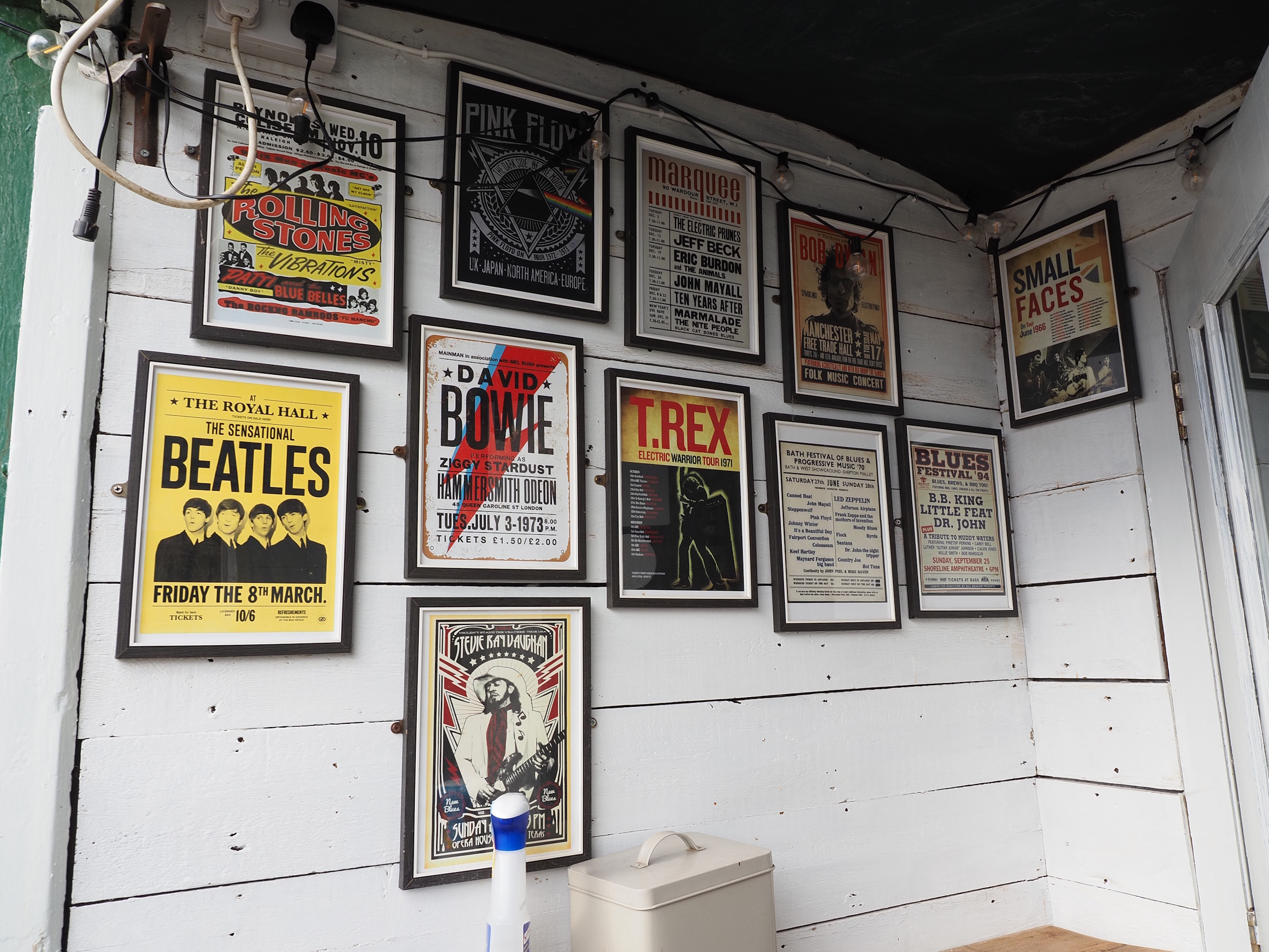
It’s so cosy, and if you like cafes that are full of random things then this is for you . . .
And that concludes this Wonderful Walk. I think Devon’s trees still have some way to go with their Autumnal colours, so i’m looking forward to some more colourful walks over the next few weeks.
See soon.
Left click on the photos and you’ll get a much bigger picture that will open in a new tab.
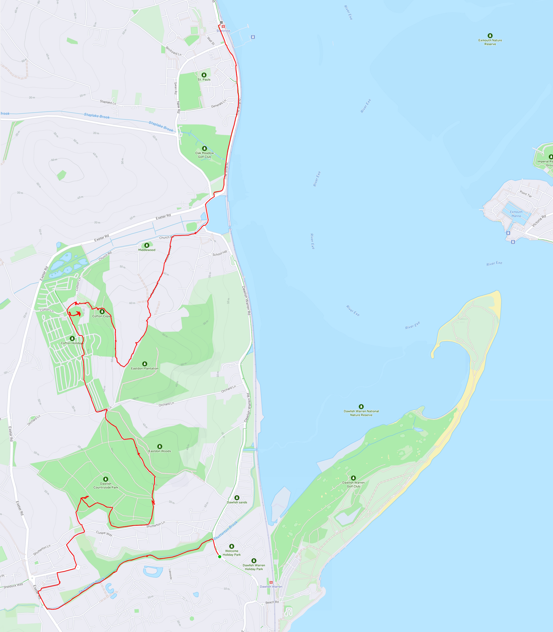
Here’s the route we took. We had started at Dawlish Warren train station, but i forgot to start the Garmin until we walked a while . . .
Left click on the photos and you’ll get a much bigger picture that will open in a new tab.
Here’s the route we took. We had started at Dawlish Warren train station, but i forgot to start the Garmin until we walked a while . . .
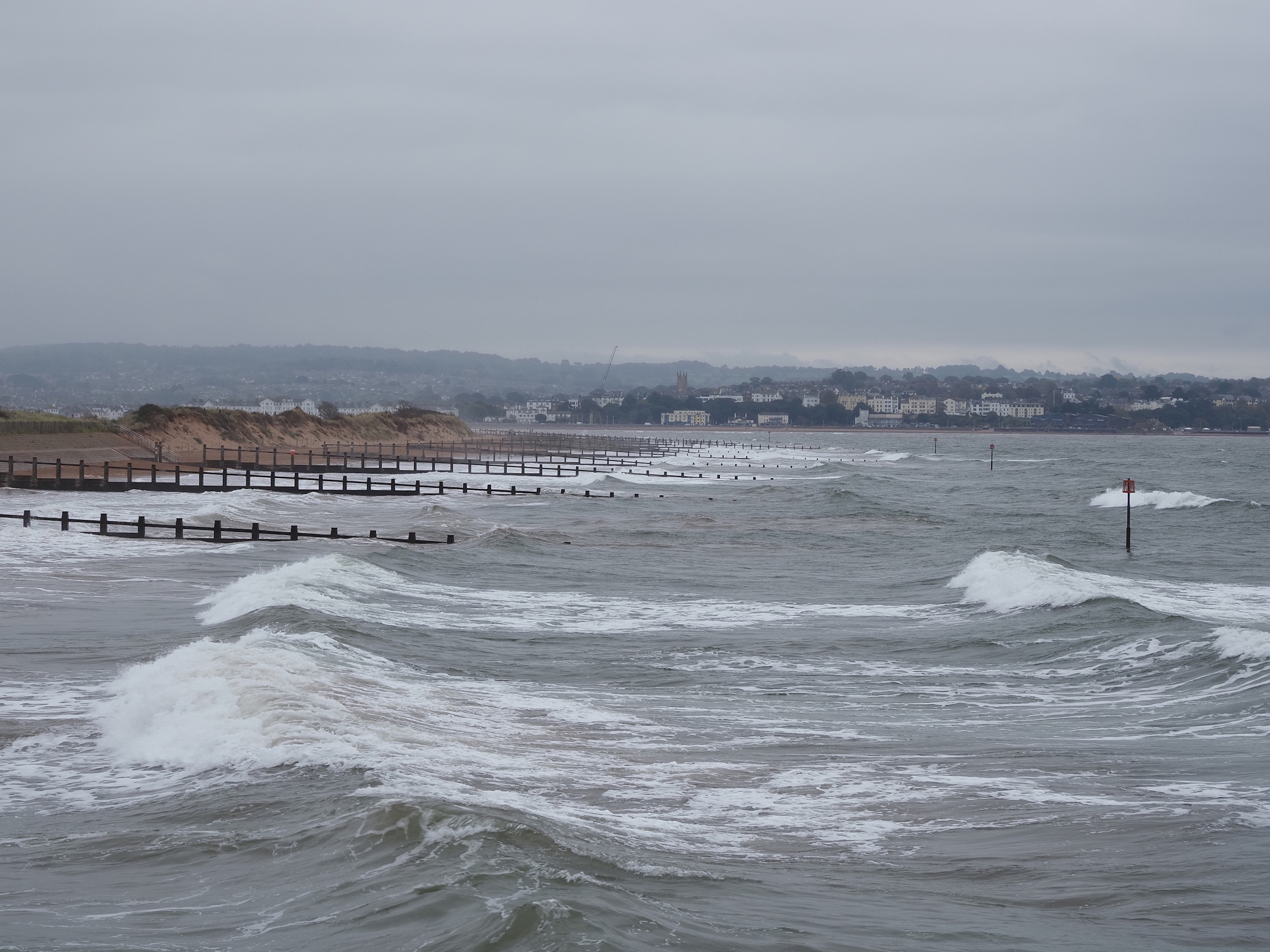
The sea was rather vigorous and the weather wasn’t the greatest when we started out, drizzly and chilly, but the weather forecast said it wasn’t going to last and it would be better later . . .
A beautiful view. Yeah, grock season is finally over . . .
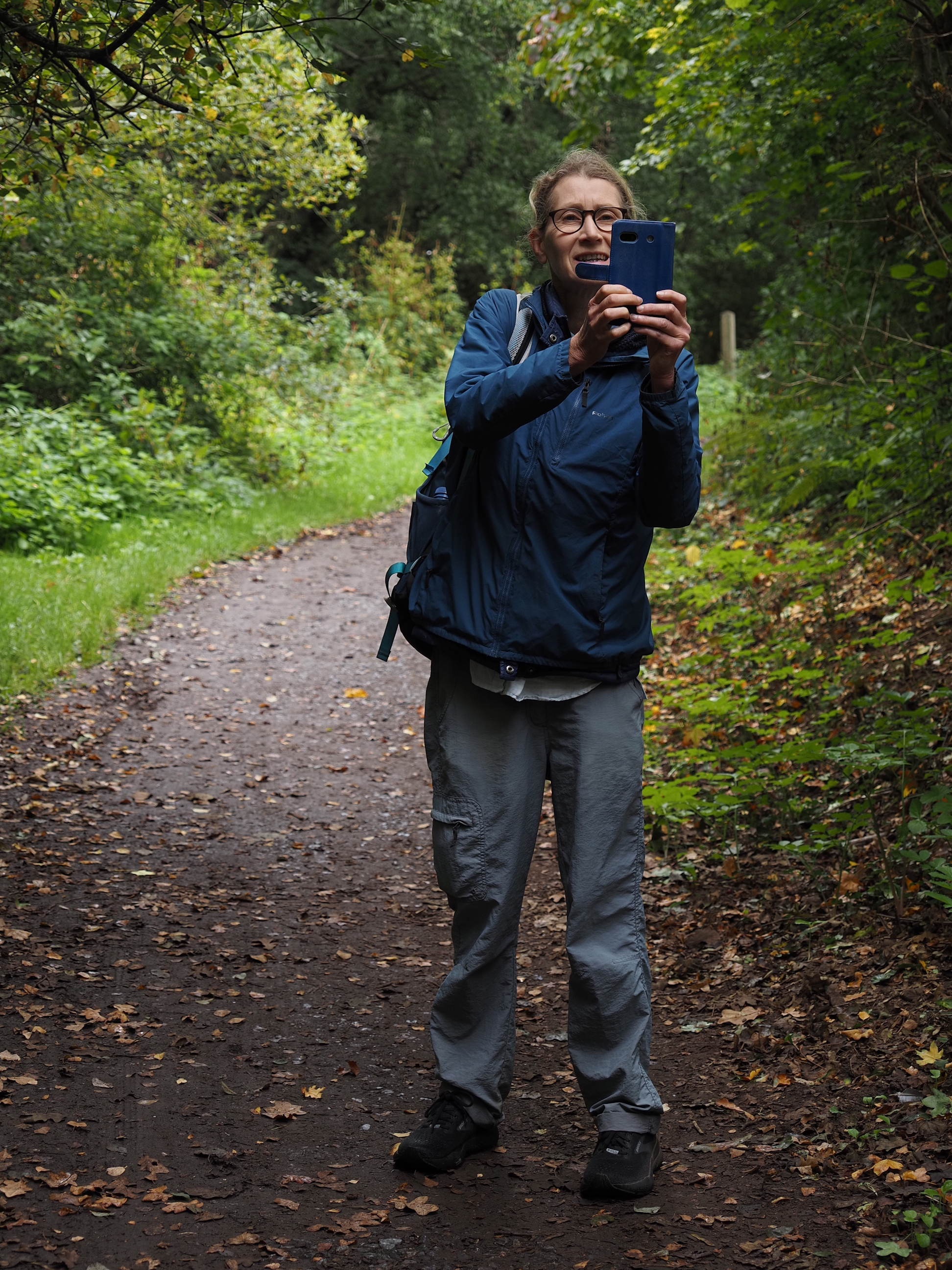
Who photographs the photographers? It’s Val, who planned and scouted today’s walk . . .
Sainsburys have some nice wall art, full blown “Ogden-esque” . . .
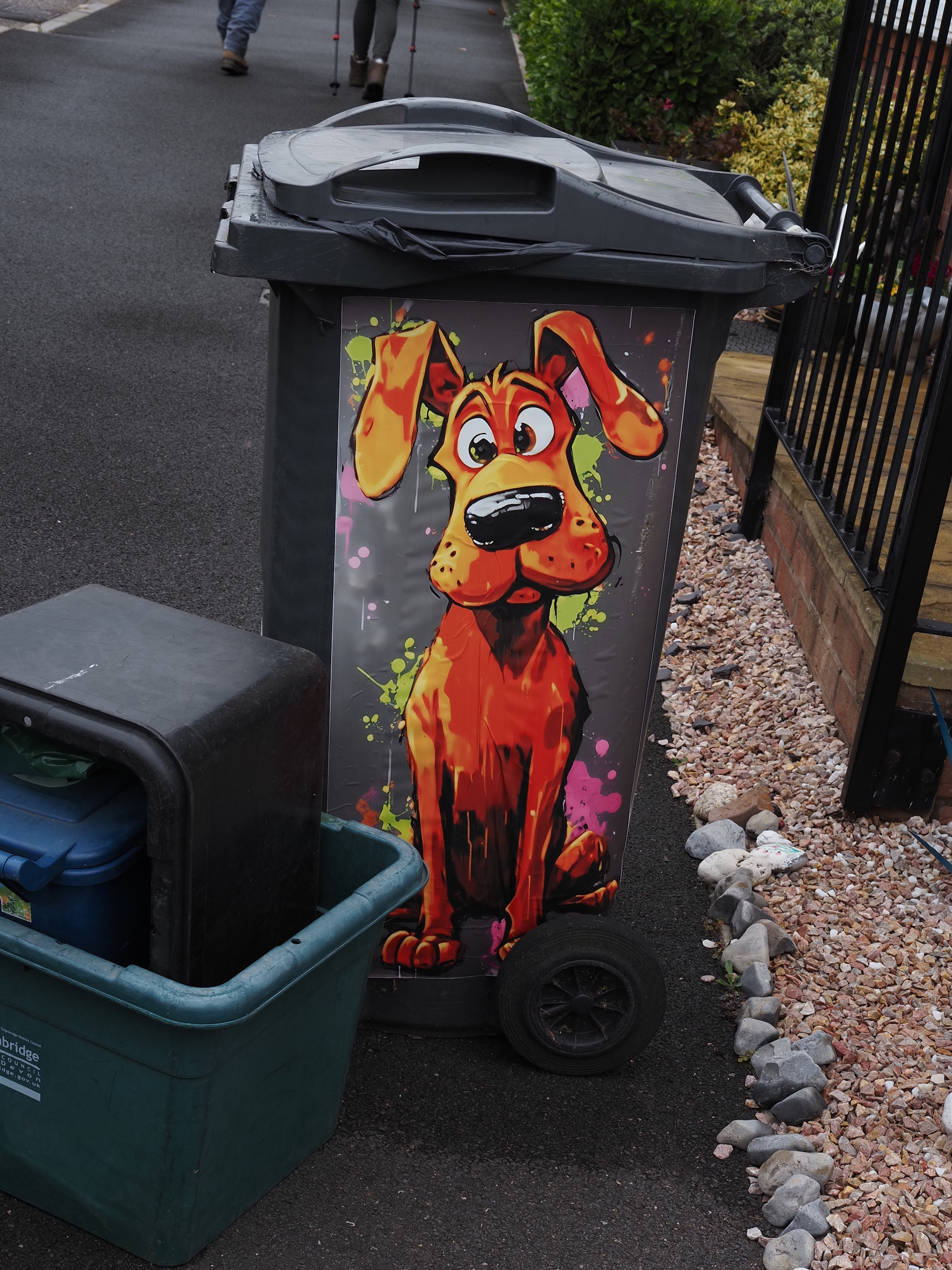
Some great dustbins . . .
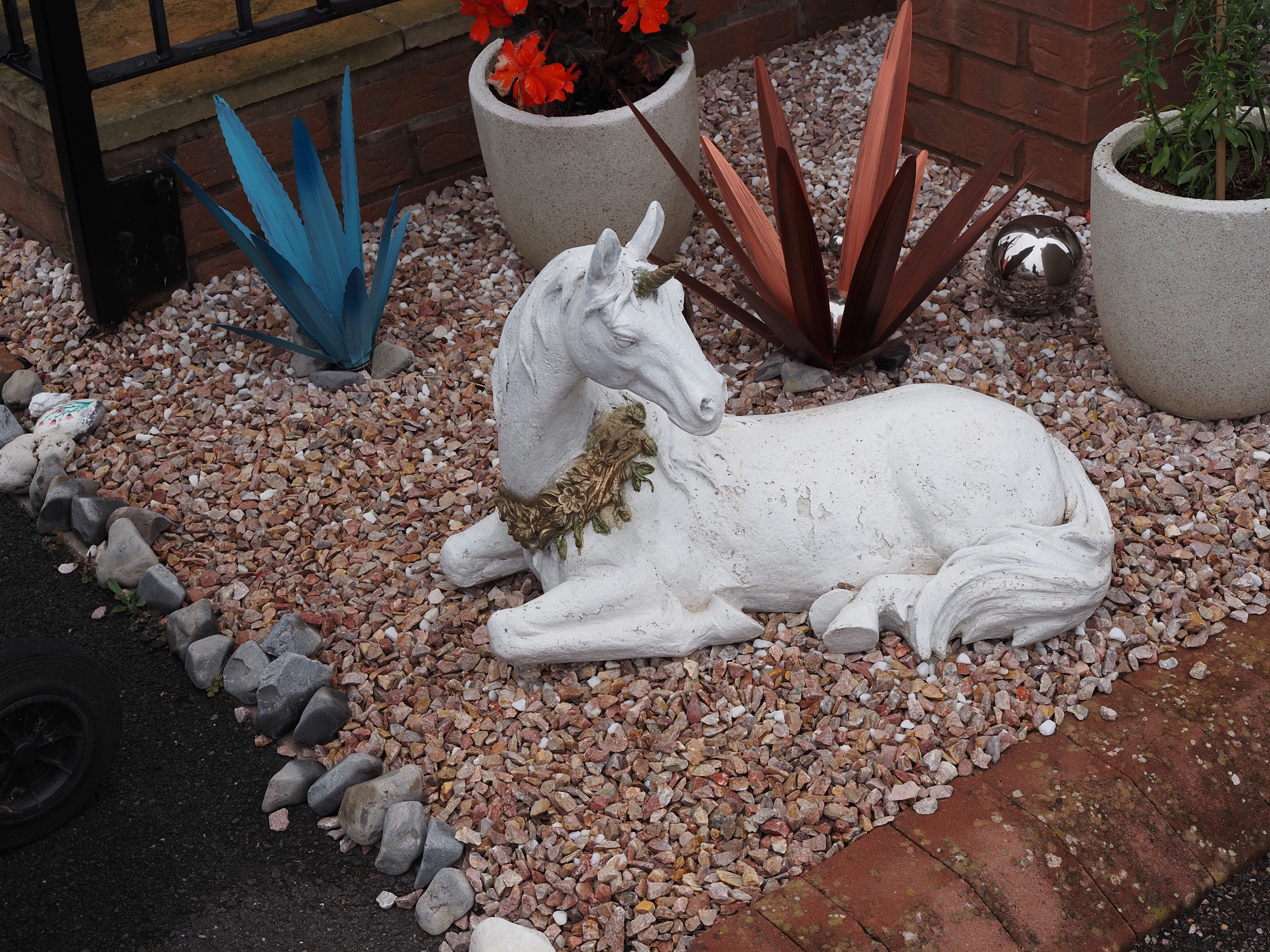
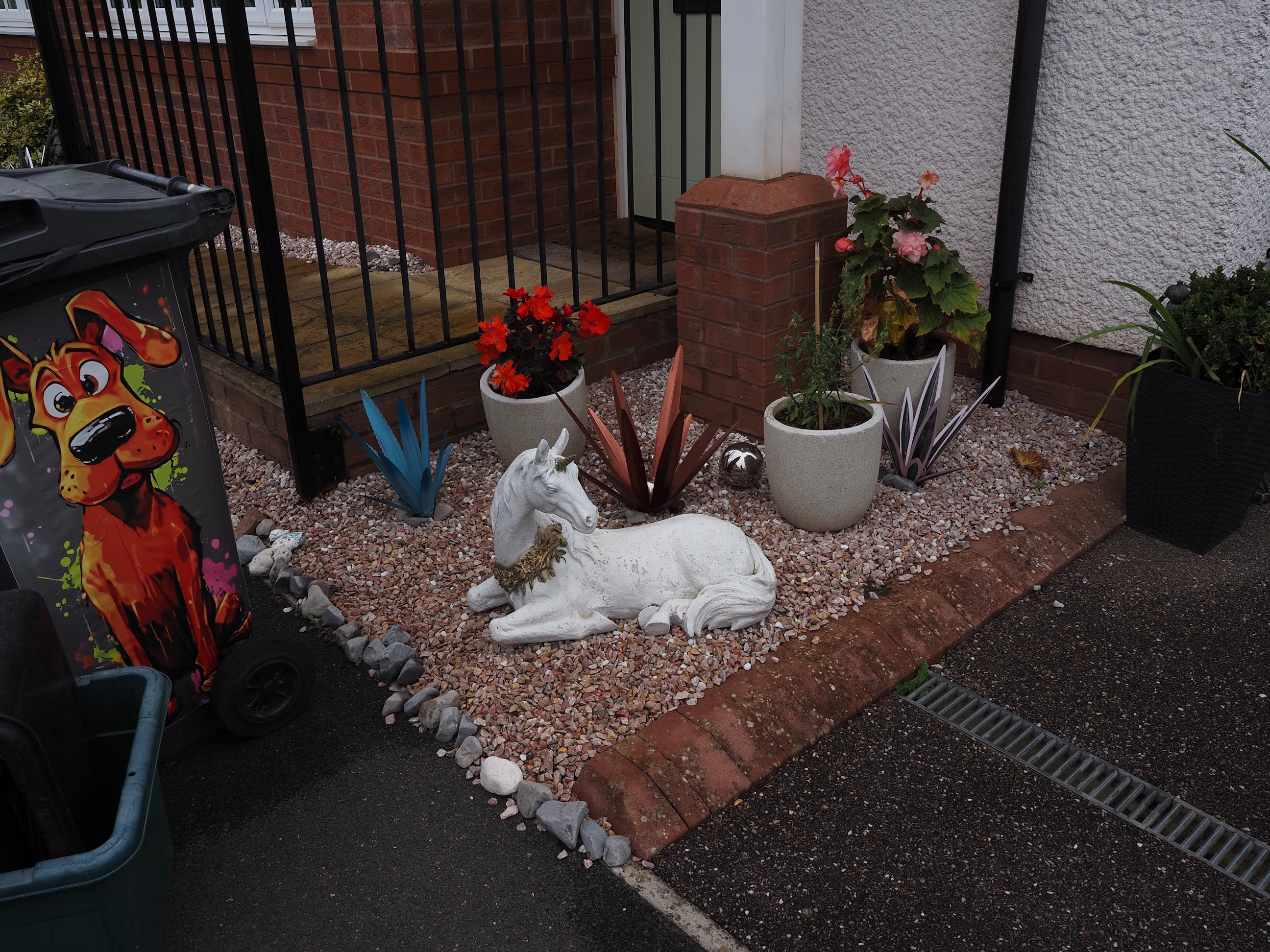
And a unicorn too (yes, they obviously do exist) . . .
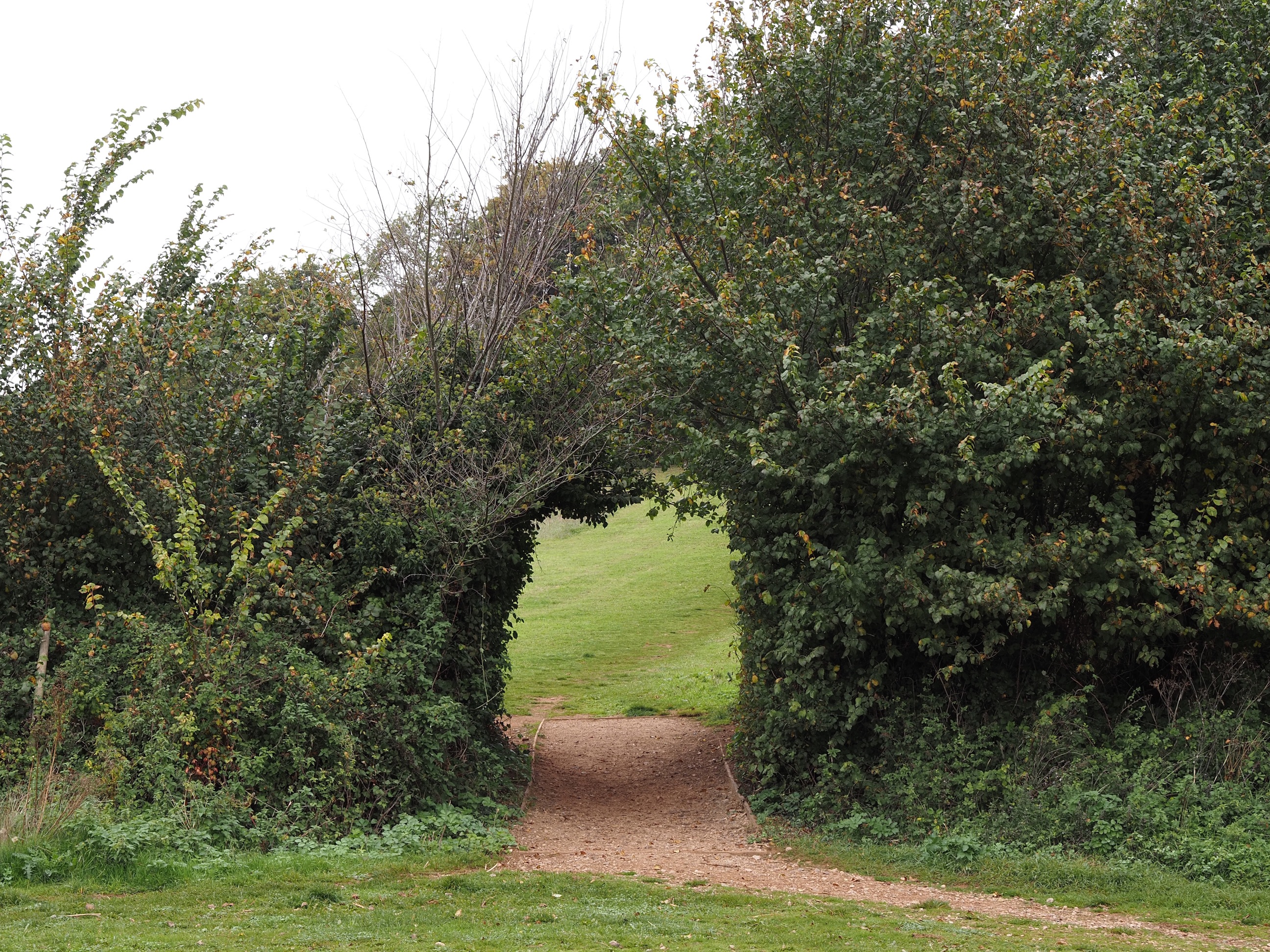
Hedge tunnel . . .
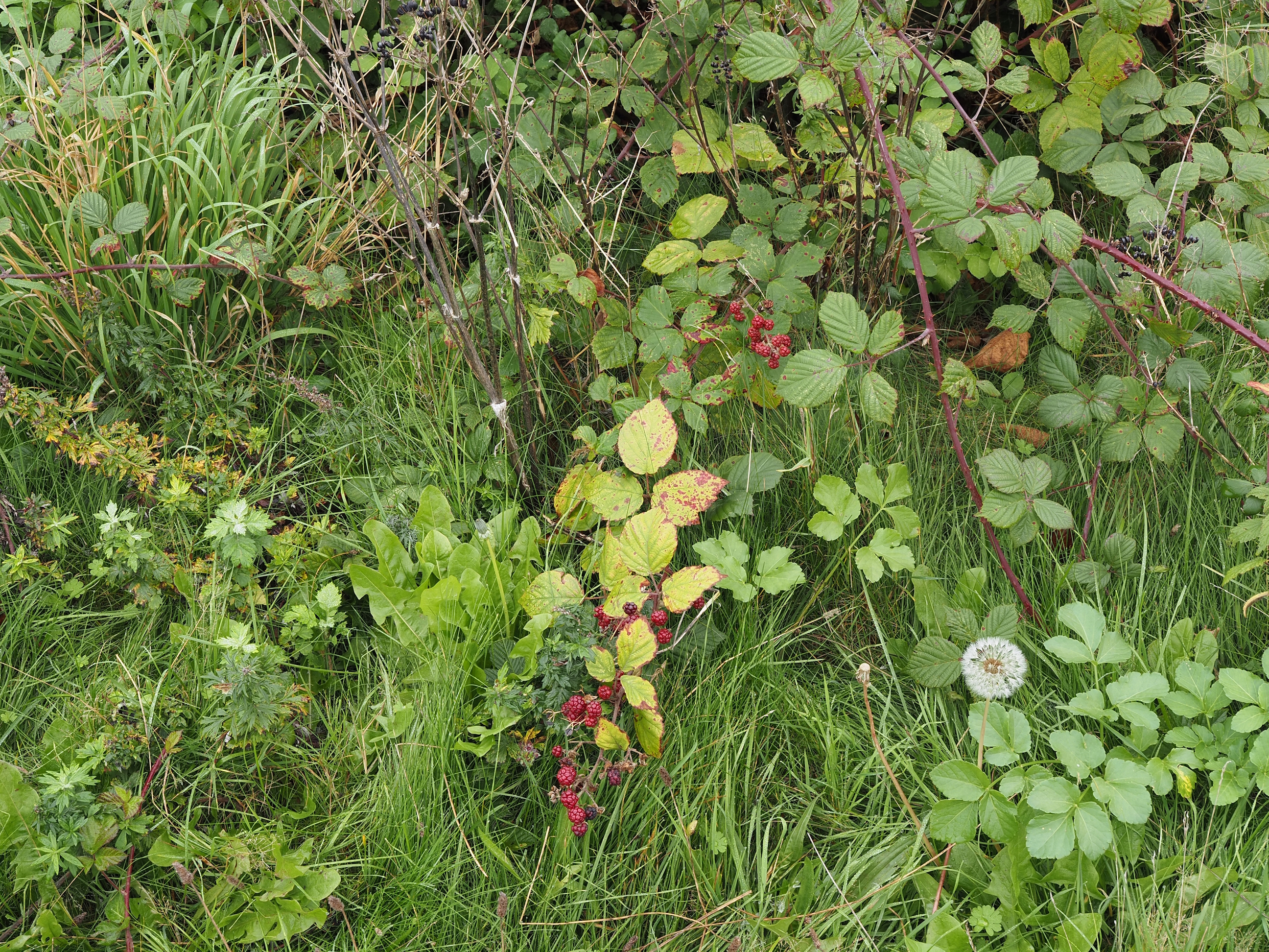
This bramble was trying to have one last try before winter . . .
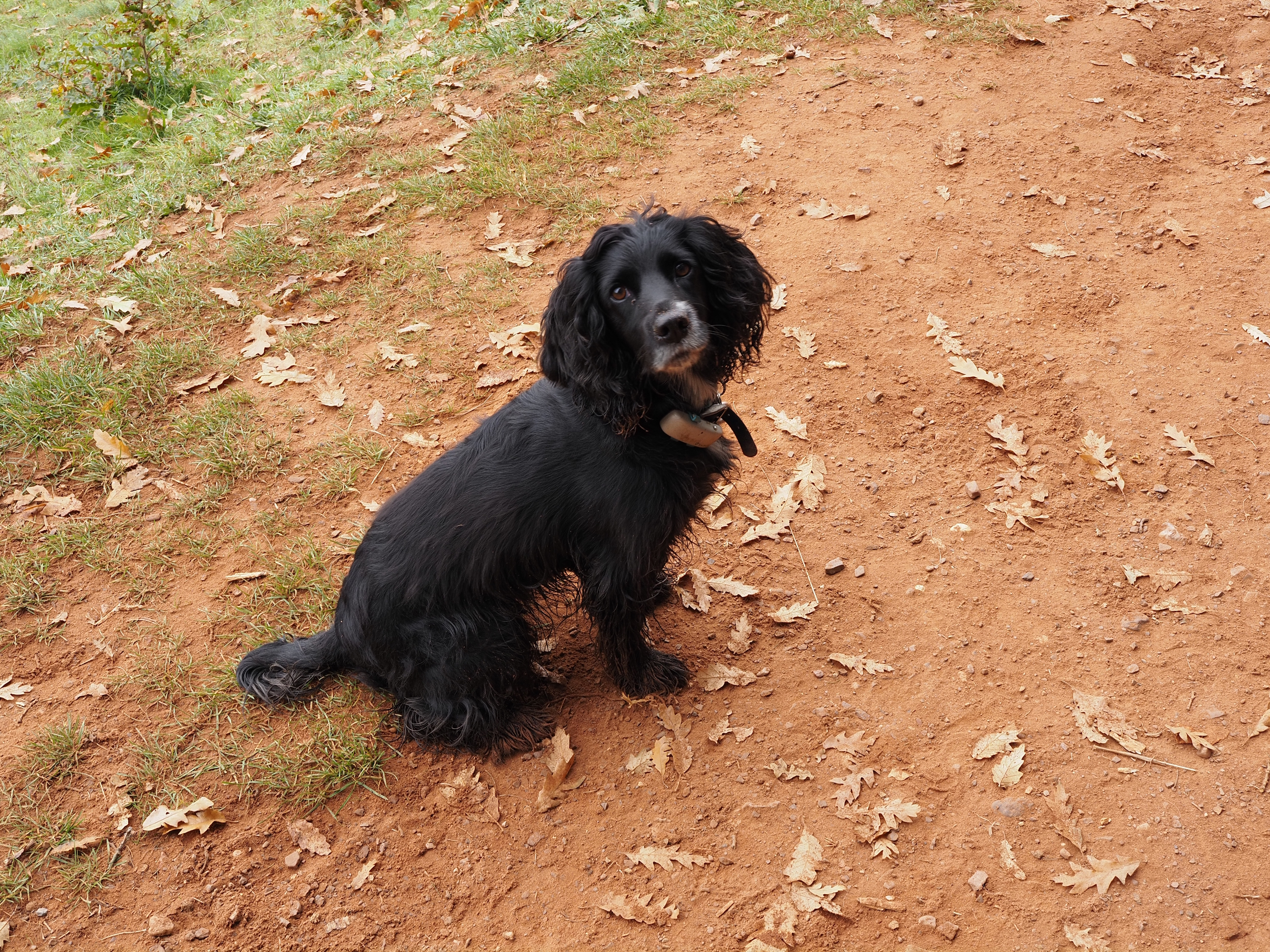
Tora enjoying walking with her muddy feet . . .
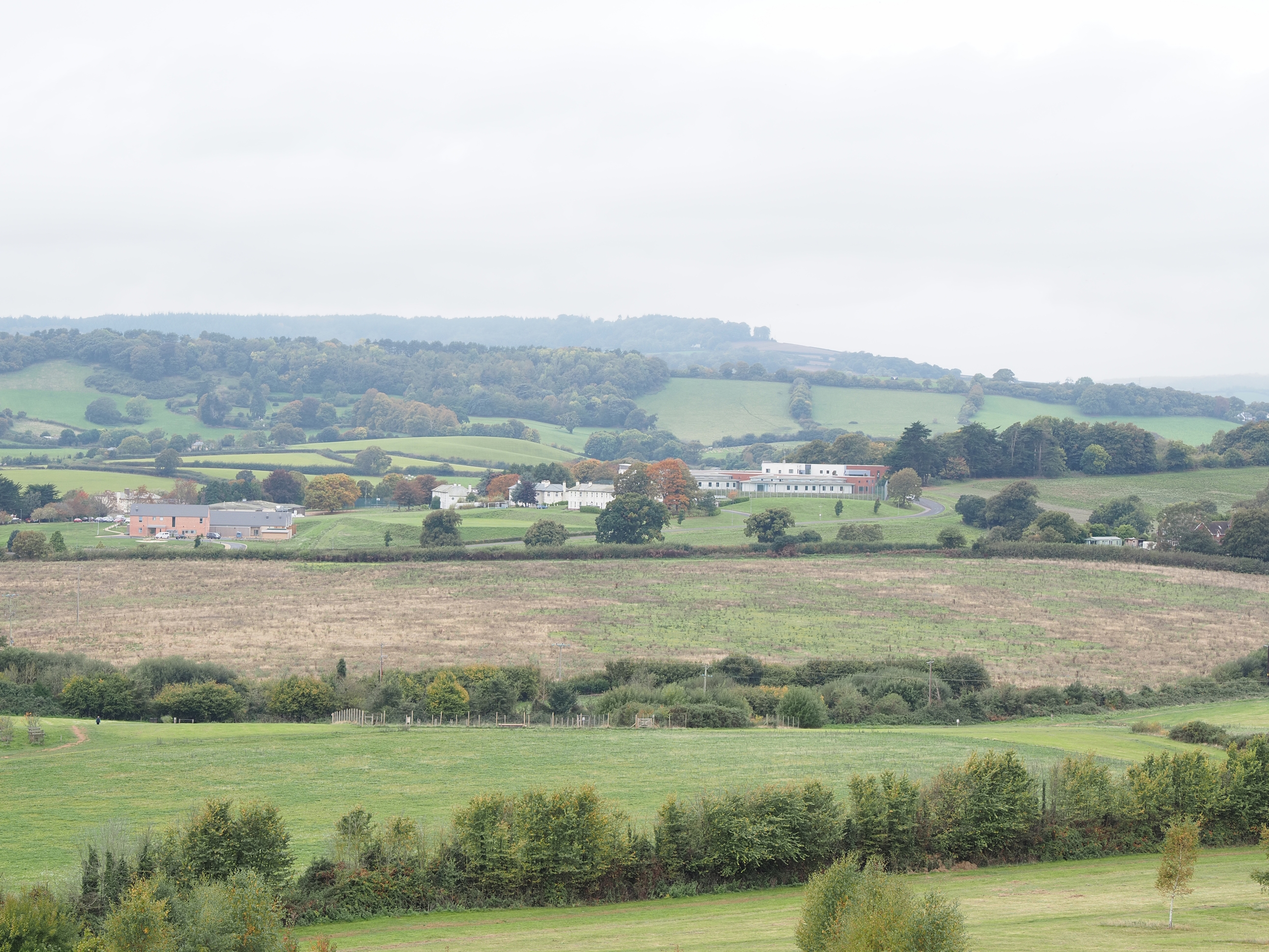
Langdon Hospital, which the NHS describes as Forensic mental health (inpatient) . . .
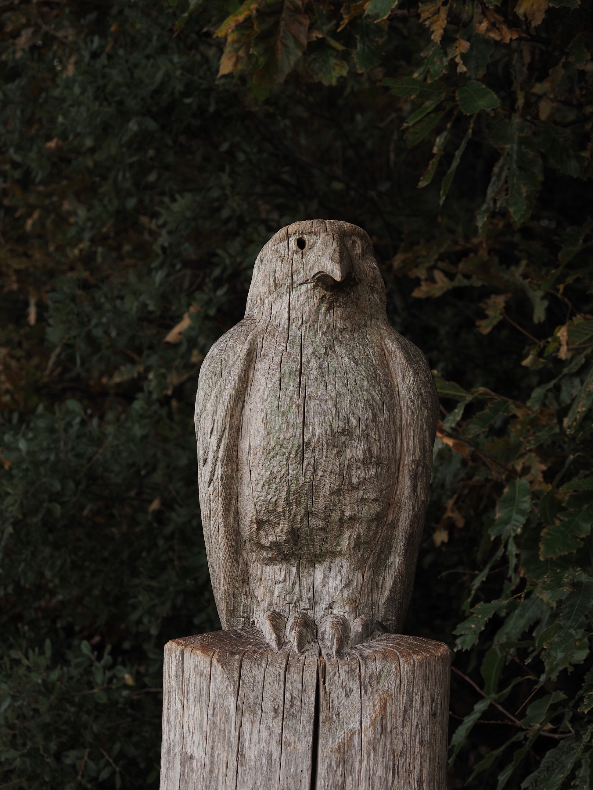
Some lovely countryside art that someone carved on a wooden post . . .
Where we stopped to eat our packed lunches . . .
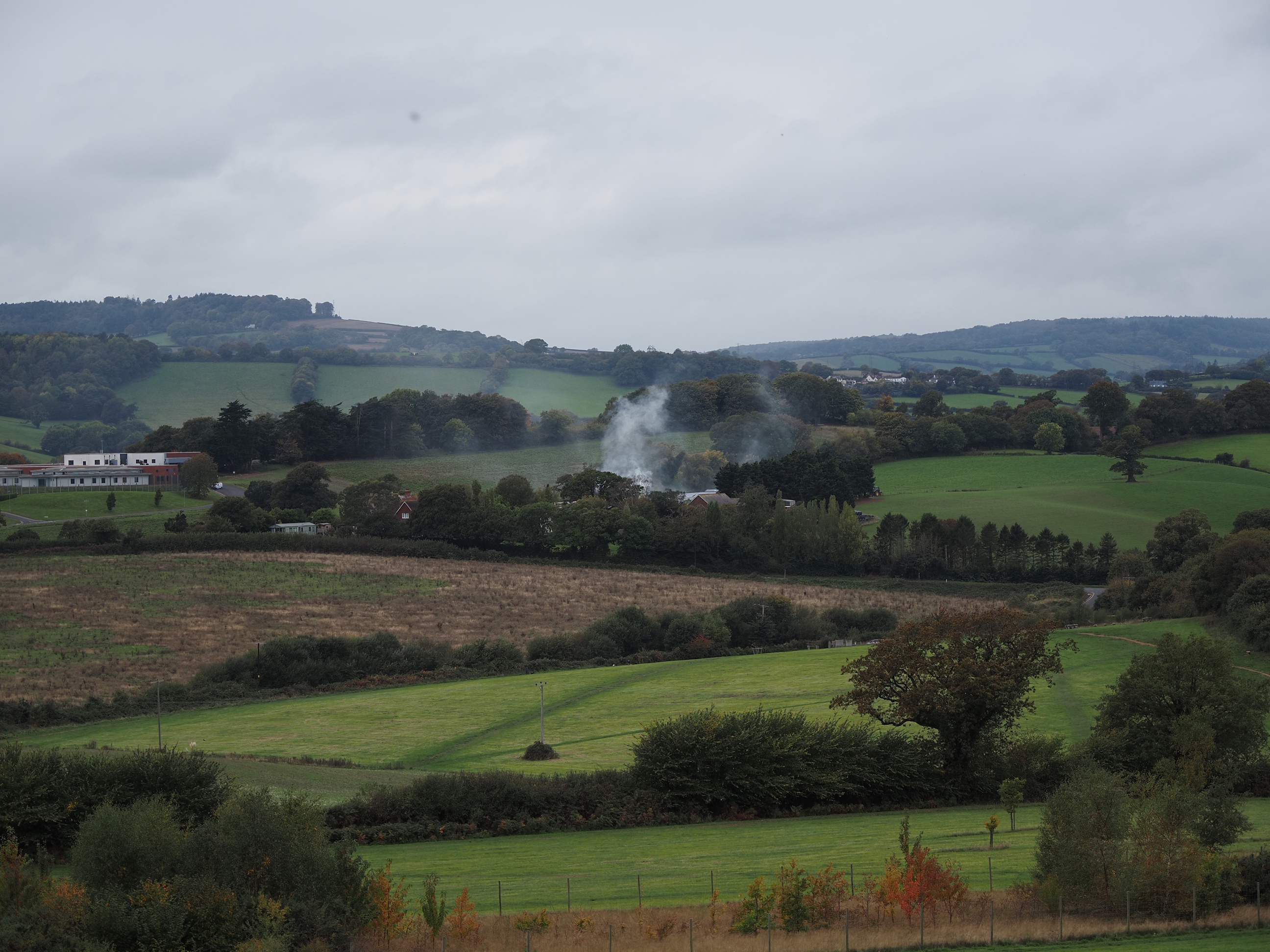
While we were eating lunch this place decided to start smoking . . .
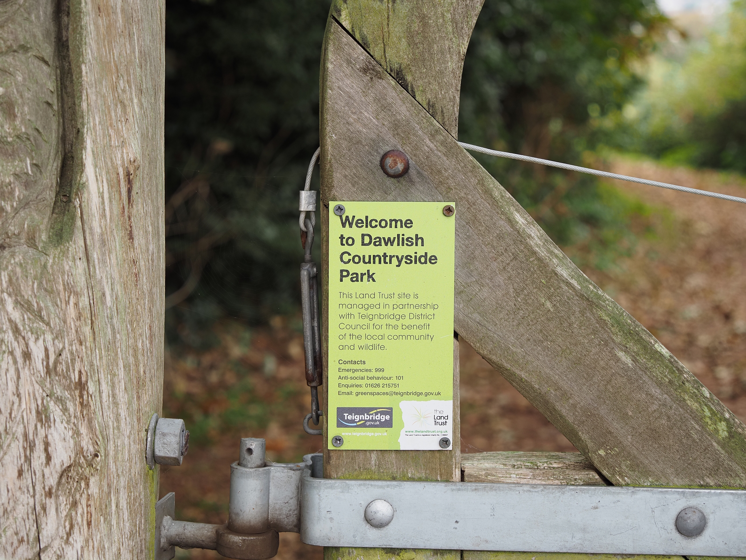
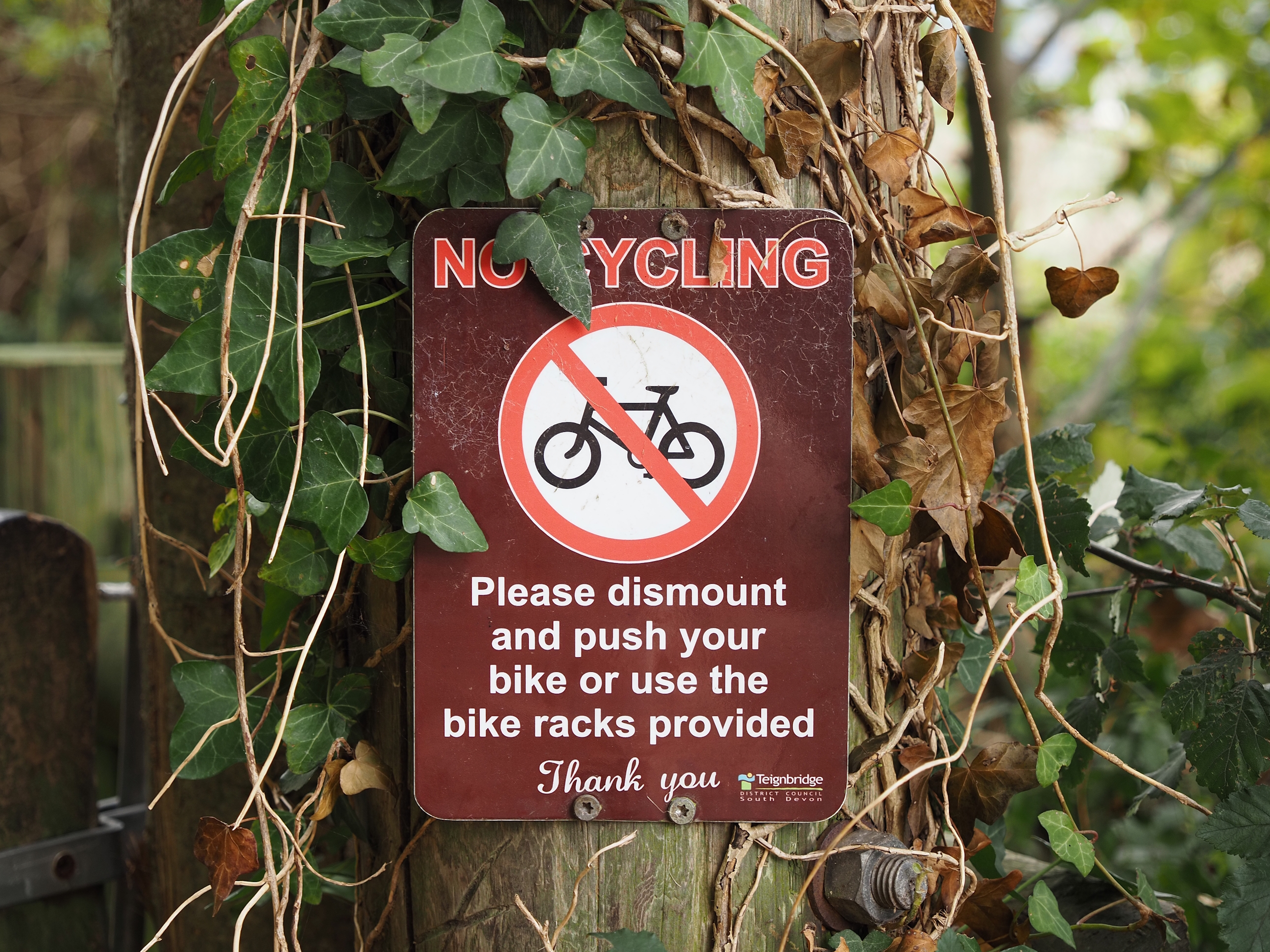
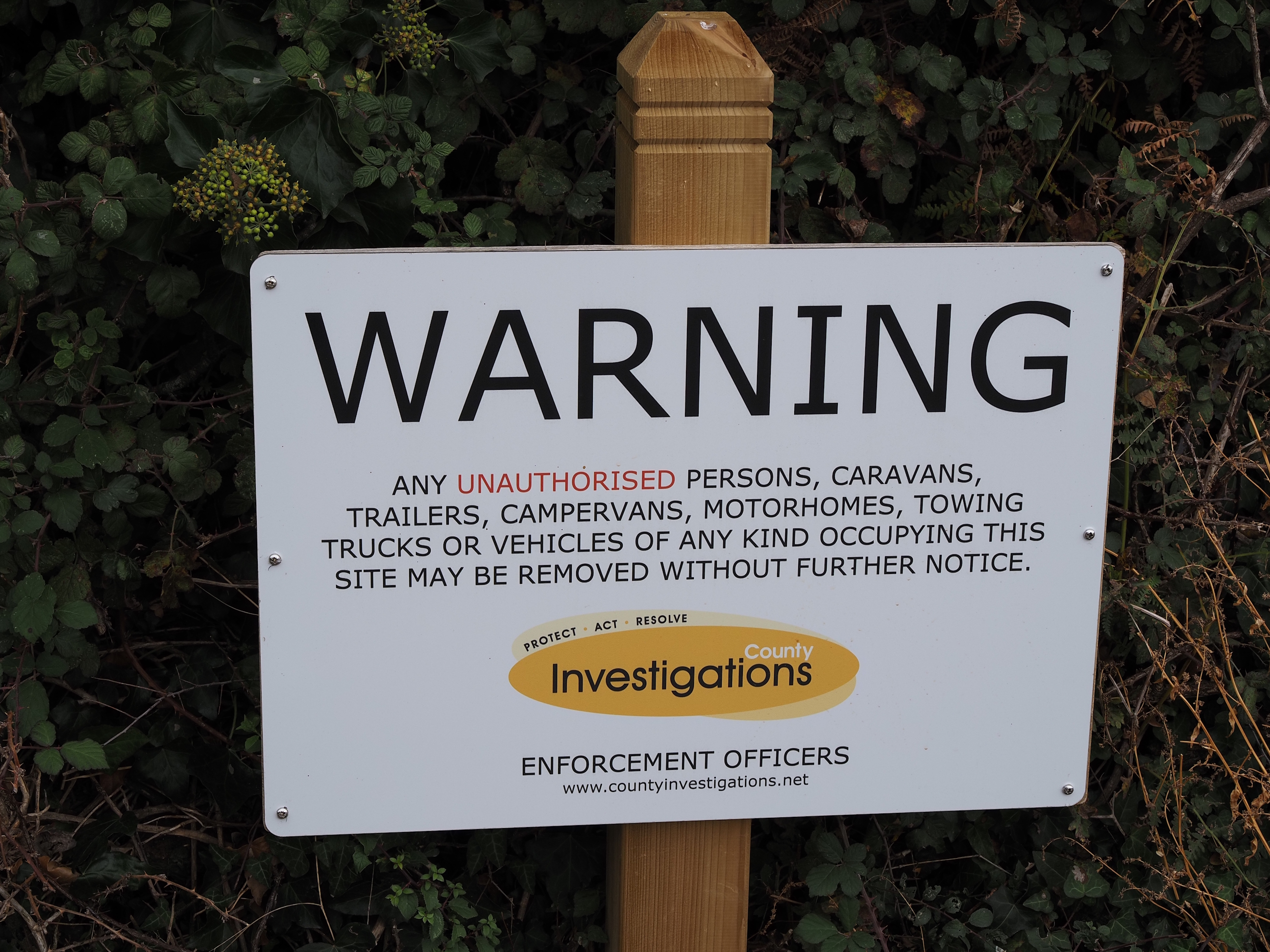
Signs, signs, signs, signs . . .
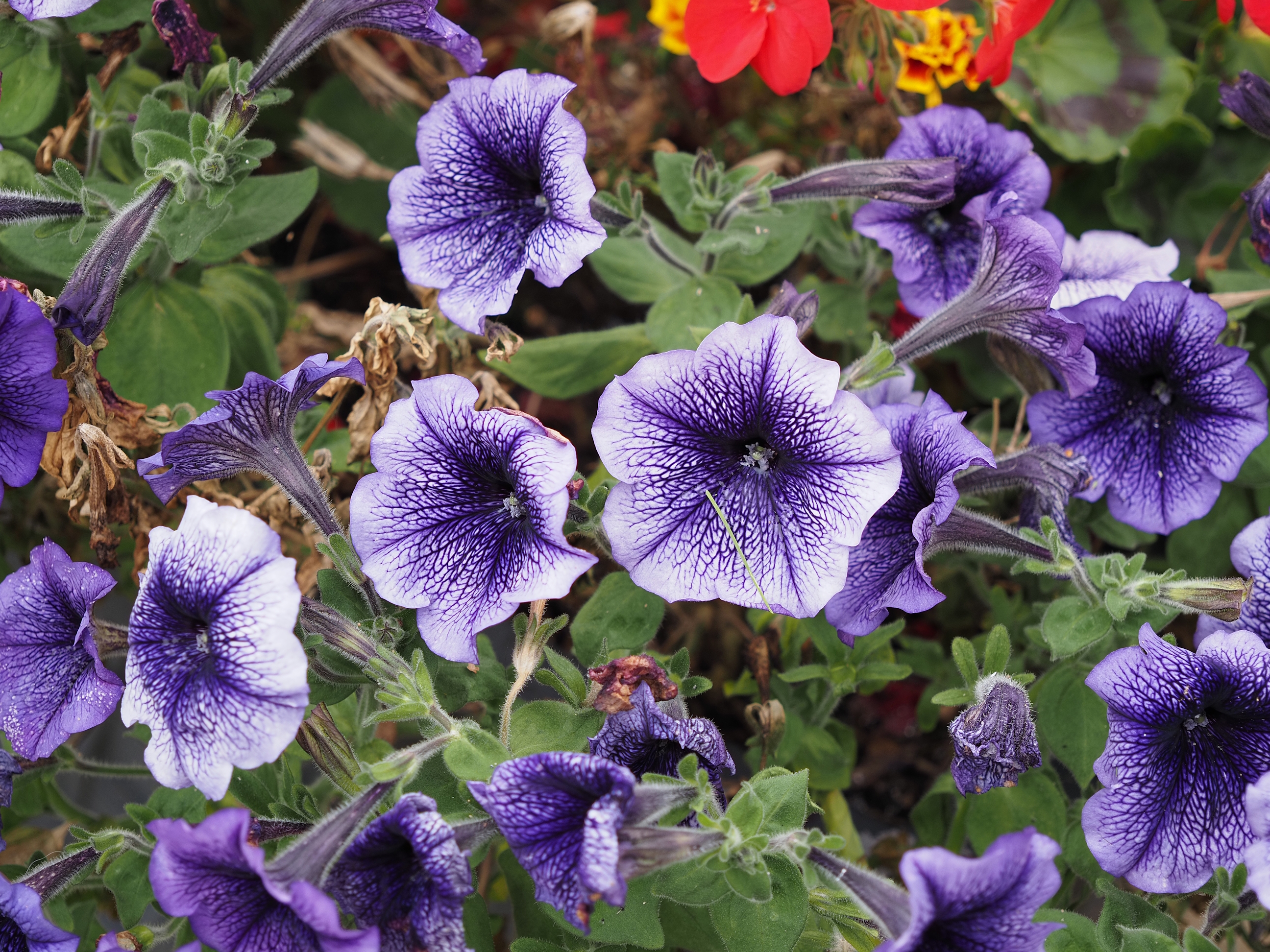
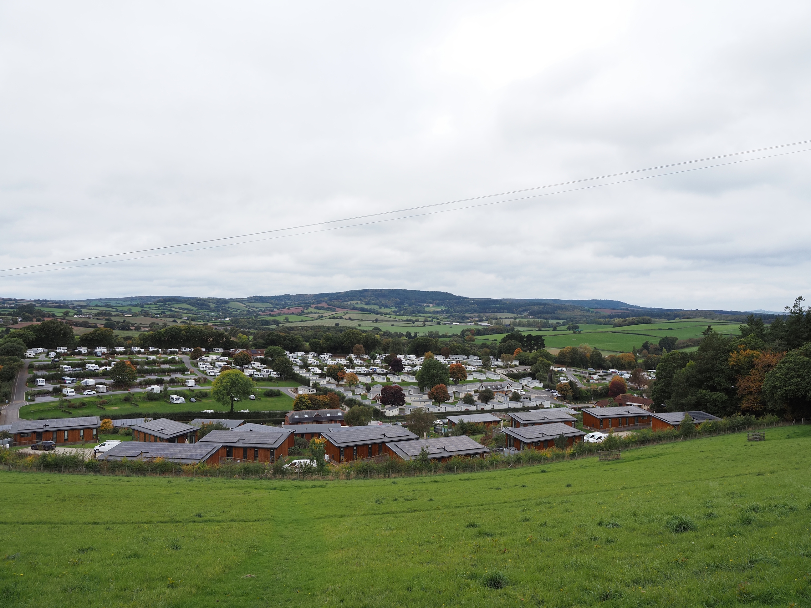
After all the signs telling us what we shouldn’t be doing, we finally arrive at Cofton Holiday Park where they have some lovely pretties . . .
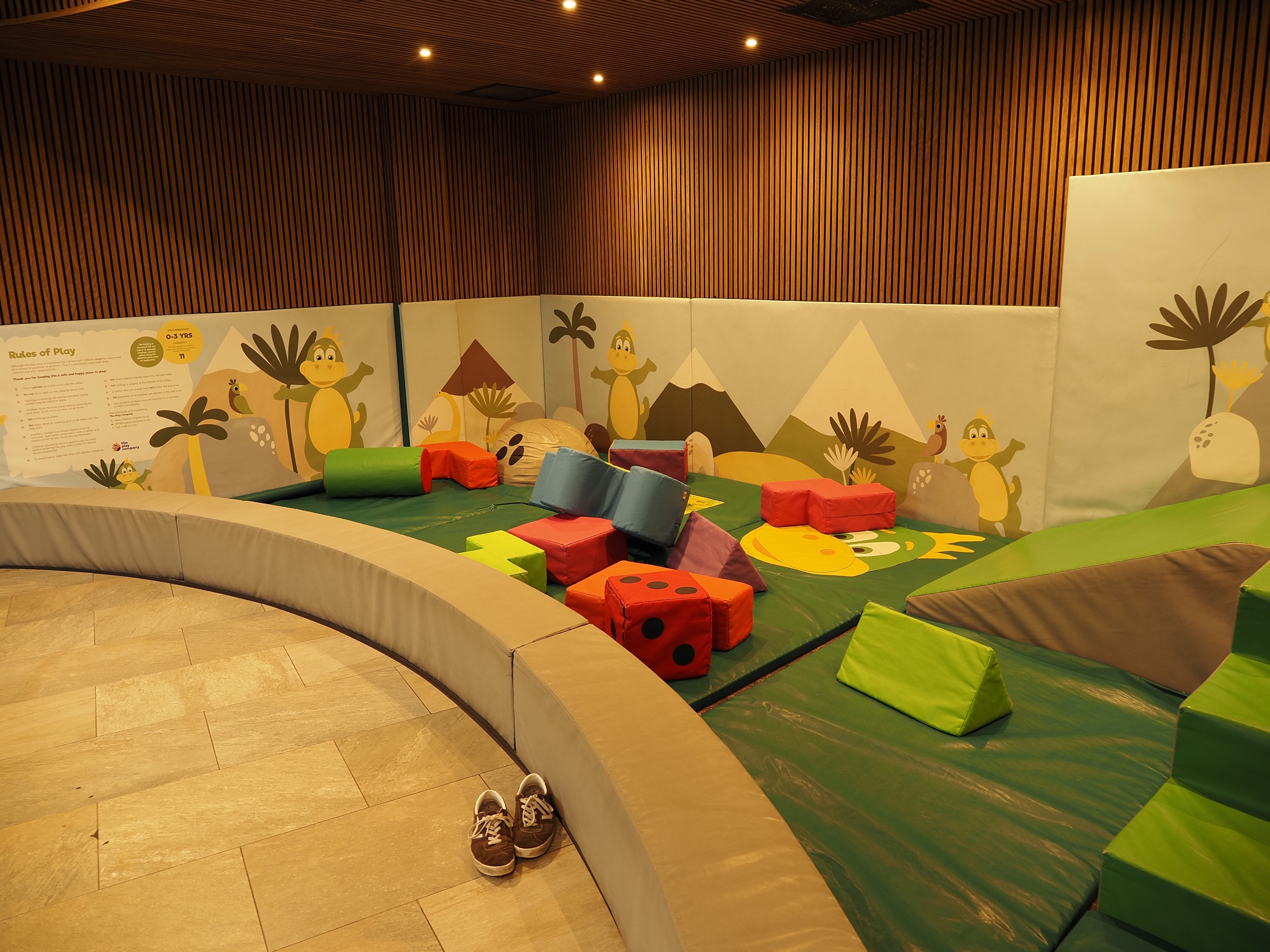
A play area for toddlers . . .
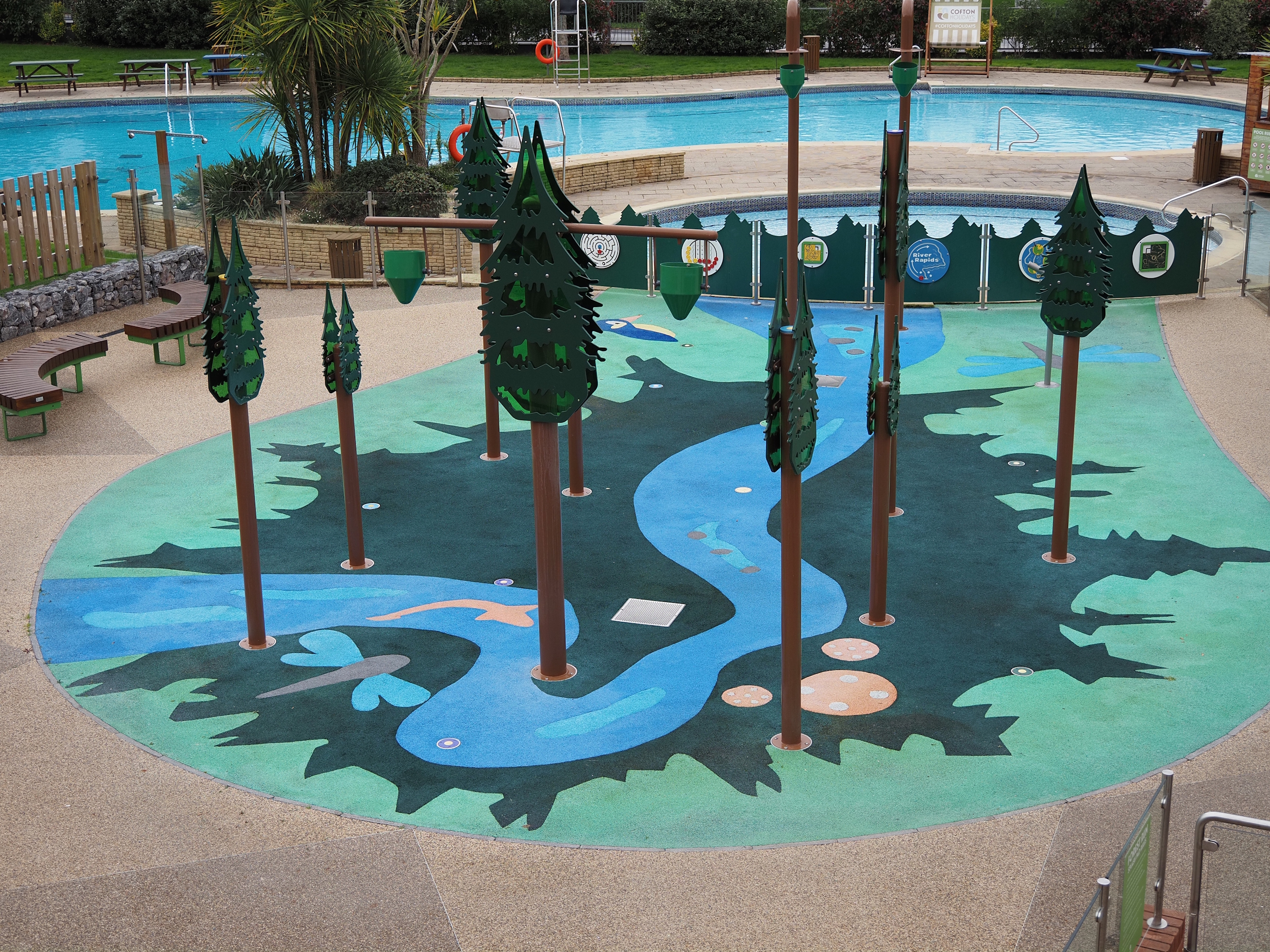
And some fountain thing (no water now the grocks have gone), though i’m not sure what the christmas trees have to do with it . . .
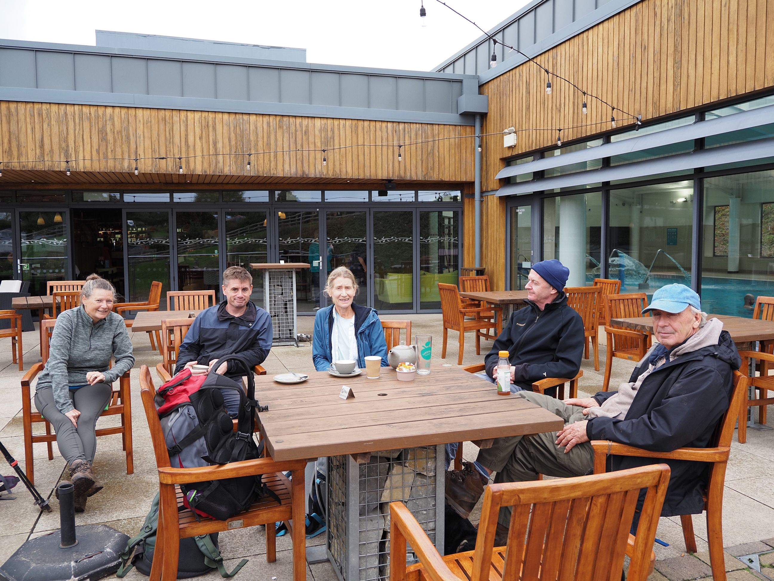
And a nice cafe bar area to sit and have another break . . .
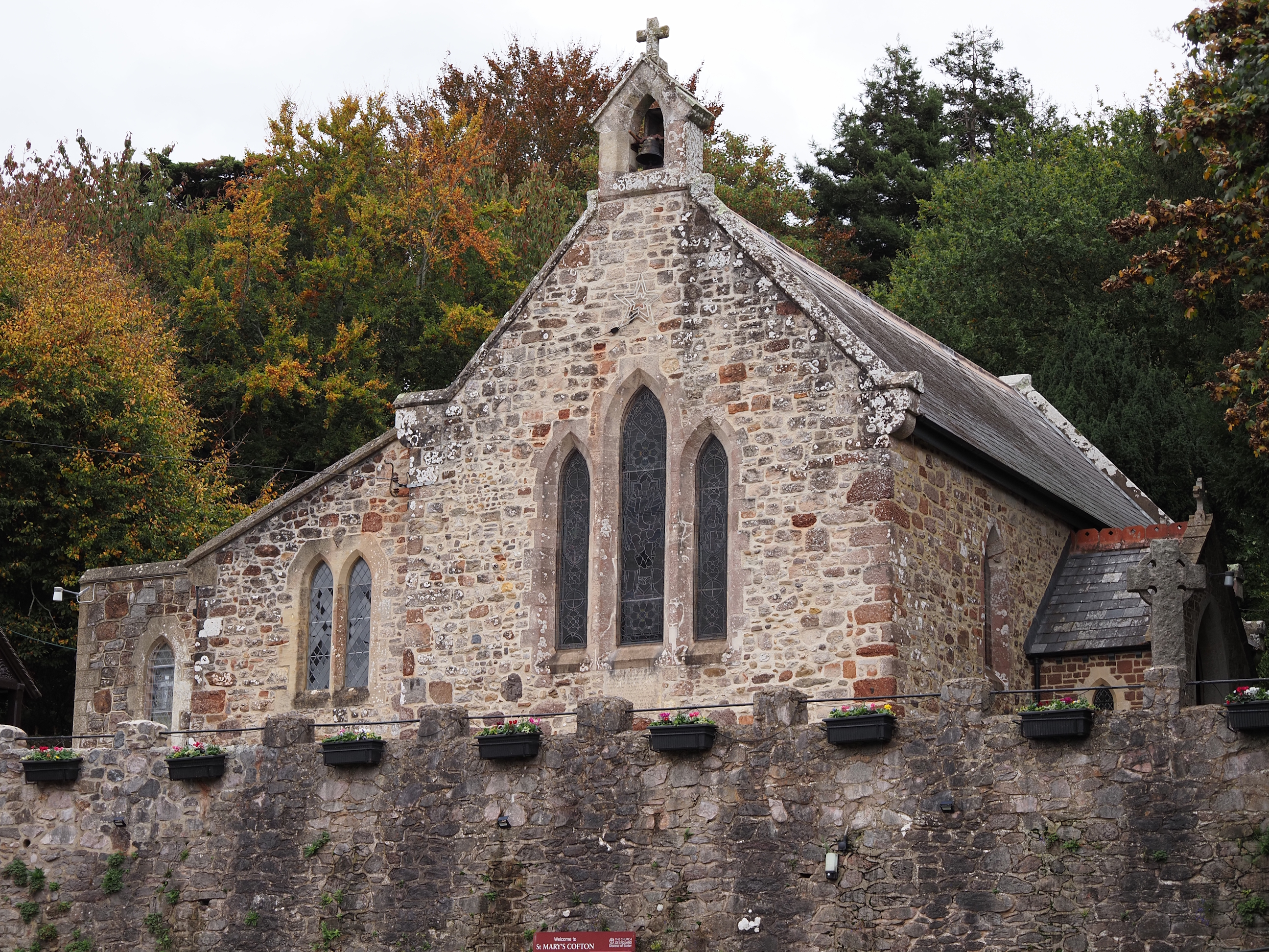
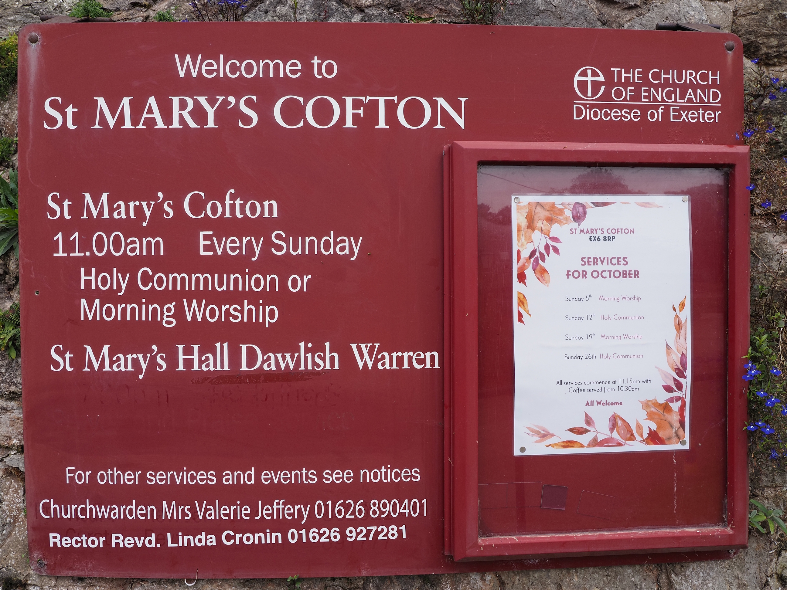
On the way out of Cofton there was this lovely old chapel, belonging to St. Mary . . .
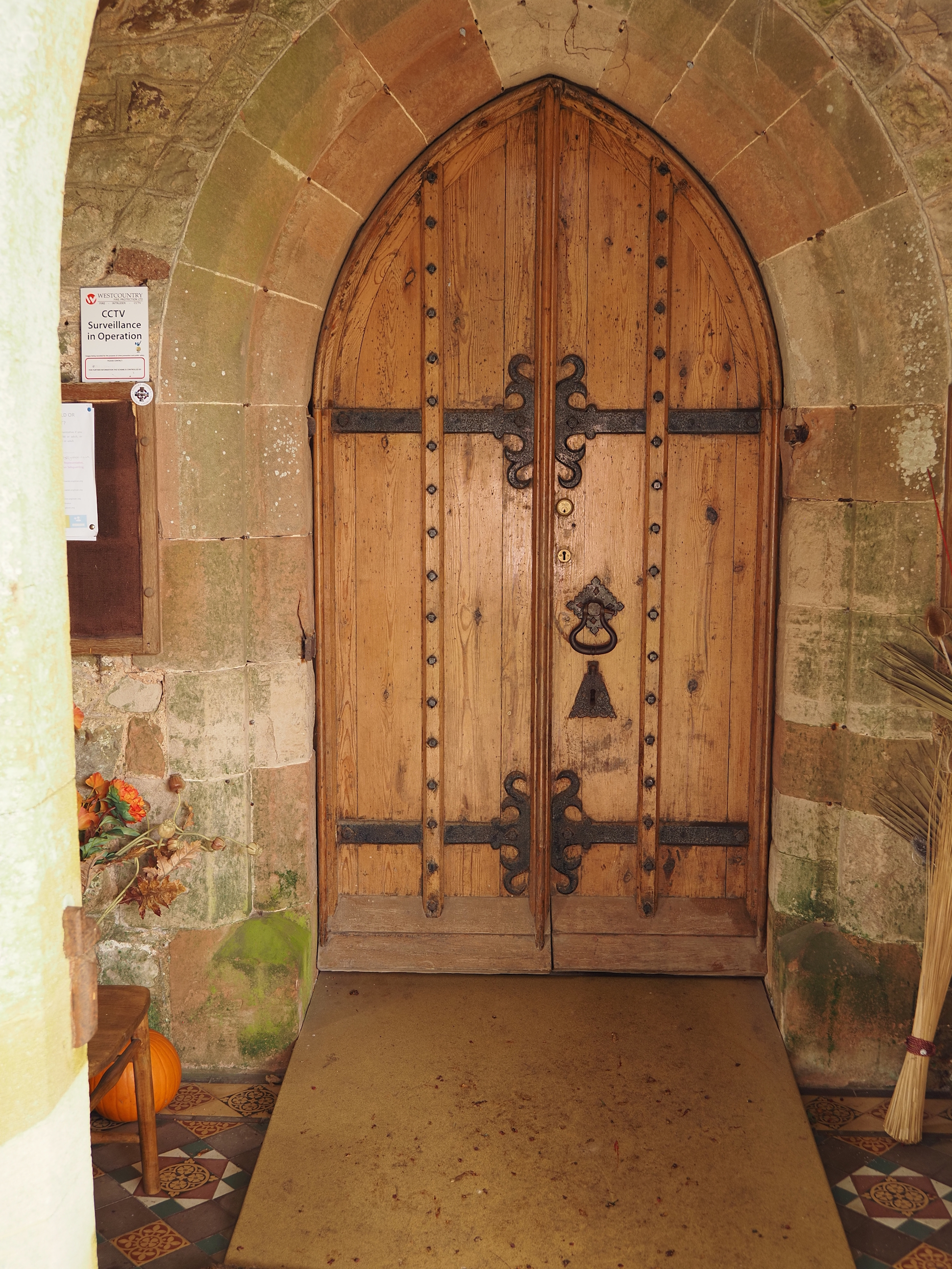
Along with pipe organs and bell towers, my other favourite thing about these older churches/chapels are their doors . . .
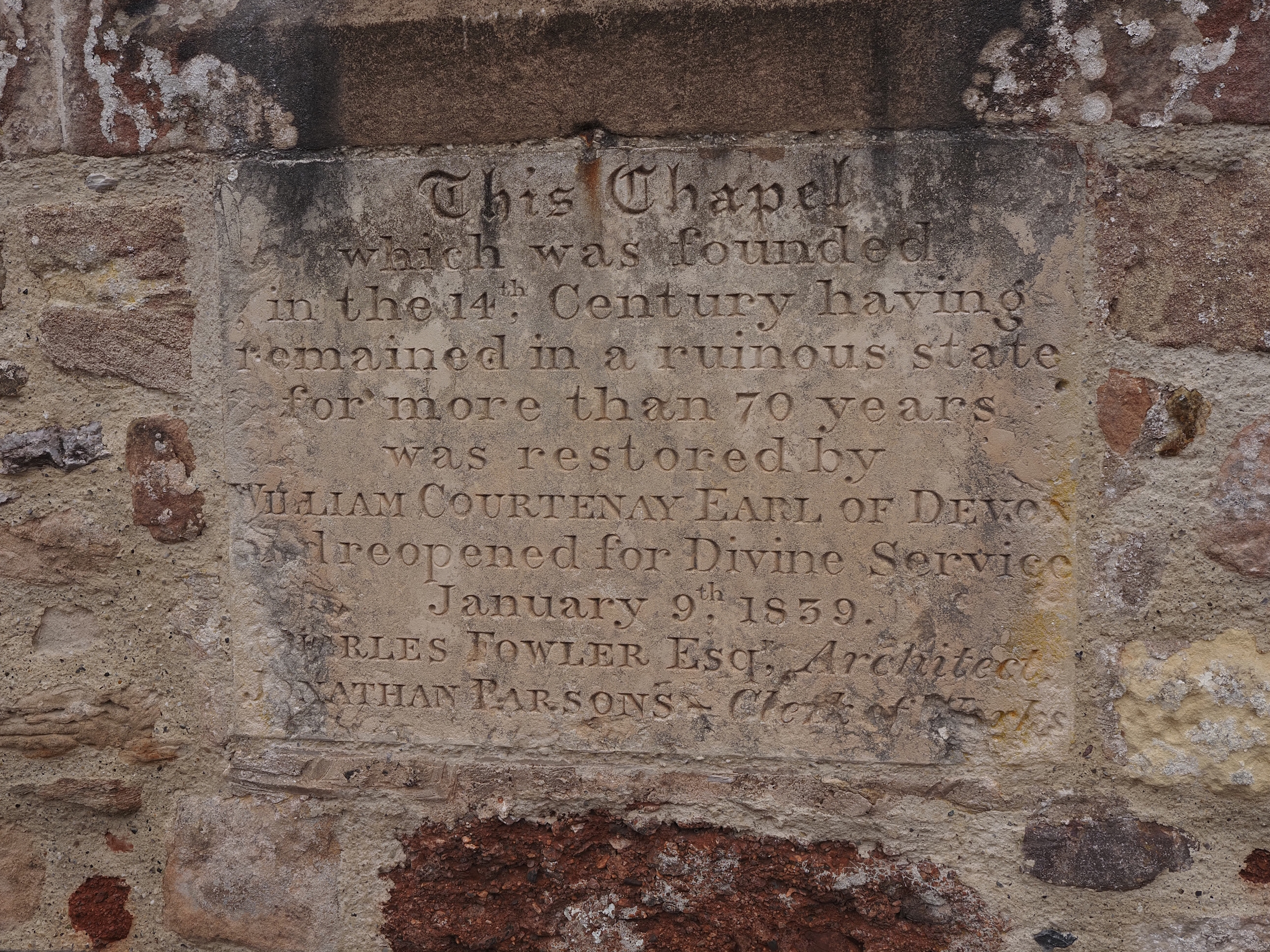
Some history for those who enjoy that kind of thing . . .
This looks like fun for children . . .
The overhead view of Cofton Holiday Park . . .
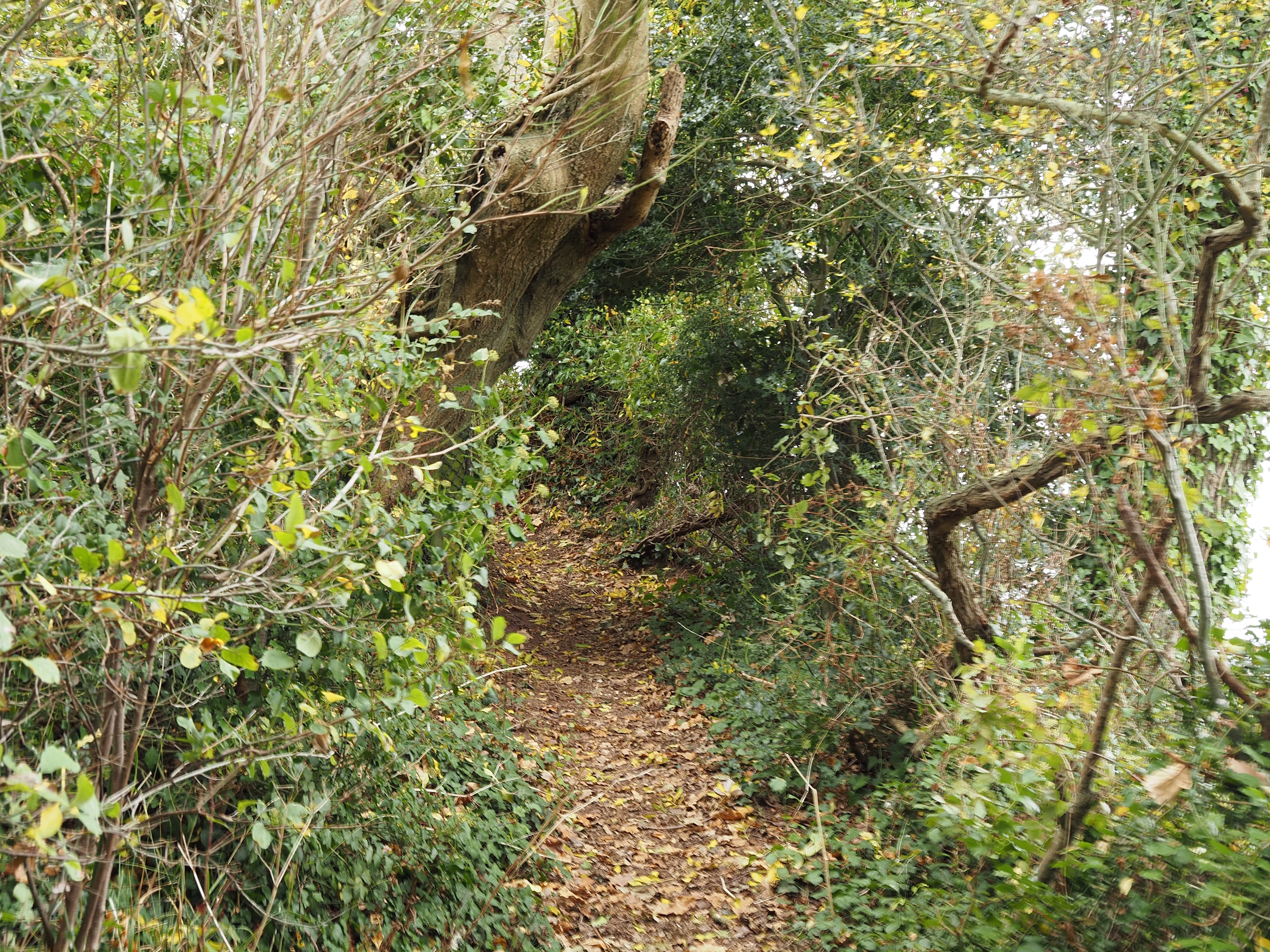
As we wander along this lovely footpath . . .
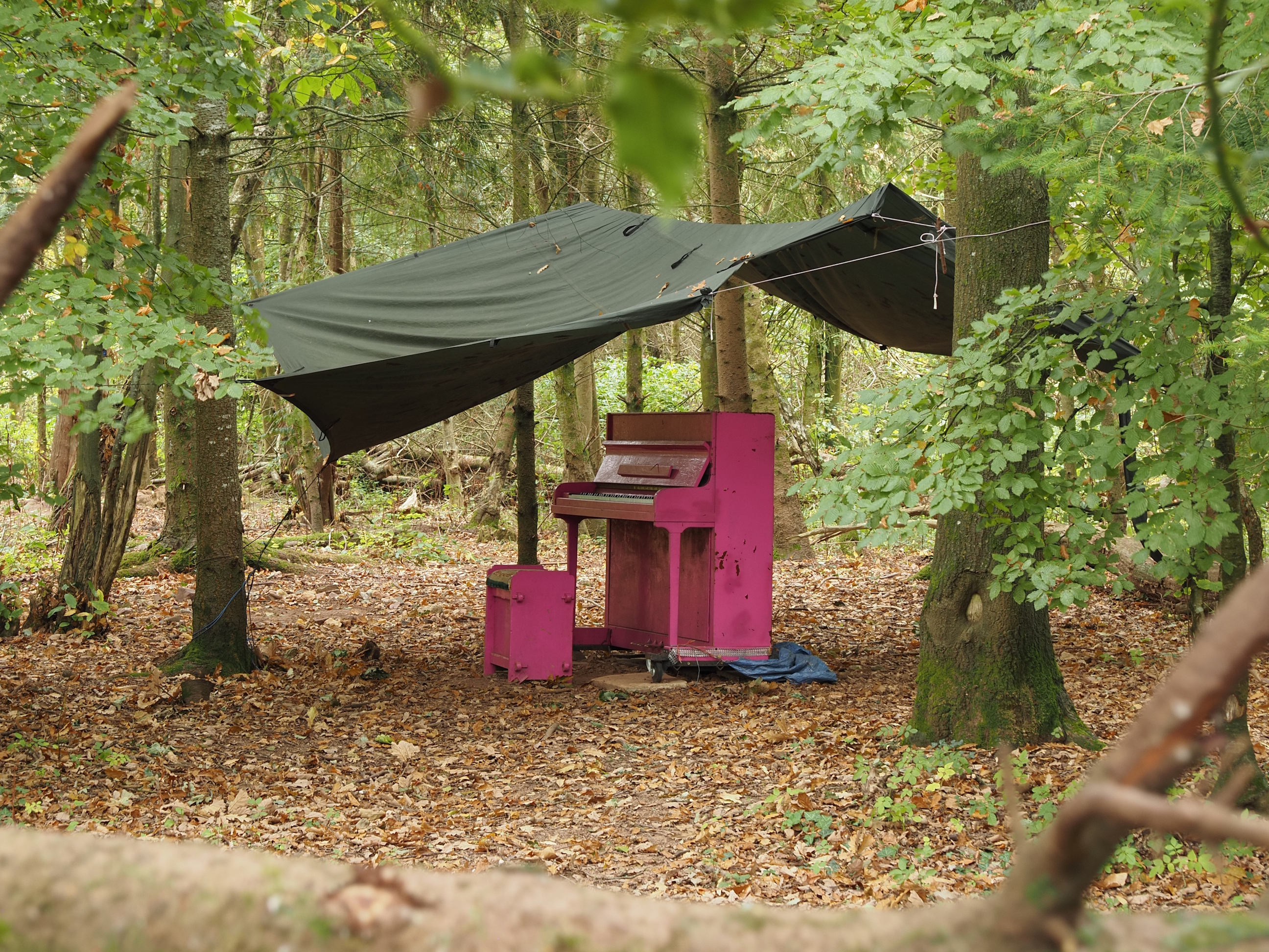
And then we find a piano, a bright pink piano, in the middle of the woods, random! . . .
The trees are slowly beginning to get their Autumn plumage . . .
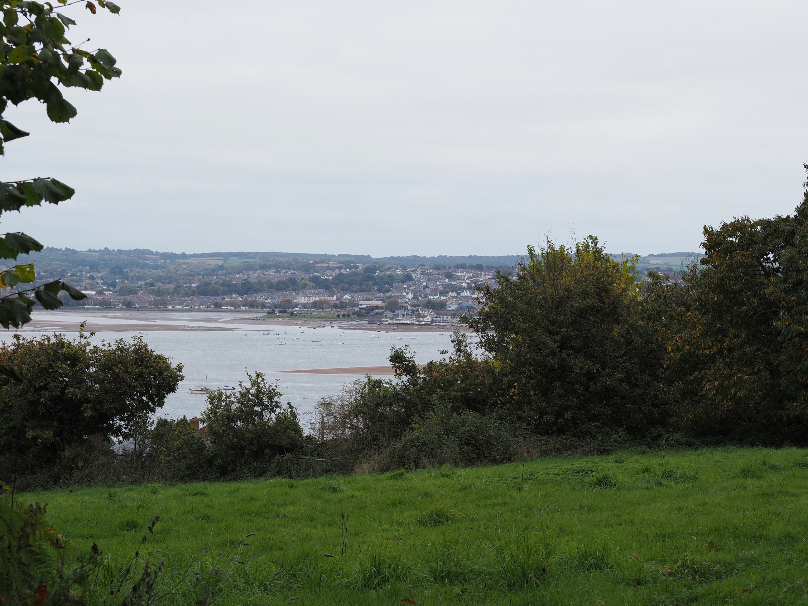
Across the estuary to Exmouth. My house is about the exact centre of the photo . . .
Starcross is still a bit of a way off . . .
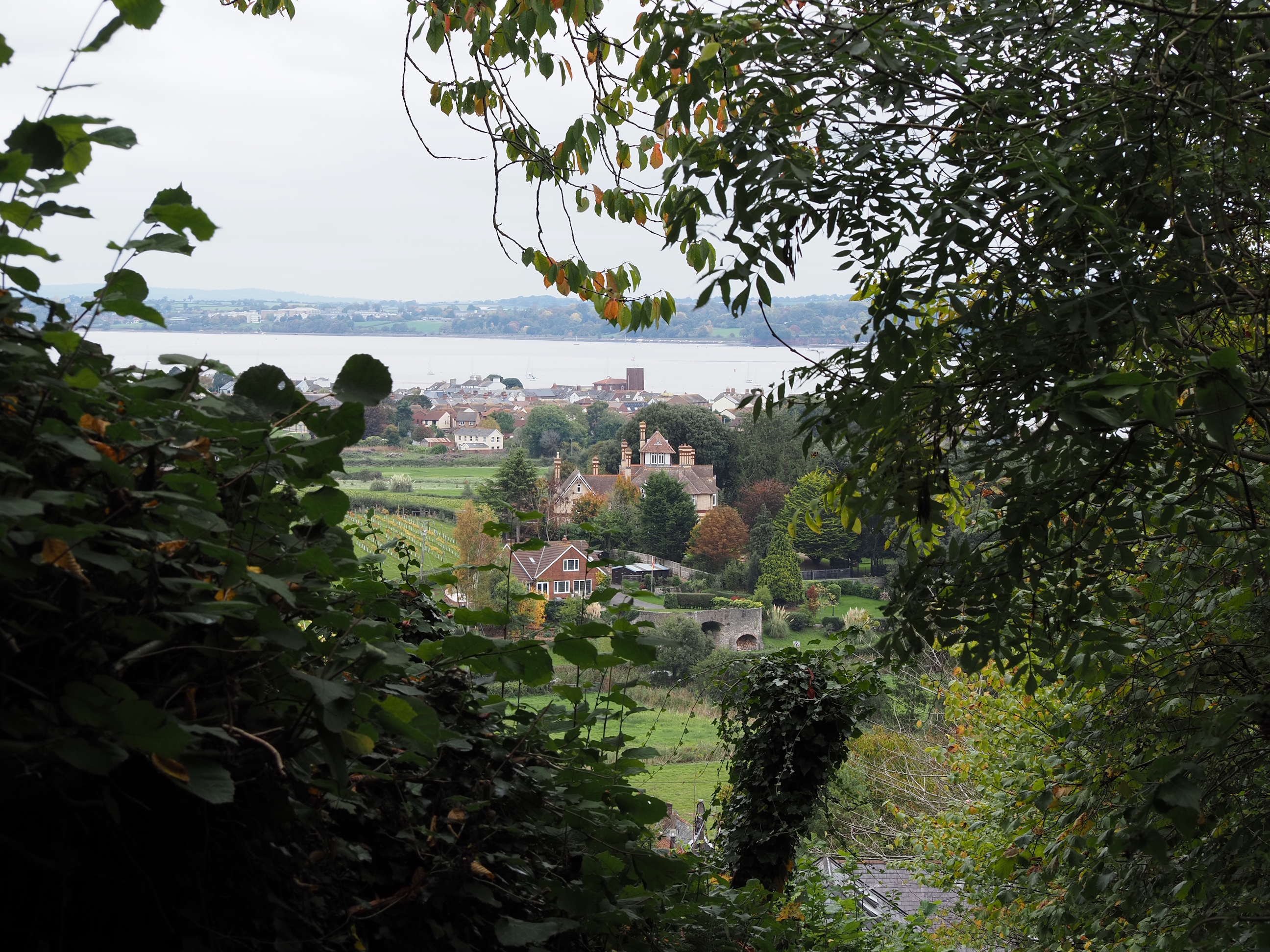
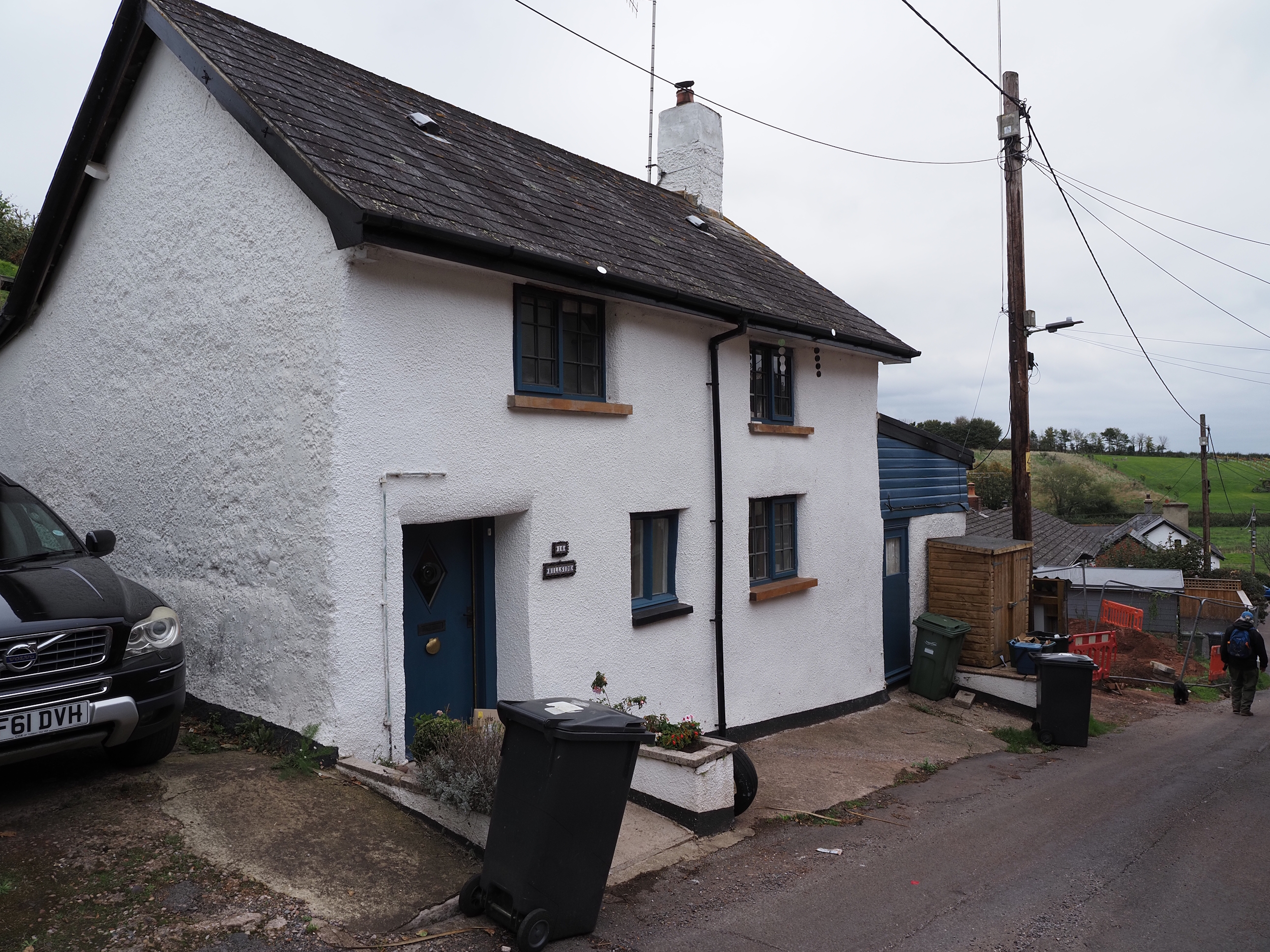
But first we must get through Cockwood, where i find the nicest cottage of the day. One would think they would find somewhere for the unsightly bins though . . .
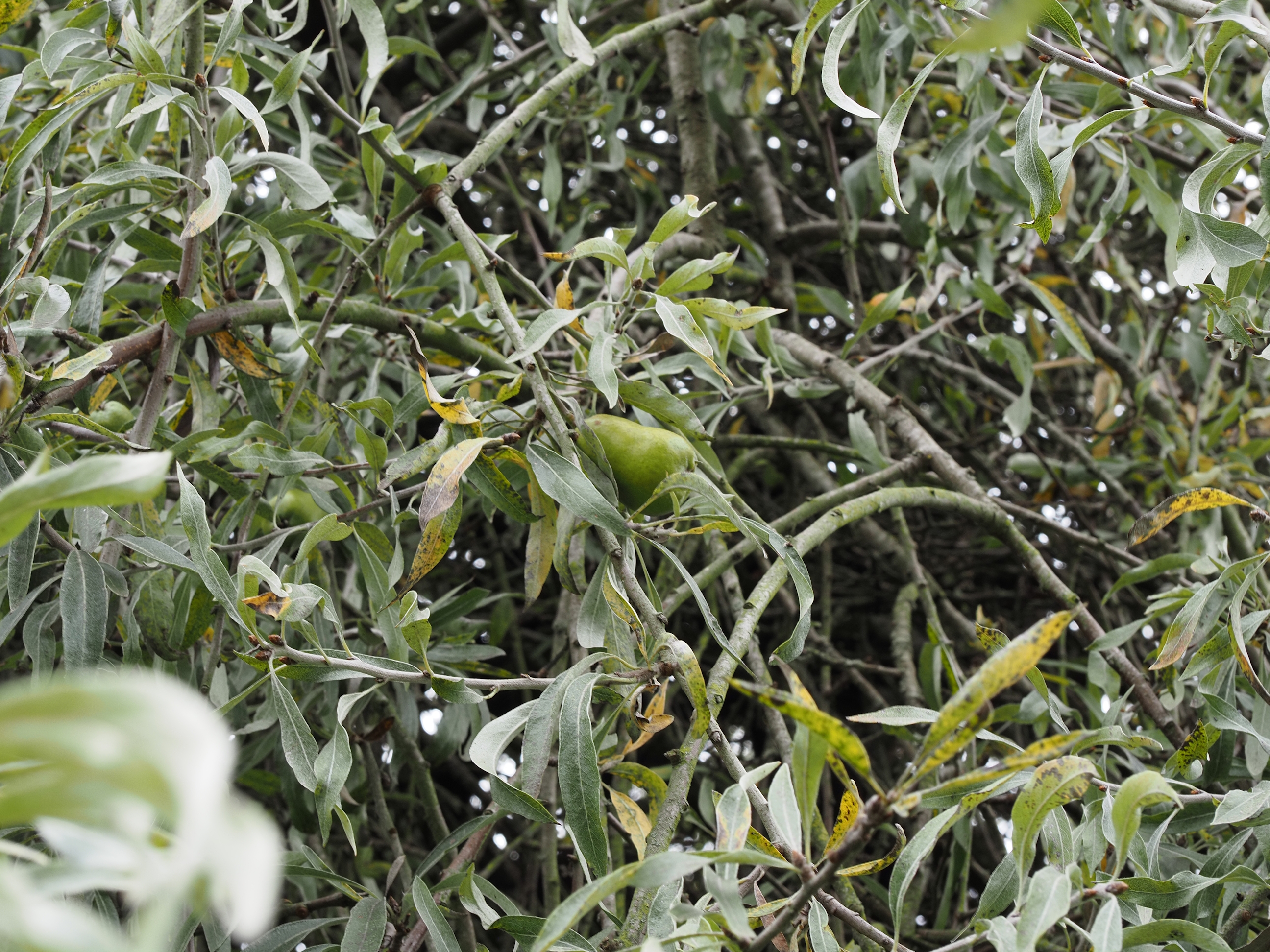
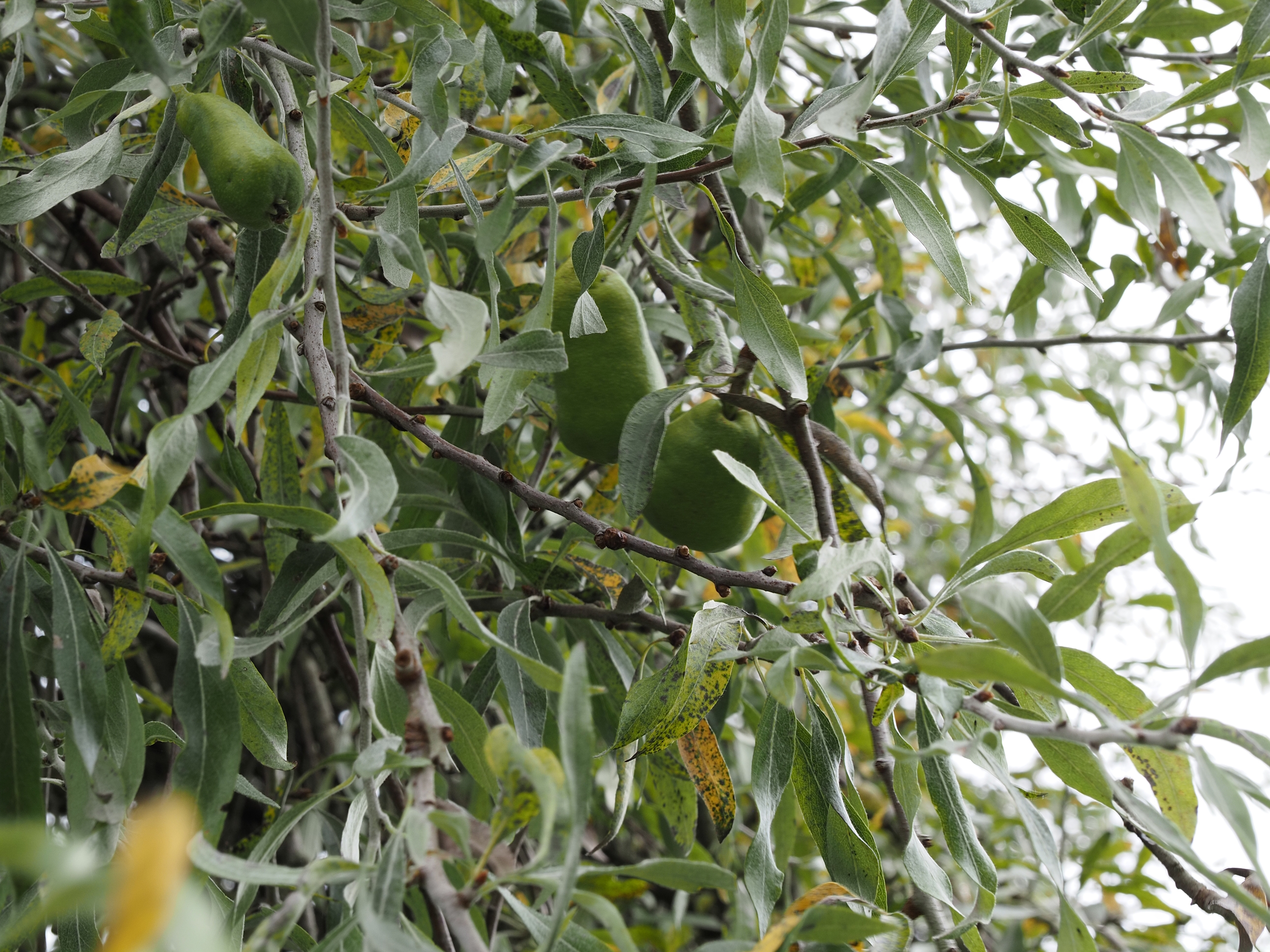
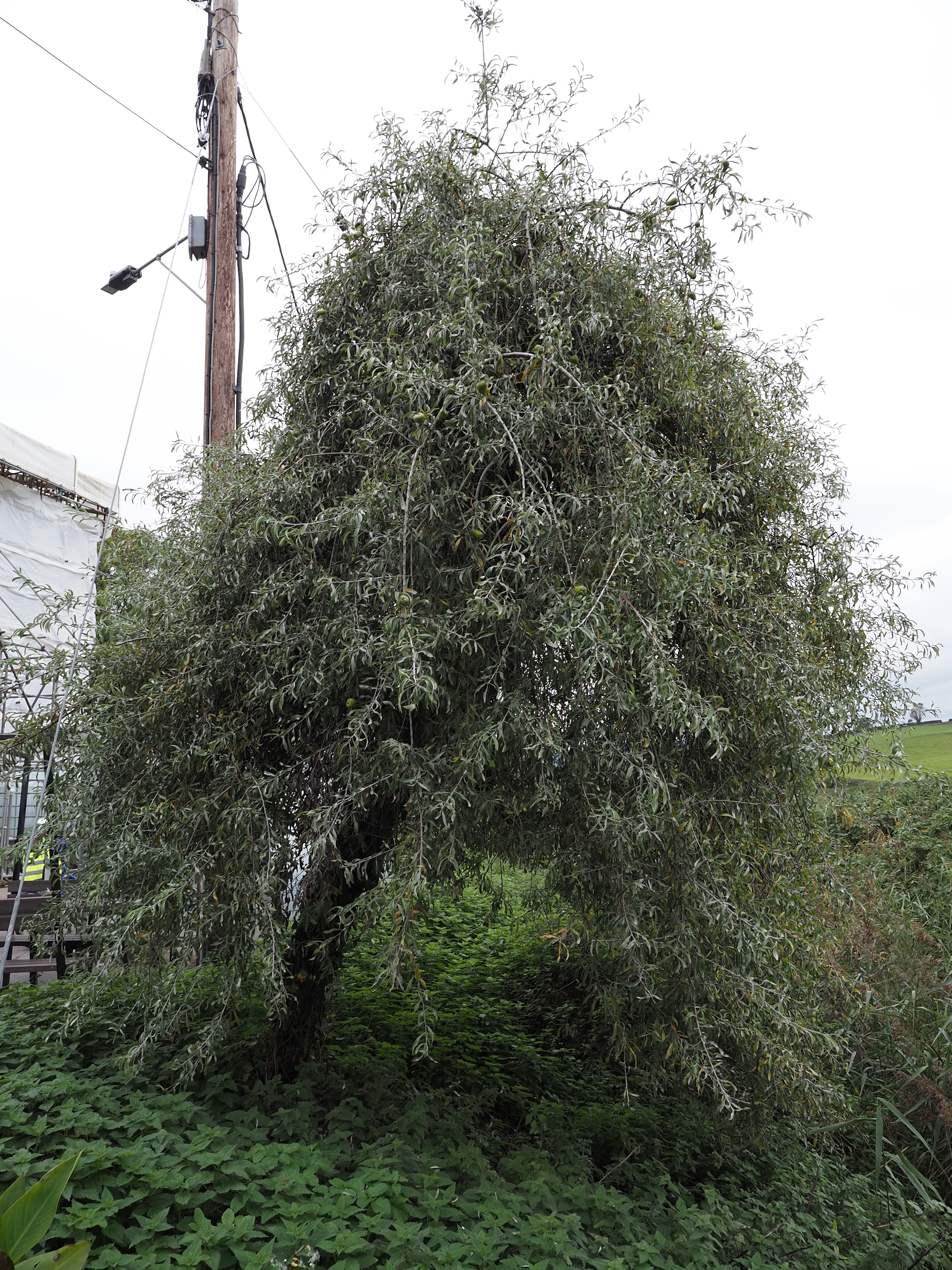
Then we came across this tree with these tiny pears on it. Pyrus salicifolia . . .
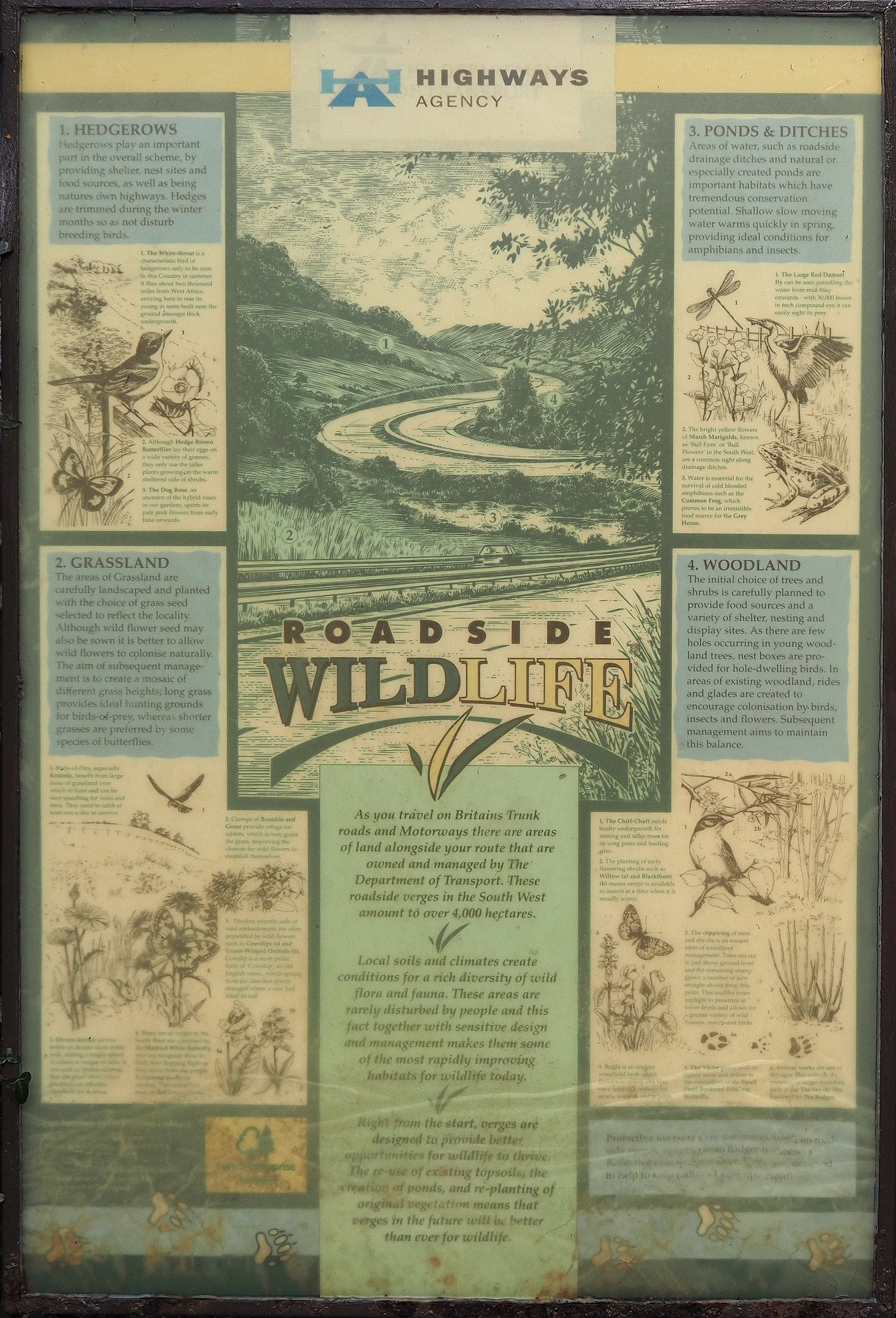
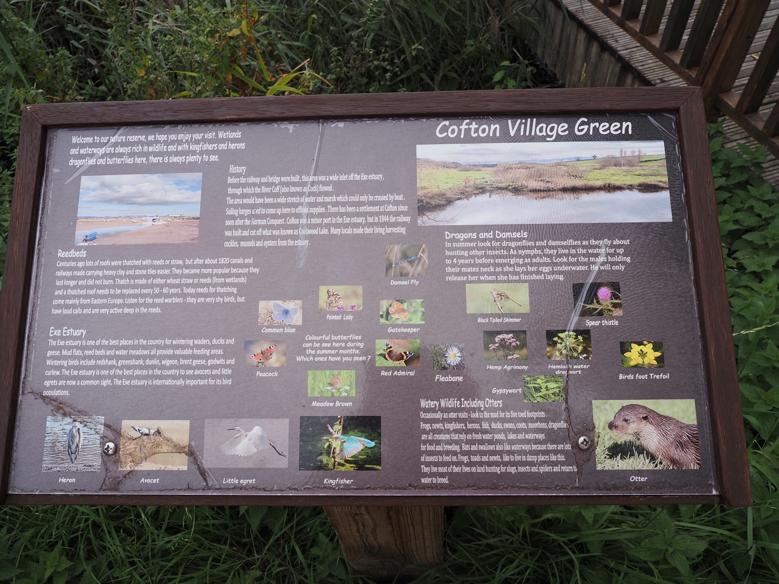
Some interesting stuff to read about the local fauna and flora . . .
And then we finally get to Starcross where we all go our seperate ways after another great day out in the beautiful and interesting Devon countryside.
The train station shelter was all done up in giant murals, so i had to take my last few photos before putting my camera away for the journey home . . .
All in all, a great day out. The weather did get much better and the coats soon got taken off.
And a big thanks to Val for planning this walk out for us all to enjoy.
See ya all soon.
My first real outing into the countryside with my camera: exciting!
Left click on the photos and you’ll get a much bigger picture open in a new tab.
Here’s the route we took . . .
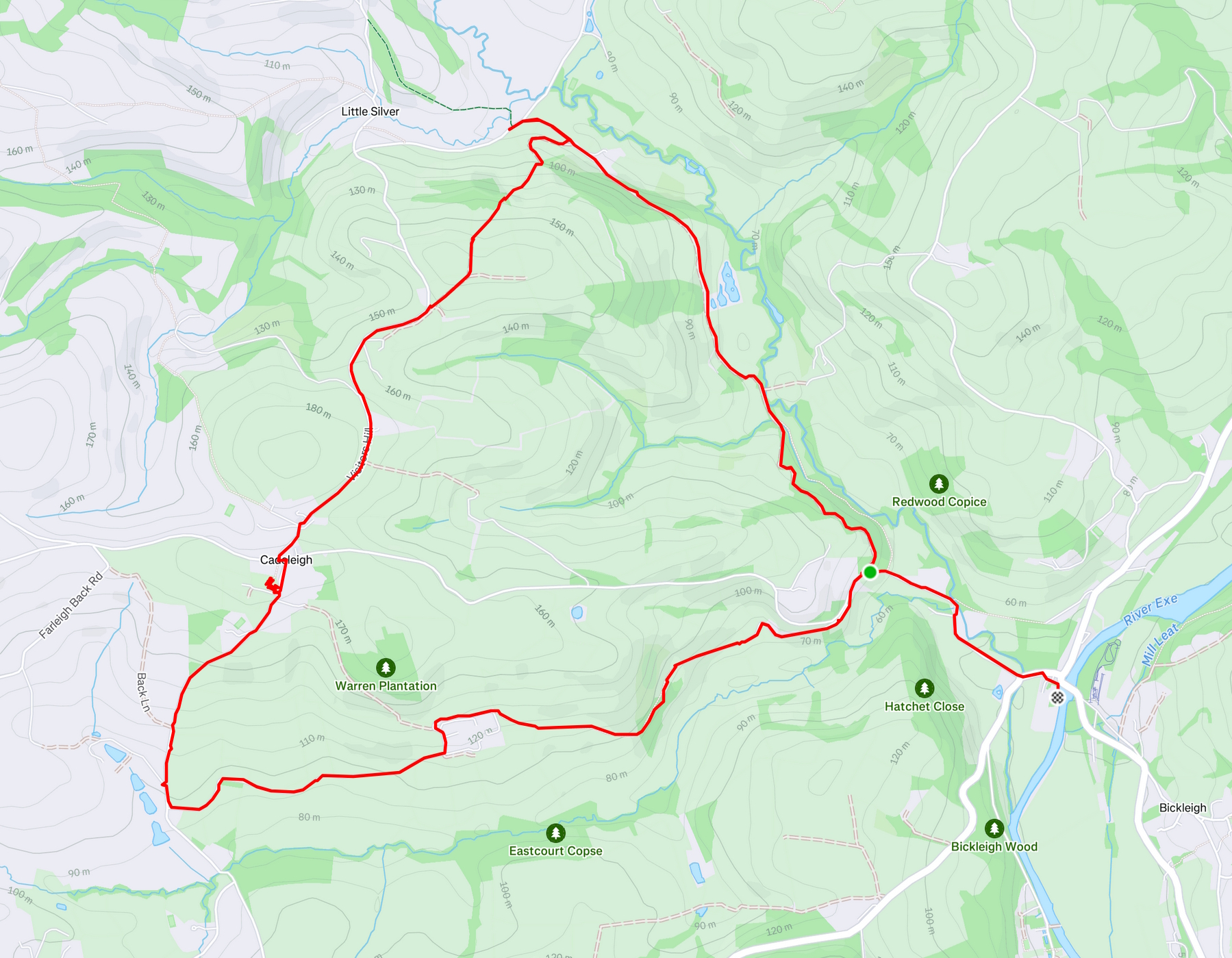
Yeah, we took a little wrong turn, ergo the dogleg at the top. I think the footpath sign was either missing or covered over by the hedgerow.
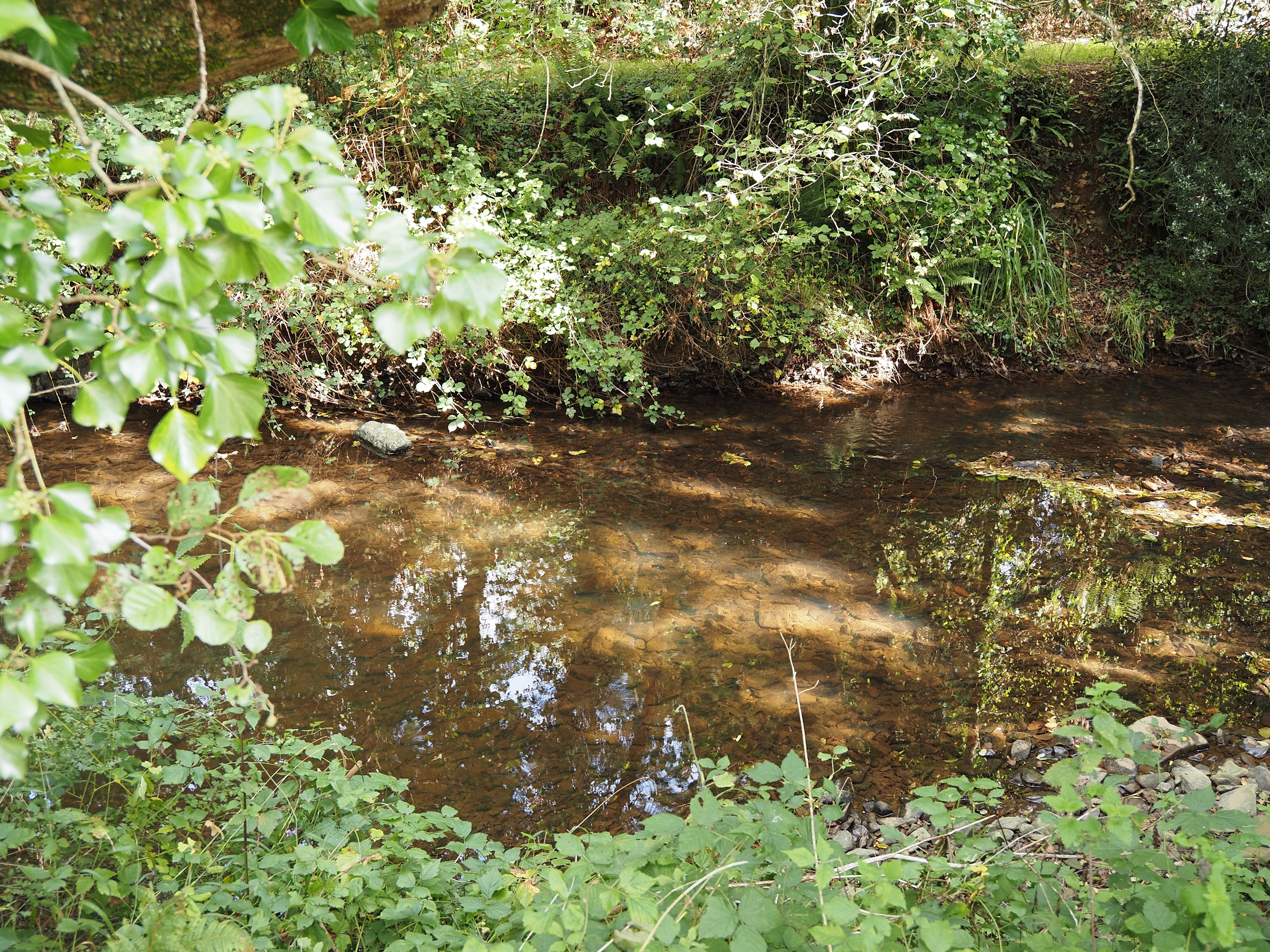
The walk out of Bickleigh was fairly easy alongside the River Dart . . .
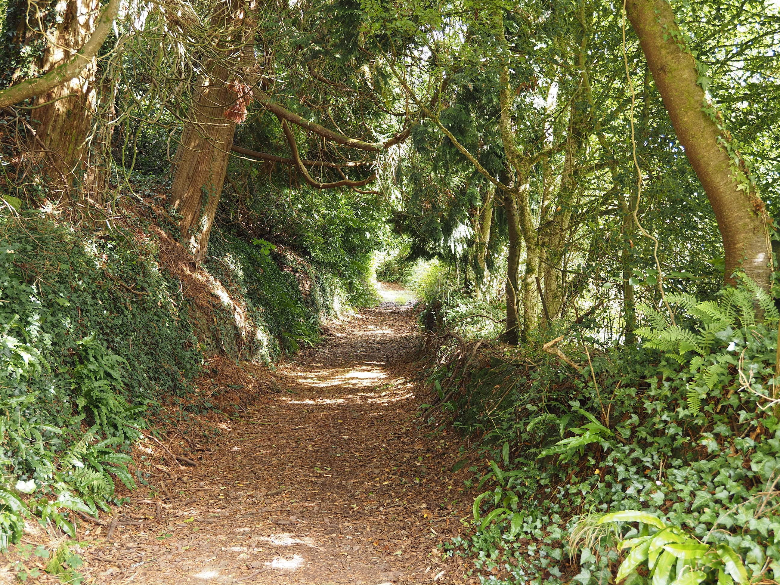
It’s starts as a lovely gentle uphill, which belies what comes later on as we head up the hill to Cadeleigh . . .
This is my favourite photo of the day . . .
Not sure who likes to shower outside here, but each to their own . . .
Strange place to grow . . .
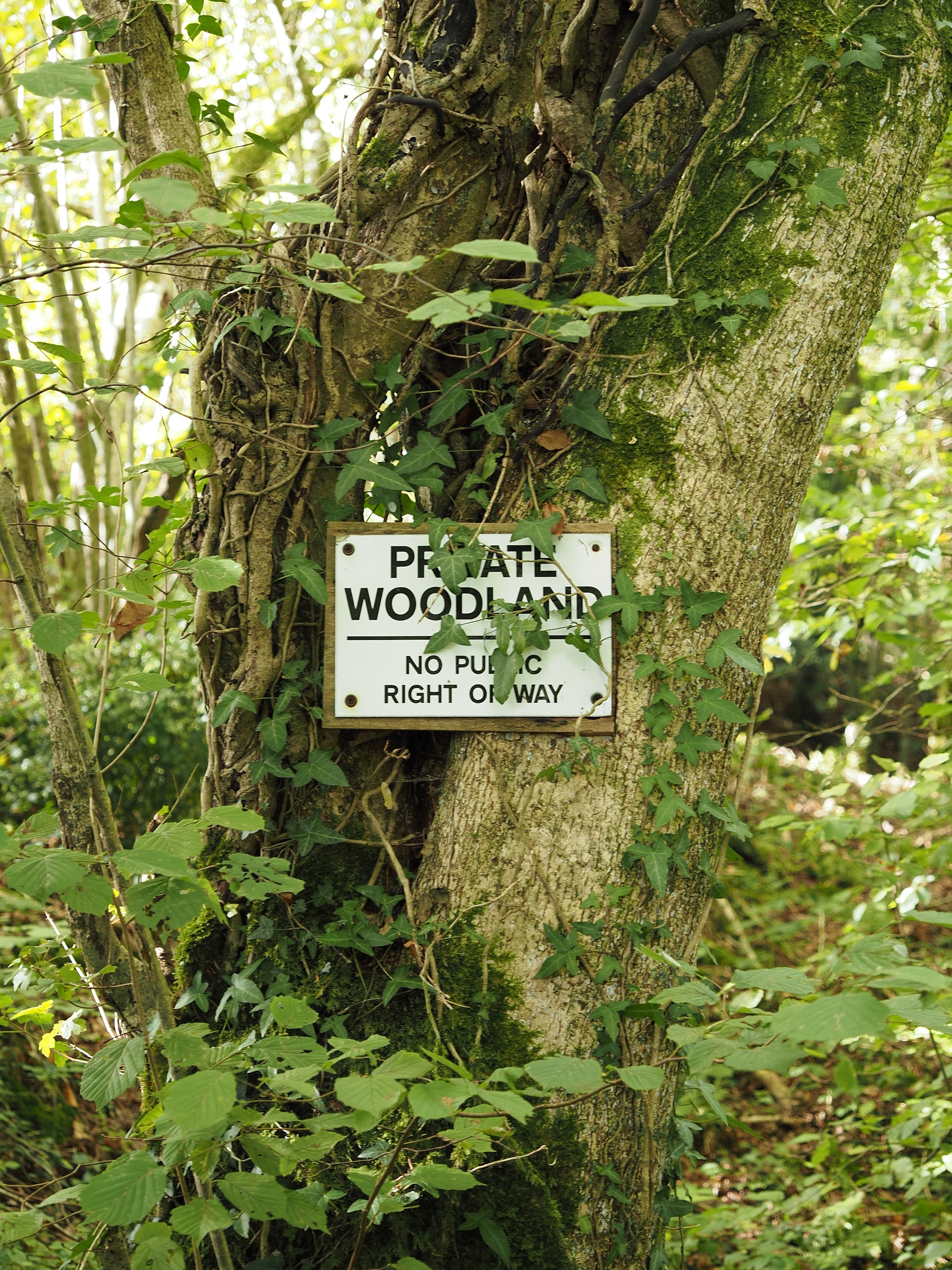
Just ignore it, we did, LOL . . .
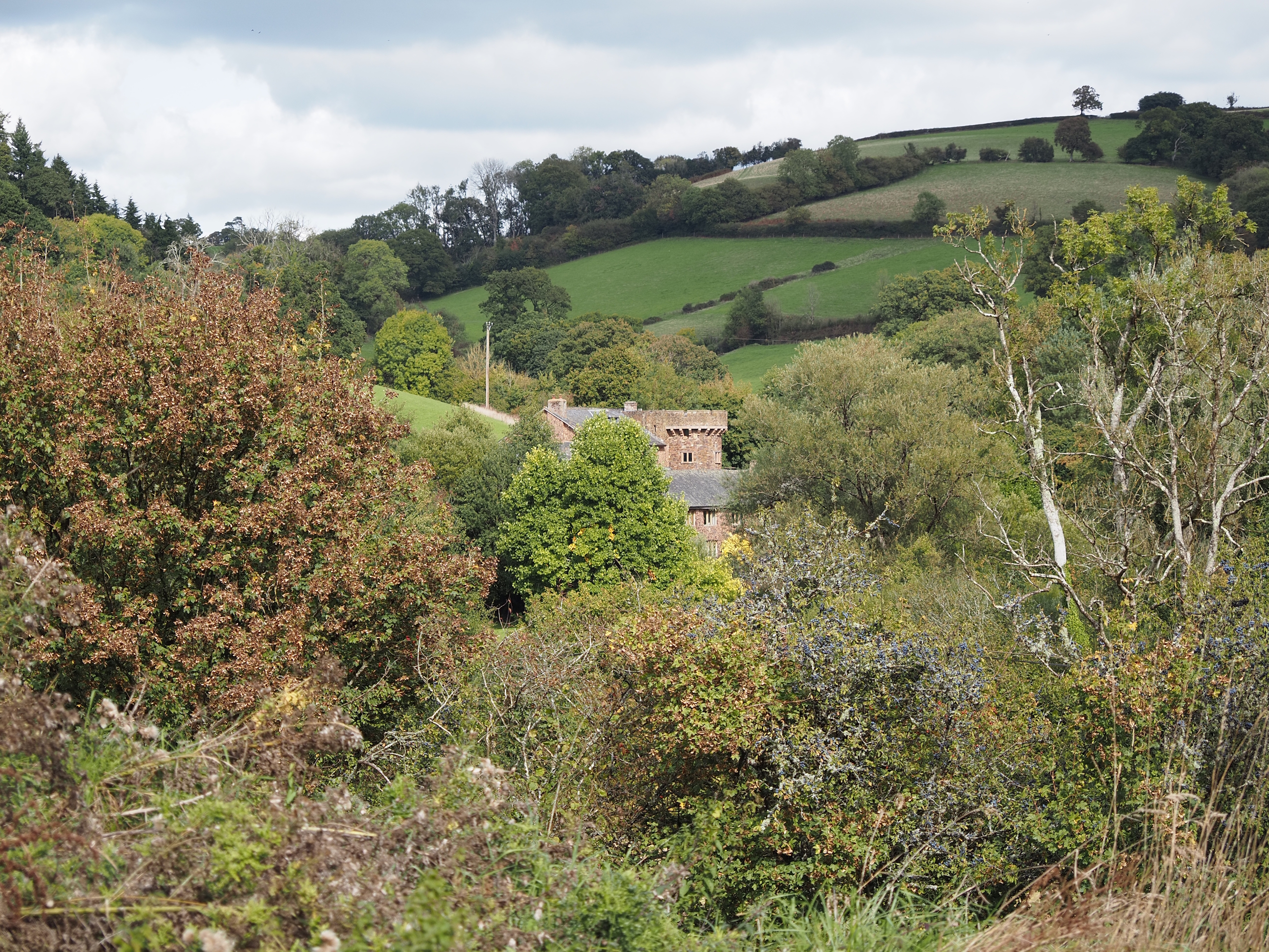
What a lovely place to live . . .
Such a beautiful farm yard . . .
I think this is West Barton Farm . . .
But i do wonder how many farms have tennis courts . . .
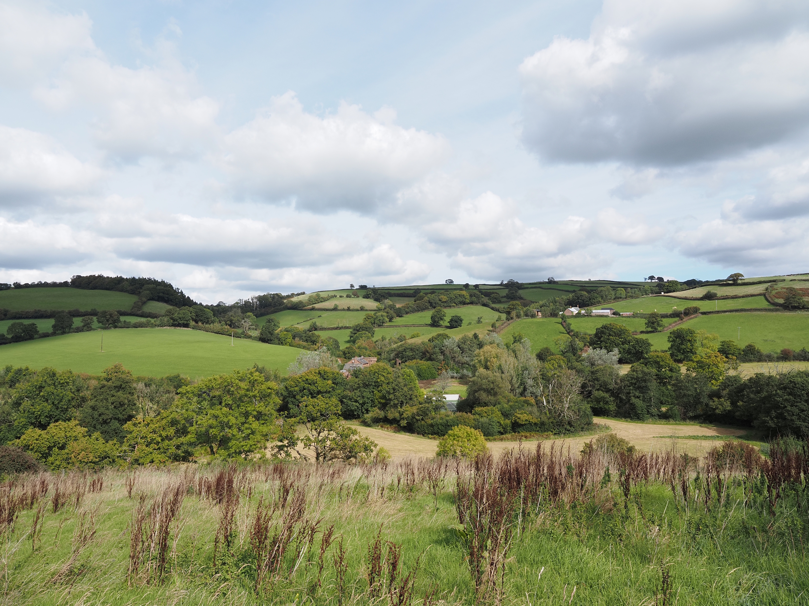
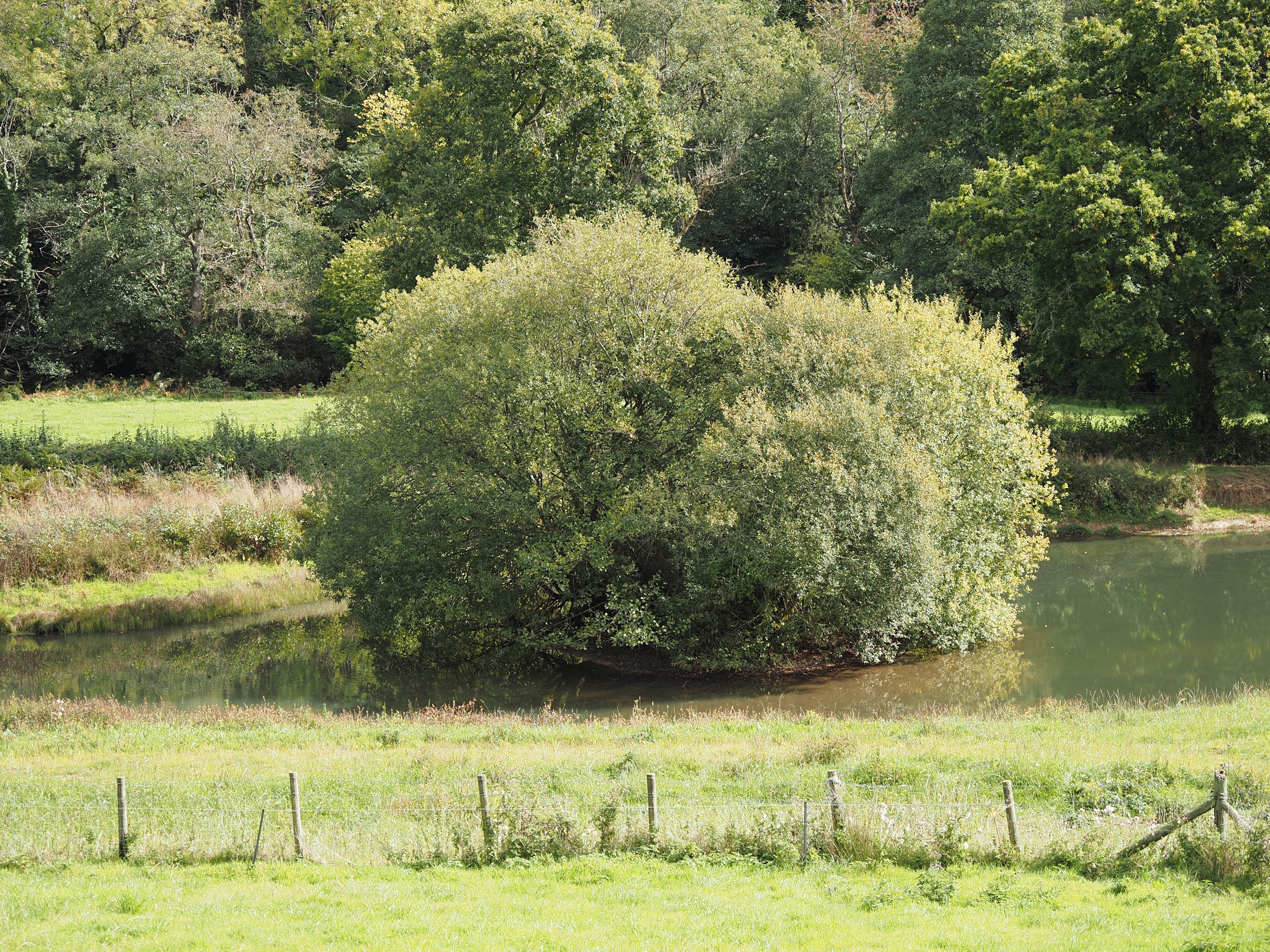
Just a lovely Devon Valley . . .
Awwww, when he spotted a vegan he came over to say hello . . .
As we headed up higher the views get better . . .
A lovely Devon cottage in Cadeleigh . . .
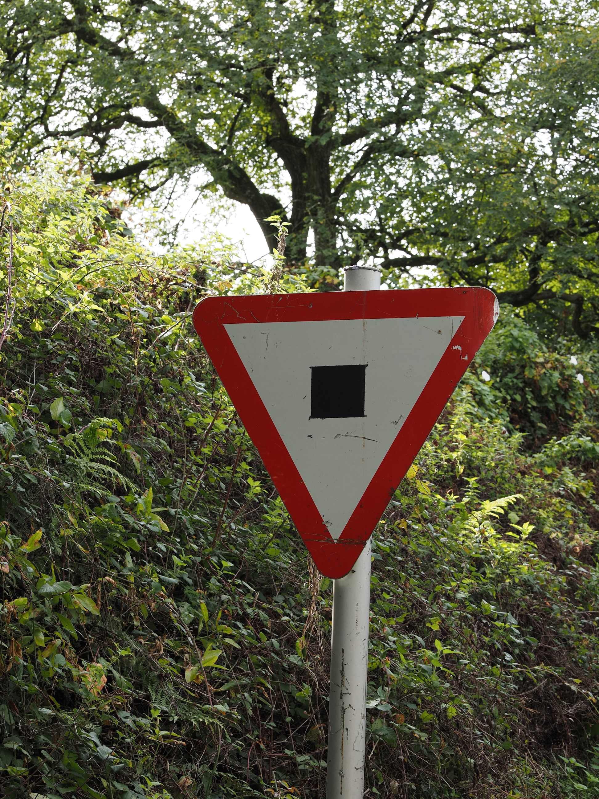
I asked one of the Cadeleigh locals what the sign meant, and he had no idea there was any kind of sign coming into the village.
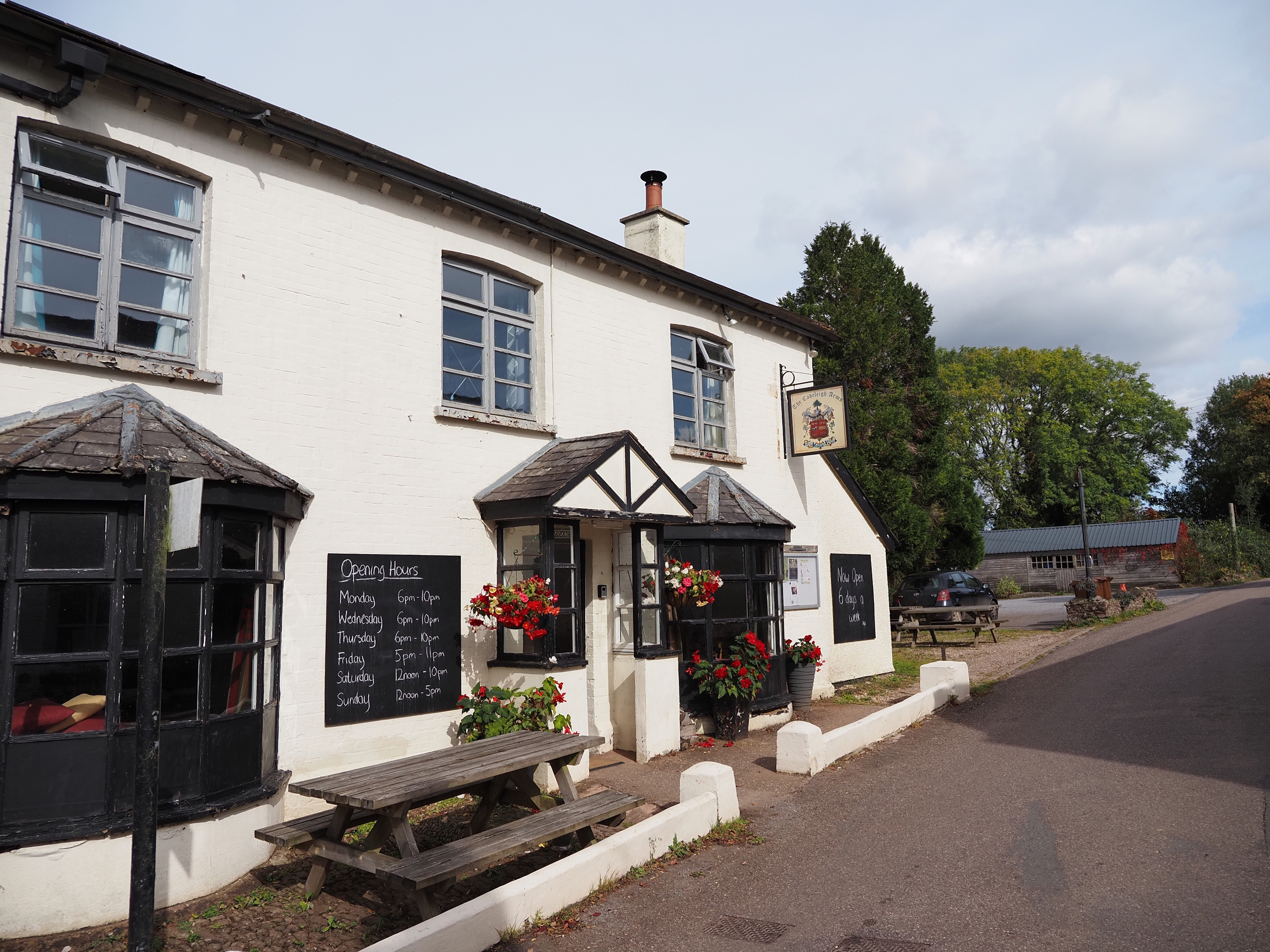
The Cadeleigh Arms has seen some much, much better days, in desperate need of some tlc . . .
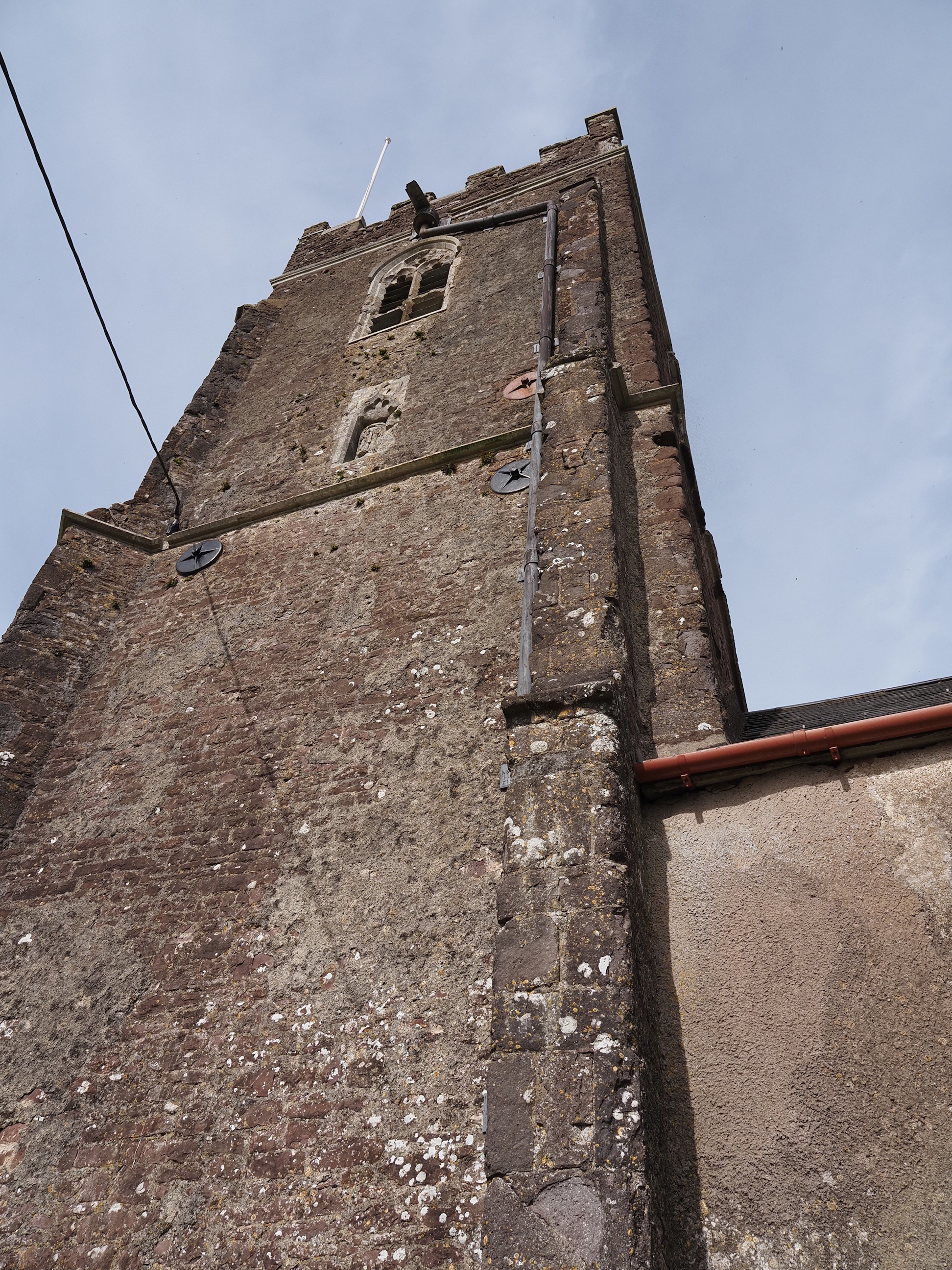
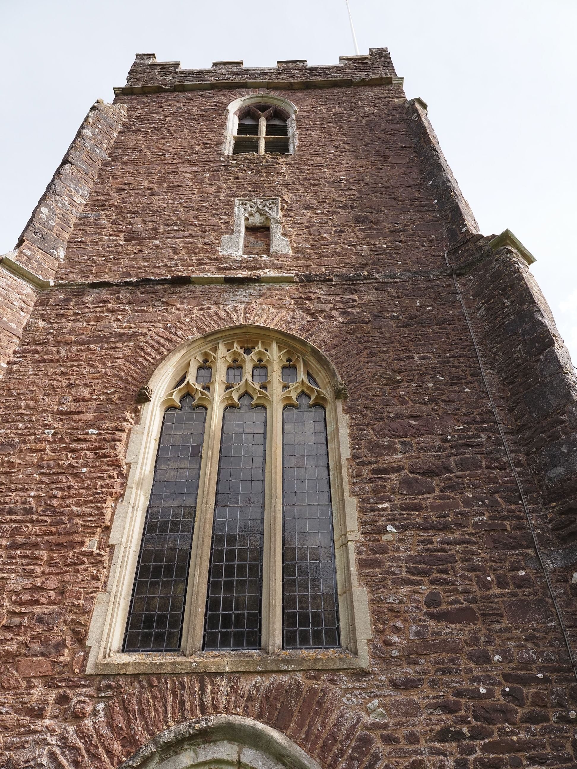
And now we get to St. Bartholomew’s Church, where we sat and had lunch in the grave yard. You can read all about it’s history and architecture over at Historic England
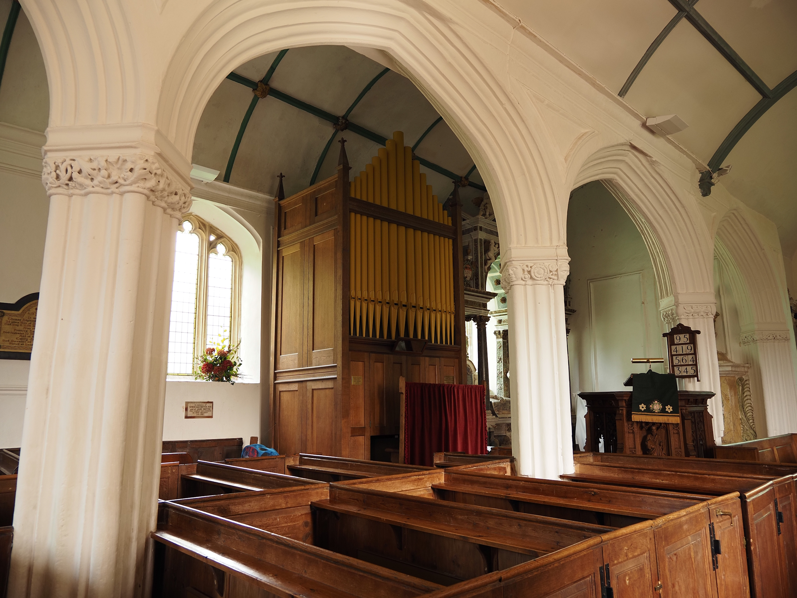
The nice thing about these out-of-the-way village churches is that they tend to not lock them up and you can have a peek inside. And they’ve got a nice looking, little pipe organ . . .
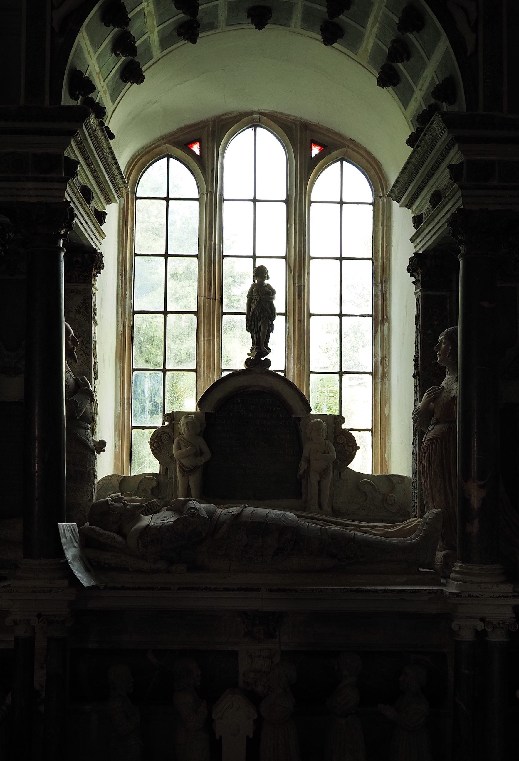
Memorial to Sir Simon Leach . . .
The bell tower . . .
The statue is St Anthony with his pig . . .
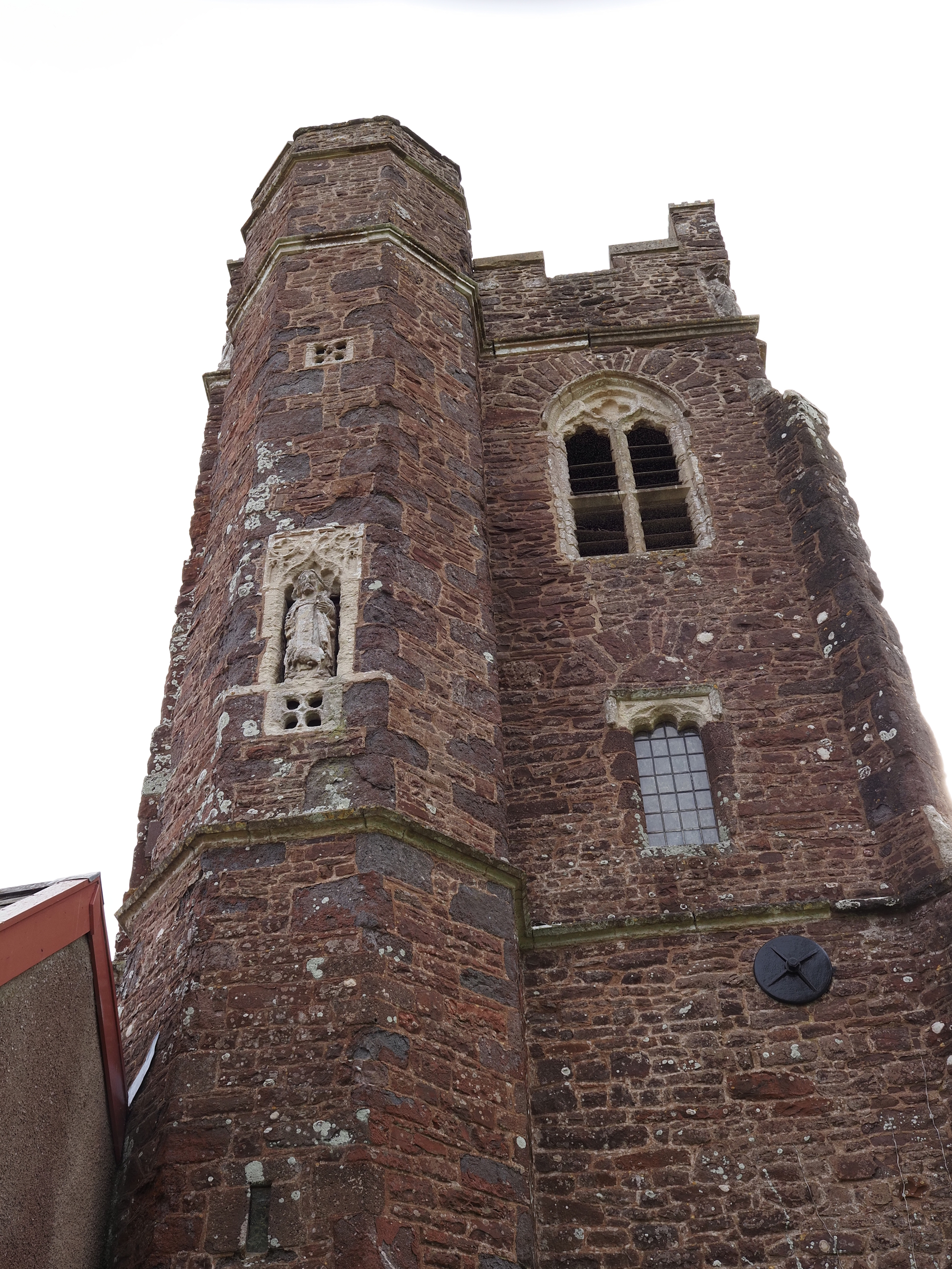
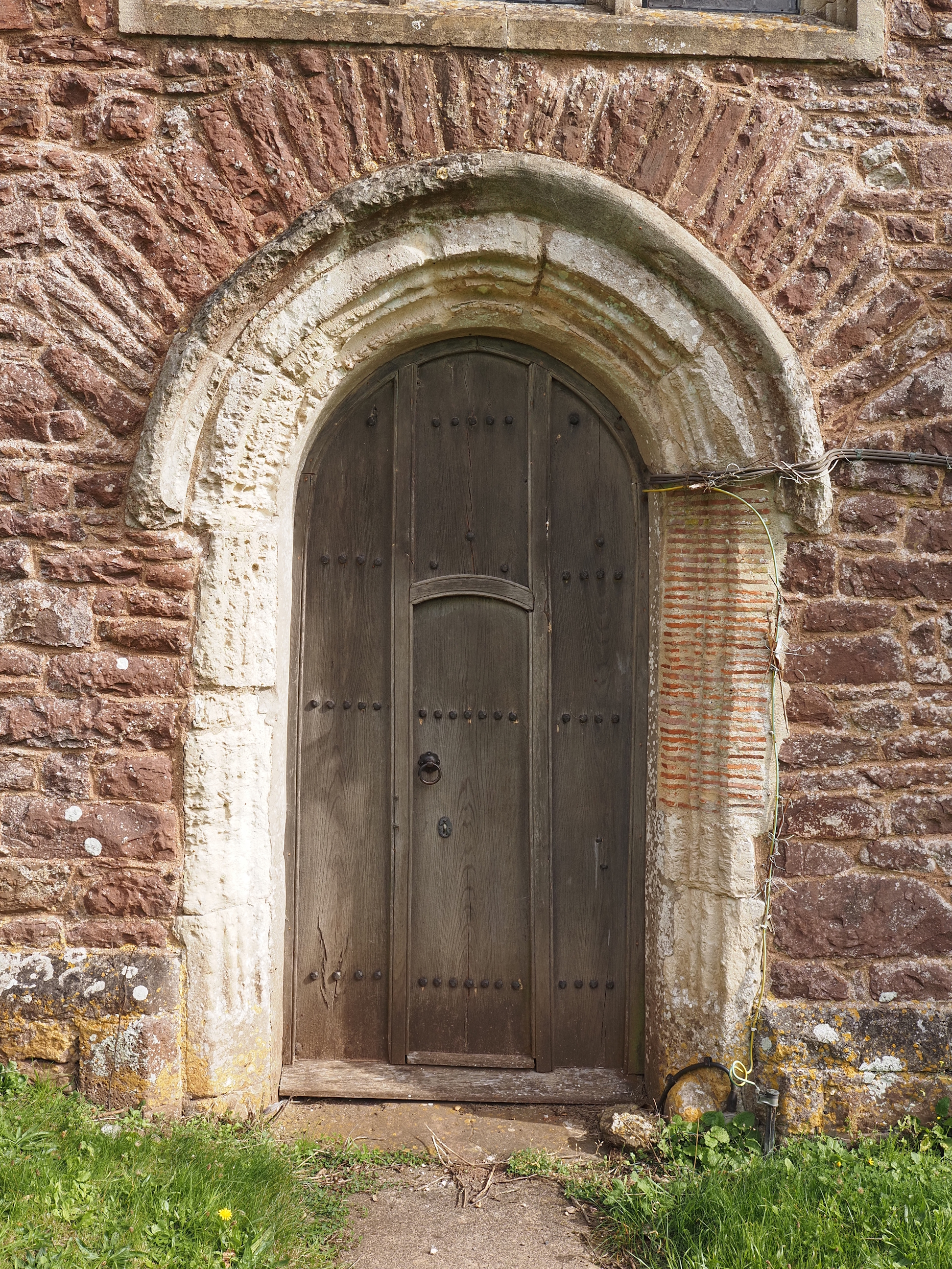
The bell tower’s door with beerstone arch . . .
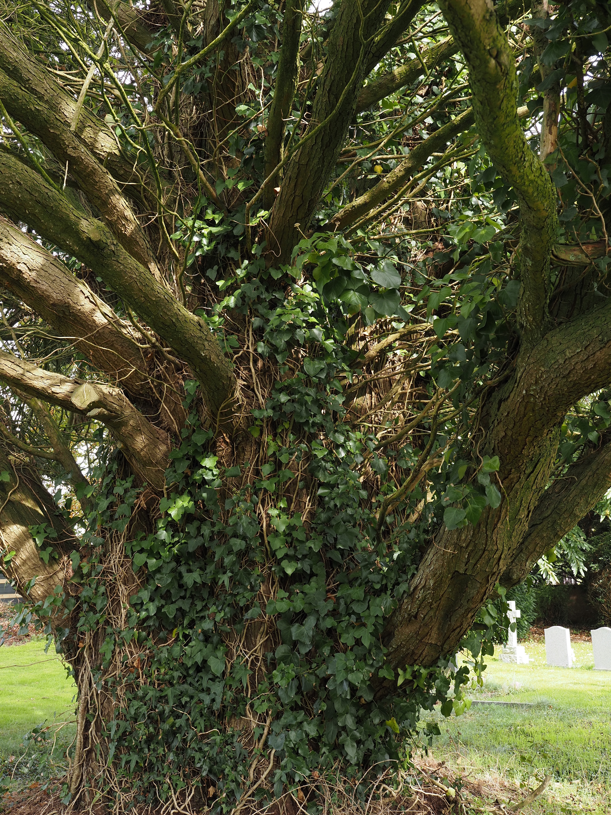
The ivy in the graveyard has taken over a little bit . . .
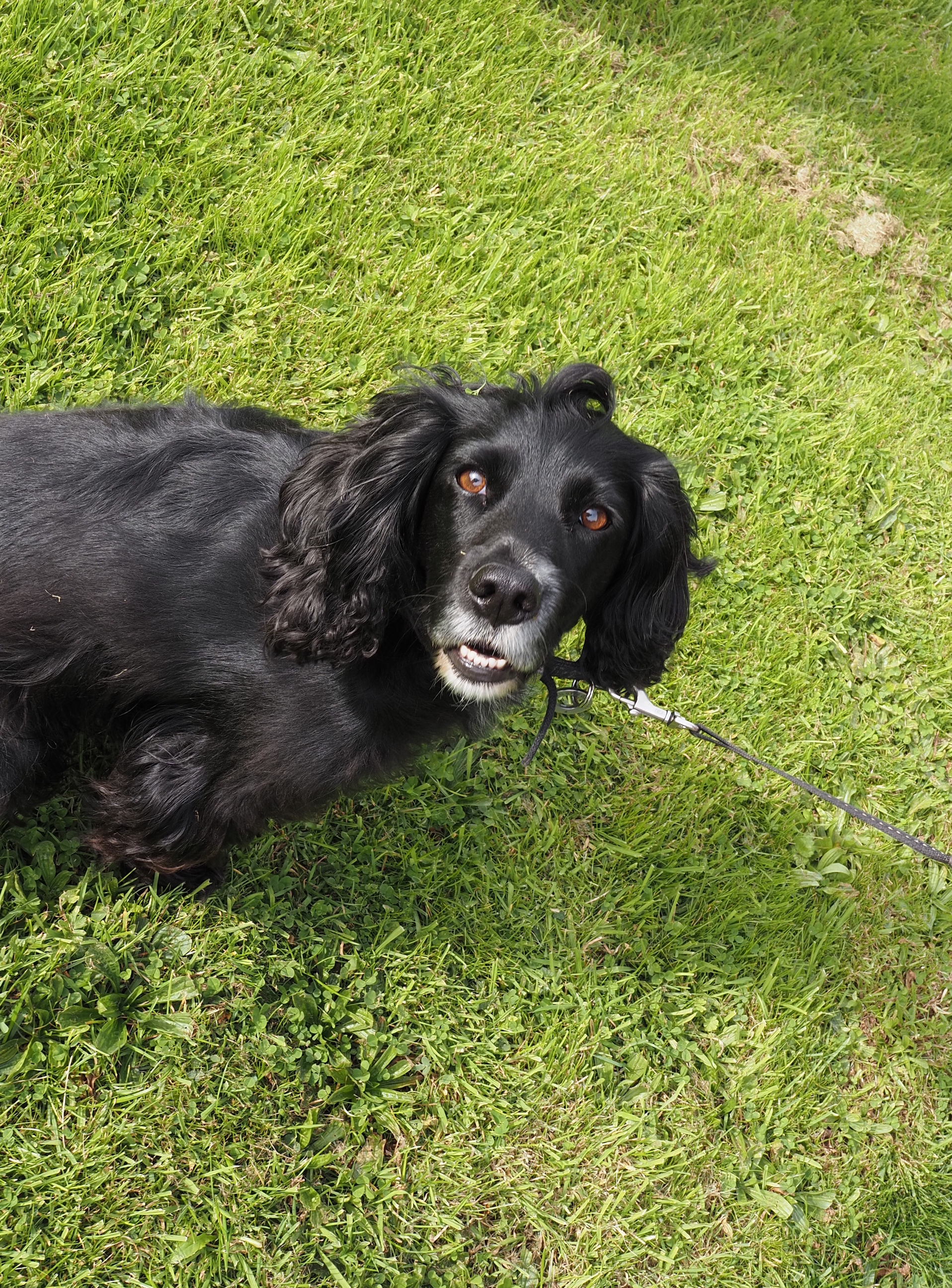
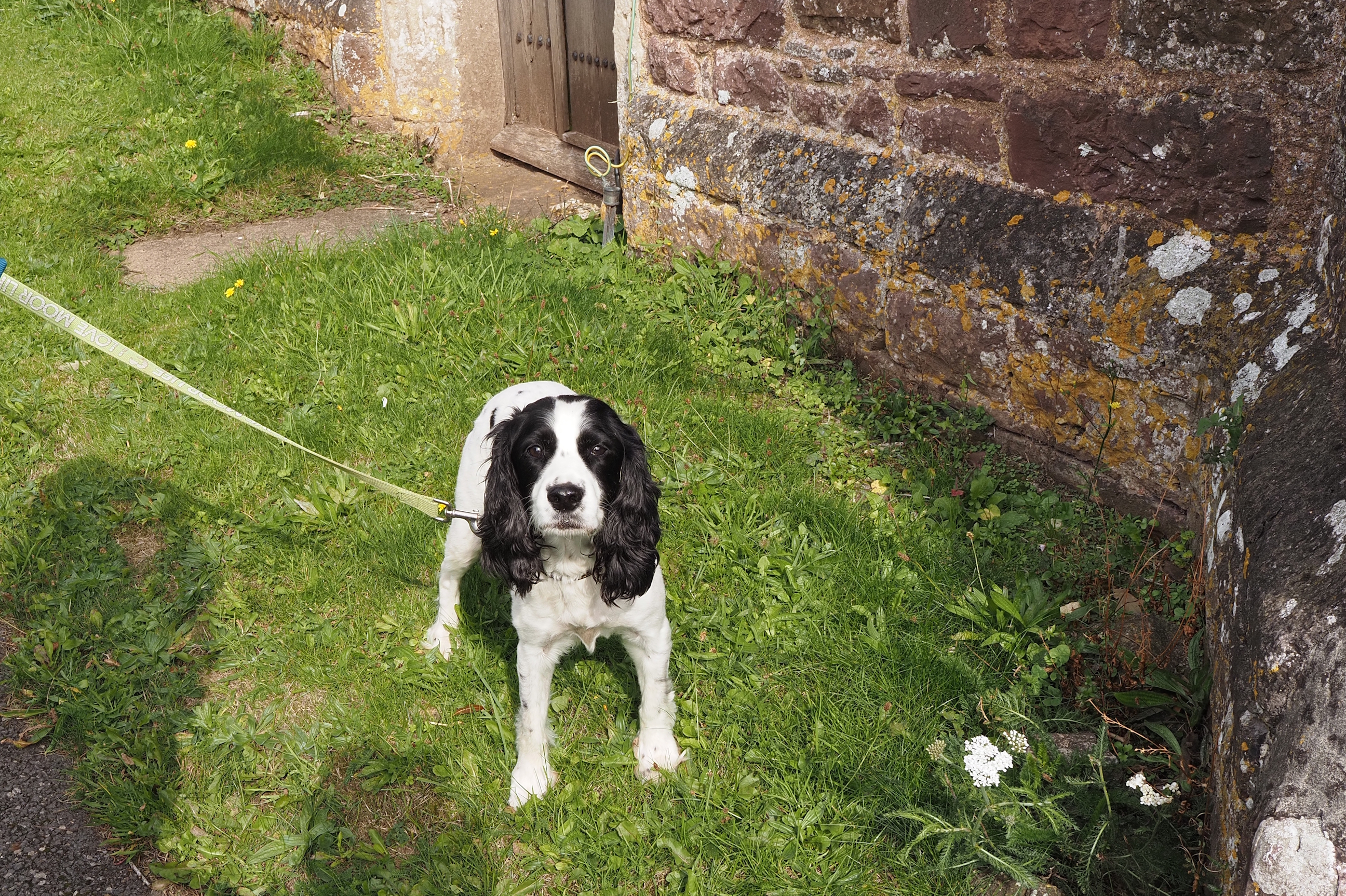
Our two doggy friends were having a great day out enjoying the last of the summer sunshine . . .
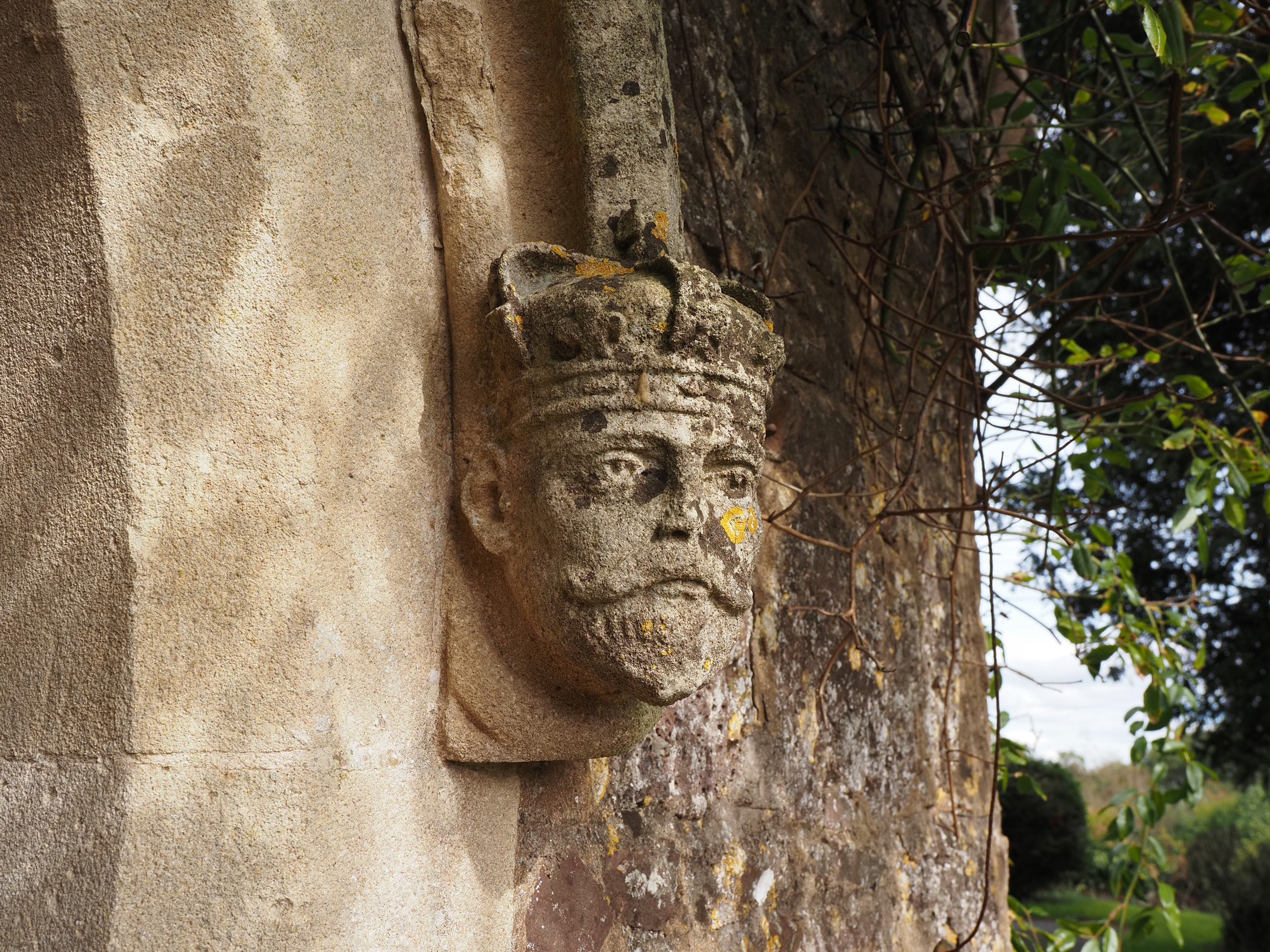
Edward vii . . .
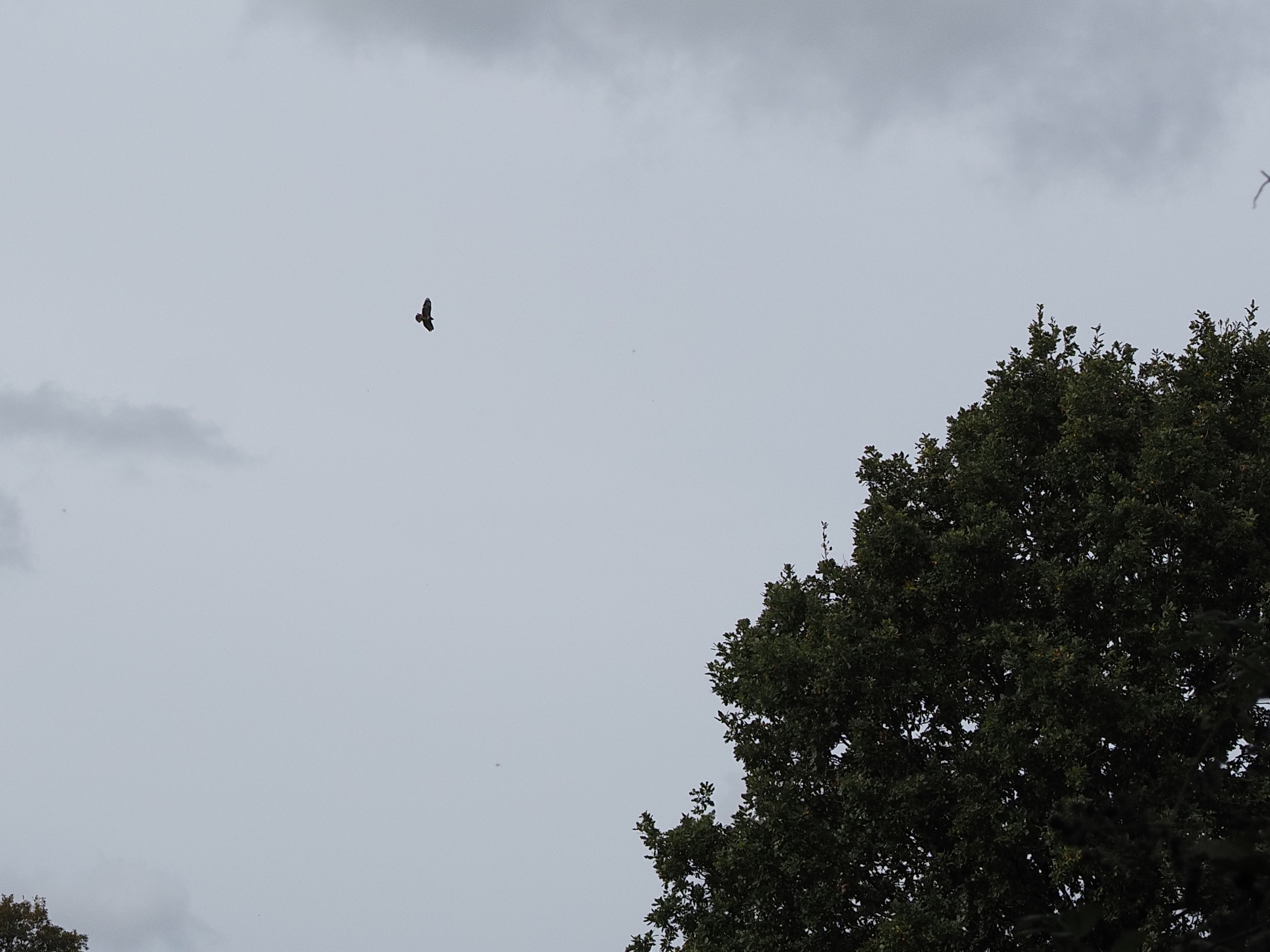
A buzzard out hunting, or maybe just enjoying some fun in the thermals . . .
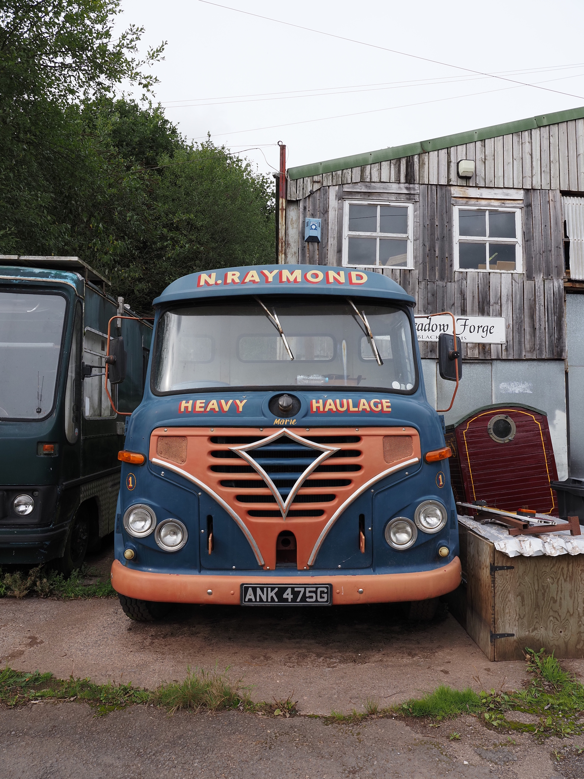
On the way back to Bickleigh there was this lovely old Foden truck . . .
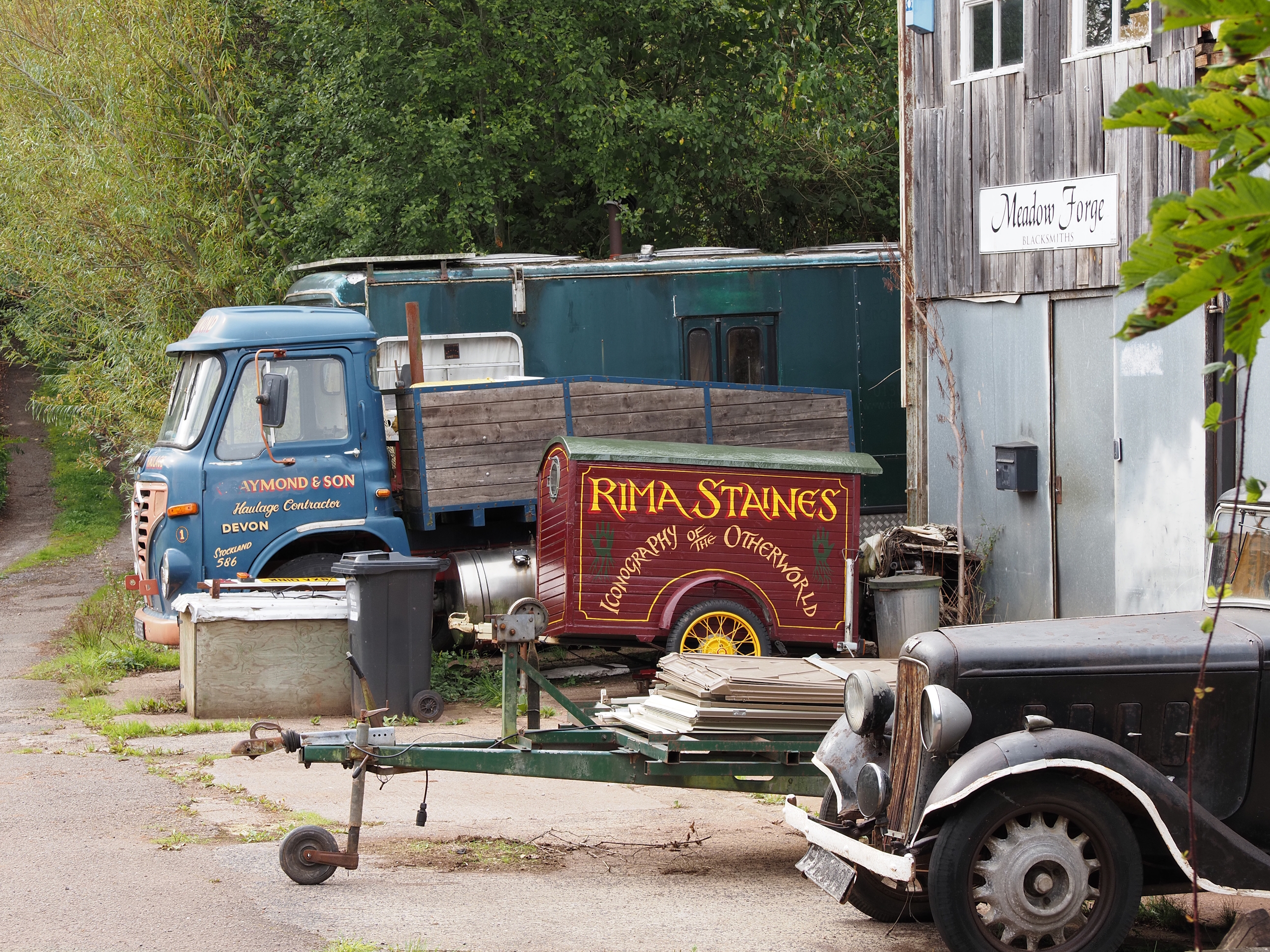
I thought this was some fair ground fortune tellers trailer so Rima can shift her tent and trinkets around, but, alas, i was wrong.
Rima Staines is an artist . . .
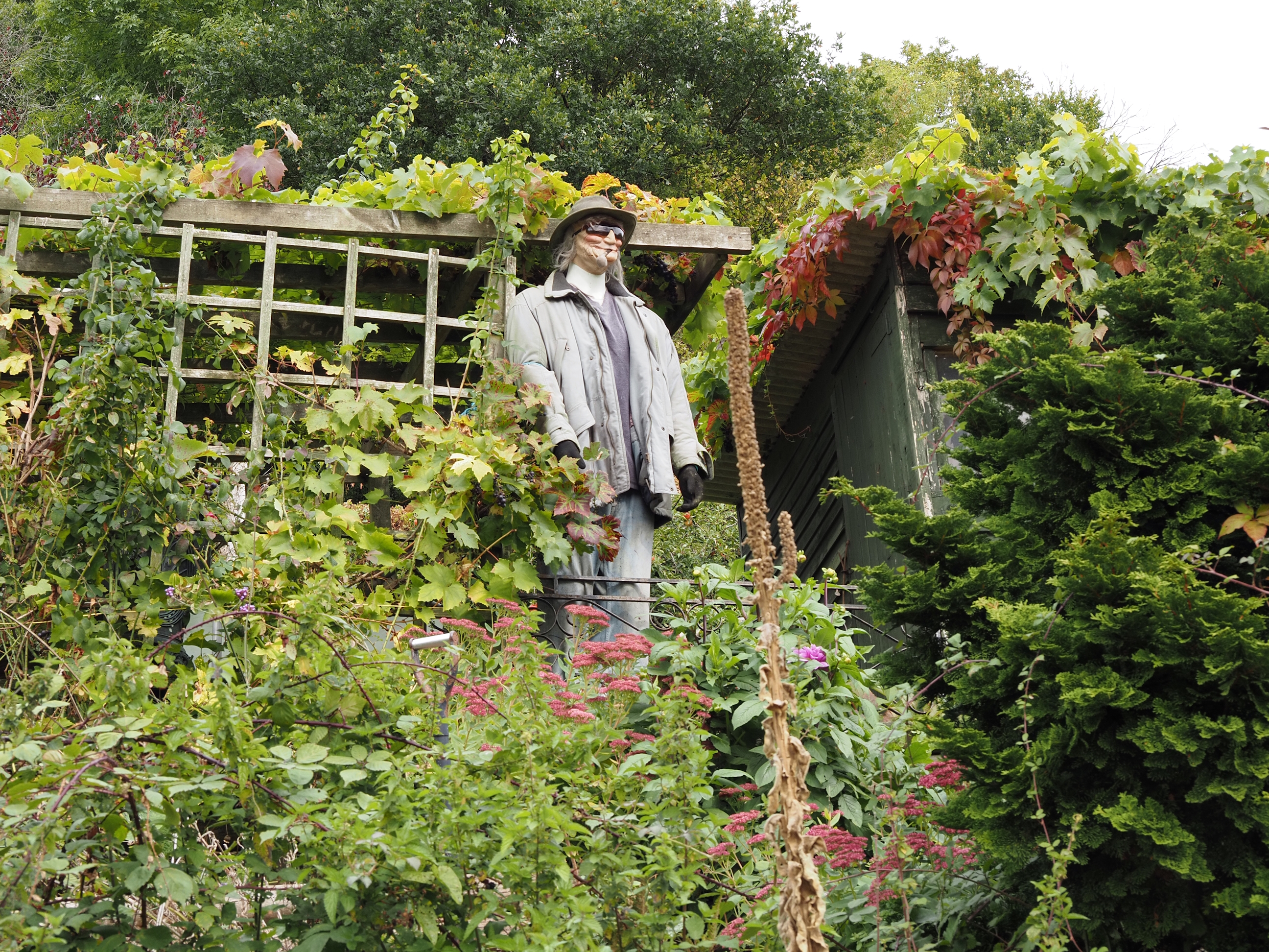
Gerroff my land!!! Nice to see people still have scarecrows . . .
No expense spared on the signage . . .
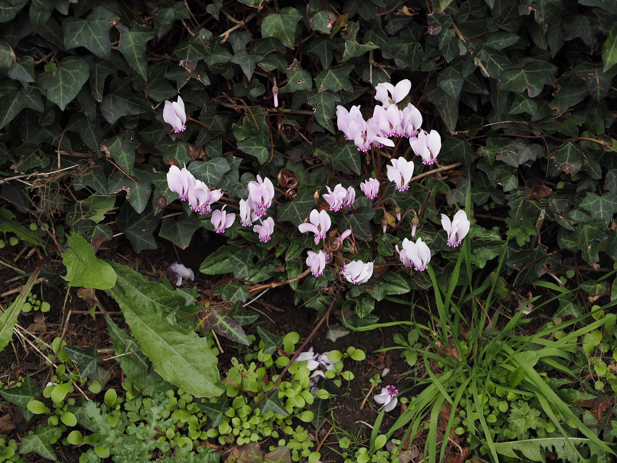
And this pretty little plant is a Cyclamen hederifolium
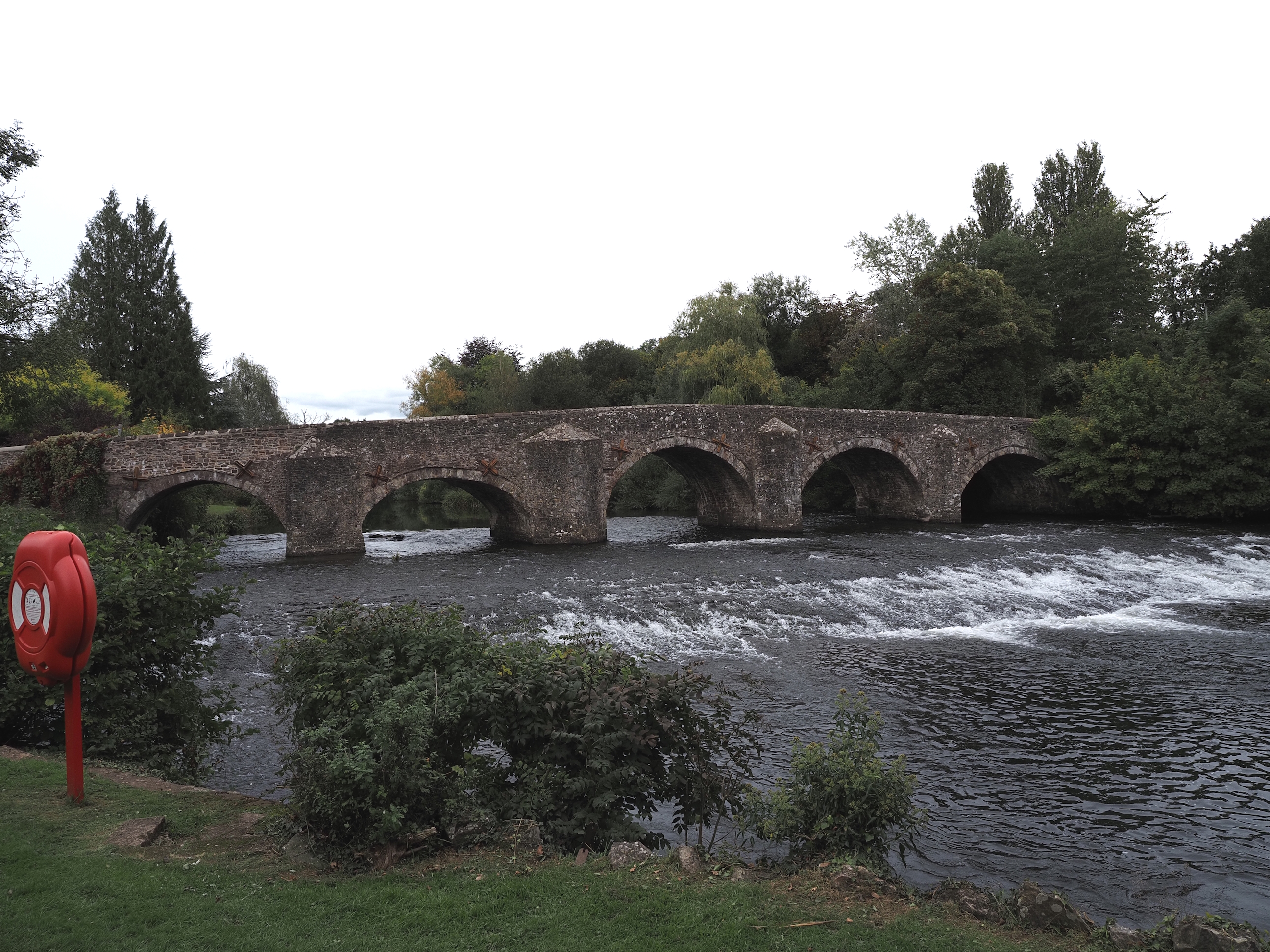
And we finally end up back where we started at Bickleigh Bridge. It was rebuilt in 1809, so well over 200 years old . . .
And that is all we have time for this week. Hope you enjoyed this little taste of beautiful Devon.
See soon.
that no one can hear the whispers
they’ve lit the world so bright
that no one can see in the dark
they’ve told so many lies
that no one knows the truth now
they’ve ruined all of nature
and told us to play in the park


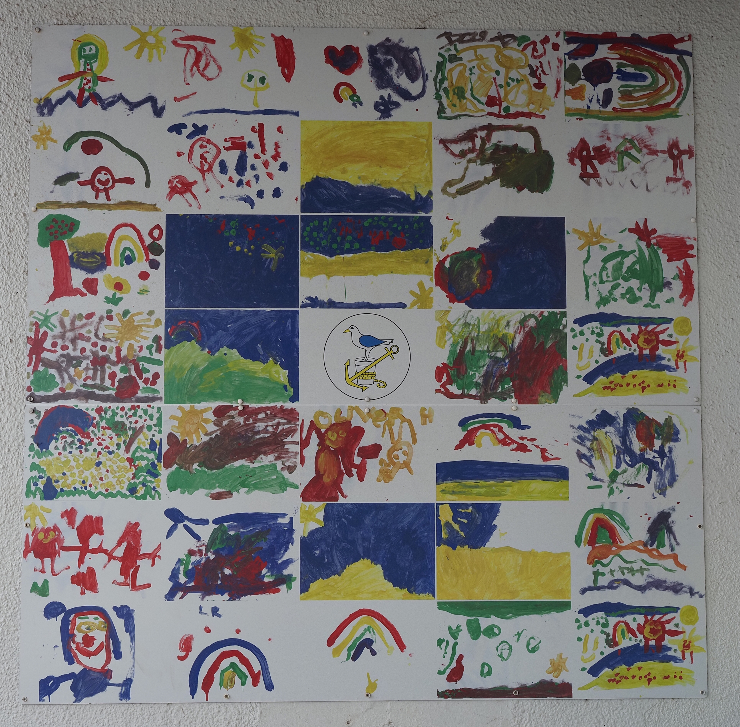
 20 x 15 cm. Using various hard pastels and pastel pencils on Winsor and Newton Tints grey pastel paper.
This was a painting of a painting from the book 30 Minute Pastels by Margaret Evans.
I really don’t like this paper, it was just soooo hard to get the pastel pencils to do anything with it and i ended up breaking a few leads pressing too hard just trying to make a mark. But it’s good to try various supports, maybe it’ll work better with soft pastels.
All in all i’m quite happy with how it turned out, even if it did take me quite a lot longer than 30 minutes.
Another painting for my living room wall though.

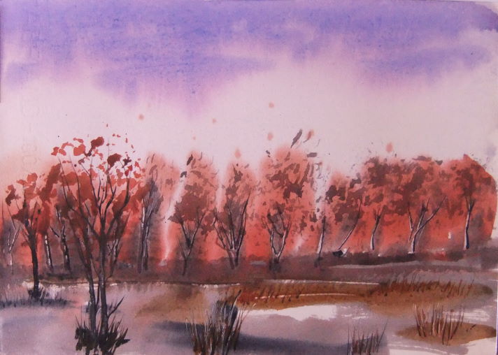
 Having some fun in my Pink Pig watercolour book.
And i’m rather pleased with how it all turned out. Still plenty of learning going on and it’s soooo nice to have something constructive and creative to do while the world has gone to chaos.
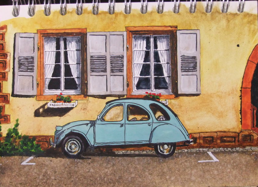
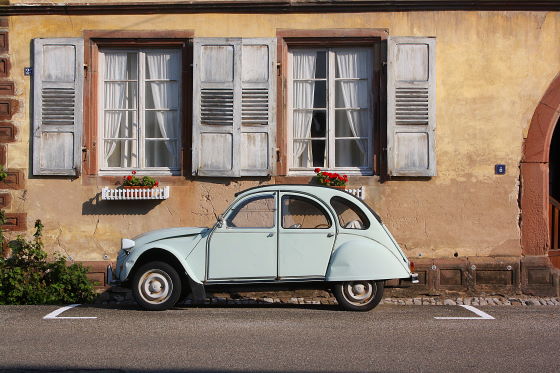
It’s based upon this photo:
Back soon with another picture.
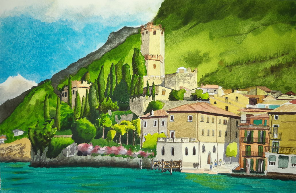 Using Winsor and Newton and Daniel Smith watercolours, white gouache and Fabriano Artistico paper.
Looking at it compared to the original, my colour mixing still needs a lot more work, but i’m still rather pleased with how it all turned out. Still plenty of learning going on.
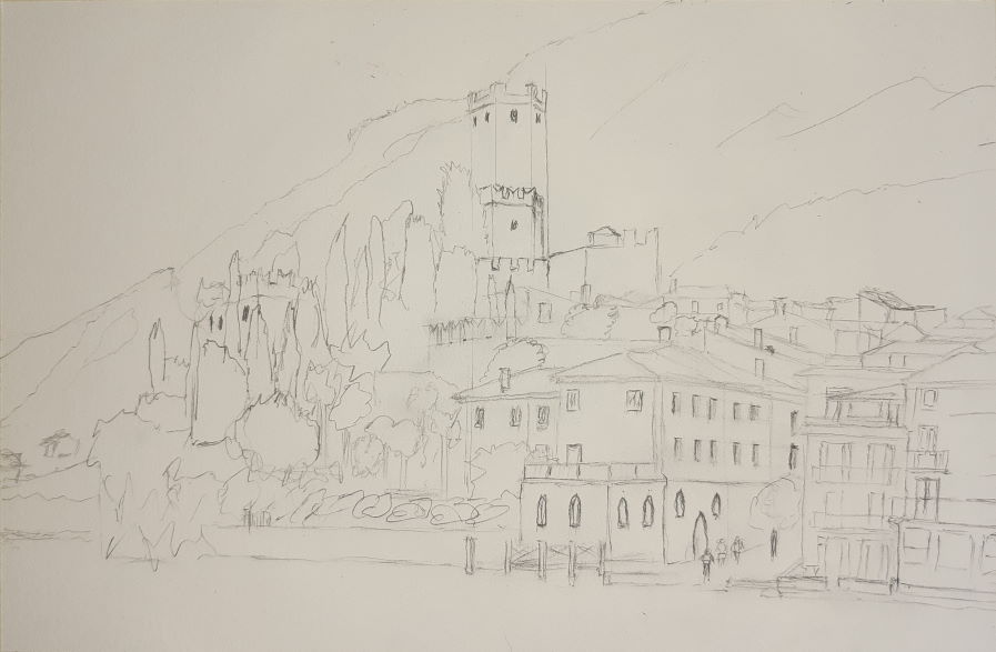 Everything starts with a quick sketch.
 It’s based upon this photo.
I got inspired to do it watching Liron, who has a great Youtube channel:
Back soon with another picture.
 Materials: My watercolours, a tiny bit of white gouache and my ink drawing.
Thoughts: I was very anxious starting this as it’s the first time ever that i’ve used watercolours and i really liked my ink drawing and didn’t want to mess it up. I know i totally used the wrong paper for this and the washes and a few other bits just fucked up because of that. But, regardless, it was good to make a start with my paints.
Learned: I’m not sure what i learned in regards to mixing colours, but i did enjoy playing with them and seeing the colours change as i added new colours to the mix. Certainly some colours leave a bit to be desired, but i’m sure these things will improve in time as i play more with the paints. It was also quite difficult to judge the amount of water in the mix in regards to how light or dark the colour will be on the paper — but again, i’m sure these things will improve with practice.
I definitely learned not to use this sketch book for anything i intend to paint with watercolour. I bought a Stillman and Birn Zeta for future painting projects as i do like the smooth paper to draw and paint on so i’m just going to explore that for a while.
Soooo: I’m quite pleased with how it turned out for my first attempt at this kind of thing, especially the painting with watercolour thing.
Next: After this i feel a lot more confident having another go, so next i’m going to draw a picture in my nice, new, Stillman and Birn sketchbook and see how that behaves when i paint it. Fingers crossed it’ll be much better.
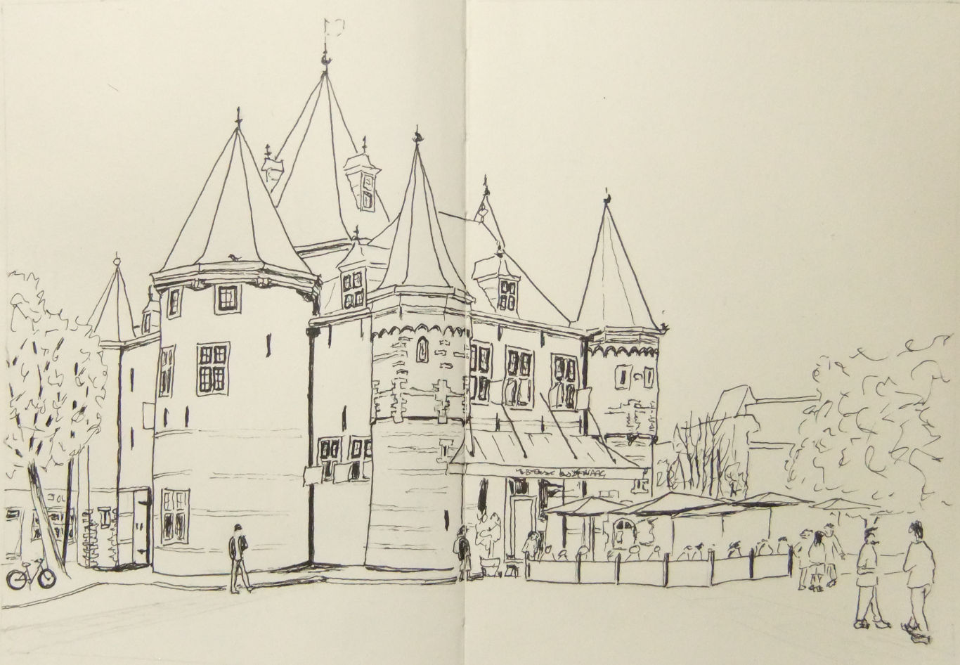 Materials: Handbook Drawing Journal 8.25×5.5in and a Uni Ball 0.1mm Pin.
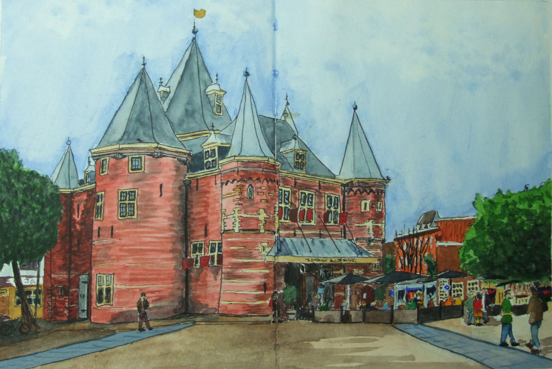
Thoughts: While wandering through Teoh Yi Chie’s channel on Youtube i found “Sketching the Waag at Nieuwmarkt square (timelapse tutorial)”.
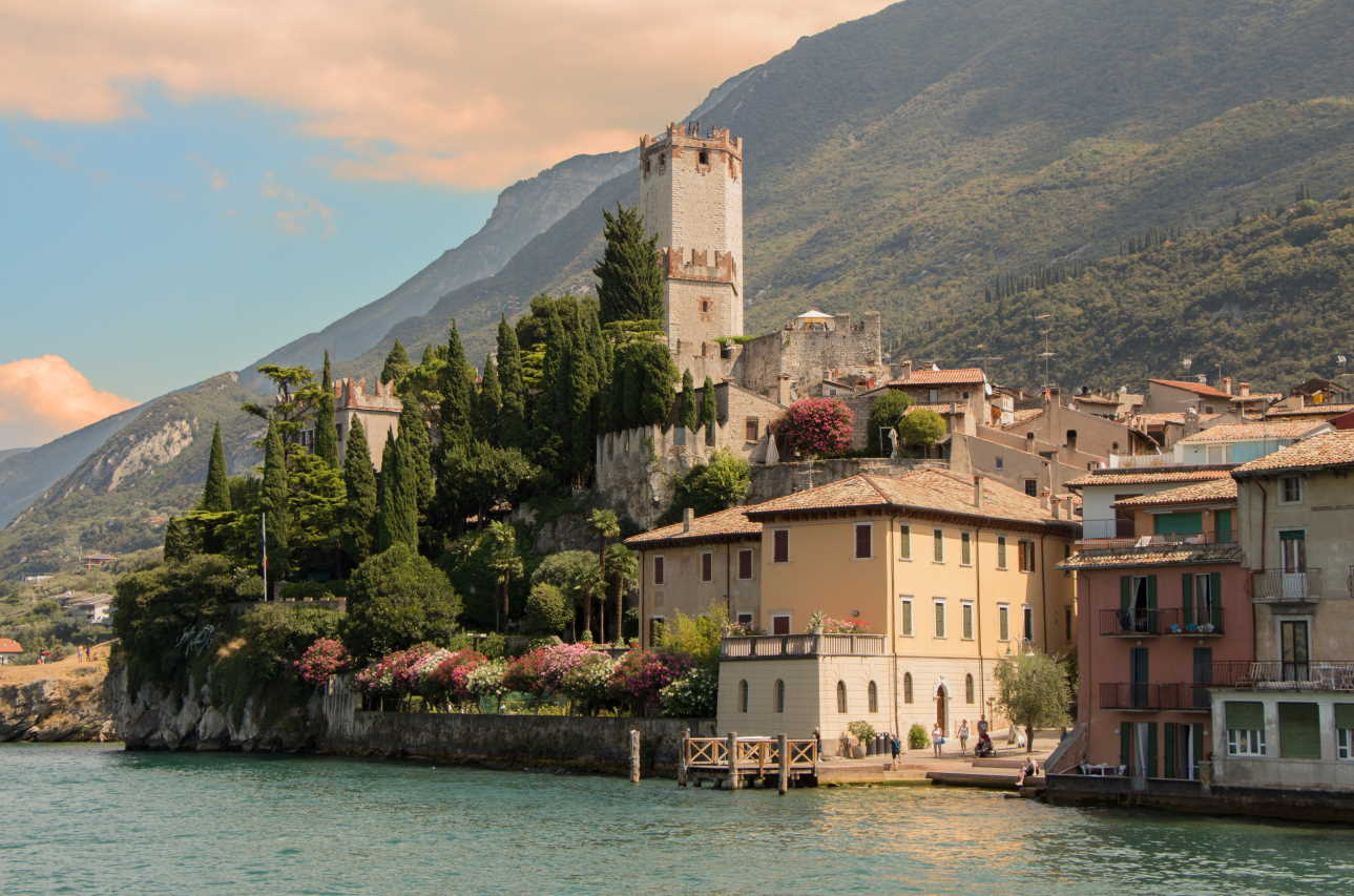
I really liked the look of the building and had a look at Teoh’s reference photo. It was quite a small photo and the building was obscured by a fruit & veg market and lots and lots of cars and vans, so i went off to Wikipedia and found this one . . .
Learned: Find a picture of the subject that i really like and with tons of pixels to exploit: 3872 x 2592. Don’t worry if you make a mistake, which i did several times for any amateur art critics out there who want to practice being picky as fuck while i practice my urban sketching. While i quite enjoyed drawing with the Uni Ball Pin, i don’t think the 0.1mm is 0.1mm, it’s not even close: i can get finer lines with my 0.5mm Rotring Tikky pencil.
Soooo: I do need to pay a bit more attention to what i’m doing as i did make some silly mistakes, but for a first go at sketching a building i’m rather happy with it. I also need to find a better pen for the really fine stuff. This pen will write quite fine but you have to be really delicate with it to do so, as soon as you allow any pressure at all it starts to get quite thick.
Next: I have to do a nice mixing chart with my paints, which should give me a little more practice with them. And then i get to cover my nice picture of De Waag in lots of pretty colours and you’ll all get to see how it turns out.
I’ll be back soon, so don’t go away. Well, alright then, you can go away, but make sure you come back soon and i’ll see you here.
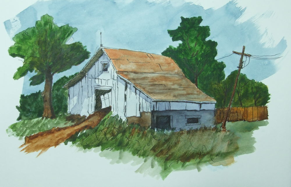 Materials: A very cheap Jinhao 992 fountain pen from China (£1.25 on eBay, inc. postage) with Lotte flavour SketchINK, my new Winsor and Newton Professional Watercolours (i’ll get around to swatching these soon), and a Pink Pig 270 gsm hot press watercolour book (we like Pink Pig).
Plan: I wanted to give my new watercolours a play so i followed along with Peter Sheeler’s tutorial of this old barn.
Learned: That the Pink Pig watercolour books are very good. This was a much better experience than painting on the Handbook sketch book, and oddly these Pink Pig watercolour books are much cheaper. I already own a Pink Pig sketch book which i used for this drawing. I think they’re incredibly good value for money with paper and everything made right here in England.
Soooo: I’m fairly happy with how it turned out for my second ever watercolour. Obviously plenty of space for learning and improving, which i’m looking forward to doing very much.
Next: I definitely need a few more brushes. Peter was using a flat brush throughout this tutorial and the only two flat brushes i have were either way too big or way too small, so most of my painting was done with a number 7 round with a number 2 round for the fine lines. So i think my next purchase is going to be a Da Vinci Casaneo size 12 flat to have a play with.
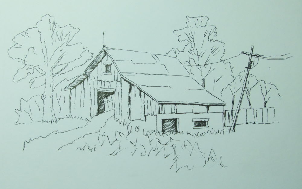
Here’s the ink drawing before i painted it:
 This was drawn mostly using the reverse side of the nib, which works incredibly well with this pen and gives these amazing consistent fine lines.
For £1.25, including postage from China, this Jinhao 992 pen is really sweet. Yeah, you read it right, £1.25 including postage from China. And it works lovely with the SketchINK which is super important. If you like spending lots of money on disposable pens, wrecking the environment, then carry on, but if you have a couple of pounds to spare get on eBay and buy one, or several, of these pens and give it a go with some SketchINK — i think you’ll be surprised. The pen comes complete with the convertor as well.
Back soon with another picture.
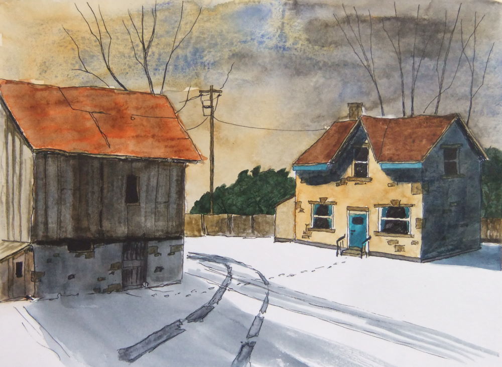 Materials: Jinhao 992 fountain pen with Lotte flavour SketchINK, my new Winsor and Newton Professional Watercolours (i’ll get around to swatching these soon), and a Pink Pig 270 gsm hot press watercolour book. After the last picture i went and bought a Cotman 13mm flat brush, and i also used a number 2 round.
Plan: To do another of Peter’s enjoyable paint along tutorials which you can find by clicking here, and get to play with my new 13mm flat brush.
Learned: The flat brush is very nice and i really enjoyed painting with it. The Cobalt Blue Deep is very granulating, that sky, whoops.  I bought this colour just because i was curious, well, my curiosity has been served. Not sure what i shall be doing with this colour in the future, but painting skies on hot press paper doesn’t appear to be one of its good points…
Soooo: …back to French Ultramarine for skies then.
Next: As i’m really enjoying doing these tutorials i’m gonna keep on doing them as they’re good drawing practice and challenging plenty enough for me to be learning about my paints.
I forgot to take a pic of the drawing before i painted it.
Back soon with another picture.
 Playing with my new Hake and Rigger brushes on Fabriano Artistico paper.
Fun things to do while under house arrest.
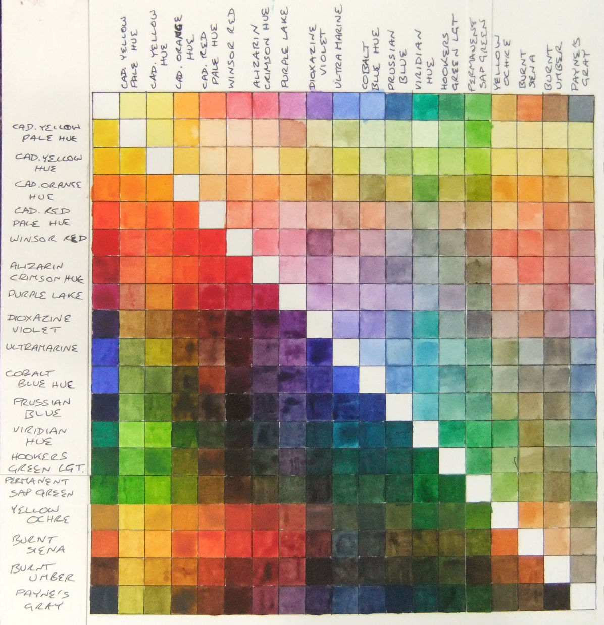 So after my recent mix chart of yesterday, i decided i may as well call into The Range, while i was passing, and buy the Permanent Sap Green from the Professional range to replace the Sap Green from the Cotman range.
What a difference. After faffing around the last couple of days with the Cotman Sap Green struggling to make its presence felt against every other colour, the Permanent Sap Green had no problems holding it’s own on my mixing plate.
So i then had to redo my mix chart. I cut a couple of 12mm strips of the Fabriano Artistico paper and glue sticked them to the chart covering the old Sap Green — i most certainly wasn’t going to do the whole lot again. 
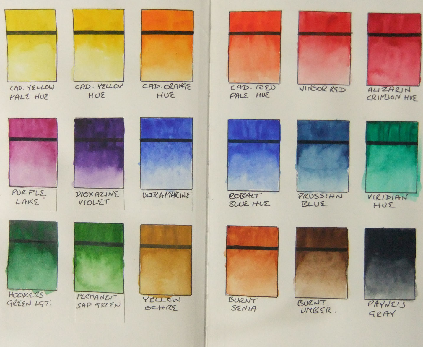 When i finished the mix chart i then redid the swatch in a similar manner. As the swatch is in my Handbook Sketch Journal i cut the very last page out and made a bit to cover the places i needed to. The spare paper left over goes nicely into the plastic pouch inside the back cover for future mistake coverings.
So yeah, very happy now with all my colours. All that’s left to do is to sit and play with them and make pretty colour things on paper.